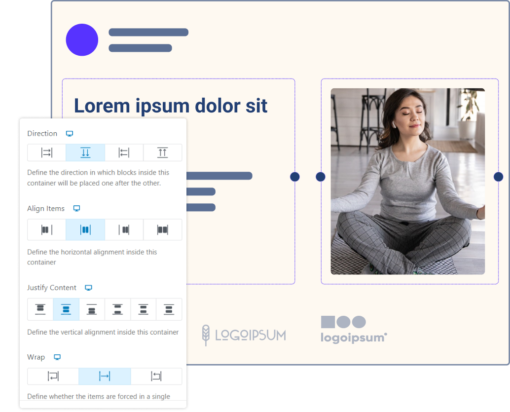
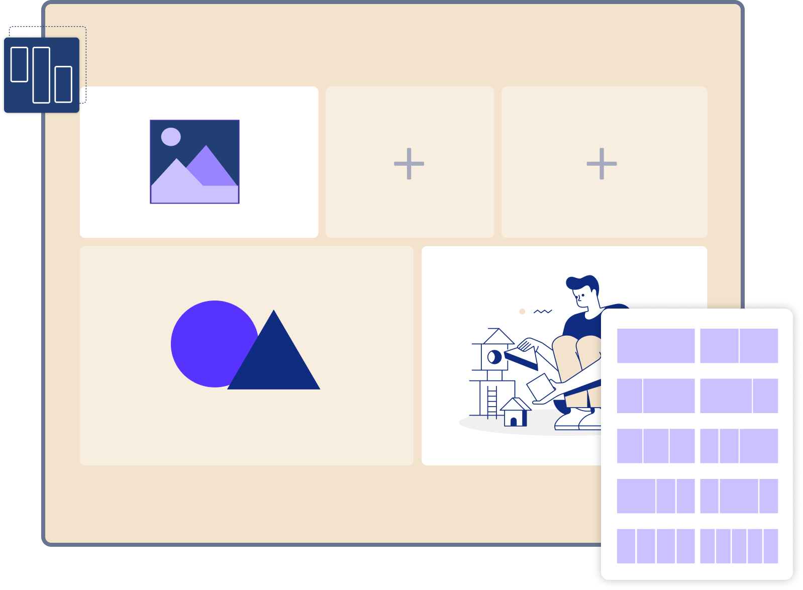
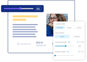
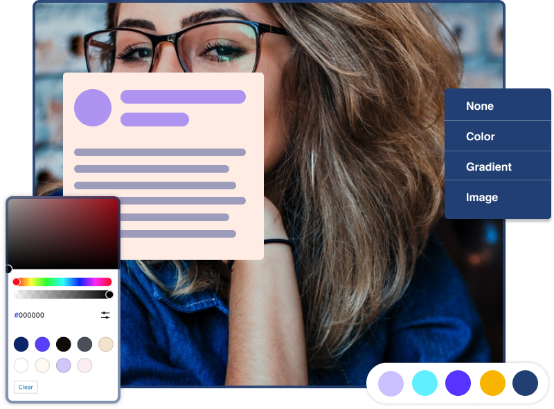
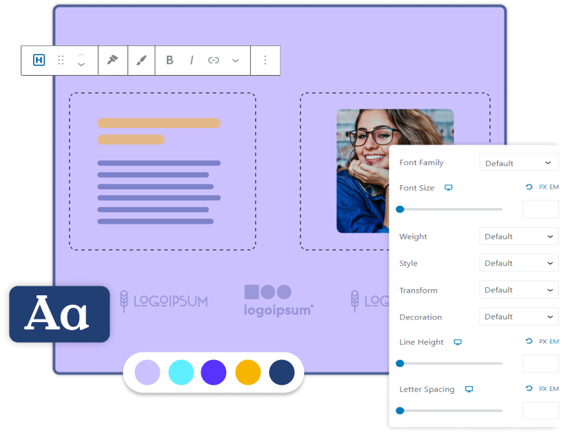
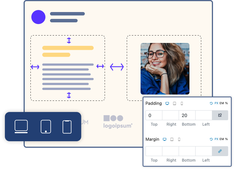
Section and Rows Are So
Web 1.0. Flexbox Containers
Are the Future!

Flexible Containers

Get easy-to-use layouts that make it simple to build and design websites of any kind for any niche.
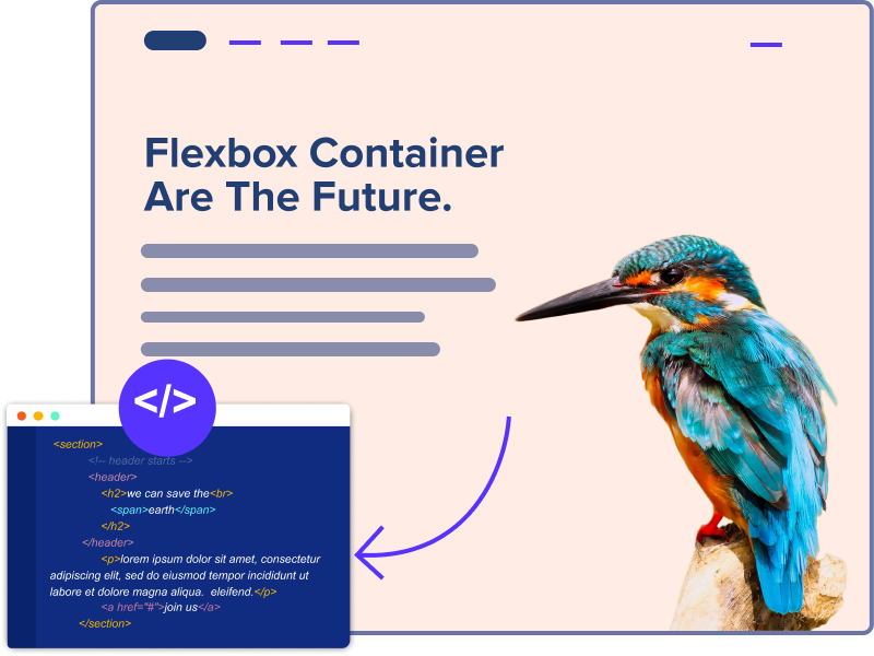
Optimized Code

Build a website with clean code and fewer dependencies for faster load times and a 90+ Core Website Vital score.
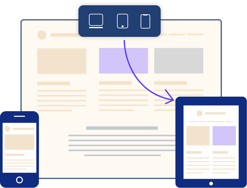
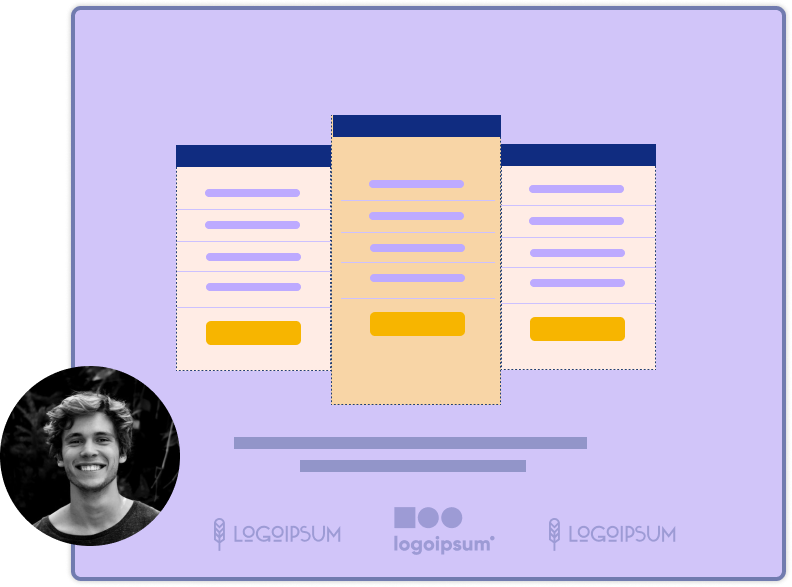
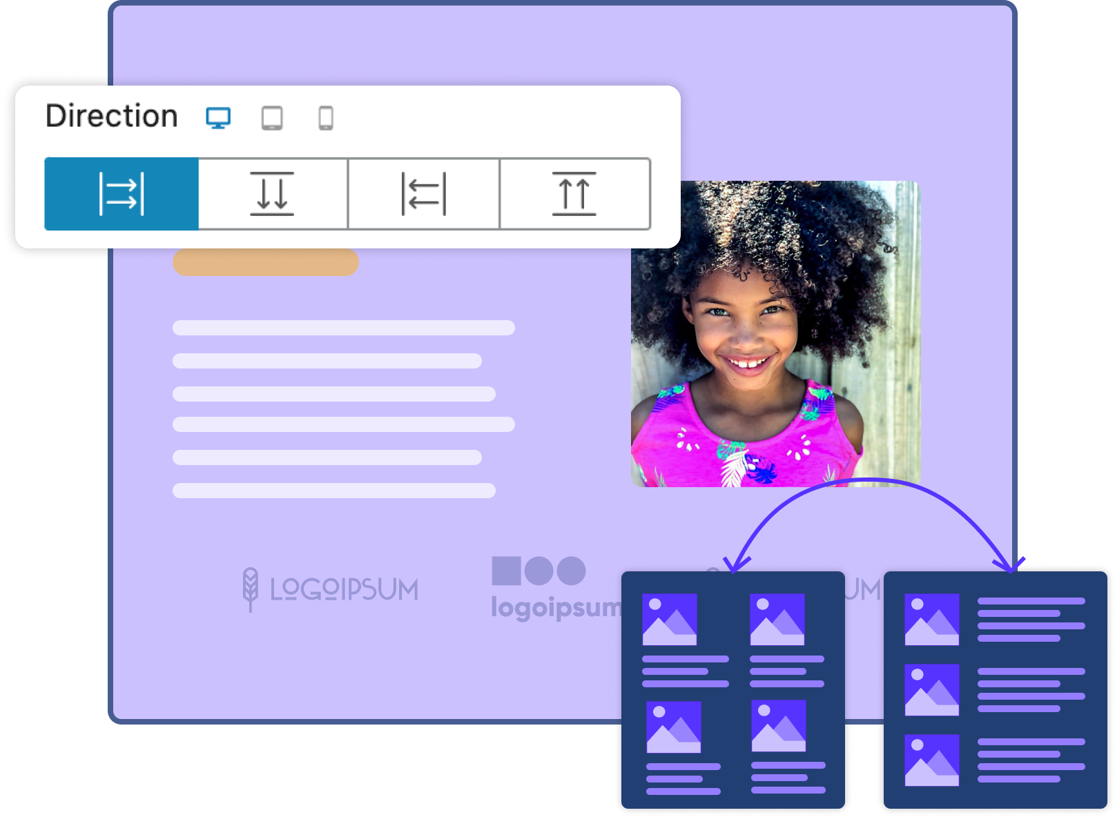
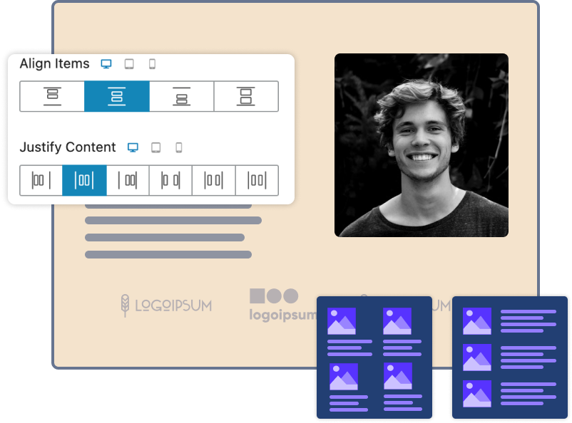
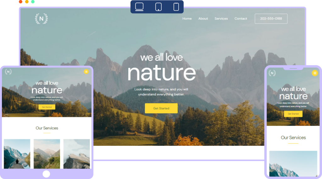
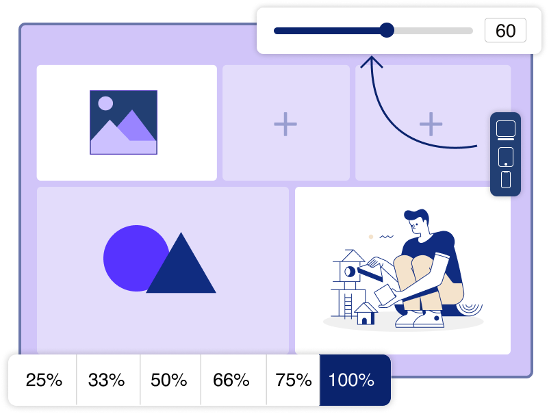
Responsive Layout

Create responsive layouts that give customers a consistent user experience, regardless of device or screen size.

What’s a Flexbox Container?

A Flexbox Container is a powerful layout mechanism that utilizes flexible containers to solve web design problems. It enables you to build responsive websites with ease and deliver the high quality experience your visitors demand. Spectra takes this a step further with a simple and easy interface.

With Spectra Flexboxes you can change the direction of elements in a container, justify-content settings, and customize alignment. All while keeping the layout fluid and responsive for all devices.

Endless Design Possibilities
Without Coding

Align Elements to Match Design Needs

Maintain uniformity with easy-to-use quick alignment settings. You can manage the alignment for all the elements within the entire section so it looks good on all browsers and devices.

Display Controlled Container Heights 

Flexbox containers allow you to manage the height and maintain uniformity irrespective of the content. You can restrict containers to equal heights or configure them however you want them to look within your design.

Create Content Grid Layouts

Design grid layouts to incorporate custom image galleries or unequal containers using the advanced flexbox properties in Spectra.

Display Important Feature Lists

Create custom layouts to display feature lists to highlight certain pieces of content. You can manage the placements of icons, headings, and descriptions to make them look more appealing.

Build Custom Tables Easily

You can create easy-to-read custom pricing tables without using the HTML table markups. Build and customize tables as you want without coding!

Customizable Containers with Endless Creation Possibilities

Adjust Content Width and Height

You can control the width and height of containers so you can easily fit them into your page design.

Control Element Directions

Changing directions will allow you to switch the layout of all elements within a container with a single click.

Justify Content With Spacing

The justify setting allows you to manage spacing with just a click so your child containers are perfectly placed.

Color Customization

Play with the colors of every single element within a container, including borders and backgrounds.

Typography UI
Font Customizations

Experiment with typography to choose a good font family, weight, size, and more according to your needs.

Spacing Controls

Make your page pixel perfect by managing margin and padding within all containers until your page looks just the way you want.

Create Responsive Designs With No Compromise!

Build Ultra High performance
Websites, Without Coding

Whether you are a beginner, marketer, or professional, Spectra has the tools and resources you can rely on to succeed

Download is Just A Click Away!

Enter your email address and be the first to learn about updates and new features.

Get your hands on Spectra Pro

Enter your name and email address to get access to Spectra Pro.