- Using Heading Block
- Buttons
- Post Grid
- Content Timeline
- Social Share
- Google Map
- Add Testimonials
- Info Box
- Team
- Icon List
- Price List
- Post Masonry
- Post Carousel
- Post Timeline
- Call To Action
- Advanced Columns
- Blockquote
- Marketing Button
- Table Of Contents
- How-to Schema
- FAQ’s: Schema/Accordion
- Inline Notice
- WP – Search
- Review Schema
- Lottie
- Taxonomy List
- Tabs Block
- Create Contact Forms
- Star Rating
- Masonry Image Gallery
- Wireframe Blocks
- Heading Block
- Image Block
- Buttons Block
- Translate Everything WPML
- Container Block
- Taxonomy Styling Options
- Block Presets
- Image Gallery
- Counter Block
- Modal Block
- Registration Form Block
- Slider Block
- Pagel Level Custom CSS
- Countdown Pro
- Slider Custom Navigation
- Instagram Feed
- Loop Builder
- Animations
- Login Form Block
- Global Block Style Extension
- Create Popups
- Custom Blocks
- Move Block Patterns
- Grid Builder
- Newsletter Forms
- Register High-Privileged Users
- Hide Core Blocks
- Getting Started with Instagram
- Advanced Loop Builder
- Section
- Troubleshooting: Missing Icons
- Spectra Patterns
- Contact Form 7: Multiple Column Fields
- Contact Form 7: Checkbox / Radio / Acceptance Control
- Unable To Style Contact Form 7
- Tab Index For Multiple Gravity Forms
- Getting Started With Spectra
- Exclude Heading From TOC
- Block Display Conditions
- Importing Starter Templates With Spectra
- Getting Started With Spectra
- Manually Install Spectra Via FTP
- Automatic Beta Updates
- Rollback To Previous Versions
- Load Google Fonts Locally
- Activate Spectra Pro License
- Install Spectra Pro
- Translate Strings With Loco Translate
- Process Refund Requests
- Transparent / Sticky Header
- Change Site Logo
- Change Global Styles
- Disable Title on Posts & Pages
- Transparent / Sticky Header For Single Page / Post
- Change Header & Footer Patterns
- Custom / Google Fonts
- Reset Global Default Styling
- Manually Install Spectra One Via FTP
- Enable / Disable Header & Footer On Specific Pages / Posts
Contact Form 7 Designer
Are you looking to add a touch of style and uniqueness to your website’s contact forms but worried about your lack of coding skills? Well, worry no more! With Spectra’s Contact Form 7 Designer Block, you can easily style forms created with the popular Contact Form 7 plugin without writing a single line of code. Let’s dive into what this amazing block has to offer and how it can transform your forms into eye-catching masterpieces.
Customization Made Easy:
Spectra’s Contact Form 7 Designer Block empowers you to fully customize the design of your Contact Form 7 plugin’s forms. Say goodbye to plain and mundane forms that look like everyone else’s. Now, you can effortlessly change form colors, shapes, shadows, backgrounds, and more, all within your browser. No need to mess around with additional code – just create your desired style using the intuitive form output editor.
The Problem with Regular Forms:
You might wonder why you need this feature in the first place. Well, think about it: when all your forms look the same, they lack individuality, and visitors might not find them appealing. This can result in fewer form submissions, leading to missed opportunities for valuable contacts and potential sales.
Until now, styling forms meant diving into CSS codes or using CSS plugins to add custom styles to each page with Contact Form 7. Not only is this time-consuming, but it also requires a fair amount of CSS knowledge. Spectra’s Contact Form 7 Designer Block eliminates all of these issues, providing an elegant solution for form customization that’s accessible to everyone. And the best part is that you do not have to download any additional plugins. All of this is within the Spectra plugin.
How to Get Started?
Before you can embark on the exciting journey of customizing your Contact Form 7 plugin’s forms with Spectra’s Contact Form 7 Designer Block, there’s one essential step you need to take – installing the Spectra plugin. Don’t worry; it’s a simple process, and this article will guide you through it. You will also need to install the Contact Form 7 plugin and create a form that matches your requirements. If you are not sure how to create a contact form using the Contact Form 7 plugin, please check out the documentation here.
Once you have installed the Spectra plugin, please follow the steps below to design your Contact Form 7 forms:
Step 1: Add the Contact Form 7 Designer Block
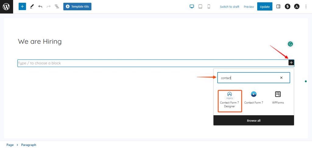
Click on the “+” sign. Once you click on the “+,” a block library will appear. In the search box, type “contact,” and the Contact Form 7 Designer block will show up in the search results. Click on it to add it to your page.
Step 2: Selecting the Form for Customization
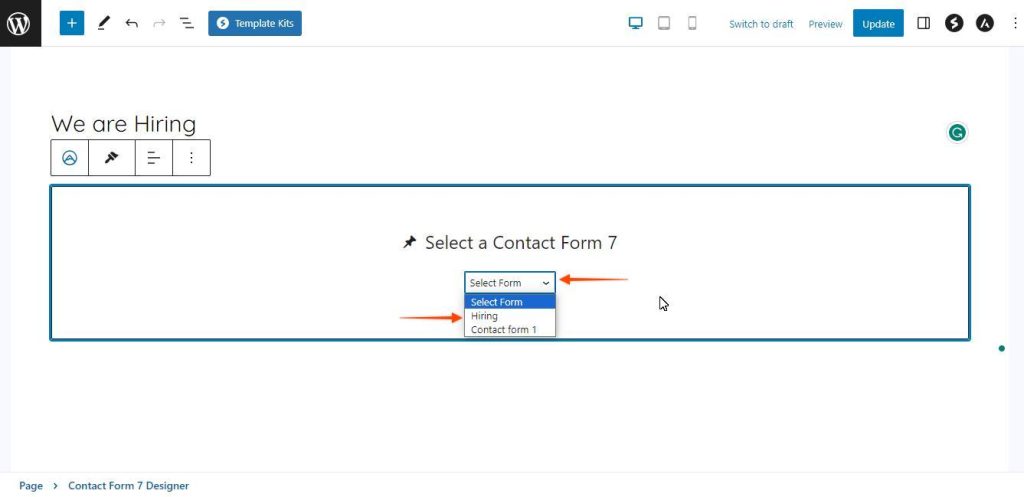
In the next step, you will need to select the form that you would like to customize. Click on the drop-down and the forms that you have already created using the Contact Form 7 plugin will appear here. Click on the form that you would like to customize.
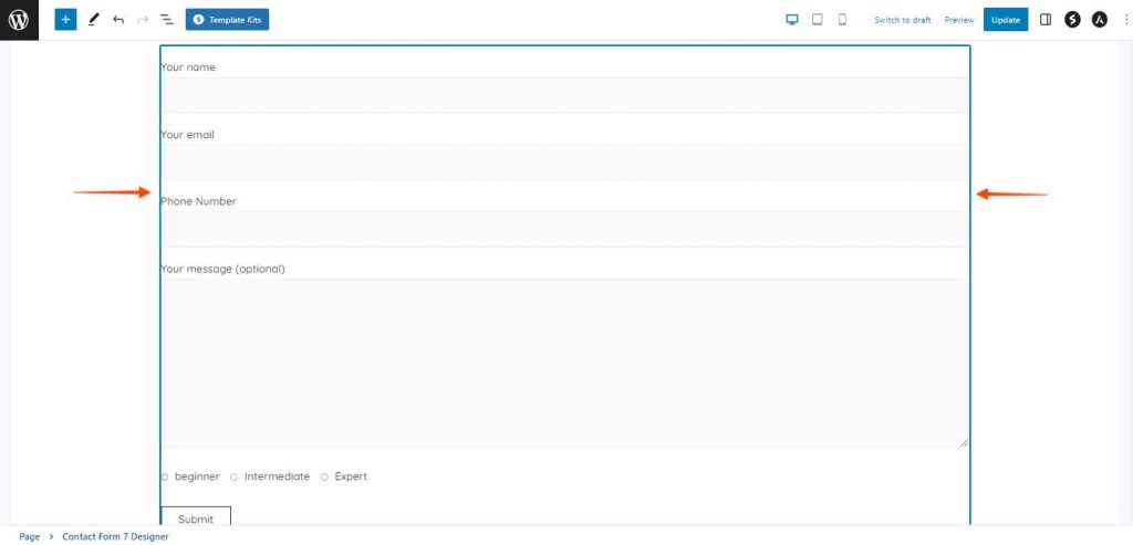
Once you click on any of the forms, the form will appear on the selected block to customize.
Step 3: Accessing the Block Settings
To customize the form, you will need to access the block settings. You can do so by clicking on the form block and then clicking on the Settings button on the top right corner of the page.
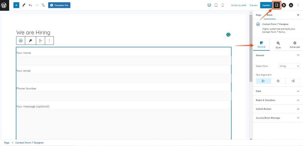
Let’s explore the block settings, which are conveniently divided into three sections: General, Style, and Advanced. We’ll take a closer look at each of them in the following discussion.
General Settings
In the General section, you’ll find all the essential elements to get your contact form up and running. Here’s what you’ll find:
Form Selection: Spectra’s got your back! We’ll list all the available Contact Form 7 forms right there, so you can easily choose the one you want to style. No need to dig through complex menus!
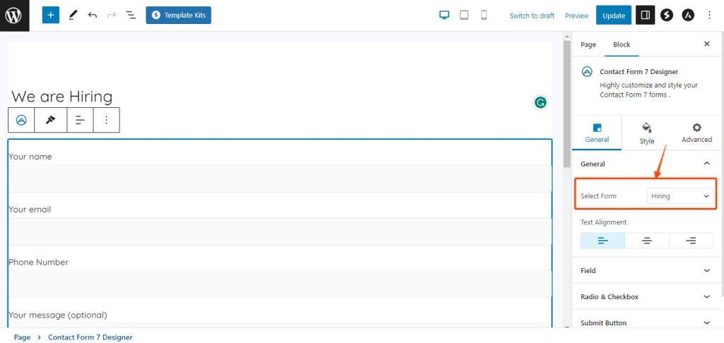
Text Alignment: Align your form’s content just the way you want it. Whether you prefer it centered, left-aligned, or right-aligned, Spectra got you covered.
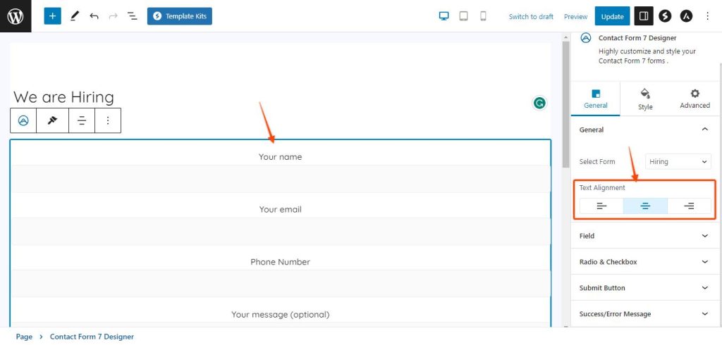
Form Field Style: It’s time to get creative! You can choose between two stylish options for your form input fields – “Box” or “Underline.” Pick the one that matches your website’s vibe to perfection.
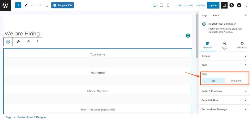
Radio & Checkbox Customization: Say goodbye to boring radio buttons and checkboxes! Ensure that the Override Current Style button is turned on so that we can style the radio buttons later in the Style section.
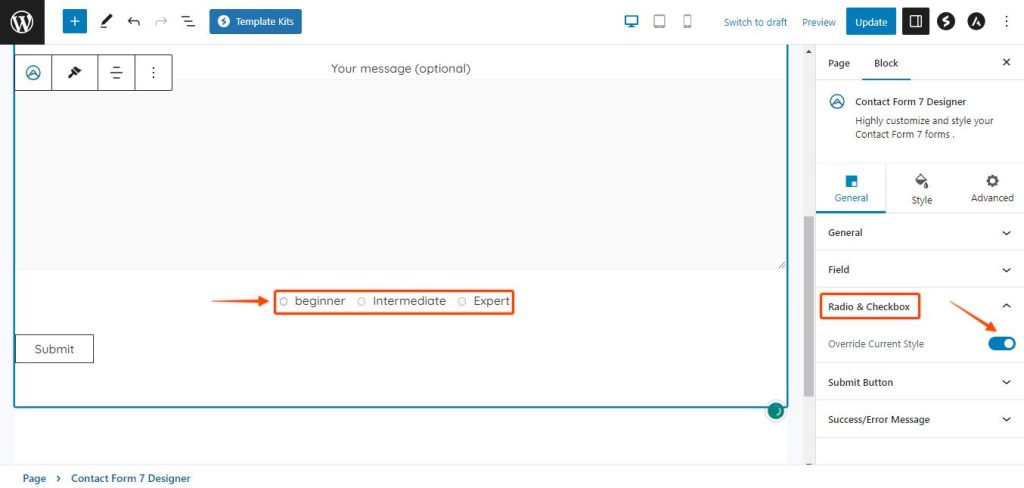
Submit Button Alignment: The cherry on top! The Submit button is the gateway to form submissions, and this option lets you align it as per your requirement to match the style of your website.
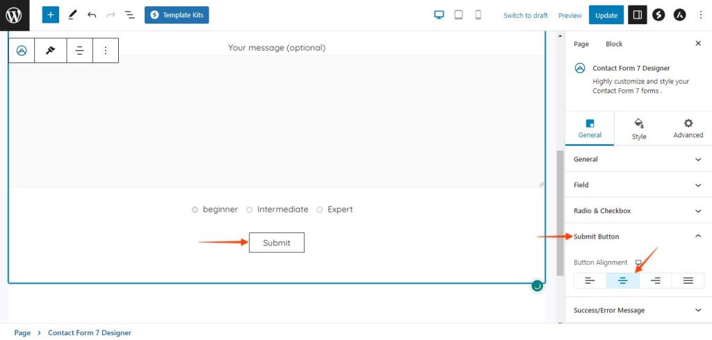
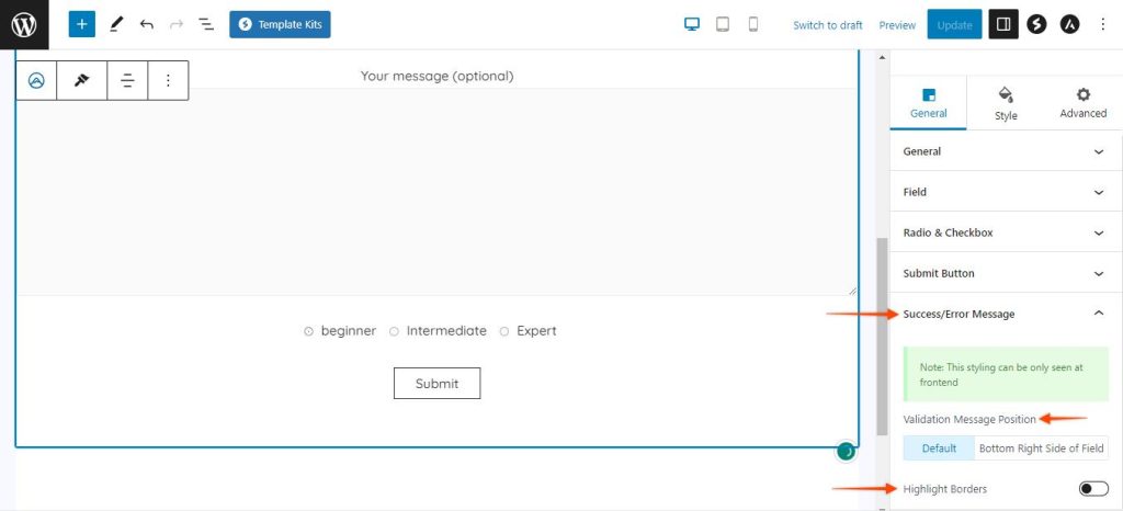
Success/Error Messages: Let’s not forget about user feedback! You can style the success and error messages, ensuring they blend seamlessly with the overall form design. Under General settings, you have the option to choose the following:
- Validate Message Position: With this option, you’re in control of where the success or error message will show up after submitting the form. You can choose between two stylish positions: the center of the page or the bottom right corner. It’s all about making sure your messages catch the eye and fit perfectly with your overall design.
- Highlight Borders: This option lets you highlight the border around the success or error message that appear upon submitting the form.
Style Settings:
Here’s where the magic really happens. The Style settings open up a world of possibilities to transform your contact forms into visual delights.
Form Border Style: Customize the form borders to suit your design preferences. You can click on the drop-down and select the best border style according to your requirement.
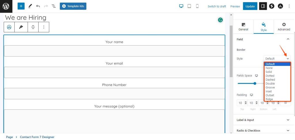
Field Space: This option lets you create space between each field of the form. Check out the video to see it in action.
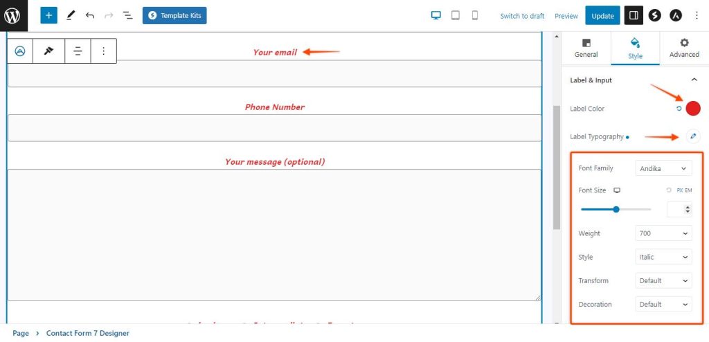
Label & Inputs: Labels provide essential information to users, guiding them on what type of data they should input in a specific field. For example, if you have a form for users to enter their name, the label would typically say “Name” or “Full Name.” Inputs are the interactive components of the form that allow users to provide the necessary information or make choices based on the form’s purpose.
Customize form labels and inputs effortlessly with Spectra’s Contact Form 7 Designer block. Simply click on the color to choose the perfect hue and personalize text designs with various font options like Font-family, Font-Size, Weight, Style, Text Transformation, and Decorations.
Radio and CheckBox: This option gives you a plethora of options to make your radio buttons and checkboxes stand out from the crowd. Here’s what you can do:
- Size Selection: Want your radio buttons and checkboxes to be bigger or smaller? No problem! Adjust their size to suit your design preferences.
- Typography Control: Fonts matter! Customize the text inside your radio buttons and checkboxes. Choose the font family, font size, weight, and style that complements your form’s overall look.
- Color Palette: Add a touch of color magic! You can pick the perfect hue for the radio buttons and checkboxes to match your brand’s identity or create a harmonious visual experience.
- Borders and Backgrounds: Make them pop with borders and backgrounds! Define the borders’ width, style, and color, and even set a background color to make them truly captivating.
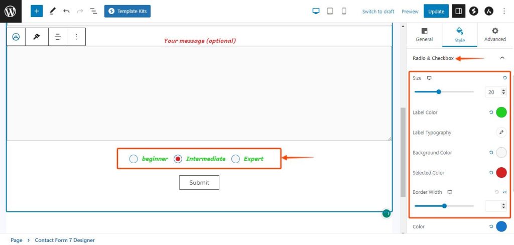
Submit Button Styling: With the Contact Form 7 Designer block, your Submit button becomes a focal point of your contact form, and you have a wealth of options to customize its appearance. Here’s what you can do:
- Button Colors: Catch their attention! Pick the perfect color for your Submit button to ensure it harmonizes seamlessly with your form’s overall look and feel. You can choose different color options for the text and the background of your Submit button. You can even choose different colors for Hover options.
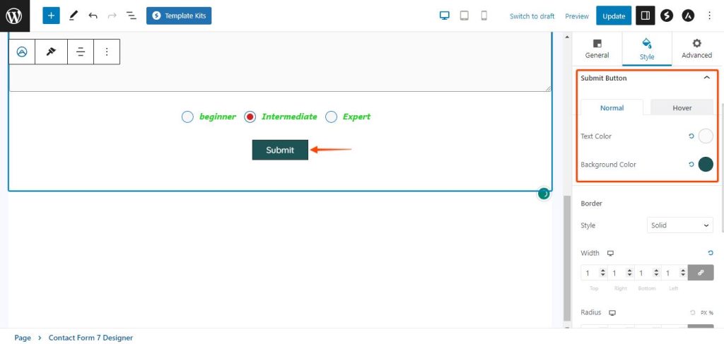
- Border Style: Unleash creativity with patterns! Contact Form 7 Designer block offers various border styles like solid, dashed, dotted, and more. Experiment to find the perfect fit for your form’s personality. Customize Border Width, Radius, and different colors for normal and hover states.
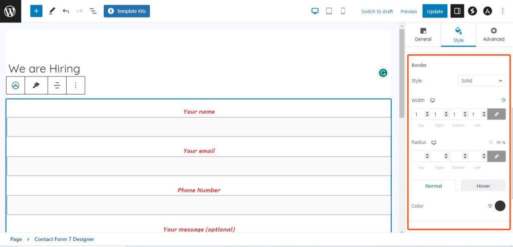
With the inclusion of form border padding, you have even more control over the spacing and positioning of your form’s Submit button, resulting in a polished and well-balanced design.
Styling Success and Error Messages: You have full control over their appearance, ensuring a seamless blend with your form’s overall design. Customize Validation Message Color & Typography to make the messages visually appealing and legible. Set Validation Message Background Color to create an eye-catching backdrop. Highlight Border Color lets you add emphasis, and you can adjust Border Width, Border Radius, and Padding to achieve the perfect balance. With these options, your contact form will not only look stunning but also provide clear and elegant feedback to users.
Conclusion
If you’ve ever wanted to add your personal touch to the Contact Form 7 plugin’s forms without wrestling with code or relying on external plugins, Spectra’s Contact Form 7 Designer Block is your dream come true. Take your form styling to the next level with its user-friendly interface and comprehensive customization options. So, what are you waiting for? Unleash your creativity, design captivating forms, and watch your form submissions soar!
We don't respond to the article feedback, we use it to improve our support content.