- Section
- Troubleshooting: Missing Icons
- Spectra Patterns
- Contact Form 7: Multiple Column Fields
- Contact Form 7: Checkbox / Radio / Acceptance Control
- Unable To Style Contact Form 7
- Tab Index For Multiple Gravity Forms
- Getting Started With Spectra
- Exclude Heading From TOC
- Block Display Conditions
- Importing Starter Templates With Spectra
- Getting Started With Spectra
- Manually Install Spectra Via FTP
- Automatic Beta Updates
- Rollback To Previous Versions
- Load Google Fonts Locally
- Activate Spectra Pro License
- Install Spectra Pro
- Translate Strings With Loco Translate
- Process Refund Requests
- Transparent / Sticky Header
- Change Site Logo
- Change Global Styles
- Disable Title on Posts & Pages
- Transparent / Sticky Header For Single Page / Post
- Change Header & Footer Patterns
- Custom / Google Fonts
- Reset Global Default Styling
- Manually Install Spectra One Via FTP
- Enable / Disable Header & Footer On Specific Pages / Posts
- Container
- Buttons
- List
- Modal
- Slider In Spectra
- Animations In Spectra
- Icons
- Tabs In Spectra
- Text Block In Spectra
- Countdown In Spectra
- Loop Builder In Spectra
- Image Mask In Spectra
- Dynamic Content In Spectra
- Global Styles In Spectra
- Accordion In Spectra
- Responsive Control In Spectra
- Font Management In Spectra
- Google Maps
- Separator
- Getting Started With Spectra
- Public Actions and Hooks In Spectra
- Popup Builder In Spectra
- Counter Block In Spectra
- Login Block in Spectra
- Register Block In Spectra
- Spectra Design Library Guide
- How to Enable Spectra 3 Beta
- Preview Options in Spectra (Desktop, Tablet & Mobile)
Icons
Introduction
The Icon Block allows you to add professional icons from Font Awesome’s extensive library to your content. Whether you need social media icons, interface elements, or decorative graphics, this block provides complete control over icon styling, colors, and interactions. Icons can be used individually or grouped together using the Icons (parent) block for creating icon sets.

How to Add or Use the Block in the Gutenberg Editor.
Method 1: Using Icons Container (Recommended)
- Add the Icons Block
- Click the “+” button to open the block inserter
- Search for “Icons” (plural) or find in Spectra category
- Click on Icons Block to add the container
- Add Individual Icons
- The container starts with one icon placeholder
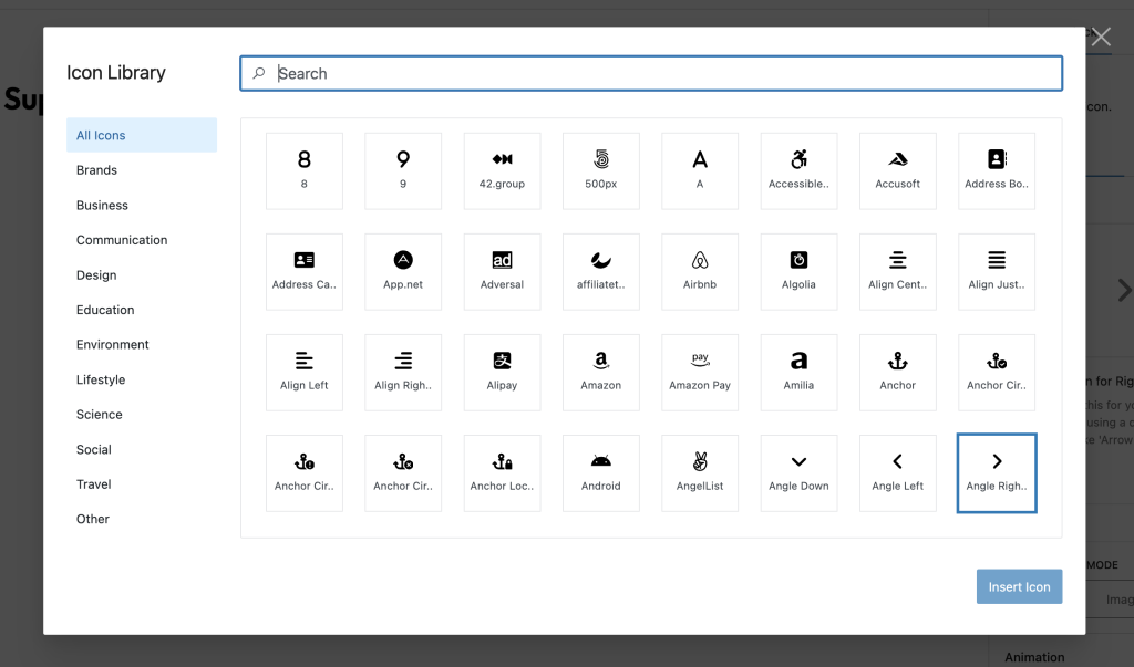
- Click the icon to open the icon picker
- Select from hundreds of Font Awesome icons
- Click “+” to add more icons to the group
Method 2: Standalone Icon
- Add an Icons block (as above)
- Add and customize a single icon
- Select the Icons container
- Use the transform option to convert to standalone icon
Icon Selection

Using the Icon Picker
- Browse by Category
- Accessibility
- Alert
- Animals
- Arrows
- Audio & Video
- Buildings
- Business
- And many more…
- Search Icons
- Type keywords to filter icons
- Search by icon name or related terms
- Icon Variants
- Solid icons (filled)
- Brand icons (company logos)
Block Styling Options
General Settings

Styling Settings

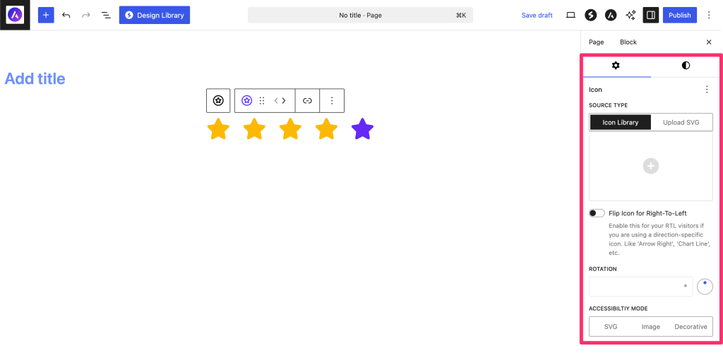
Icon Settings
| Option | Description | Available Settings |
|---|---|---|
| Icon | Selected icon | Icon picker with categories |
| Size | Icon dimensions | px, %, em, rem, vw (10-300px) vh |
| Rotation | Rotate icon | 0-360 degrees with angle picker |
| Flip for RTL | Mirror for RTL languages | On/Off toggle |
Link Settings
| Option | Description | Available Settings |
|---|---|---|
| Link URL | Make icon clickable | URL, email, phone, anchor |
| Open in New Tab | Link behavior | On/Off toggle |
| Link Rel | Relationship attributes | NoFollow, NoReferrer, Sponsored |
Color Settings
| Option | Description | Available Settings |
|---|---|---|
| Icon Color | Primary icon color | Color picker |
| Icon Hover Color | Color on hover | Color picker |
| Background Color | Background behind icon | Color/Gradient picker |
| Background Hover | Background on hover | Color/Gradient picker |
Accessibility Settings

| Mode | Description | Use Case |
|---|---|---|
| SVG | Inline SVG with title | Icons with meaning |
| Image | Image role with alt text | Decorative with context |
| Decorative | Hidden from screen readers | Purely visual icons |
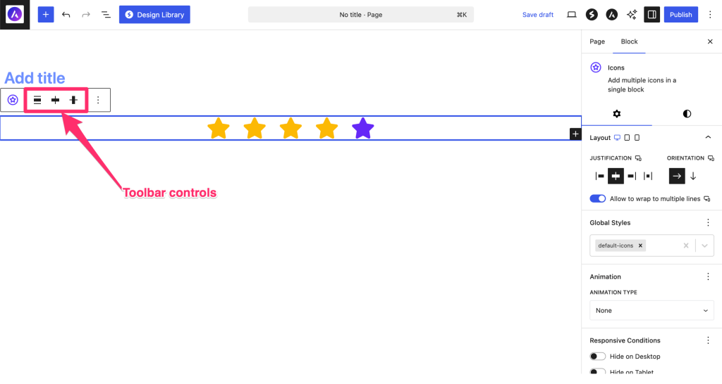
Icons Container Settings
When using multiple icons in an Icons container:
Layout Options
| Option | Description | Available Settings |
|---|---|---|
| Justify Content | Horizontal alignment | Start, Center, End, Space Between |
| Align Items | Vertical alignment | Start, Center, End |
| Wrap | Allow wrapping | On/Off toggle |
| Gap | Space between icons | 0-100px (Responsive) |
Container Styling
| Option | Description | Available Settings |
|---|---|---|
| Background | Container background | Color/Gradient picker |
| Hover Background | Background on hover | Color/Gradient picker |
| Padding | Internal spacing | Top, Right, Bottom, Left |
| Border | Container border | Width, Style, Color, Radius |
Common Icon Configurations
Social Media Icons

- Use Icons container
- Add brand icons (Facebook, Twitter, Instagram, etc.)
- Set appropriate brand colors
- Add links to social profiles
- Open links in new tab
Responsive Controls
Device-Specific Settings
| Setting | Desktop | Tablet | Mobile |
|---|---|---|---|
| Icon Size | ✓ | ✓ | ✓ |
| Container Gap | ✓ | ✓ | ✓ |
| Padding | ✓ | ✓ | ✓ |
| Margin | ✓ | ✓ | ✓ |
Styling Examples
Minimal Icons
- No background
- Single color
- Small size (20-30px)
- Subtle hover color change
Boxed Icons
- Solid background
- Rounded corners
- Medium size (40-50px)
- Background changes on hover
Circular Icons
- Circular background (border-radius: 50%)
- Centered icon
- Contrasting colors
- Shadow effects
Gradient Icons
- Gradient backgrounds
- Larger size (60-80px)
- White icons
- Hover animations
Advanced Features
Icon Rotation
- Rotate any icon 0-360 degrees
- Useful for arrows, refresh icons
- Create unique orientations
- Smooth hover rotations with CSS
RTL Support
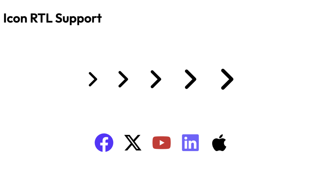
Icons automatically flip for RTL languages when:
- The icon has directional meaning
- “Flip for RTL” is enabled
- Useful for arrows, navigation icons
RTL

LTR

Accessibility Features
Three Accessibility Modes:
- SVG Mode (Default)
- Adds title element to SVG
- Screen readers announce icon meaning
- Best for functional icons
- Image Mode
- Treats icon as image with alt text
- Good for complex icon meanings
- Provides more context
- Decorative Mode
- Hides from screen readers
- For purely visual icons
- Reduces screen reader noise
Tips and Best Practices
Icon Selection
- Clarity: Choose icons that clearly represent their purpose
- Consistency: Use icons from the same style set
- Recognition: Prefer commonly understood icons
- Simplicity: Avoid overly complex icons at small sizes
Styling Guidelines
- Size Hierarchy: Larger icons for importance
- Color Consistency: Match brand colors
- Hover Feedback: Always provide hover states
- Spacing: Adequate space around icons
Performance Tips
- Limit Quantity: Too many icons can slow loading
- Optimize Size: Use appropriate sizes
- Reuse Styles: Create consistent icon patterns
Accessibility Best Practices
- Meaningful Labels: Provide clear accessibility labels
- Link Context: Ensure linked icons have purpose
- Color Contrast: Maintain WCAG contrast ratios
- Focus Indicators: Visible focus for keyboard users
Block Toolbar Options

Icons Container Toolbar
- Add Icon: Insert new icon to group
- Layout: Switch between layouts
- Transform: Convert to other blocks
- Alignment: Wide, full width options
Individual Icon Toolbar
- Replace Icon: Quick icon switcher
- Link: Add/edit icon link
- Remove: Delete from group
Common Use Cases
- Social Media Links: Brand icons linking to profiles
- Service Features: Icons with feature descriptions
- Contact Information: Phone, email, location icons
- Navigation Menus: Icons with menu items
- Call-to-Action: Icons emphasizing buttons
- Testimonial Ratings: Star icons for ratings
- Process Steps: Numbered or sequential icons
- Technology Stack: Brand icons for tools/languages
Tips and Best Practices
Design Guidelines
- Icon Selection
- Choose icons that are universally recognizable
- Maintain consistent style (outlined vs filled)
- Use metaphors appropriate to your audience
- Avoid overly decorative or complex icons
- Size and Scaling
- Standard sizes: 16px (small), 24px (medium), 32px (large)
- Maintain consistent sizing within groups
- Scale proportionally with surrounding text
- Test visibility at different zoom levels
- Color Usage
- Limit to 2-3 colors per icon group
- Use brand colors consistently
- Ensure sufficient contrast (3:1 minimum)
- Consider color-blind users
Performance Optimization
- Icon Loading
- Font Awesome loads only used icons
- SVG format is resolution-independent
- No additional image requests
- Minimal impact on page load
- Animation Best Practices
- Use CSS transitions over JavaScript
- Limit to hover/focus states
- Keep animations subtle (0.2-0.3s)
- Avoid continuous animations
Accessibility Guidelines
- Screen Reader Support
- Add descriptive aria-labels
- Use role=”img” for decorative icons
- Include text alternatives
- Hide purely decorative icons
- Keyboard Navigation
- Ensure focusable if interactive
- Visible focus indicators
- Logical tab order
- Keyboard shortcuts where appropriate
Layout Strategies
- Icon Grouping
- Use consistent spacing (16-24px)
- Align to baseline grid
- Group related icons
- Consider visual weight balance
- Responsive Design
- Stack icons vertically on mobile
- Adjust sizes for touch targets (44x44px)
- Hide non-essential icons
- Use media queries for layouts
Common Mistakes to Avoid
- Using too many different icon styles
- Making icons too small to recognize
- Poor contrast against backgrounds
- Overusing animation effects
- Relying solely on icons without labels
- Inconsistent sizing within groups
Troubleshooting
Icon not displaying?
- Check if icon is selected in picker
- Verify Font Awesome is loading
- Clear browser cache
- Check for CSS conflicts
Hover effects not working?
- Ensure hover colors are different from default
- Check theme doesn’t override styles
- Test in preview mode
Icons not aligning properly?
- Check container layout settings
- Verify gap and alignment options
- Use consistent icon sizes
Accessibility warnings?
- Add meaningful labels for functional icons
- Use decorative mode for visual-only icons
- Test with screen readers
Frequently Asked Questions
Q: How many icons are available?
A: The block includes hundreds of Font Awesome icons across multiple categories.
Q: Can I upload custom icons?
A: Currently, the block uses Font Awesome icons. Custom SVG support may be added in future.
Q: Can I use emoji as icons?
A: The block is designed for Font Awesome icons. Use the Paragraph block for emoji.
Q: How do I make icons the same size?
A: Set a consistent size in the Icons container or individually match sizes from the icon size settings.
Q: Can icons have different colors in one group?
A: Yes, each icon can have its own color settings.
Q: Do icons work with dark mode?
A: Yes, use CSS custom properties or theme integration for dark mode support.
Advanced Customization
Icon Combinations
Create meaningful icon combinations:
- Icon + Text (using columns)
- Icon + Heading (for features)
- Icon + Button (for CTAs)
- Icon + Counter (for statistics)
Available Extensions
Animation Extension
Icons support Spectra animations:
- Entrance animations
- Custom timing
- Works with icon groups and Individual icons
Compatibility and Requirements
System Requirements
- WordPress: 6.6.0 or higher
- PHP: 8.1 or higher
- Browser: Modern browsers with SVG support
Icon Library
- Font Awesome: Version 5+ icons
- Regular Updates: New icons added periodically
- Backwards Compatible: Supports older icon names
Theme Compatibility
- Works with all standard themes
- SVG icons adapt to theme colors
- No font dependencies
We don't respond to the article feedback, we use it to improve our support content.