- Section
- Troubleshooting: Missing Icons
- Spectra Patterns
- Contact Form 7: Multiple Column Fields
- Contact Form 7: Checkbox / Radio / Acceptance Control
- Unable To Style Contact Form 7
- Tab Index For Multiple Gravity Forms
- Getting Started With Spectra
- Exclude Heading From TOC
- Block Display Conditions
- Importing Starter Templates With Spectra
- Getting Started With Spectra
- Manually Install Spectra Via FTP
- Automatic Beta Updates
- Rollback To Previous Versions
- Load Google Fonts Locally
- Activate Spectra Pro License
- Install Spectra Pro
- Translate Strings With Loco Translate
- Process Refund Requests
- Transparent / Sticky Header
- Change Site Logo
- Change Global Styles
- Disable Title on Posts & Pages
- Transparent / Sticky Header For Single Page / Post
- Change Header & Footer Patterns
- Custom / Google Fonts
- Reset Global Default Styling
- Manually Install Spectra One Via FTP
- Enable / Disable Header & Footer On Specific Pages / Posts
- Container
- Buttons
- List
- Modal
- Slider In Spectra
- Animations In Spectra
- Icons
- Tabs In Spectra
- Text Block In Spectra
- Countdown In Spectra
- Loop Builder In Spectra
- Image Mask In Spectra
- Dynamic Content In Spectra
- Global Styles In Spectra
- Accordion In Spectra
- Responsive Control In Spectra
- Font Management In Spectra
- Google Maps
- Separator
- Getting Started With Spectra
- Public Actions and Hooks In Spectra
- Popup Builder In Spectra
- Counter Block In Spectra
- Login Block in Spectra
- Register Block In Spectra
- Spectra Design Library Guide
- How to Enable Spectra 3 Beta
- Preview Options in Spectra (Desktop, Tablet & Mobile)
Tabs In Spectra
Introduction
The Tabs Block allows you to create organized, tabbed content sections that help present information in a compact and user-friendly way. Perfect for product features, service descriptions, documentation, and any content that benefits from categorized presentation. Each tab can contain any type of content, from simple text to complex layouts with multiple blocks.

How to Add or Use the Block in the Gutenberg Editor
Adding and using the Tabs Block in Gutenberg editor
- Adding the Block
- Click the “+” button in the editor to open the block inserter
- Search for “Tabs” or navigate to the Spectra category
- Click on the Tabs Block to add it to your page
- The block automatically creates 3 tabs to start
- Working with Tabs
- Click on any tab header to switch between tabs
- Click inside the content area to add blocks
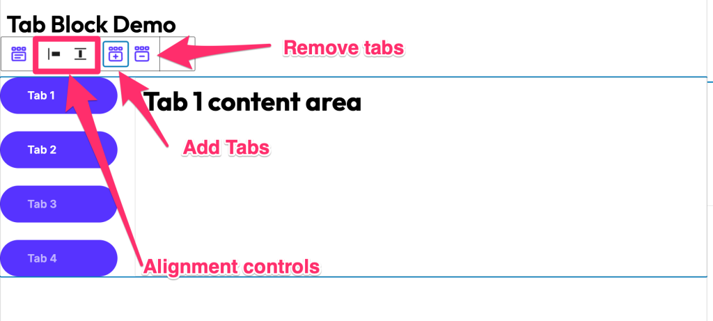
- Use the toolbar to add or remove tabs
- Minimum of 1 tab is required

- Adding Content
- Click inside an active tab
- Add any blocks (paragraphs, images, lists, etc.)
- Content can be as simple or complex as needed
- Each tab maintains its own content independently
Key Features
- Apply different Vertical layout styles and Horizontal layout styles
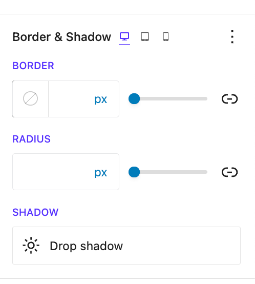
- Set Border, Margin, and Padding styling to the Tab Header and Tab body
- Choose which tab to set Open from the Initial Open Tab setting
- Add Icons and modify Icon styling in the tab header
- Set Tab Header Alignment
- Style with body-color styling and tab title color styling
- Icon Position and Spacing feature
- Box-shadow styling
- Add any child block or multiple child blocks inside tabs body
Block Toolbar Options

| Option | Description | Icon |
|---|---|---|
| Add Tab | Insert a new tab | + |
| Delete Tab | Remove selected tab | 🗑️ |
| Move Tab Left | Reorder tab position | ← |
| Move Tab Right | Reorder tab position | → |
| Duplicate Tab | Clone tab with content | 📄 |
General Settings
Presets
When you add the Tabs block in the block editor, you can see the block presets under the You can select the block preset from there to quickly change the design style.

Layout
Choose between horizontal or vertical tab layouts:
- Horizontal Tabs: Tabs aligned above content (default)
- Vertical Tabs: Tabs aligned beside content
| Layout Type | Best For | Responsive Behaviour |
|---|---|---|
| Horizontal | Wide content areas, fewer tabs | Scrollable on mobile |
| Vertical | Many tabs, narrow content | Converts to accordion on mobile |
Tabs Title
This section provides options for:
- Initial Open Tab: Select which tab will open by default
- Tab Alignment: Aligns the Header Title under the Vertical Layout styles or when you have enough width on the Horizontal Layout styles
- Text Alignment: Aligns the text to left, center, or right
- Enable Icon: Enables the Icon and displays options to select the tab icon and icon position
Style Settings
This section allows styling the body content of the tab blocks, tab title, icon, and border.
Title Styling
| Option | Description | Available Settings |
|---|---|---|
| Text Color | Default tab title color | Color picker |
| Active Color | Active tab title color | Color picker |
| Background Color | Tab header background | Color/Gradient picker |
| Active Background | Active tab background | Color/Gradient picker |
| Typography | Font settings for titles | Font family, size, weight |
| Margin | Space around titles | px, em, rem (Responsive) |
| Padding | Space inside titles | px, em, rem (Responsive) |
Icon Styling
| Option | Description | Available Settings |
|---|---|---|
| Icon Color | Default icon color | Color picker |
| Active Icon Color | Active tab icon color | Color picker |
| Icon Size | Size of tab icons | px, em, rem (10-100px) |
| Icon Spacing | Space between icon and text | px, em, rem |
| Icon Position | Position relative to text | Before, After, Above, Below |
Body Styling
| Option | Description | Available Settings |
|---|---|---|
| Text Color | Content area text color | Color picker |
| Background Color | Content area background | Color/Gradient picker |
| Margin | Space around content | px, em, rem (Responsive) |
| Padding | Space inside content | px, em, rem (Responsive) |
Border Styling
| Option | Description | Available Settings |
|---|---|---|
| Border Style | Type of border | None, Solid, Dashed, Dotted, Double |
| Border Color | Color of borders | Color picker |
| Border Width | Thickness of borders | px (1-20) |
| Border Radius | Corner rounding | px, % (0-50) |
Responsive Controls

| Device | Available Controls | Behavior |
|---|---|---|
| Desktop | All styling options | Full layout |
| Tablet | Font size, padding, margins | May stack vertically |
| Mobile | Font size, padding, margins | Converts to accordion |
Common Use Cases
- Product Features
- Organize product details by category
- Show specifications, reviews, and shipping info
- Include images and videos in each tab
- Service Descriptions
- Present different service tiers
- Compare features side-by-side
- Include pricing tables in tabs
- Documentation
- Organize content by topic
- Create step-by-step tutorials
- Include code examples in tabs
- Portfolio Showcase
- Categorize work by type
- Show project details in tabs
- Include galleries and testimonials
- Course Content
- Organize lessons by module
- Include video and text content
- Add quizzes and resources
Advanced Features
Animation Settings
| Animation Type | Description | Duration |
|---|---|---|
| Fade | Smooth opacity transition | 0.3-1s |
| Slide | Horizontal slide effect | 0.3-1s |
| None | Instant switching | 0s |
Keyboard Navigation
The Tabs Block supports full keyboard accessibility:
| Key | Action |
|---|---|
| Tab | Move focus between tabs |
| Arrow Keys | Navigate between tab headers |
| Enter/Space | Activate selected tab |
| Home | Go to first tab |
| End | Go to last tab |
Tips and Best Practices
- Content Organization
- Keep tab titles short and descriptive
- Group related content logically
- Limit to 5-7 tabs for best usability
- Design Consistency
- Use consistent styling across all tabs
- Ensure active tab is clearly distinguishable
- Test color contrast for accessibility
- Performance
- Avoid heavy content in all tabs
- Use lazy loading for images
- Consider pagination for long content
- Mobile Optimization
- Test responsive behavior thoroughly
- Consider accordion conversion on mobile
- Ensure touch targets are large enough
- Accessibility
- Use descriptive tab labels
- Ensure keyboard navigation works
- Test with screen readers
Troubleshooting
| Issue | Possible Cause | Solution |
|---|---|---|
| Tabs not switching | JavaScript conflict | Check browser console for errors |
| Content overflow | Fixed height set | Adjust height settings or use auto |
| Icons not showing | Font library not loaded | Refresh page or check icon settings |
| Mobile layout broken | Custom CSS conflict | Review responsive settings |
| Keyboard navigation fails | Focus styles removed | Restore default focus indicators |
FAQ
Q: Can I add different blocks in each tab?
A: Yes, each tab can contain any combination of blocks including images, videos, forms, and other Spectra blocks.
Q: How many tabs can I add?
A: There’s no hard limit, but we recommend 5-7 tabs for optimal user experience.
Q: Can I link directly to a specific tab?
A: Yes, you can use anchor links with tab IDs to link directly to specific tabs.
Q: Do tabs work with page builders?
A: Yes, the Tabs Block is compatible with all page builders that support Gutenberg blocks.
Q: Can I nest tabs inside tabs?
A: While technically possible, we don’t recommend nesting tabs for usability reasons.
Q: How do I style individual tabs differently?
A: Use the Advanced > Additional CSS Classes option to add custom classes to specific tabs.
Available Extensions
Animation Extension
- Add entrance animations to tab content
- Configure timing and easing functions
- Set delays for staggered effects
Responsive Extension
- Advanced breakpoint controls
- Custom layouts per device
- Visibility controls
Advanced Controls Extension
- URL hash navigation
- Auto-rotate tabs
- External tab triggers
Compatibility and Requirements
- WordPress Version: 5.8+
- PHP Version: 7.4+
- Browser Support: All modern browsers
- Theme Compatibility: Works with all standard themes
We don't respond to the article feedback, we use it to improve our support content.