- Section
- Troubleshooting: Missing Icons
- Spectra Patterns
- Contact Form 7: Multiple Column Fields
- Contact Form 7: Checkbox / Radio / Acceptance Control
- Unable To Style Contact Form 7
- Tab Index For Multiple Gravity Forms
- Getting Started With Spectra
- Exclude Heading From TOC
- Block Display Conditions
- Importing Starter Templates With Spectra
- Getting Started With Spectra
- Manually Install Spectra Via FTP
- Automatic Beta Updates
- Rollback To Previous Versions
- Load Google Fonts Locally
- Activate Spectra Pro License
- Install Spectra Pro
- Translate Strings With Loco Translate
- Process Refund Requests
- Transparent / Sticky Header
- Change Site Logo
- Change Global Styles
- Disable Title on Posts & Pages
- Transparent / Sticky Header For Single Page / Post
- Change Header & Footer Patterns
- Custom / Google Fonts
- Reset Global Default Styling
- Manually Install Spectra One Via FTP
- Enable / Disable Header & Footer On Specific Pages / Posts
- Container
- Buttons
- List
- Modal
- Slider In Spectra
- Animations In Spectra
- Icons
- Tabs In Spectra
- Text Block In Spectra
- Countdown In Spectra
- Loop Builder In Spectra
- Image Mask In Spectra
- Dynamic Content In Spectra
- Global Styles In Spectra
- Accordion In Spectra
- Responsive Control In Spectra
- Font Management In Spectra
- Google Maps
- Separator
- Getting Started With Spectra
- Public Actions and Hooks In Spectra
- Popup Builder In Spectra
- Counter Block In Spectra
- Login Block in Spectra
- Register Block In Spectra
- Spectra Design Library Guide
- How to Enable Spectra 3 Beta
- Preview Options in Spectra (Desktop, Tablet & Mobile)
Text Block In Spectra
Introduction
The Text Block (formerly known as Content Block) is a powerful and versatile text element that enhances WordPress’s native text capabilities with advanced styling and interactive features. Whether you need simple paragraphs, stunning headlines, or complex text with shadows and hover effects, the Text Block delivers professional typography control with modern design flexibility.
Key advantages over core blocks:
- Built-in text shadows with full control over color, blur, and position
- Responsive controls (typography, padding and margin, border & shadow, text shadow)
- Animation support with 20+ free effects via Spectra Animation Extension
- Dynamic content integration (Pro Extension)
- Transform seamlessly between different text types
- Root-level span tag auto-wrapping for proper behavior
- Slash inserter (
/) support for inline blocks
How to Add or Use the Block in the Gutenberg Editor
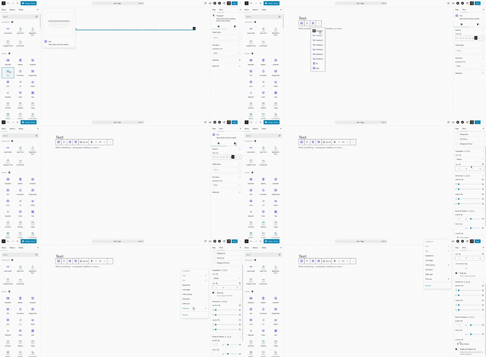
- Adding the Block
- Click the “+” button in the editor to open the block inserter
- Search for “Text” or navigate to the Spectra category
- Click on the Text Block to add it to your page
- Alternative: Type
/textin a new paragraph for quick insertion
- Writing and Formatting Text
- Click inside the block to start typing your content
- Use keyboard shortcuts: Ctrl/Cmd + B (bold), Ctrl/Cmd + I (italic)
- Select text to access inline formatting toolbar
- Press Enter at the end to create a new Text block automatically
- Choosing HTML Tags
- Use the tag selector in the toolbar to switch between H1-H6, P, Div, Span
- Perfect for semantic markup and SEO optimization
- Maintains all styling when switching between tags
Block Settings Overview
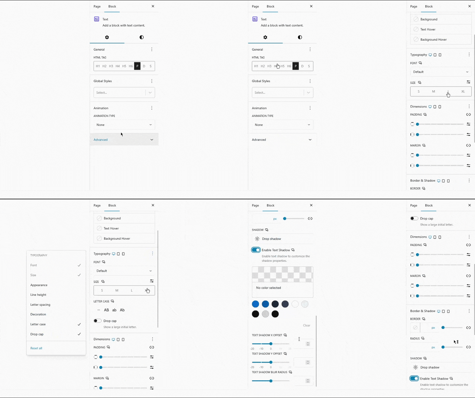
Settings Tab
General Controls
- HTML Tag: Choose between H1, H2, H3, H4, H5, H6, P, Div, Span for semantic markup
Style Tab
Color Settings
- Text Color: Primary text color with opacity control
- Text Hover: Text color on mouse hover
- Background Color: Block background with opacity
- Background Gradient: Linear/radial gradient backgrounds
- Background Hover: Background color/gradient on hover
- Link Color: Color for links within text
Typography
- Font Size: Set size with px, em, rem, % units
- Font Family: System fonts + Google Fonts integration
- Font Weight: 100-900 weight options
- Font Style: Normal, italic, oblique
- Line Height: Control vertical spacing between lines
- Letter Spacing: Adjust character spacing
- Text Transform: Uppercase, lowercase, capitalize
- Text Decoration: Underline, overline, strikethrough
Drop Cap
- Enable: Large decorative first letter
- Requirements: Only works with left-aligned text and paragraph tags
- Note: Automatically disabled for center/right alignment and span tags
Dimensions
- Padding: Inner spacing (responsive, individual sides)
- Margin: Outer spacing (responsive, individual sides)
Border & Shadow
- Border Style: Solid, dashed, dotted options
- Border Width: Individual sides or linked control
- Border Color: Theme colors + custom picker
- Border Radius: Rounded corners control
- Box Shadow: Multiple shadows with position, blur, spread
Text Shadow
- Enable Text Shadow: Toggle to activate shadow controls
- Shadow Color: Color picker with opacity support
- X Offset: Horizontal shadow position (-20px to 20px)
- Y Offset: Vertical shadow position (-20px to 20px)
- Blur Radius: Shadow softness (0-20px)
Text Formatting Toolbar
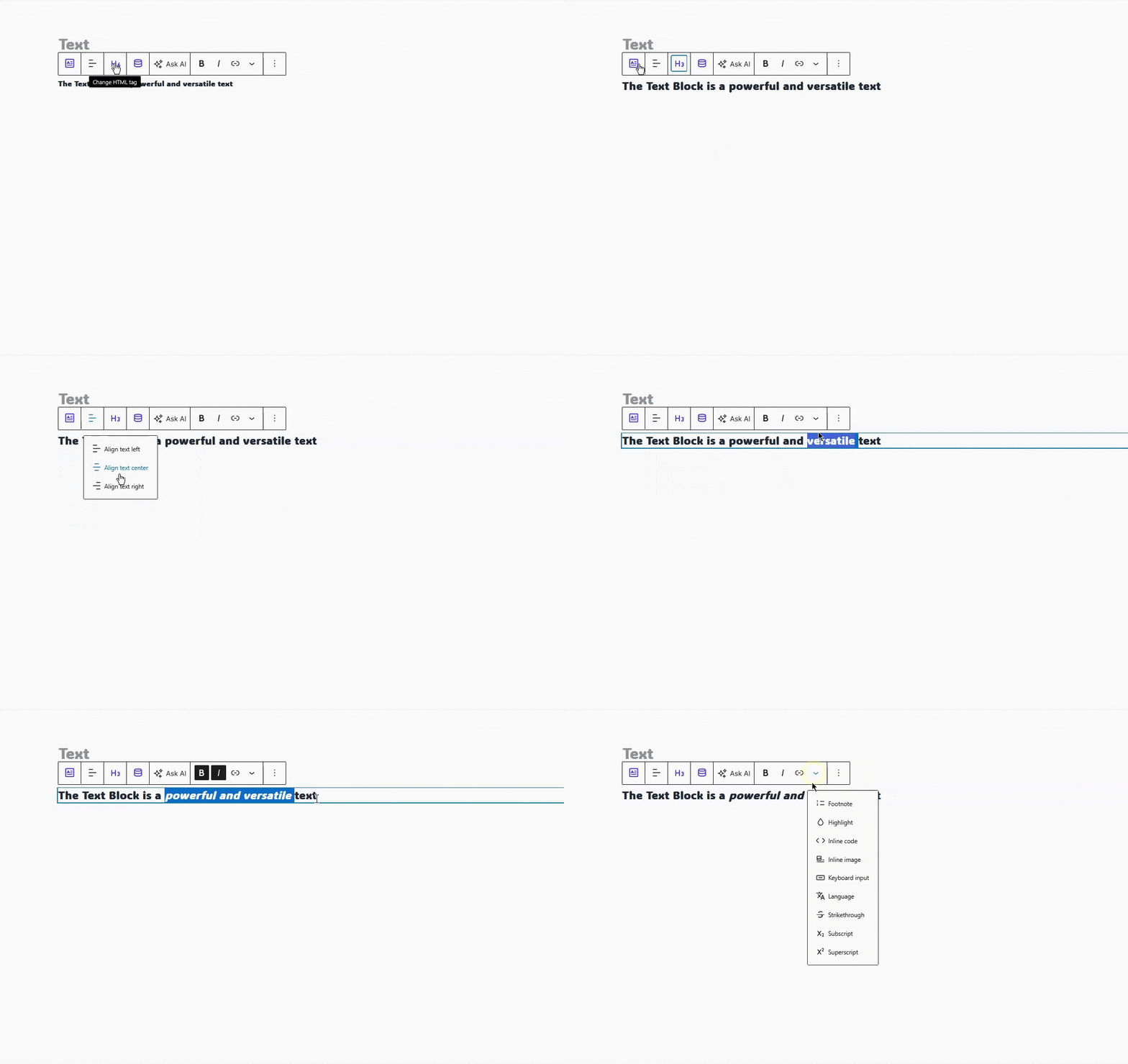
Block Toolbar
- HTML Tag Selector: Quick switch between H1-H6, P, Div, Span
- Text Alignment: Left, center, right, justify
- Transform: Convert to other block types
- More Options: Additional block settings
Inline Toolbar (appears when text is selected)
- Bold (Ctrl/Cmd + B): Make selected text bold
- Italic (Ctrl/Cmd + I): Italicize selected text
- Link (Ctrl/Cmd + K): Add hyperlinks
- Inline Code: Format as code
- Strikethrough: Cross out text
- Subscript/Superscript: Lower/raise text position
- Text Color: Quick color picker
Advanced Features
Text Shadow Effects
Create professional text shadows:
- Navigate to Style → Border panel
- Toggle “Enable Text Shadow” to activate
- Choose shadow color (supports transparency)
- Adjust X/Y offsets for shadow direction
- Set blur radius for soft or sharp shadows
Common Shadow Styles:
- Subtle: X: 1px, Y: 1px, Blur: 2px
- Bold: X: 3px, Y: 3px, Blur: 0px
- Glow: X: 0px, Y: 0px, Blur: 8px
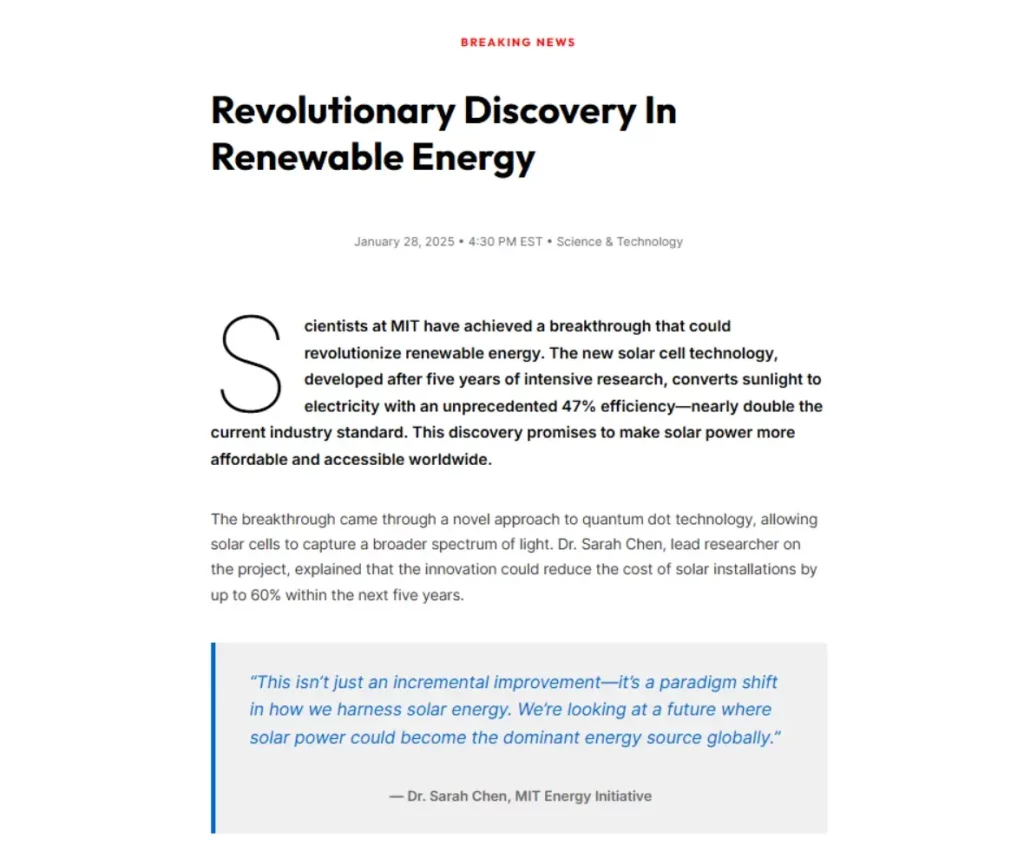
Drop Cap Feature
Magazine-style large first letters:
- Enable in Style → Typography panel
- Works with left-aligned paragraphs only
- Perfect for article beginnings and stories
- Automatically disabled for center/right alignment
Hover Effects
Create interactive text elements:
- Text Hover: Change text color on mouse over
- Background Hover: Change background color/gradient
- Smooth Transitions: Built-in animation between states
- Use Cases: Interactive headings, call-to-action text
Beautiful Design Examples
The Text Block excels at creating professionally designed content. Here are expertly crafted examples from the demo page:
Hero Headlines & Feature Sections
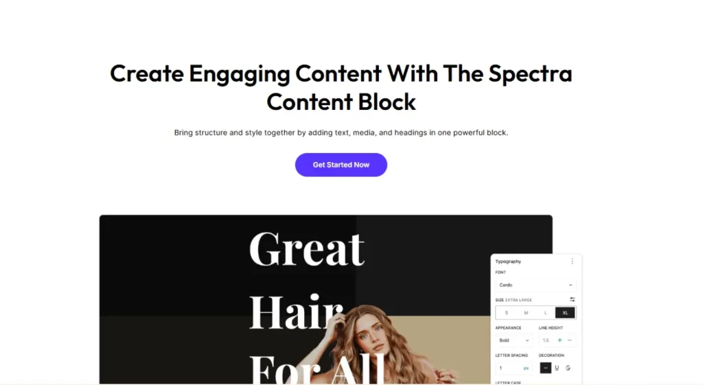
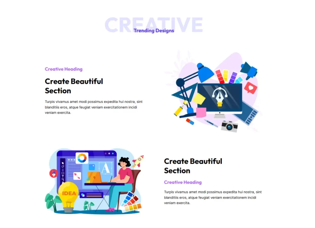
Creative Typography with Large Text
Article Text with Drop Caps

Testimonial & Quote Cards
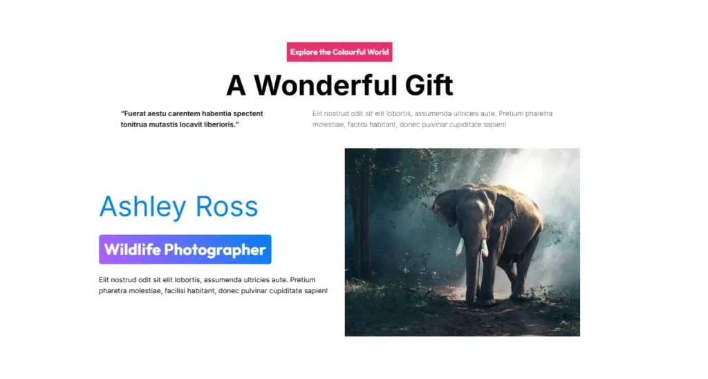
Magazine & News Style Content
Common Use Cases
1. Hero Headlines
Settings: H1 tag, 48px font, bold weight, text shadow, center alignment
Perfect for: Landing pages, feature announcements
2. Article Body Text
Settings: P tag, 18px font, 1.6 line height, drop cap (first paragraph)
Perfect for: Blog posts, long-form content
3. Section Subheadings
Settings: H2/H3 tags, colored text, bottom border, hover effects
Perfect for: Page sections, feature lists
4. Call-to-Action Text
Settings: Span tag, bold weight, brand colors, hover background
Perfect for: Inline CTAs, highlighted text
5. Testimonials & Quotes
Settings: Div tag, italic style, larger font, colored border, text shadow
Perfect for: Customer quotes, featured content
Responsive Design
Desktop, Tablet, Mobile Controls:
- Font Size: Different sizes per device
- Line Height: Adjust for readability
- Alignment: Stack or center on mobile
- Padding/Margin: Optimize spacing for each screen
Best Practices:
- Reduce font sizes by 20-30% on mobile
- Increase line height on smaller screens
- Center-align headlines on mobile
- Reduce text shadows on mobile for performance
Tips and Best Practices
Typography Guidelines
- Hierarchy: H1 (48-60px) → H2 (36px) → H3 (28px) → Body (16-18px)
- Line Height: Headlines (1.2-1.4), Body text (1.6-1.8)
- Contrast: Ensure WCAG AA compliance (4.5:1 ratio minimum)
- Mobile: Scale down font sizes appropriately
Accessibility
- Use proper heading hierarchy (H1 → H2 → H3)
- Ensure sufficient color contrast
- Avoid relying solely on color for meaning
- Keep text readable at 200% zoom
Block Transformations
The Text Block can transform to/from:
- Core Paragraph Block: Preserves basic formatting
- Core Heading Block: Maintains heading level and styling
- Other Spectra Blocks: Compatible with block library
Preserved During Transform:
- Text content and basic formatting
- Typography settings
- Colors and backgrounds
- Border and spacing
Troubleshooting
Drop cap not showing?
- Ensure text is left-aligned (right-aligned for RTL languages)
- Verify you’re not using a span tag
- Check that Drop Cap is enabled in Typography panel
Text shadow not visible?
- Enable “Text Shadow” toggle first
- Select a shadow color (required)
- Increase offset values from default
- Check contrast against background
Hover effects not working?
- Ensure hover colors differ from normal colors
- Clear any caching plugins
Font not loading?
- Check Google Fonts integration in theme
- Verify font name spelling
- Try system fonts as fallback
Frequently Asked Questions
Q: What’s the difference between Text Block and core Paragraph/Heading blocks?
A: Text Block offers text shadows, hover effects, drop caps, and advanced typography controls not available in core blocks.
Q: Can I use Text Block for all my text?
A: Yes, but use strategically. Text Block is ideal for styled headings and featured content. Use core blocks for simple paragraphs to keep your site lightweight.
Q: How do I create text shadows?
A: Go to Style → Border panel, enable “Text Shadow”, choose color, and adjust X/Y offsets and blur radius.
Q: Why can’t I enable drop cap?
A: Drop cap requires left-aligned text (right-aligned for RTL) and cannot be used with span tags or center/right alignment.
Q: Can I save text styles for reuse?
A: Yes! Use Copy/Paste Styles, create Reusable Blocks, or define Global Styles in the Site Editor.
Advanced Tips
Content Strategy
- Use semantic HTML tags for SEO benefits
- Maintain consistent typography scale
- Plan responsive behavior from mobile-first approach
Performance Optimization
- Limit Google Fonts to essential weights
- Compress and optimize any background images
- Use system fonts for body text when possible
We don't respond to the article feedback, we use it to improve our support content.