- Section
- Troubleshooting: Missing Icons
- Spectra Patterns
- Contact Form 7: Multiple Column Fields
- Contact Form 7: Checkbox / Radio / Acceptance Control
- Unable To Style Contact Form 7
- Tab Index For Multiple Gravity Forms
- Getting Started With Spectra
- Exclude Heading From TOC
- Block Display Conditions
- Importing Starter Templates With Spectra
- Getting Started With Spectra
- Manually Install Spectra Via FTP
- Automatic Beta Updates
- Rollback To Previous Versions
- Load Google Fonts Locally
- Activate Spectra Pro License
- Install Spectra Pro
- Translate Strings With Loco Translate
- Process Refund Requests
- Transparent / Sticky Header
- Change Site Logo
- Change Global Styles
- Disable Title on Posts & Pages
- Transparent / Sticky Header For Single Page / Post
- Change Header & Footer Patterns
- Custom / Google Fonts
- Reset Global Default Styling
- Manually Install Spectra One Via FTP
- Enable / Disable Header & Footer On Specific Pages / Posts
- Container
- Buttons
- List
- Modal
- Slider In Spectra
- Animations In Spectra
- Icons
- Tabs In Spectra
- Text Block In Spectra
- Countdown In Spectra
- Loop Builder In Spectra
- Image Mask In Spectra
- Dynamic Content In Spectra
- Global Styles In Spectra
- Accordion In Spectra
- Responsive Control In Spectra
- Font Management In Spectra
- Google Maps
- Separator
- Getting Started With Spectra
- Public Actions and Hooks In Spectra
- Popup Builder In Spectra
- Counter Block In Spectra
- Login Block in Spectra
- Register Block In Spectra
- Spectra Design Library Guide
- How to Enable Spectra 3 Beta
- Preview Options in Spectra (Desktop, Tablet & Mobile)
Accordion In Spectra
Introduction
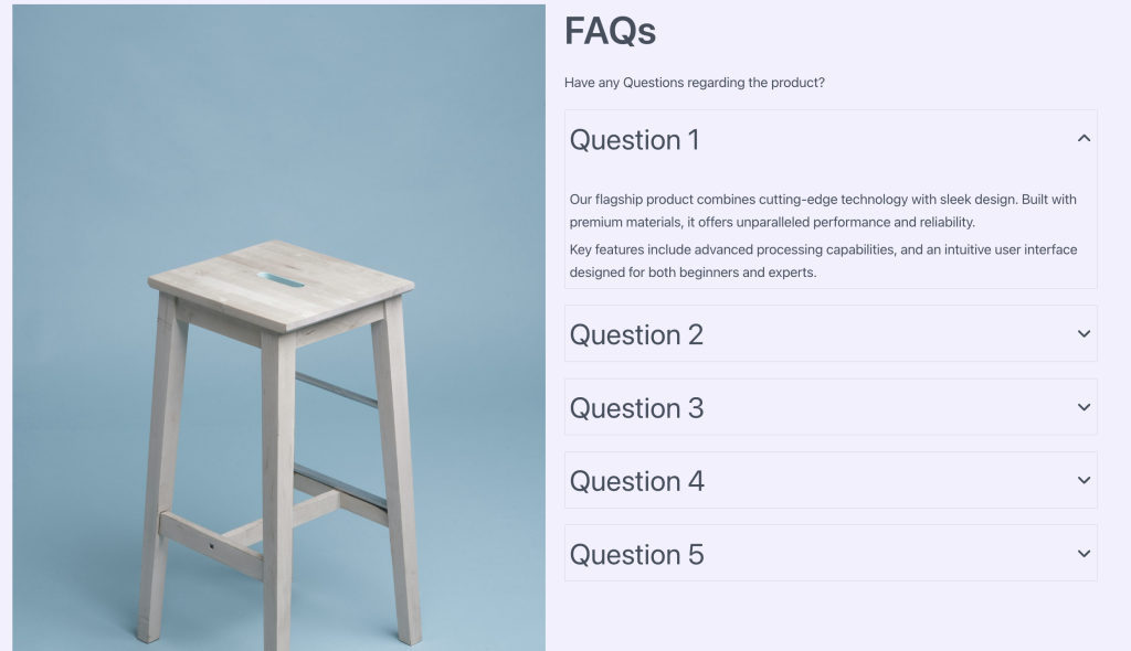
The Accordion Block allows you to create collapsible content sections that help organize information in a space-efficient way. Perfect for FAQs, feature lists, documentation, and any content that benefits from progressive disclosure. Each accordion item can contain any type of content, from simple text to complex layouts with multiple blocks.
How to Add or Use the Block in the Gutenberg Editor
- Adding the Block
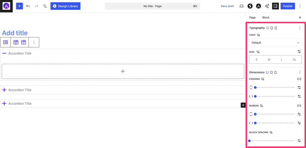
- Click the “+” button in the editor to open the block inserter
- Search for “Accordion” or navigate to the Spectra category
- Click on the Accordion Block to add it to your page
- The block automatically creates 3 accordion items to start
- Working with Accordion Items
- Click on any accordion header to expand/collapse it
- Click inside the content area to add blocks
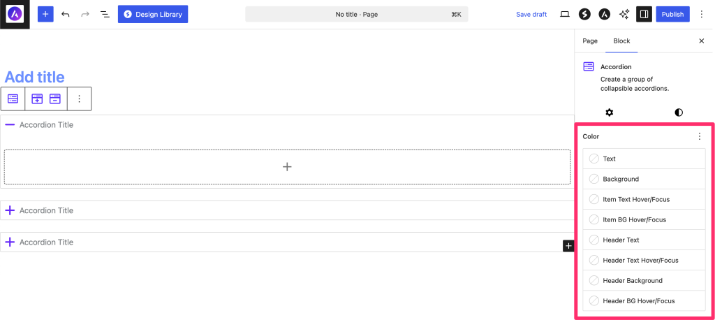
- Use the toolbar to add or remove accordion items
- Minimum of 1 item is required
- Adding Content
- Click inside an expanded accordion item
- Add any blocks (paragraphs, images, lists, etc.)
- Content can be as simple or complex as needed
- Each item maintains its own content independently
Block Styling Options
General Settings

Style Settings
Advanced Settings

Icon Settings
| Option | Description | Available Settings |
|---|---|---|
| Collapsed Icon | Icon shown when item is closed | Icon library selection |
| Expanded Icon | Icon shown when item is open | Icon library selection |
| Icon Size | Size of expand/collapse icon | px, em, rem (10-100px) |
| Icon Rotation | Rotate icon angle | 0-360 degrees |
| Flip for RTL | Auto-flip for RTL languages | On/Off toggle |
Color Settings
| Option | Description | Available Settings |
|---|---|---|
| Item Text Color | Default text color for all items | Color picker |
| Item Text Hover | Text color on hover | Color picker |
| Item Background | Background for accordion items | Color/Gradient picker |
| Item Background Hover | Background on hover | Color/Gradient picker |
Header Styling
| Option | Description | Available Settings |
|---|---|---|
| Header Text Color | Color for header text | Color picker |
| Header Text Hover | Header text color on hover | Color picker |
| Header Background | Header background | Color/Gradient picker |
| Header Background Hover | Header background on hover | Color/Gradient picker |
Typography Settings
| Option | Description | Available Settings |
|---|---|---|
| Font Family | Header text font | System + Google Fonts |
| Font Size | Header text size | px, em, rem (Responsive) |
| Font Weight | Header text weight | 100-900 |
| Line Height | Header line spacing | Number, px, em |
| Letter Spacing | Character spacing | px, em |
| Text Transform | Case transformation | None, Uppercase, Lowercase, Capitalize |
Layout Settings
| Option | Description | Available Settings |
|---|---|---|
| Border | Accordion border | Width, Style, Color, Radius |
| Box Shadow | Shadow effects | Multiple shadow layers |
| Padding | Internal spacing | Top, Right, Bottom, Left (Responsive) |
| Margin | External spacing | Top, Right, Bottom, Left (Responsive) |
| Block Gap | Space between items | 0-100px (Responsive) |
Advanced Features
Icon Customization
- Use different icons for collapsed/expanded states
- Popular combinations:
- Plus/Minus
- Chevron Down/Up
- Arrow Right/Down
- Custom brand icons
Content Flexibility
Each accordion item can contain:
- Text and headings
- Images and galleries
- Videos and embeds
- Tables and lists
- Other Spectra blocks
- Custom HTML
Block Toolbar Options
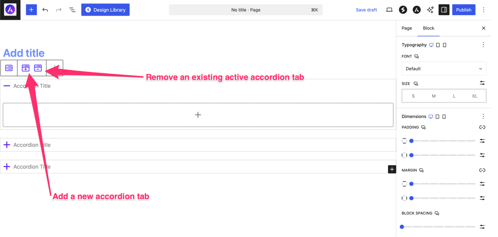
Parent Accordion Toolbar
- Add Item: Insert new accordion item
- Transform: Convert to other compatible blocks
- Alignment: Block alignment options
- Options: Additional settings
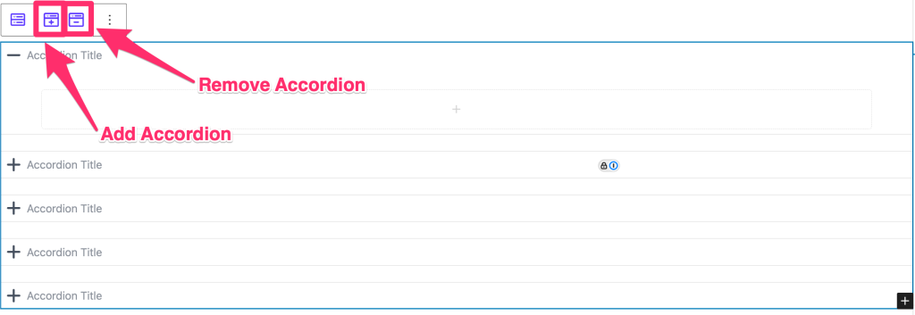
Individual Item Toolbar
- Remove Item: Delete specific accordion item
- Move Up/Down: Reorder items
- Duplicate: Copy an accordion item
Responsive Controls
Main Responsive Controls
Header Responsive Controls

Device-Specific Settings
| Setting | Desktop | Tablet | Mobile |
|---|---|---|---|
| Font Size | ✓ | ✓ | ✓ |
| Padding | ✓ | ✓ | ✓ |
| Margin | ✓ | ✓ | ✓ |
| Block Gap | ✓ | ✓ | ✓ |
| Icon Size | ✓ | ✓ | ✓ |
Common Use Cases
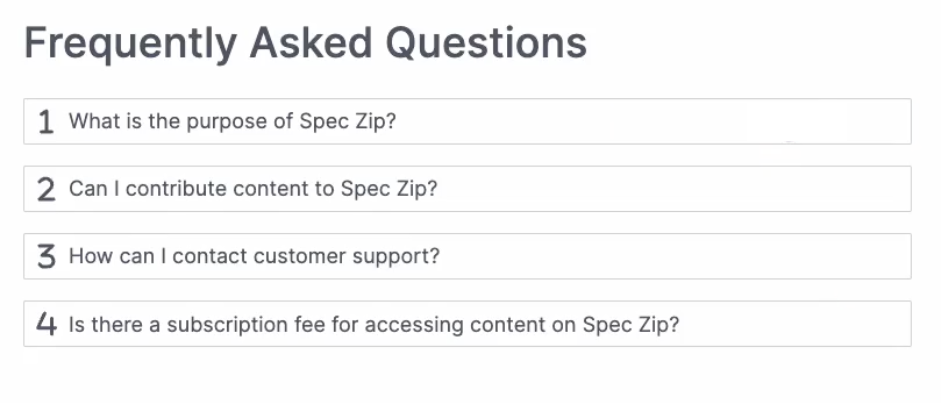
- FAQ Sections: Questions as headers, answers as content
- Feature Lists: Feature names as headers, descriptions inside
- Documentation: Topics as headers, detailed info as content
- Product Specifications: Categories as headers, specs inside
- Course Curriculum: Lessons as headers, content inside
- Privacy Policy/Terms: Sections as headers, details inside
Tips and Best Practices
Content Organization
- Clear Headers: Use descriptive, concise header text
- Logical Order: Arrange items by importance or category
- Consistent Length: Keep content lengths relatively similar
- Progressive Disclosure: Most important info first
Design Guidelines
- Visual Hierarchy: Make headers stand out from content
- Adequate Spacing: Use block gap for breathing room
- Consistent Icons: Use matching icon style throughout
- Mobile Consideration: Test collapsed view on small screens
Performance Tips
- Optimize Media: Compress images/videos in accordion content
- Lazy Loading: Heavy content loads only when expanded
- Limit Items: 5-10 items per accordion is optimal
- Avoid Nesting: Don’t put accordions inside accordions
Available Extensions
Animation Extension
The Accordion Block supports Spectra animations:
- Animations trigger when accordion expands
- Per-item or whole-accordion animations
- Respects user motion preferences
Using Animations
- Select the Accordion Block
- Scroll down to the general Animation setting
- Choose animation type and settings
Accessibility Features
Built-in Accessibility
- Semantic HTML structure
- ARIA attributes for screen readers
- Keyboard navigation support
- Focus indicators
- Announce state changes
Keyboard Controls
- Tab: Navigate between headers
- Enter/Space: Toggle accordion item
- Arrow Keys: Move between items (when focused)
Troubleshooting
Accordion not expanding/collapsing?
- Check if JavaScript is enabled
- Clear browser cache
- Verify no plugin conflicts
- Test in different browser
Content not showing when expanded?
- Check content exists in the editor
- Verify no CSS hiding content
- Look for JavaScript errors in console
Icons not displaying?
- Ensure icons are selected in settings
- Check if icon font is loading
- Verify no ad blockers interfering
Styling not applying?
- Clear cache (browser and server)
- Check theme compatibility
- Use browser inspector for conflicts
Animation issues?
- Verify Animation extension is enabled
- Check animation settings
- Test with different animation types
Frequently Asked Questions
Q: Can I have only one accordion item open at a time?
A: Currently, Single-open mode is available at a time, multiple items may be added in future updates.
Q: How do I link directly to an accordion item?
A: Add an anchor ID to the accordion block and use URL fragments (#anchor-name).
Q: Can I nest accordions inside each other?
A: While technically possible, it’s not recommended for usability and performance reasons.
Q: Is there a limit to accordion items?
A: No hard limit, but 5-10 items is recommended for best user experience.
Q: Can I style individual accordion items differently?
A: Currently, all items share the same styling. Use custom CSS classes for individual styling.
Q: Do accordions work with page builders?
A: Yes, the Accordion Block is compatible with the block editor and page builders that support it.
Advanced Customization
Custom CSS Classes
Add custom classes to:
- The accordion container
- Individual accordion items
- Style specific accordions differently
Compatibility and Requirements
System Requirements
- WordPress: 6.6.0 or higher
- PHP: 8.1 or higher
- Browser: Modern browsers with JavaScript enabled
Theme Compatibility
- Works with all standard WordPress themes
- Some themes may require minor CSS adjustments
- Block-based themes fully supported
Plugin Compatibility
- Compatible with major SEO plugins
- Works with caching plugins
- Integrates with translation plugins
We don't respond to the article feedback, we use it to improve our support content.