- Section
- Troubleshooting: Missing Icons
- Spectra Patterns
- Contact Form 7: Multiple Column Fields
- Contact Form 7: Checkbox / Radio / Acceptance Control
- Unable To Style Contact Form 7
- Tab Index For Multiple Gravity Forms
- Getting Started With Spectra
- Exclude Heading From TOC
- Block Display Conditions
- Importing Starter Templates With Spectra
- Getting Started With Spectra
- Manually Install Spectra Via FTP
- Automatic Beta Updates
- Rollback To Previous Versions
- Load Google Fonts Locally
- Activate Spectra Pro License
- Install Spectra Pro
- Translate Strings With Loco Translate
- Process Refund Requests
- Transparent / Sticky Header
- Change Site Logo
- Change Global Styles
- Disable Title on Posts & Pages
- Transparent / Sticky Header For Single Page / Post
- Change Header & Footer Patterns
- Custom / Google Fonts
- Reset Global Default Styling
- Manually Install Spectra One Via FTP
- Enable / Disable Header & Footer On Specific Pages / Posts
- Container
- Buttons
- List
- Modal
- Slider In Spectra
- Animations In Spectra
- Icons
- Tabs In Spectra
- Text Block In Spectra
- Countdown In Spectra
- Loop Builder In Spectra
- Image Mask In Spectra
- Dynamic Content In Spectra
- Global Styles In Spectra
- Accordion In Spectra
- Responsive Control In Spectra
- Font Management In Spectra
- Google Maps
- Separator
- Getting Started With Spectra
- Public Actions and Hooks In Spectra
- Popup Builder In Spectra
- Counter Block In Spectra
- Login Block in Spectra
- Register Block In Spectra
- Spectra Design Library Guide
- How to Enable Spectra 3 Beta
- Preview Options in Spectra (Desktop, Tablet & Mobile)
Buttons
Introduction
The Buttons Block allows you to create eye-catching, customizable button groups in your WordPress content.
Whether you need a single call-to-action button or multiple buttons arranged together, this block provides extensive styling options and layouts to match your design needs.
Use it to direct visitors to important pages, encourage actions like purchases or sign-ups, or create navigation elements within your content.
Block Architecture
The Buttons Block uses a parent-child relationship:
- Buttons Block (Container):
spectra/buttons– Manages the overall layout and container styling - Button Block (Individual):
spectra/button– Each individual button with its own styling
Important: Individual Button blocks can ONLY exist within a Buttons container block. You cannot use a Button block independently.
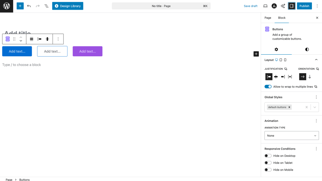
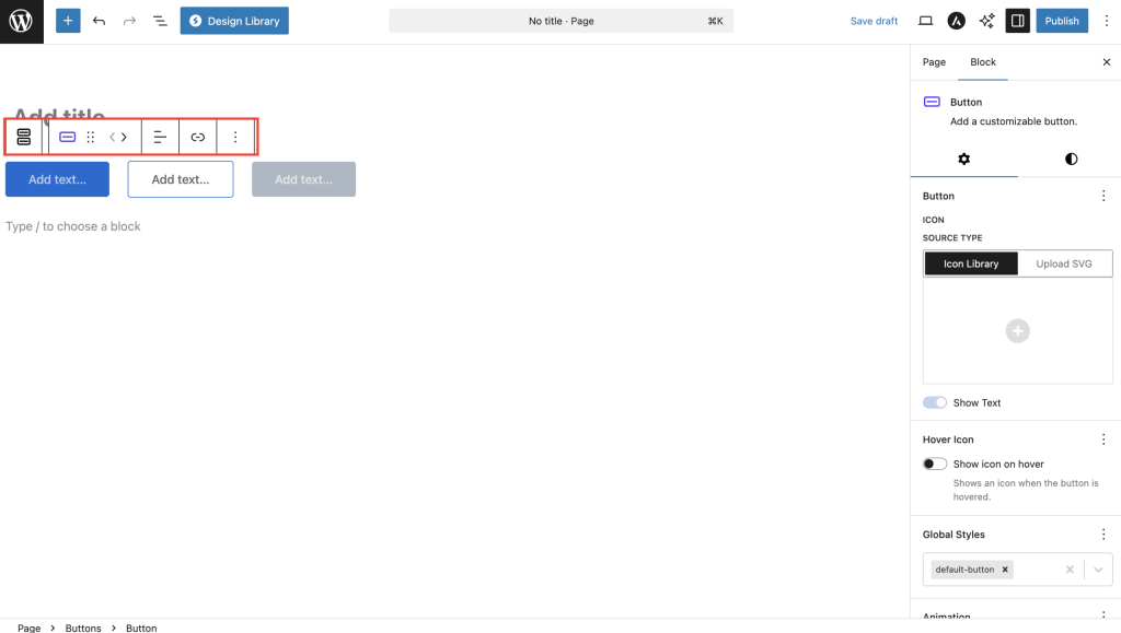
How to Add or Use the Block in the Gutenberg Editor
Adding the Block
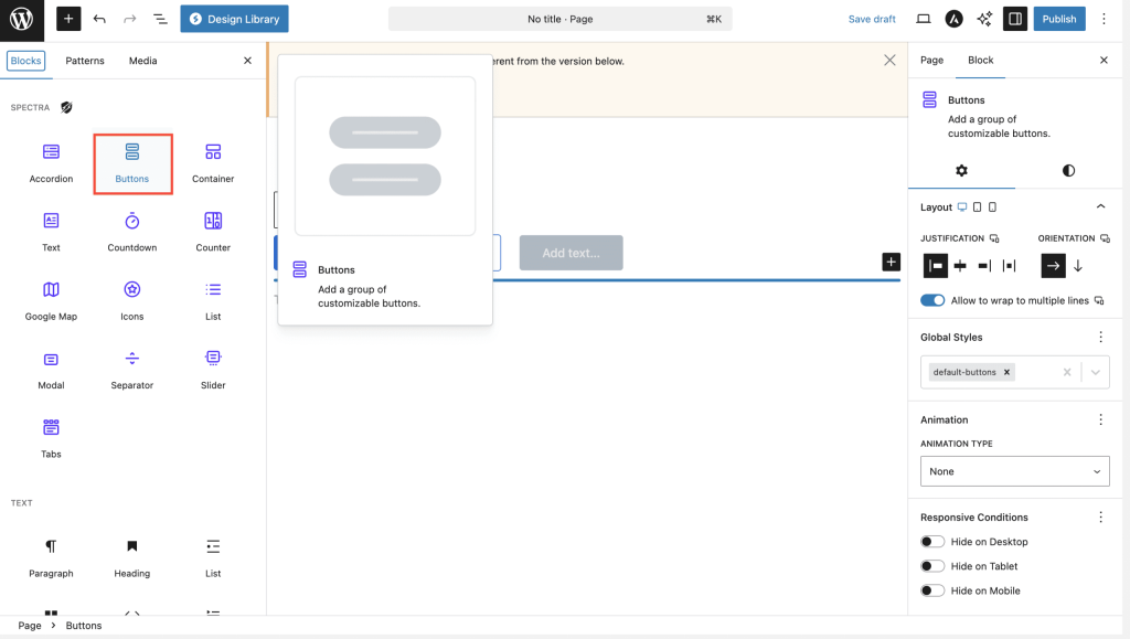
- Click the “+” button in the editor to open the block inserter
- Search for “Buttons” or navigate to the Spectra category
- Click on the Buttons Block to add it to your page
Adding Individual Buttons
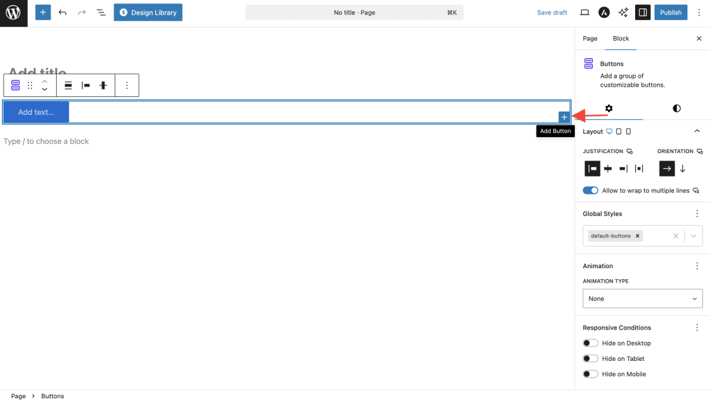
- Once the Buttons Block is inserted, click the “+” icon inside to add a button
- Type your button text directly in the button
- Use the toolbar to set the button link by clicking the link icon
Managing Multiple Buttons
- Add more buttons by clicking the “+” between or after existing buttons
- Reorder buttons by using the drag handle (six dots) when hovering over a button
- Delete buttons by selecting them and pressing Delete or using the three-dot menu
Block Styling Options
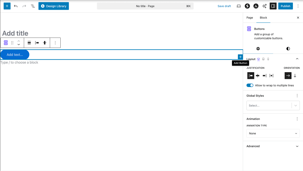
These options apply to the entire Buttons Block container:
CSS Variable System
The Buttons Block uses an advanced CSS custom properties system for dynamic styling. Key variables include:
--spectra-background-color: Container background--spectra-background-gradient: Container gradient--spectra-background-color-hover: Container hover background--spectra-background-gradient-hover: Container hover gradient
| Option | Description | Available Settings |
|---|---|---|
| Layout | Controls button arrangement | Horizontal, Vertical, Fill |
| Alignment | Sets button group alignment | Left, Center, Right |
| Gap | Space between buttons | 0-100px (default: varies by layout) |
| Stack on Mobile | Responsive behavior | On/Off toggle |
| Reverse on Mobile | Reverses button order on mobile | On/Off toggle |
| Full Width on Mobile | Makes buttons full width on mobile | On/Off toggle |
| Overall Alignment | Container alignment within the content | Left, Center, Right, Wide, Full |
| Vertical Alignment | Vertical alignment of buttons | Top, Middle, Bottom |
| Container Background | Background color/gradient for container | Color picker with gradient support |
| Container Background Hover | Container hover state background | Color picker with gradient support |
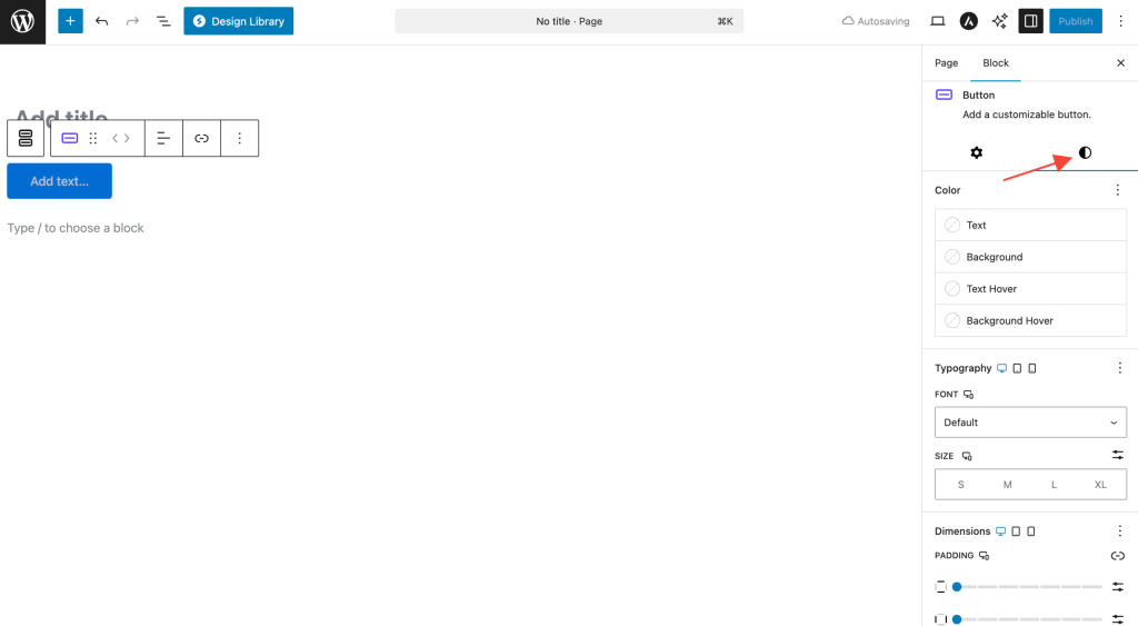
Individual Block Styling Options
Each button within the Buttons Block can be customized individually. The settings are organized into three main panels:
Settings Panel Organization
- Block Settings (General Tab)
- Link configuration (URL, target, rel)
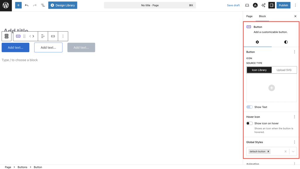
- Icon picker and settings
- Text visibility toggle
- Accessibility options
- Color Settings Tab
- Text and icon colors
- Hover state colors
- Background colors and gradients
- Icon Style Settings (Dimensions)
- Icon size controls
- Text-icon gap spacing
Detailed Settings Reference
| Option | Description | Available Settings |
|---|---|---|
| Button Text | The text displayed on the button | Any text |
| Link/URL | Button destination | URL, email, phone, or anchor |
| Open in New Tab | Link behavior | On/Off toggle |
| Size | Button size preset | Small, Medium, Large, Extra Large |
| Background Type | Fill style | Color, Gradient, Transparent |
| Background Color | Button background | Color picker with opacity |
| Text Color | Button text color | Color picker |
| Border | Button border styling | Width, Style, Color, Radius (Responsive) |
| Border Shadow | Border shadow effects | Multiple shadow options |
| Icon | Add icon to button | Icon library with position options |
| Icon Position | Icon placement | Before text, After text |
| Icon Size | Icon dimensions | Custom size with units (px, %, em, rem, vw) |
| Icon Color | Base icon color | Color picker (separate from text color) |
| Icon Color Hover | Icon hover state color | Color picker (independent from base color) |
| Icon Rotation | Rotate icon for custom orientation | 0-360 degrees (useful for directional arrows) |
| Icon-Text Gap | Space between icon and text | Custom spacing (default: 10px in editor) |
| Flip for RTL | Mirror directional icons for RTL languages | On/Off toggle (auto-flips arrows, chevrons) |
| Aria Label | Screen reader text for icon-only buttons | Text field (appears when “Show Text” is off) |
| Padding | Internal button spacing | Top, Right, Bottom, Left |
| Typography | Text styling | Font family, size, weight, style, line height |
| Text Transform | Text case transformation | None, Uppercase, Lowercase, Capitalize, Initial |
| Letter Spacing | Space between letters | Custom spacing with units |
| Text Decoration | Text decoration | None, Underline, Overline, Line-through |
| Box Shadow | Shadow effects | Multiple shadow options |
| Hover Effects | Hover state styling | Separate colors for text, icon, background (with gradient support) |
| Link Relationship | SEO/security attributes | NoFollow, NoReferrer, Sponsored, UGC |
Important Settings
Critical Settings to Configure
- Button Link – Always set a destination URL for each button to ensure functionality
- Mobile Responsiveness – Enable “Stack on Mobile” for better mobile layouts when using multiple buttons
- Accessibility – Add descriptive button text that clearly indicates the action
- Color Contrast – Ensure sufficient contrast between text and background colors
- Button Size – Choose appropriate sizes based on importance and hierarchy
- Icon-Only Accessibility – When using icon-only buttons (“Show Text” off), the Aria Label field becomes available and MUST be filled for screen reader accessibility
Default Values
Key default settings that apply unless changed:
- Icon-Text Gap: 10px (in editor)
- Icon Position: Before text (left side)
- Link Target: Same window
- Text Alignment: Left
- Flip for RTL: Off
Performance Considerations
- Use the built-in gradient options instead of background images for better performance
- Limit the number of buttons in a single group to maintain visual clarity
- Optimize icon usage by selecting lightweight SVG icons
Responsive Controls
The Buttons Block includes built-in responsive controls that allow you to customize settings for different devices:
Device-Specific Settings
| Setting | Desktop | Tablet | Mobile |
|---|---|---|---|
| Font Size | ✓ | ✓ | ✓ |
| Padding | ✓ | ✓ | ✓ |
| Gap Between Buttons | ✓ | ✓ | ✓ |
| Alignment | ✓ | ✓ | ✓ |
| Stack Buttons | – | ✓ | ✓ |
| Reverse Order | – | ✓ | ✓ |
| Full Width | – | ✓ | ✓ |
| Border Width | ✓ | ✓ | ✓ |
| Border Radius | ✓ | ✓ | ✓ |
| Typography Size | ✓ | ✓ | ✓ |
| Icon Size | ✓ | ✓ | ✓ |
How to Use Responsive Controls
- Look for the device icons (desktop, tablet, mobile) next to supported settings
- Click on the device icon to switch between devices
- The editor preview will update to show the selected device view
- Changes made will only apply to the selected device size
Responsive Inheritance
- Mobile inherits from Tablet if not set
- Tablet inherits from Desktop if not set
- This ensures consistent styling across devices while allowing customization where needed
Tips and Best Practices
Design Tips
- Hierarchy: Use different sizes and colors to establish visual hierarchy
- Consistency: Maintain consistent styling for similar actions across your site
- Whitespace: Use appropriate gap settings to give buttons breathing room
- Call-to-Action: Make primary actions stand out with contrasting colors
Common Use Cases
- Hero Section CTAs: Large, prominent buttons for main actions
- Navigation Buttons: Link to different sections or pages
- Download/Resource Links: Multiple download options in a row
- Social Media Links: Icon-based buttons for social profiles
- Multi-Step Processes: Sequential action buttons
Block Toolbar Options
When the Buttons Block is selected, the toolbar provides quick access to:
- Transform: Convert to other compatible blocks
- Drag Handle: Move the entire block
- Move Up/Down: Reposition block in content
- Alignment: Quick alignment options
- Variations: Switch between button styles
- Copy: Duplicate the entire button group
- Options: Additional block settings
Troubleshooting
Buttons not aligning properly?
- Check the Layout and Alignment settings
- Verify no custom CSS is conflicting
- Try toggling “Stack on Mobile” for responsive issues
Links not working?
- Ensure URLs include the protocol (https://)
- Check for typos in the URL
- Verify “Open in New Tab” setting if links seem unresponsive
Styling not applying?
- Clear your browser cache
- Check if theme styles are overriding block styles
- Use the browser inspector to identify conflicts
Advanced Features
Custom CSS Classes
Add custom classes to individual buttons for advanced styling:
- Select the button
- Open the Advanced panel in the sidebar
- Add your custom class name
- Style via your theme’s CSS file
Icon-Only Buttons
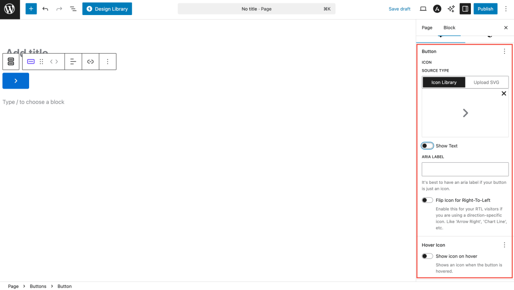
When creating icon-only buttons:
- Toggle off “Show text” in the button settings
- An “Aria Label” field will automatically appear in the settings panel
- Required: Enter descriptive text for screen readers (e.g., “Share on Facebook”, “Download PDF”, “Play video”)
- The icon can be customized with size, color, rotation, and hover effects
- Icon colors can be set independently from (non-visible) text colors
Link Relationship Attributes
For SEO and security, you can add relationship attributes to links:
- NoFollow: Tells search engines not to follow the link
- NoReferrer: Prevents sending referrer information
- Sponsored: Indicates paid/sponsored links
- UGC: Marks user-generated content links
Keyboard Navigation
The Buttons Block is fully keyboard accessible:
- Tab through buttons in order
- Enter/Space to activate buttons
- Arrow keys to navigate within the editor
Available Extensions
The Buttons Block supports powerful extensions that work across all Spectra blocks:
Animations Extension
Add eye-catching animations to your buttons:
Animation Types:
- Fade: fade-up, fade-down, fade-left, fade-right
- Flip: flip-up, flip-down, flip-left, flip-right
- Slide: slide-up, slide-down, slide-left, slide-right
- Zoom: zoom-in, zoom-out, zoom-in-up, zoom-in-down
Animation Settings:
- Duration: Animation speed (100-3000ms)
- Delay: Time before animation starts (0-3000ms)
- Easing: Animation curve (ease, linear, ease-in, ease-out, ease-in-out)
- Once: Animate only on first scroll
Using Extensions
- Select the Buttons Block (not individual buttons)
- In the block settings sidebar, look for the Extensions panel
- Enable desired extensions and configure their settings
- Preview animations in the editor or frontend
Extension Best Practices
- Use subtle animations for professional appearance
- Limit animation delay to maintain user engagement
- Test animations on mobile devices for performance
- Consider accessibility – provide option to disable animations
Additional Features
Container Styling
The Buttons Block container itself can be styled:
- Background Color/Gradient: Apply background to the entire button group
- Hover Effects: Different background on container hover (separate from individual button hovers)
- Padding/Margin: Space around the button group
- CSS Custom Properties: Advanced styling through CSS variables
Styling System Architecture
The Buttons Block uses a sophisticated two-tier styling system:
- Container Level (Buttons Block)
- Uses CSS custom properties for dynamic values
- Handles overall layout and spacing
- Container background and hover states
- Responsive breakpoints
- Individual Level (Button Block)
- Independent styling for each button
- Separate normal and hover states
- Icon and text color separation
- Border and shadow effects
Editor vs Frontend Differences
- Editor includes additional helper styles (e.g., default icon gap)
- Frontend rendering optimized for performance
- Some visual aids only appear in editor
Advanced Icon Controls
- Icon Rotation: Rotate icons to any angle (0-360°) – useful for:
- Diagonal arrows (45°, 135°, 225°, 315°)
- Upward/downward chevrons (90°, 270°)
- Custom orientations for design purposes
- RTL Support: The “Flip for RTL” toggle automatically mirrors directional icons (arrows, chevrons) when your site is viewed in RTL languages like Arabic or Hebrew
- Independent Colors: Icon colors are separate from text colors, allowing:
- Different base colors for icon vs text
- Independent hover states for each
- Gradient backgrounds with solid color icons
- Responsive Sizing: Different icon sizes per device breakpoint
Frequently Asked Questions
General Questions
Q: How many buttons can I add to one Buttons Block?
A: While there’s no technical limit, we recommend 3-5 buttons for optimal visual clarity and user experience.
Q: Can I use different button styles within the same block?
A: Yes! Each button can be styled individually with different colors, sizes, borders, and effects.
Q: How do I center a single button?
A: Select the Buttons Block container (not the individual button) and use the alignment controls to center it.
Q: Can I copy styling from one button to another?
A: You can duplicate a button with its styling by selecting it and using the duplicate option in the toolbar.
Technical Questions
Q: Do buttons support custom CSS?
A: Yes, you can add custom CSS classes in the Advanced panel of each button.
Q: Are buttons mobile-responsive by default?
A: Yes, buttons automatically adapt to smaller screens, and you can customize mobile-specific settings.
Q: Can I use buttons in reusable blocks?
A: Absolutely! The Buttons Block works perfectly within reusable blocks and patterns.
Q: How do I make buttons the same width?
A: Use the “Fill” layout option in the Buttons Block settings to make all buttons equal width.
Troubleshooting Tips
- Buttons not clickable? Check if the link field is properly filled
- Styles not showing? Clear browser cache and check for theme conflicts
- Mobile layout issues? Enable “Stack on Mobile” option
- Animation not working? Ensure the Animations extension is enabled
- Icon not showing? Check if icon is selected in the icon picker
- Aria label field missing? It only appears when “Show Text” is turned off – this is required for accessibility
- RTL not working? Ensure “Flip for RTL” is enabled and you’re using directional icons (arrows, chevrons)
Compatibility and Requirements
WordPress Requirements
- Minimum WordPress Version: 6.6.0
- Gutenberg: Latest version recommended
- PHP: 8.1 or higher
Browser Support
- Chrome (latest 2 versions)
- Firefox (latest 2 versions)
- Safari (latest 2 versions)
- Edge (latest 2 versions)
Theme Compatibility
The Buttons Block works with all standard WordPress themes. For best results:
- Ensure your theme doesn’t override button styles globally
- Check for CSS conflicts if styling issues occur
- Use the browser inspector to debug style inheritance
Plugin Compatibility
- Works with all major page builders that support Gutenberg blocks
- Compatible with SEO plugins for link attributes
- Integrates with performance optimization plugins
We don't respond to the article feedback, we use it to improve our support content.