- Section
- Troubleshooting: Missing Icons
- Spectra Patterns
- Contact Form 7: Multiple Column Fields
- Contact Form 7: Checkbox / Radio / Acceptance Control
- Unable To Style Contact Form 7
- Tab Index For Multiple Gravity Forms
- Getting Started With Spectra
- Exclude Heading From TOC
- Block Display Conditions
- Importing Starter Templates With Spectra
- Getting Started With Spectra
- Manually Install Spectra Via FTP
- Automatic Beta Updates
- Rollback To Previous Versions
- Load Google Fonts Locally
- Activate Spectra Pro License
- Install Spectra Pro
- Translate Strings With Loco Translate
- Process Refund Requests
- Transparent / Sticky Header
- Change Site Logo
- Change Global Styles
- Disable Title on Posts & Pages
- Transparent / Sticky Header For Single Page / Post
- Change Header & Footer Patterns
- Custom / Google Fonts
- Reset Global Default Styling
- Manually Install Spectra One Via FTP
- Enable / Disable Header & Footer On Specific Pages / Posts
- Container
- Buttons
- List
- Modal
- Slider In Spectra
- Animations In Spectra
- Icons
- Tabs In Spectra
- Text Block In Spectra
- Countdown In Spectra
- Loop Builder In Spectra
- Image Mask In Spectra
- Dynamic Content In Spectra
- Global Styles In Spectra
- Accordion In Spectra
- Responsive Control In Spectra
- Font Management In Spectra
- Google Maps
- Separator
- Getting Started With Spectra
- Public Actions and Hooks In Spectra
- Popup Builder In Spectra
- Counter Block In Spectra
- Login Block in Spectra
- Register Block In Spectra
- Spectra Design Library Guide
- How to Enable Spectra 3 Beta
- Preview Options in Spectra (Desktop, Tablet & Mobile)
Countdown In Spectra
Introduction
Create urgency and engagement with powerful countdown timers that display time remaining until a specific date or event.
Getting Started
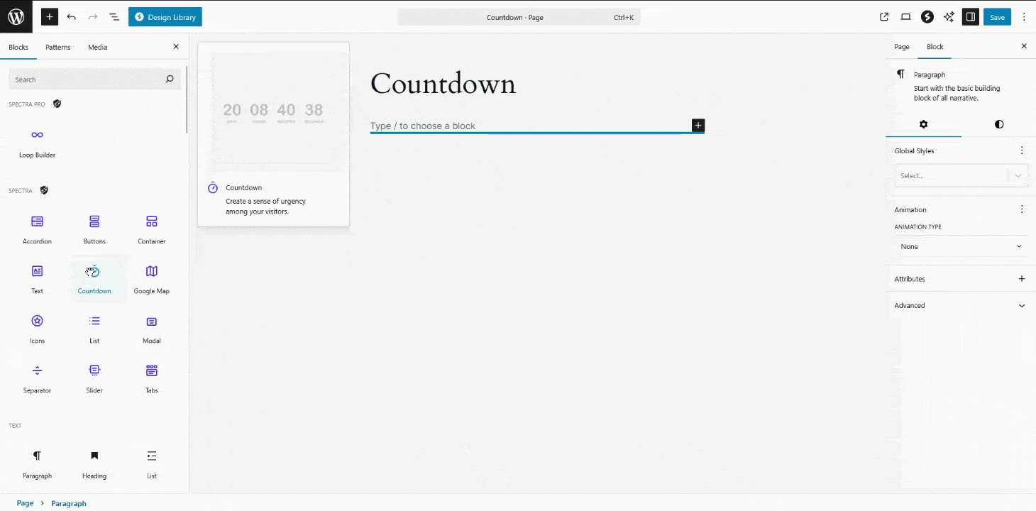
Adding the Block
- Click the “+” button in the block editor
- Search for “Countdown” or find it in the Spectra category
- Click to add the block to your page
Complete process: Adding block from inserter, setting date, choosing units, and basic styling
The block automatically creates a 7-day countdown. Set your target date in the “End Date & Time” setting and customize as needed.
Core Features
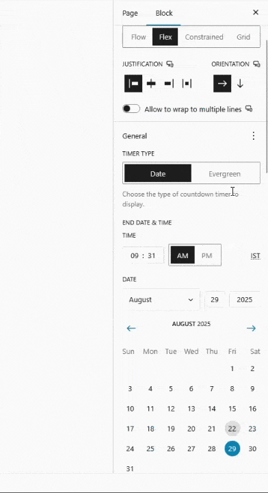
Date-Based Countdown
Set a specific end date and time using the built-in date/time picker. The countdown uses your WordPress site timezone and updates in real-time.
Configuration:
- End Date & Time: Choose your target date and time
- Time Units: Toggle Days, Hours, Minutes, Seconds visibility
- Labels: Show/hide labels and customize singular/plural text
- Separators: Choose between colon (:), pipe (|), slash (/), or none
Time Unit Control
Control which time units to display:
- All units: For long campaigns (days, hours, minutes, seconds)
- Hours/Minutes/Seconds: For daily offers (hide days)
- Minutes/Seconds: For quick deadlines
- Custom combination: Show any combination you need
Label Customization
- Show/Hide: Toggle all labels on or off
- Smart Labels: Automatic singular/plural switching (1 Day vs 2 Days)
- Custom Text: Personalize labels for any language
- Translation Ready: Full internationalization support
Pro Features (Available with Spectra Pro)
Evergreen Countdown
Each visitor gets their own personalized countdown that starts when they first visit your page.
How it works:
- Visitor arrives → Timer starts with your configured duration
- Countdown runs until expiration
- After expiration → Waits for reset period (optional)
- Timer resets for new visits
Configuration:
- Duration: Set days (0-365), hours (0-23), minutes (0-59)
- Reset After: Days to wait before timer resets (0 = immediate)
- Cookie Management: Secure visitor tracking per countdown
Expiry Actions
Control what happens when the countdown reaches zero:
Keep (Default)
Timer displays 00:00:00 and stops – perfect for simple announcements.
Hide
Countdown disappears completely when expired – ideal for temporary offers.
Redirect
Automatically redirects visitors to a specified URL – great for flash sales or limited offers.
Replace
Shows alternative content when timer expires. Two modes available:
- Reload Required (Recommended): Content appears after page reload
- No Reload: Content is hidden but present in DOM
Live/Expired Editor Mode
When using the Replace action, toggle between “Live” and “Expired” views in the editor:
- Live Mode: Shows the active countdown timer
- Expired Mode: Shows replacement content
- Toolbar Toggle: Switch between modes using editor toolbar buttons
This allows you to preview both states while editing and add any blocks as replacement content.
Settings Tab
Layout Panel
Controls how the countdown integrates with your page layout:
Layout Type Selection:
- Flow: (Default) Display countdown inline with other blocks – content flows naturally around it
- Flex: Flexible alignment options with full control over justification and alignment
- Grid: Grid-based layout with precise column controls for advanced layouts
- Constrained: Keeps countdown within a maximum width – perfect for readability
Flex Layout Controls (When Flex is selected)
- Orientation:
- Horizontal (Default): Time units in a row
- Vertical: Time units stacked vertically
- Justification: Left, Center, Right, Space Between, Space Around, Space Evenly
- Vertical Alignment: Top, Center, Bottom, Stretch
- Flex Wrap: Allow units to wrap to new lines or keep in single line
- Gap: Spacing between individual time units
Grid Layout Controls (When Grid is selected)
- Grid Item Fraction:
- Auto: WordPress determines sizing automatically
- Manual: You control exact grid placement
- Columns: Set number of columns (1-6)
- Grid Template: Define custom grid layouts
- Column Span: How many columns each unit spans
Constrained Layout (When Constrained is selected)
- Content Width: Maximum width before text wraps
- Alignment: Left, Center, Right within the constraint
- Content Justification: How content aligns within the width
General Panel
Primary countdown configuration and behavior:
Timer Configuration:
- Timer Type:
- Date (Default): Countdown to specific date/time
- Evergreen (Pro): Personal timer for each visitor
- End Date & Time(Date mode only):
- Interactive date/time picker
- Uses your WordPress site timezone
- Supports 12/24 hour formats
- Future dates only (validates input)
Time Unit Visibility:
- Show Days: Toggle days display (Default: On)
- Show Hours: Toggle hours display (Default: On)
- Show Minutes: Toggle minutes display (Default: On)
- Show Seconds: Toggle seconds display (Default: On)
- Validation: At least one unit must remain visible
Accessibility Settings:
- ARIA Live Type: Screen reader announcements
- Off (Default): No announcements
- Polite: Announces when user is idle
- Assertive: Immediate announcements (use sparingly)
Display Behaviour:
- Overflow: How content handles container boundaries
- Visible (Default): Content can extend beyond container
- Hidden: Clips content at container edges
- Auto: Shows scrollbars when needed
Labels Panel
Complete control over time unit text labels:
Global Label Settings:
- Show Labels: Master toggle for all labels (Default: On)
- Label Position: Above or below numbers
Individual Label Customization:
(Each unit has both singular and plural forms)
Days Labels:
- Days Label (Plural): Default: “Days”
- Day Label (Singular): Default: “Day”
Hours Labels:
- Hours Label (Plural): Default: “Hours”
- Hour Label (Singular): Default: “Hour”
Minutes Labels:
- Minutes Label (Plural): Default: “Minutes”
- Minute Label (Singular): Default: “Minute”
Seconds Labels:
- Seconds Label (Plural): Default: “Seconds”
- Second Label (Singular): Default: “Second”
Smart Label Features:
- Auto Plural/Singular: Automatically switches based on value (1 Day vs 2 Days)
- Translation Ready: Full i18n support for multilingual sites
- Custom Text: Use any text (emojis, symbols, other languages)
Separator Panel
Control visual separators between time units:
Separator Visibility:
- Show Separator: Toggle all separators (Default: On)
Separator Style (When separators are enabled):
- Colon (:) (Default): Traditional time format
- Line (|): Modern, clean separation
- Slash (/): Alternative style option
Separator Positioning:
- Automatically centers between time units
- Inherits text color from countdown
- Responsive scaling with font size
Pro Settings (Available with Spectra Pro)
Evergreen Timer Settings
Create personalized countdowns for each visitor:
Duration Configuration:
- Days: 0-365 days (Default: 0)
- Hours: 0-23 hours (Default: 0)
- Minutes: 0-59 minutes (Default: 0)
- ⚠️ Validation: At least 1 minute total duration required
Reset Behavior:
- Reset After: Days to wait before timer resets (Default: 1)
- 0 Days: Resets immediately after expiration
- 1+ Days: Waits specified days before new timer starts
Cookie Management:
- Secure visitor tracking per countdown
- Automatic cleanup after reset period
- Unique ID prevents conflicts with multiple countdowns
Expiry Settings Panel
Control what happens when countdown reaches zero:
Timer End Actions:
- Keep (Default): Shows 00:00:00 and stops
- Hide: Countdown disappears completely
- Redirect: Automatically redirects to specified URL
- Replace: Shows alternative content
Redirect Options (When Redirect is selected):
- Redirect URL: Destination URL with validation
- URL Validation: Ensures proper URL format
- Security: Prevents malicious redirects
Content Replacement (When Replace is selected):
- Reload Required:
- On (Recommended): Content appears after page reload
- Off: Content hidden but present in DOM
- Auto Reload: Automatic page reload when timer expires
- Content Blocks: Add any blocks as replacement content
Style Tab
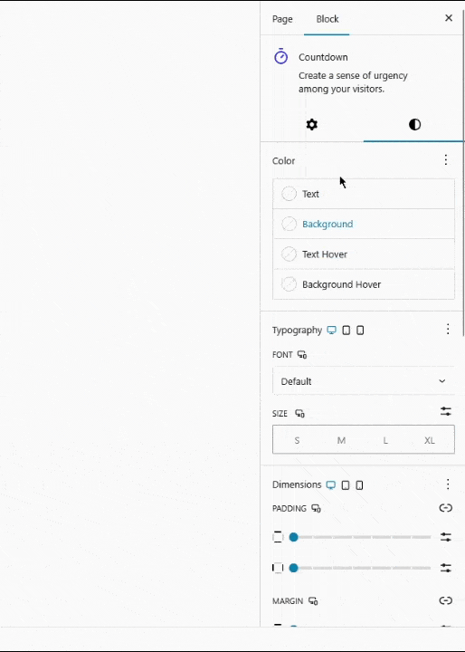
Colors
- Text: Normal and hover states
- Background: Normal and hover states
- Background Gradient: Normal and hover states
- ⚠️ Accessibility Warning: Alerts for low contrast ratios (WCAG compliance)
Typography
- Font Family: Theme, system, or custom fonts
- Font Size: Responsive sizing (Desktop/Tablet/Mobile)
- Font Weight & Style: Light → Bold, Normal/Italic
- Line Height: Adjust vertical spacing
- Letter Spacing: Adjust character spacing
- Text Transform: None, Uppercase, Lowercase, Capitalize
- Text Decoration: None, Underline, etc.
Dimensions
- Padding: Inner spacing (responsive)
- Margin: Outer spacing (responsive)
- Block Gap: Gap between time units
- Height: Fit, Grow, Fixed options
- Width/Height Units: px, %, em, rem, vw, vh
- Min/Max Width/Height: Constraints for responsive layouts
Border & Shadow
- Border Width: All sides or individual
- Border Style: Solid, Dashed, Dotted, etc.
- Border Color: Color selection
- Border Radius: Rounded corners
- Box Shadow: Drop shadow controls
Inner Block Settings
Each time unit (Days, Hours, Minutes, Seconds) is a separate inner block with individual styling:
Individual Time Unit Controls
- Colors: Text, background, gradients for each unit
- Typography: Font settings per unit (numbers and labels)
- Layout: Flex orientation (horizontal/vertical stacking)
- Spacing: Padding, margin, block gap for each unit
- Dimensions: Width, height constraints per unit
- Border & Shadow: Individual border and shadow styling
Number & Label Blocks
Each time unit contains:
- Number Block: Displays the countdown value (customizable styling)
- Label Block: Shows “Days”, “Hours”, etc. (independent styling)
Pro Expiry Wrapper Block (Pro only)
- Expiry Wrapper: Container for replacement content when using “Replace” action
- Full Styling: All standard block styling options available
- Content Blocks: Add any blocks inside for expired state content
Example: Style days with red background, hours with blue, minutes with green – each unit completely independent. Pro users can also style the expiry wrapper with custom background and add any content blocks for the expired state.
Quick Setup Guide
- Set Target Date: Choose your end date and time
- Choose Time Units: Show/hide days, hours, minutes, seconds as needed
- Customize Labels: Set custom text or hide labels for clean design
- Style Countdown: Use color, typography, and layout controls
- Configure Pro Features(Pro only):
- Switch to Evergreen for personalized timers
- Set expiry actions (hide, redirect, or replace)
- Use Live/Expired mode for replacement content
Use Cases & Examples
Product Launch
- Timer Type: Date
- Units: Days, Hours, Minutes
- Styling: Brand colors, prominent placement
- Pro: Replace with “Now Available” message

Product launch countdown with branded styling
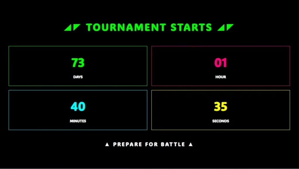
Flash Sale
- Timer Type: Evergreen (Pro)
- Duration: 24 hours
- Units: Hours, Minutes, Seconds (urgency colors)
- Pro: Redirect to regular pricing page when expired

Urgent flash sale countdown with bold colors and effects
Event Registration
- Timer Type: Date
- Units: Days, Hours, Minutes
- Pro: Replace with “Registration Closed” message
Professional event countdown for registration deadlines
Coming Soon
- Timer Type: Date
- Units: Days, Hours
- Style: Minimal design, large typography
- Labels: Hidden for clean look

Clean, minimal coming soon countdown
Design Gallery
Premium Sale Countdown
Perfect for e-commerce and promotional campaigns with bold branding and urgency.

End of season sale with golden accent colors and structured layout
Construction Timer
Ideal for maintenance notifications and “coming soon” pages with content replacement.

Under construction page with replacement content for when site goes live
Minimalist Seconds Timer
Great for quick actions, form submissions, or short-duration events.

Clean 60-second timer with replacement message
Circular Gradient Design
Modern, eye-catching design perfect for product launches and special events.

Circular countdown with colorful border styling and professional layout
Styling Options
Typography: Font family, size, weight, line height, letter spacing Colors: Text, background, gradients with hover states Layout: Flex controls, spacing, alignment options Responsive: Different settings for desktop, tablet, mobile Borders: Width, style, color, radius, shadows
Accessibility & Best Practices
Accessibility Features
WCAG 2.1 AA compliance with built-in accessibility features:
Screen Reader Support:
- ARIA Live Regions: Configurable announcements for countdown updates
- Off: Silent operation (good for decorative timers)
- Polite: Announces during user idle time (recommended)
- Assertive: Immediate announcements (use sparingly – for urgent deadlines)
Common Mistakes to Avoid:
- ❌ Using only color to convey urgency
- ❌ Setting ARIA Live to “assertive” for non-critical timers
- ❌ Poor contrast ratios (especially with gradient backgrounds)
- ❌ Missing context about what happens when timer expires
- ❌ Rapid flashing or animation effects
Performance Considerations
Update Frequency Optimization:
- Smart Intervals: Updates based on visible time units
- Seconds visible: 1-second updates
- Minutes only: 1-minute updates
- Hours only: 1-hour updates
- Days only: 1-day updates
Performance
Smart Updates: Countdown updates based on visible time units:
- Seconds visible: Updates every 1 second
- Minutes only: Updates every 1 minute
- Hours only: Updates every 1 hour
- Days only: Updates every 1 day
Optimization: Only changed values update in DOM, minimal resource usage, pauses when tab is inactive.
Troubleshooting
Countdown not updating: Check browser console for errors, verify end date is in future Wrong time display: Check WordPress timezone settings Pro features not working: Verify Spectra Pro is active, check cookie settings
We don't respond to the article feedback, we use it to improve our support content.