- Section
- Troubleshooting: Missing Icons
- Spectra Patterns
- Contact Form 7: Multiple Column Fields
- Contact Form 7: Checkbox / Radio / Acceptance Control
- Unable To Style Contact Form 7
- Tab Index For Multiple Gravity Forms
- Getting Started With Spectra
- Exclude Heading From TOC
- Block Display Conditions
- Importing Starter Templates With Spectra
- Getting Started With Spectra
- Manually Install Spectra Via FTP
- Automatic Beta Updates
- Rollback To Previous Versions
- Load Google Fonts Locally
- Activate Spectra Pro License
- Install Spectra Pro
- Translate Strings With Loco Translate
- Process Refund Requests
- Transparent / Sticky Header
- Change Site Logo
- Change Global Styles
- Disable Title on Posts & Pages
- Transparent / Sticky Header For Single Page / Post
- Change Header & Footer Patterns
- Custom / Google Fonts
- Reset Global Default Styling
- Manually Install Spectra One Via FTP
- Enable / Disable Header & Footer On Specific Pages / Posts
- Container
- Buttons
- List
- Modal
- Slider In Spectra
- Animations In Spectra
- Icons
- Tabs In Spectra
- Text Block In Spectra
- Countdown In Spectra
- Loop Builder In Spectra
- Image Mask In Spectra
- Dynamic Content In Spectra
- Global Styles In Spectra
- Accordion In Spectra
- Responsive Control In Spectra
- Font Management In Spectra
- Google Maps
- Separator
- Getting Started With Spectra
- Public Actions and Hooks In Spectra
- Popup Builder In Spectra
- Counter Block In Spectra
- Login Block in Spectra
- Register Block In Spectra
- Spectra Design Library Guide
- How to Enable Spectra 3 Beta
- Preview Options in Spectra (Desktop, Tablet & Mobile)
Counter Block In Spectra
Introduction
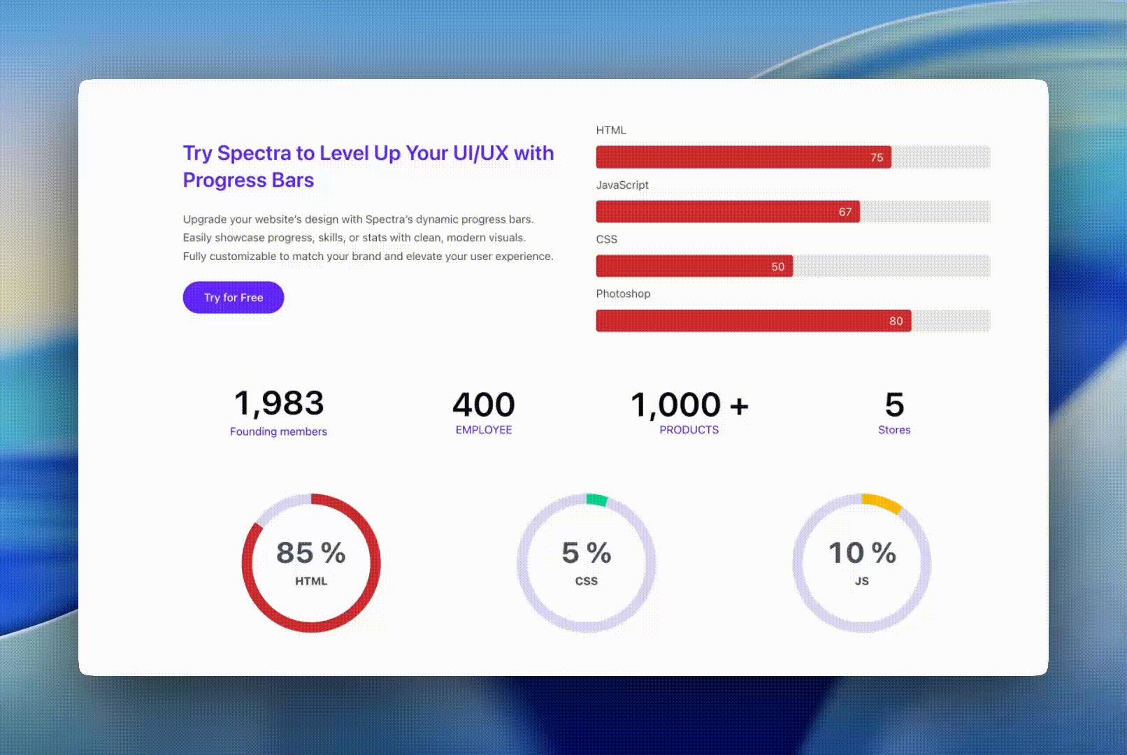
The Counter Block brings your statistics to life with animated numbers and progress visualizations. Whether you’re showcasing website visitors, sales achievements, project completion, or any data metrics, this block makes your numbers eye-catching and engaging. Choose from three distinct styles—Simple numbers, Circular progress rings, or Horizontal progress bars—to perfectly match your design needs.
How to Add or Use the Block in the Gutenberg Editor
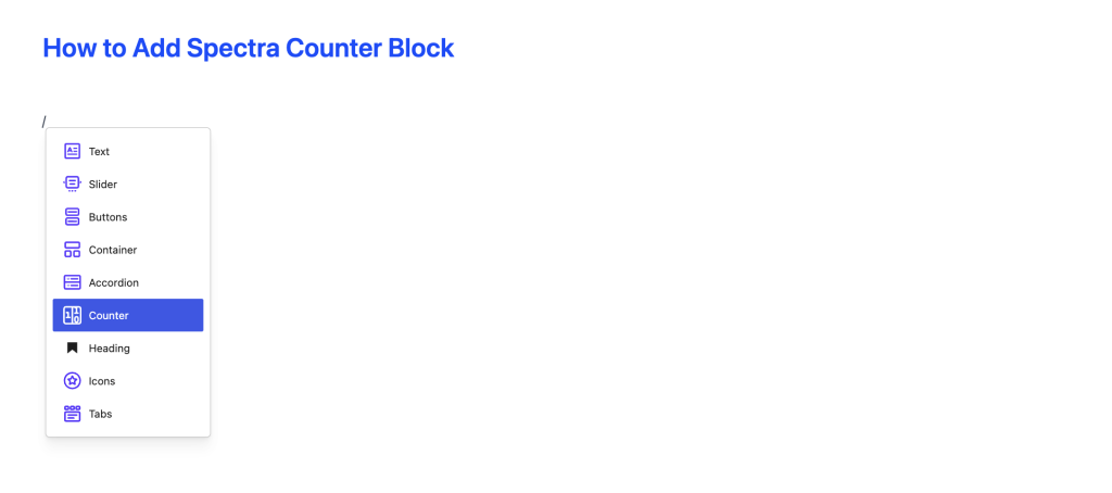
- Adding the Block
- Click the “+” button in the editor to open the block inserter
- Search for “Counter” or navigate to the Spectra category
- Click on the Counter Block to add it
- What You Get
- When you add the Counter block, it automatically includes:
- Icon area – Add optional icons from the Spectra library
- Animated number – The main counter that animates when scrolled into view
- Text area – Add labels, descriptions, or context
- Progress bar – Automatically appears when you choose “Bar” style
- When you add the Counter block, it automatically includes:
- Customizing Content
- Click on any element to edit it
- Add descriptive text to explain what the number represents
- Choose icons that match your content
- Arrange elements vertically or horizontally using layout controls
Block Settings Overview
⚙️ Settings Tab
General
Counter Style
Choose how your counter looks:
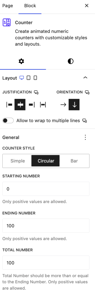
- Simple – Clean number display, perfect for straightforward statistics
- Circular – Beautiful progress ring with the number in the center
- Bar – Horizontal progress bar great for goal tracking
Animation Settings
- Starting Number – Where the counter begins (default: 0)
- Ending Number – Your target number (default: 100)
- Total Number – Max value for progress calculation (only for Circular & Bar styles)
- Example: If ending is 75 and total is 100, progress shows 75%
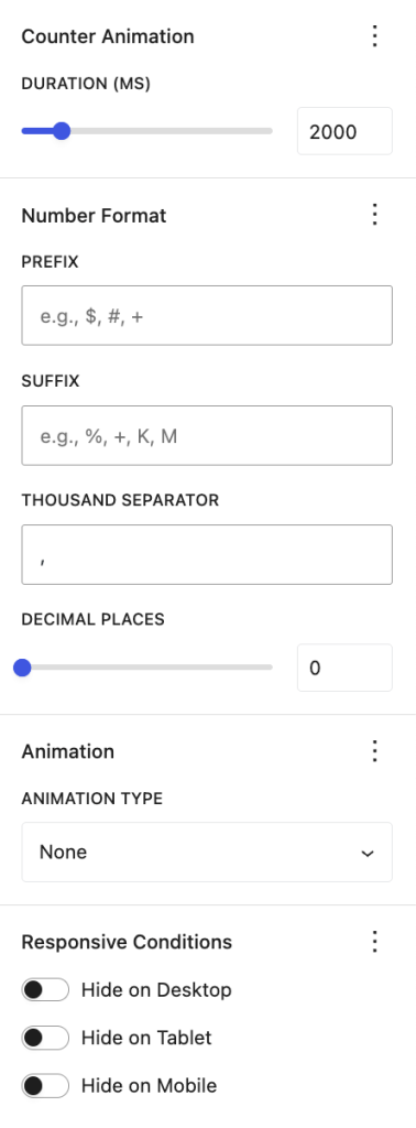
- Duration – How fast the animation runs (500ms to 10,000ms)
- Quick: 1000-2000ms
- Smooth: 2000-3000ms (default)
- Dramatic: 3000-5000ms
Number Format
Make your numbers readable and meaningful:
- Prefix – Add symbols before the number (e.g., “$” for currency, “#” for ranks)
- Suffix – Add units after the number (e.g., “%” for percentages, “K” for thousands)
- Thousand Separator – Make large numbers readable (e.g., “1,250,000”)
- Options: comma (,), period (.), or space
- Decimal Places – Show precision (0-5 decimal places)
- Example: “98.5%” uses 1 decimal place
Styles Tab
Appears when you choose Circular style
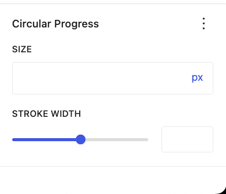
- Size – Control the diameter of the circle (default: 300px)
- Stroke Width – Thickness of the progress ring (4px to 100px)
- Thin: 4-8px for subtle effect
- Medium: 8-15px for standard use
- Bold: 15-25px for emphasis
Color Settings
Text & Background
- Text Color – Main color for your numbers and labels
- Background Color – Background behind your counter
- Background Gradient – Create gradient backgrounds for modern effects
Progress Colors (for Circular & Bar styles)
- Progress Color – Color of the filled portion (default: blue)
- Progress Background – Color of the empty track (default: light gray)
Prefix & Suffix Colors
- Customize colors for your prefix and suffix separately
- Example: Green “$” prefix, gray suffix
Dimensions
Spacing Controls
- Padding – Inner spacing inside the counter
- Margin – Outer spacing around the counter
- Block Gap – Space between icon, number, and text elements
Fine-tune Prefix & Suffix
- Prefix Right Margin – Add space after prefix symbol
- Suffix Left Margin – Add space before suffix symbol
Typography
Font Styling
- Font Family – Choose from available fonts
- Font Size – Set text size (responsive across devices)
- Font Weight – Light, regular, bold, etc.
- Line Height – Spacing between lines
- Letter Spacing – Space between characters
- Text Transform – Uppercase, lowercase, capitalize
Layout
Arrange Your Counter Elements
- Orientation – Vertical (stack) or Horizontal (side-by-side)
- Alignment – Left, center, or right alignment
- Justify Content – How elements are distributed
- Vertical Alignment – Top, middle, or bottom positioning
What’s Inside the Counter
When you add a Counter block, you get these elements working together:
Icon (Optional)
- Choose from thousands of icons in the Spectra library
- Upload your own custom SVG icons
- Adjust size, color, and rotation
- Perfect for representing your metric visually
Animated Number
- The star of the show – your counter number
- Animates smoothly when visitors scroll to it
- Shows your prefix, number, and suffix
- Fully customizable typography and colors
Text Content
- Add labels, descriptions, or context
- Use bold, italic, links, and other formatting
- Helps visitors understand what the number means
- Example: “Happy Customers”, “Years of Experience”
Progress Bar (Bar Style Only)
- Automatically appears when you choose Bar style
- Shows your progress visually with a horizontal bar
- Syncs perfectly with the animated number
- Customize height, colors, and border radius
How It Works
Scroll-Triggered Animation
Your counters spring to life automatically when visitors scroll them into view. The animation happens once per page load, creating an engaging experience without being overwhelming.
Smooth, Professional Animations
Numbers count up (or down!) smoothly at a consistent speed. Progress bars move in perfect sync with the numbers, creating a polished, professional effect.
Responsive & Mobile-Friendly
Counters automatically adapt to different screen sizes. You can customize spacing, sizes, and layouts specifically for mobile, tablet, and desktop views.
Built for Performance
Even with multiple counters on one page, performance stays smooth. Counters only initialize when needed and clean up properly when removed.
Accessibility First
- Screen readers announce counter values properly
- Keyboard navigation works throughout the editor
- High contrast mode is fully supported
- Progress bars include proper accessibility labels
Common Use Cases
Statistics Dashboard
Show key metrics with circular progress rings
Example: 7,500 website visitors (75% of 10,000 target)
Style: Circular with green progress color
Sales & Revenue Tracking
Display financial goals with bar progress
Example: $1,250,000 revenue (83% of $1,500,000 goal)
Style: Bar with currency prefix and thousand separators
Achievements & Milestones
Highlight impressive numbers
Example: 5,000+ Happy Customers
Style: Simple with icon and bold typography
Project Completion
Track progress with percentages
Example: 75% Complete
Style: Circular with percentage suffix
Countdown Timers
Show remaining time or items
Example: 23 Days until launch
Style: Simple with text suffix
Feature Highlights
Showcase product capabilities
Example: 50+ Templates | 24/7 Support | 99.9% Uptime
Style: Simple counters in a row
Tips and Best Practices
Animation Timing
Choose the right duration for your counters:
- Quick (1-2 seconds): Simple statistics, quick engagement
- Smooth (2-3 seconds): Most use cases, balanced pace
- Dramatic (3-5 seconds): Hero sections, major milestones
- Avoid going over 5 seconds – visitors lose interest
Remember: Counters animate once when scrolled into view
Number Formatting
Make numbers easy to read:
- Use thousand separators for big numbers:
1,250,000 - Add decimals only when needed:
98.5%or$1,234.56 - Use standard symbols:
$for currency,%for percentages - Match your audience’s locale (comma vs. period separators)
For Progress Displays:
- Set Total Number to your goal/maximum
- Set Ending Number to your current value
- Example: 75 ending / 100 total = 75% progress
Visual Design
Colors:
- Use high contrast for readability
- Match your brand colors
- Consider meaning: green=success, red=urgent, blue=neutral
- Test for colorblind accessibility
Choose the Right Style:
- Simple: Straightforward numbers, no visual progress needed
- Circular: Dashboards, KPIs, compact spaces
- Bar: Goal tracking, horizontal layouts, linear progress
Circular Counters:
- Default 300px works well for most uses
- Increase stroke width (10-15px) for prominence
- Reduce size on mobile devices
Bar Counters:
- Default 32px height is well-balanced
- Increase for more visual impact
- Add border radius for modern look
Content & Layout
Text Labels:
- Always explain what the number represents
- Keep labels concise and clear
- Use larger fonts for numbers, smaller for labels
- Example: Big “5,000” with small “Happy Customers” below
Icons:
- Choose icons that match your content
- Keep size proportional to numbers
- Use consistent style across multiple counters
- Skip them if they don’t add value
Layout:
- Vertical (default) works best for single counters
- Horizontal good for multiple stats in a row
- Test on mobile – may need to stack vertically
Mobile & Responsive
- Test on actual mobile devices
- Reduce circular progress size if needed
- Adjust font sizes for mobile screens
- Use responsive spacing controls
- Stack horizontal layouts vertically on small screens
Accessibility Checklist
- ✓ Ensure sufficient color contrast (text readable on background)
- ✓ Add descriptive text labels for all counters
- ✓ Test keyboard navigation in editor
- ✓ Don’t rely on color alone to convey meaning
Troubleshooting
Counter not animating?
- Check visibility: Counter must be scrolled into view to trigger animation
- Preview vs. Live: Animations work better on the live site than in editor preview
- Cache issue: Clear your browser cache and any caching plugins
Progress bar not showing?
- Check style: Progress bar only appears with “Bar” counter style
- Auto-added: It should appear automatically when you select Bar style
- Try switching: Switch to Simple, then back to Bar to reset
Numbers not formatting correctly?
- Check separators: Ensure thousand separator is set correctly for your locale
- Decimal places: Verify decimal places setting (0-5)
- Prefix/suffix: Make sure they’re entered in the correct fields
Progress percentage seems wrong?
- Check total number: Total should be your maximum/goal value
- Check ending number: Ending should be your current value
- Formula: Progress = (Ending ÷ Total) × 100%
- Example: 75 ending ÷ 100 total = 75%
Colors not applying?
- Clear cache: Browser cache or caching plugins may show old colors
- Check specificity: Custom CSS might be overriding block styles
- Progress vs. text: Remember progress colors and text colors are separate
Mobile layout issues?
- Test responsively: Use device preview in editor or actual devices
- Check spacing: Reduce padding/margins for mobile
- Stack vertically: Consider vertical layout on small screens
- Size adjustments: Reduce circular progress size on mobile
Frequently Asked Questions
Q: Can counters count backwards? A: Yes! Set a higher starting number than ending number (e.g., start: 100, end: 0).
Q: How do I make counters animate immediately without scrolling?
A: Place them at the top of your page (above the fold) so they’re in view when the page loads.
Q: Can I use the same counter animation multiple times on one page?
A: Each counter animates once per page load. For multiple animations, add multiple counter blocks.
Q: What’s the difference between Ending Number and Total Number?
A: Ending Number is your current value. Total Number is your maximum/goal (used to calculate progress percentage).
Q: Do I need to add a progress bar manually?
A: No! The progress bar automatically appears when you choose “Bar” style and disappears when you switch away.
Q: Can I customize individual child elements?
A: Yes! Click on the icon, number, or text area to access their individual styling options.
Q: How do I align the counter on my page?
A: Use the alignment options in the block toolbar or adjust layout settings in the sidebar.
Q: Can I copy a counter to reuse it?
A: Yes! Use the block toolbar’s options menu to duplicate the counter block with all its settings.
Q: Are counters SEO-friendly?
A: Yes, the numbers and text render normally in HTML and are accessible to search engines.
Requirements
WordPress: Version 6.6.0 or higher
PHP: Version 8.1 or higher
Browsers: All modern browsers (Chrome, Firefox, Safari, Edge)
We don't respond to the article feedback, we use it to improve our support content.