- Section
- Troubleshooting: Missing Icons
- Spectra Patterns
- Contact Form 7: Multiple Column Fields
- Contact Form 7: Checkbox / Radio / Acceptance Control
- Unable To Style Contact Form 7
- Tab Index For Multiple Gravity Forms
- Getting Started With Spectra
- Exclude Heading From TOC
- Block Display Conditions
- Importing Starter Templates With Spectra
- Getting Started With Spectra
- Manually Install Spectra Via FTP
- Automatic Beta Updates
- Rollback To Previous Versions
- Load Google Fonts Locally
- Activate Spectra Pro License
- Install Spectra Pro
- Translate Strings With Loco Translate
- Process Refund Requests
- Transparent / Sticky Header
- Change Site Logo
- Change Global Styles
- Disable Title on Posts & Pages
- Transparent / Sticky Header For Single Page / Post
- Change Header & Footer Patterns
- Custom / Google Fonts
- Reset Global Default Styling
- Manually Install Spectra One Via FTP
- Enable / Disable Header & Footer On Specific Pages / Posts
- Container
- Buttons
- List
- Modal
- Slider In Spectra
- Animations In Spectra
- Icons
- Tabs In Spectra
- Text Block In Spectra
- Countdown In Spectra
- Loop Builder In Spectra
- Image Mask In Spectra
- Dynamic Content In Spectra
- Global Styles In Spectra
- Accordion In Spectra
- Responsive Control In Spectra
- Font Management In Spectra
- Google Maps
- Separator
- Getting Started With Spectra
- Public Actions and Hooks In Spectra
- Popup Builder In Spectra
- Counter Block In Spectra
- Login Block in Spectra
- Register Block In Spectra
- Spectra Design Library Guide
- How to Enable Spectra 3 Beta
- Preview Options in Spectra (Desktop, Tablet & Mobile)
Global Styles In Spectra
Introduction
The Global Styles Extension transforms the Gutenberg block editor by adding a powerful styling panel to every Spectra block. This extension provides instant access to pre-built CSS classes, system variables, and custom styling options without leaving the editor. It bridges the gap between the Global Styles Admin Dashboard and actual block styling, making professional design accessible to all users.
Understanding CSS Priority in Global Styles
The Global Styles system follows a clear hierarchy to determine which styles are applied to your blocks. Understanding this priority system helps you predict and control how your styling will appear.
CSS Priority Hierarchy (Highest to Lowest)
Priority 1: Block Settings (Highest Priority)
- Individual styling options you set directly on each block
- Found in block-specific panels (colors, spacing, typography, etc.)
- Always overrides all Global Styles settings
- Use when you need unique styling for specific blocks
Priority 2: Global Styles (High Priority)
- Classes applied through the Global Styles panel
- Includes both system classes and custom classes
- Can be overridden by individual block settings
- Perfect for consistent styling across multiple blocks
Priority 3: Default CSS (Medium Priority)
- Built-in CSS that comes with each Spectra block
- Provides basic functionality and appearance
- Applied when no higher priority styles are set
- Ensures blocks work correctly out of the box
Priority 4: Theme CSS (Lowest Priority)
- Styles from your active WordPress theme
- Only applies when no other styling is set
- Provides fallback styling for consistency
- Can vary significantly between different themes
Practical Examples
Example 1: Button Color Priority
- You apply
background--primaryvia Global Styles (Priority 2) - Later you set a custom blue background in Block Settings (Priority 1)
- Result: The blue background from Block Settings will show, overriding the Global Styles class
Example 2: Typography Hierarchy
- Theme provides default font size (Priority 4)
- Block’s default CSS sets readable text size (Priority 3)
- You apply
text--lgvia Global Styles (Priority 2) - Result: The large text size from Global Styles will display
Best Practice Guidelines
When to Use Each Level:
- Block Settings: Unique, one-off styling that won’t be reused
- Global Styles: Consistent styling patterns used across multiple blocks
- Default CSS: Leave unchanged – provides essential block functionality
- Theme CSS: Automatic fallback – no action needed
Troubleshooting Style Conflicts:
- If styles aren’t applying, check for higher priority settings
- Block Settings will always win over Global Styles
- Clear cache when switching between different priority levels
- Use browser developer tools to inspect which styles are being applied
How to Access Global Styles in the Editor
- Select Any Spectra Block
- Click on any Spectra block (Container, Buttons, Text, etc.)
- Look for the Global Styles panel in the right sidebar
- Panel appears automatically for all supported blocks
- Global Styles Panel Location
- Located in the block settings sidebar (right side)
- Appears below General settings, usually after any core settings
- Clearly labeled with “Global Styles” heading
- Panel Availability
- Available on all Spectra blocks
- Not visible on core WordPress blocks or other plugin blocks
- Disabled when multiple blocks are selected
Global Styles Dropdown Interface
Overview
The heart of the Global Styles extension is an intelligent dropdown that provides access to hundreds of pre-built CSS classes organized for easy discovery and application.
Key Features
| Feature | Description | Benefit |
|---|---|---|
| Categorized Classes | Classes organized by purpose (colors, spacing, etc.) | Easy browsing |
| Wildcard Search | Intelligent search with partial matching | Quick discovery |
| Multi-select | Apply multiple classes simultaneously | Flexible styling |
| Visual Feedback | Real-time preview in editor | Immediate results |
| Default Class Display | Block-specific defaults highlighted | Context awareness |
How the Dropdown Works
Opening the Dropdown
- Click the Dropdown Field
- Click on the dropdown to select classes (which will already contain the block default class)
- Dropdown expands showing all available options
- Search field becomes active for immediate typing
- Keyboard Navigation
- Press Tab to focus the dropdown
- Use Arrow keys to navigate options
- Press Space to select/deselect classes
- Press Escape to close dropdown
Dropdown Structure
Default Class Section (Top)
- Block Default Class: Shows the automatic default class for the block type (if removed)
- Auto-applied: Automatically assigned to new blocks, can be removed if desired
Example for Button block:
📌 default-button (Block Default)Search Field
- Type-to-Search: Start typing in the dropdown to filter options instantly
- Live Filtering: Options filter in real-time as you type
- Fuzzy Matching: Finds matches anywhere in option text, not just at the beginning
- Clear Selection: Backspace or delete key to clear current selection
Categorized Class Groups
Classes are organized into logical groups with clear headers:
Block Default
- Automatically applied default class for each block type
- Single pinned class showing as
default-[blockname](e.g.,default-button) - Only visible when user has removed the default class from selection
- Allows re-adding the block’s default styling when needed
Custom Classes
- User-created CSS classes from the Global Styles admin dashboard
- Appears when custom classes exist, dynamically populated
Typography
- Font size classes matching system scale (heading–1 to heading–6, text–xs to text–xxl)
- Line height variations for optimal text spacing
Sizing
- Object fit properties for media elements
- Object position utilities
- Width utilities (content-fit, viewport percentages 20%-100%)
- Height controls and aspect ratio management
Display
- Display properties (block, flex, grid, contents, inline-block)
- Flex direction and wrap controls
- Grid structure, columns, and rows
- Layout alignment utilities (align-content, align-items)
- Justification utilities (justify-content, justify-items)
- Z-index positioning controls
Spacing
- Gap classes for flexbox and grid layout spacing
- Padding classes (all directions, individual sides, horizontal/vertical)
- Margin classes (all directions, individual sides, horizontal/vertical)
- System variable integration (–space–xs to –space–xxl)
Colors
- Text colors with full spectrum (near-white to near-black, plus complement/inverted)
- Background colors with comprehensive shade variations (primary, secondary, base)
- Border colors matching system palette for all directions (all, top, right, bottom, left, vertical, horizontal)
Filters
- Overlay colors with opacity variations (10% to 90% transparency)
- Backdrop blur effects (blur-xs to blur-xxl)
Border
- Border width controls
- Border styles for all directions
- Border radius variations (corner–xs to corner–xxl, corner–round)
- Individual corner radius control (top, bottom, left, right)
Class Selection Process
Adding Classes
- Type or Browse: Start typing to filter options or browse through categories
- Click to Select: Click on any option to add it to selection
- Multi-Value Display: Selected classes appear as removable tags above dropdown
- Dropdown Stays Open: Dropdown remains open for additional selections
- Continue Selecting: Add multiple classes without reopening dropdown
Removing Classes
- Click X on Tag: Click the × button on any selected class tag to remove it
- Backspace Key: Use backspace to remove the last selected class
- Clear All Button: Use the clear indicator (×) to remove all selections at once
- Instant Removal: Classes remove from block immediately upon deletion
Managing Multiple Classes
- Tag-Based Interface: Selected classes display as individual removable tags
- Persistent Dropdown: Dropdown stays open during multiple selections
- Order Maintained: Classes maintain selection order in the interface
- No Conflict Resolution: CSS cascade rules determine styling priority
- Flexible Removal: Remove individual classes or clear all at once
Wildcard Search System
How Wildcard Search Works
The search system uses intelligent matching to help you find classes quickly:
Partial Matching
- Start Matching: Classes beginning with your search term
- Anywhere Matching: Classes containing your term anywhere
- Word Boundary: Prioritizes matches at word beginnings
Smart Suggestions
- Purpose-Based: Search “background” to find background-related classes
- Property-Based: Search “padding” to find spacing classes
- Color Names: Search “blue” or “primary” to find color classes
- T-shirt Sizing: Search “xl”, “sm”, “lg” to find scale-based classes
Search Examples
Search: "primary"
Results:
- background--primary
- color--primary
- background--primary-dark
Search: "lg"
Results:
- padding--lg
- margin--lg
- text--lg
- corner--lg
Search: "xs"
Results:
- padding--xs
- margin--xs
- text--xs
- corner--xs
Category Filtering in Search
- Automatic Filtering: Search results grouped by category
- Category Priority: More relevant categories shown first
- Cross-category Results: Search can span multiple categories
Default Class System
Understanding Default Classes
Every Spectra block automatically receives a default class that enables automatic styling through the Global Styles Admin Dashboard configuration.
How Default Classes Work
- Automatic Assignment: Every Spectra block gets
default-[blockname]class - Admin Configuration: Default styling configured in Global Styles Admin
- CSS Generation: System generates CSS for configured defaults
- Universal Application: All Spectra blocks inherit default styling (existing and new blocks)
- Removable & Re-addable: Default classes can be removed from blocks and re-added when needed
Default Class Examples
Container Block:
default-container (Block Default)

Button Block:
default-button (Block Default)

Icons Block:
default-icons (Block Default)
Default Class Benefits
Workflow Efficiency
- Instant Branding: All blocks immediately match site design
- Reduced Work: No need to manually apply common styling
- Consistency: All blocks of same type share base styling
- Time Saving: Skip repetitive styling tasks
Design Consistency
- Brand Adherence: Automatic application of brand colors and spacing
- Professional Appearance: Consistent look across all content
- Maintenance: Update defaults globally instead of per block
User Experience
- Beginner Friendly: Good styling without CSS knowledge
- Advanced User: Provides foundation for further customization
- Flexible: Can add additional classes on top of defaults
How Admin Settings Affect Block Editor
Real-time Synchronization
The Global Styles extension maintains real-time connection with admin settings:
System Variable Updates
- Color Changes: Color variable updates immediately reflect in editor
- Spacing Updates: Spacing changes visible in real-time
- Typography Changes: Font size updates apply instantly
Custom Class Availability
- New Classes: Newly created custom classes appear in dropdown immediately
- Class Updates: Modifications to existing classes update live
- Class Deletion: Removed classes disappear from dropdown
Block Default Changes
- Default Updates: Block default changes affect all blocks with default classes
- Individual Control: Individual blocks can remove default classes if desired
- Reapplication: Default classes can be re-added to blocks when needed
CSS Variable Integration
System Variables in Classes
Many Global Styles classes use CSS variables defined in the admin.
Benefits of Variable Integration
- Global Updates: Change admin settings to update all usage
- Consistency: All classes using same variable stay synchronized
- Theme Integration: Color variables pull from theme when configured
Custom Class Integration
Custom Classes in Dropdown
- Automatic Inclusion: All custom classes appear in dropdown
- Category Organization: Custom classes grouped appropriately
- Search Integration: Custom classes included in search results
- State Display: Hover, focus states shown when applicable
Usage Workflow
- Create in Admin: Design custom classes in Global Styles Admin
- Find in Editor: Search for custom classes in dropdown
- Apply to Blocks: Select classes just like system classes
- See Results: Styling applies immediately with live preview
Practical Usage Examples
Styling a Button Block
Basic Button Styling
- Select Button Block: Click on button in editor
- Open Global Styles: Look for Global Styles panel in sidebar
- Search for Classes: Type “primary” or “padding” in search field
- Apply Classes:
background--primary(primary background color)color--base-near-white(light text color)corner--md(medium border radius)padding--x-lg(large horizontal padding)padding--y-sm(small vertical padding)
Interactive Button Styling
- Add Hover Effects (using Custom Classes):
- Create custom classes in Admin Dashboard for hover effects
- Apply transition effects for smooth interactions
- Use darker primary shades for hover states
Advanced Button Styling
- Typography Enhancement:
text--smortext--md(appropriate text size)- Apply consistent spacing with margin classes
Result: Professional button with brand colors, proper spacing, and rounded corners.
Creating a Card Component
Container as Card Base
- Add Container Block: Insert container for card structure
- Apply Card Classes:
background--base-near-white(light background)corner--lg(large border radius)padding--xl(generous internal padding)margin--md(spacing from other elements)
Card Styling Enhancement
- Add Visual Appeal:
- Use Custom Classes in Admin Dashboard for complex box shadows
- Apply border styles if needed using border classes
- Consider overlay colors for subtle effects over background images or videos
Card Content
- Add Content Blocks: Insert heading, text, button inside container
- Style Content: Apply typography classes to inner blocks
heading--2orheading--3for card titlestext--mdfor body content
Result: Clean card component with proper spacing and visual hierarchy.
Typography Hierarchy
Heading Styling
- Select Heading Block: Choose H2 heading
- Apply Typography Classes:
heading--2(H2 heading size from system scale)color--primary-dark(dark primary color)margin--b-md(bottom spacing)
Body Text Styling
- Select Content Block: Choose paragraph text
- Apply Text Classes:
text--md(medium body text size)color--base-dark(readable dark color)- Use Custom Classes for line-height adjustments
Accent Text
- Select Secondary Text: Choose caption or small text
- Apply Accent Classes:
text--sm(small text size)color--base(lighter base color)- Apply Custom Classes for styling variations
Result: Clear typography hierarchy using system font scales and color variables.
Tips and Best Practices
Efficient Class Discovery
Search Strategy
- Use Descriptive Terms: Search for purpose (border, flex, gap, spacing)
- Browse by Category: Explore category sections for related classes
- Combine Search Terms: Use multiple keywords for specific results
- Use CheatSheet: Reference the CheatSheet tab in Global Styles Admin to discover available classes
Class Selection Strategy
- Start with Basics: Apply fundamental styling first (colors, spacing)
- Test Combinations: Preview different class combinations
- Document Patterns: Note effective class combinations for reuse
Design Consistency
Color Usage
- Stick to System Colors: Use defined color variables when possible
- Maintain Contrast: Ensure sufficient contrast for accessibility
- Brand Consistency: Use primary colors for key elements
- Hierarchy: Use color to establish visual hierarchy
Spacing Consistency
- Use System Scale: Stick to defined spacing values (XS, SM, MD, LG, XL, XXL)
- Consistent Patterns: Use same spacing patterns across similar elements
- Logical Spacing: Use larger values for major sections, smaller for component details
- Visual Rhythm: Create consistent spacing rhythm throughout page
Typography Best Practices
- Hierarchy Rules: Establish clear size hierarchy for headings
- Readable Sizes: Ensure text is readable on all devices
- Line Heights: Use appropriate line heights for readability
- Color Contrast: Maintain sufficient contrast for accessibility
Performance Optimization
Class Selection
- Avoid Redundancy: Don’t apply conflicting classes
- Combine Efficiently: Use single classes that combine multiple properties when available
- Remove Unused: Clean up classes that aren’t providing value
- Test Impact: Monitor page load times with extensive class usage
Editor Performance
- Moderate Usage: Avoid applying dozens of classes to single blocks
- Search Efficiently: Use search to find classes quickly instead of browsing
- Clean Up: Remove experimental classes that didn’t work out
- Preview Regularly: Check that applied classes achieve desired effect
Advanced Usage Techniques
Custom Class Integration
Creating Project-Specific Classes
- Design in Admin: Create custom classes in Global Styles Admin Dashboard
- Test in Editor: Apply classes to blocks for immediate testing
- Refine Design: Adjust classes in admin, see changes in editor
- Document Usage: Keep track of custom class purposes and usage
Class Naming Strategy
/* Component-based naming */
.custom-hero-title { /* Hero section titles */ }
.custom-card-hover { /* Card hover states */ }
.custom-btn-cta { /* Call-to-action buttons */ }

/* BEM methodology naming */
.custom-card__header { /* Card header element */ }
.custom-card__header--secondary { /* Secondary card header modifier */ }
.custom-card__title { /* Card title element */ }
.custom-button--primary { /* Primary button modifier */ }
.custom-button--large { /* Large button modifier */ }

/* Utility-based naming */
.custom-text-highlight { /* Highlighted text */ }
.custom-spacing-section { /* Section spacing */ }
.custom-border-accent { /* Accent borders */ }
State Utilization
Interactive Elements
Apply classes with hover and focus states:
- Buttons: Hover color changes, focus rings
- Cards: Hover shadows, scale effects, transition smoothing
- Links: Underline styles, color changes
Advanced Interactions
/* Multi-state button example using available classes */
Base Classes: background--primary, color--base-near-white, corner--md, padding--sm

/* For hover/focus states, create Custom Classes in Admin: */
.custom-button-hover {
  transition: all 0.3s ease;
}

.custom-button-hover:hover {
  background-color: var(--color--primary-dark);
  transform: scale(1.05);
}
Troubleshooting
Common Issues
Global Styles panel not appearing?
- Check Block Type: Ensure you’re selecting a Spectra block
- Update Plugin: Make sure Spectra Pro is up to date
- Clear Cache: Clear browser cache and WordPress caches
- Check Permissions: Verify you have editing permissions
Classes not applying to blocks?
- Check Class Names: Verify classes exist in Global Styles Admin
- CSS Conflicts: Check if theme CSS is overriding styles
- Cache Issues: Clear all caches and refresh page
- Browser Console: Look for JavaScript errors preventing application
Dropdown Search not working properly?
- Clear Search Field: Clear the input and try again
- Check Typing: Ensure search terms are spelled correctly
- Plugin Conflicts: Temporarily disable other plugins that may interfere with the dropdown
- Browser Issues: Try different browser or disable browser extensions
Styling Issues
Classes applied but no visual change?
- CSS Specificity: Theme styles might have higher specificity in some areas
- Important Declarations: Theme might use !important declarations
- Cache Problems: Clear all caches including CDN caches
- Class Conflicts: Check for conflicting classes applied to same element
Colors not matching admin settings?
- Variable Updates: Refresh editor to get latest CSS variables
- Theme Override: Check if theme is overriding color variables
- Custom CSS: Look for custom CSS that might be interfering
- Save Status: Ensure admin changes were saved properly
Spacing inconsistent across blocks?
- System Variables: Verify spacing variables are set correctly in admin
- Theme Box Model: Check if theme uses different box-sizing
- Margin Collapse: Understand CSS margin collapse behavior
- Responsive Issues: Check spacing on different screen sizes
Performance Issues
Editor running slowly with Global Styles?
- Class Quantity: Reduce number of classes applied per block
- Browser Resources: Close unnecessary browser tabs or disable unrequired browser extensions
- Plugin Load: Temporarily disable other heavy plugins
- System Resources: Ensure adequate computer memory and processing
Dropdown loading slowly?
- Class Quantity: Large numbers of custom classes could slow dropdown
- Search Index: Clear browser data to rebuild search index
- Network Speed: Slow connection could affect real-time features
- Server Resources: Ensure WordPress has adequate server resources
Compatibility and Requirements
System Requirements
- WordPress: 6.6.0 or higher required
- PHP: 8.1 or higher
- Modern Browsers: Chrome 80+, Firefox 75+, Safari 13+, Edge 80+ with CSS Grid/Flexbox support
Theme Compatibility
- Universal Theme Support: Works with all standard WordPress themes
- Block Theme Integration: Full compatibility with block and classic themes using Gutenberg
- Advanced Theme Color Integration: Automatically detects and synchronizes with your active theme’s color palette, allowing seamless switching between theme colors and custom colors while maintaining design consistency across theme changes
Performance Considerations
- Server Resources: Adequate PHP memory and server memory for CSS generation and class processing
- JavaScript Requirements: Full functionality requires JavaScript enabled for dashboard features and real-time preview system
- Frontend Impact: Minimal impact on page load times with optimized CSS delivery
Global Styles Admin Dashboard
The Global Styles Admin Dashboard is Spectra Pro’s powerful centralized styling system that allows you to create, manage, and apply consistent design elements across your entire website. This comprehensive dashboard provides system-wide variables, custom classes, and block defaults that streamline your design workflow and ensure brand consistency. Access it through Spectra > Global Styles in your WordPress admin panel.
How to Access the Dashboard
- Navigate to Admin Panel
- Go to your WordPress admin dashboard
- Look for Spectra in the left sidebar menu
- Click on Global Styles to open the dashboard
- Dashboard Structure
- The interface uses a two-column layout
- Left sidebar: Navigation between different tabs
- Right area: Settings and preview for selected tab
Dashboard Navigation Structure
The Global Styles dashboard is organized into three main sections:
System Variables
Contains fundamental design tokens that affect your entire site:
- Colors – Primary, secondary, and base color systems
- Spacing – Consistent spacing values (XS through XXL)
- Font Size – Typography scale for text and headings
Custom Classes & Variables
Your personalized styling options:
- Variables – Custom CSS variables for advanced users
- Classes – Reusable CSS classes with interactive state support
- Block Defaults – Automatic class application to new blocks
Miscellaneous
Additional tools and references:
- CheatSheet – Searchable reference of all available classes
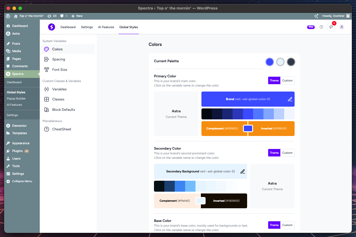
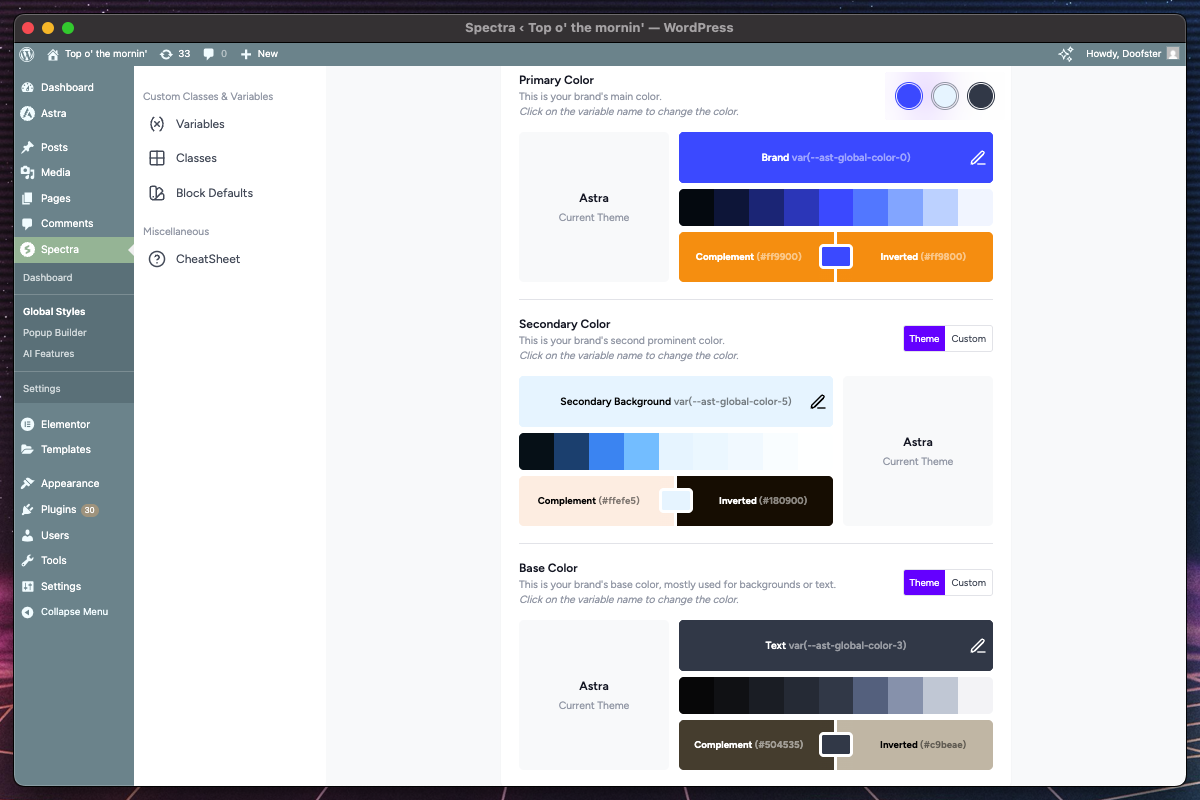
System Color Variables
Overview
System Color Variables establish your website’s primary color palette. These colors automatically generate 9 shades each and can be used throughout your site for consistent branding.
Key Features
| Feature | Description | Purpose |
|---|---|---|
| Primary Color | Main brand color | Hero sections, CTAs, primary buttons |
| Secondary Color | Supporting brand color | Accents, secondary buttons, highlights |
| Base Color | Neutral foundation color | Text, borders, subtle backgrounds |
| Theme Integration | Sync with active theme colors | Maintain theme consistency |
| Shade Generation | Automatic 9-shade palette + 2 inverted colors | Light to dark variations, complement and inverted |
How Theme Colors Work
The system provides two color modes for each color type:
Theme Colors
- Source: Automatically pulls from your active WordPress theme
- Synchronization: Updates when you change themes
- Benefits: Ensures design consistency with your theme
- Usage: Ideal for maintaining theme compatibility
Custom Colors
- Source: Manual color selection using color picker
- Control: Full control over exact color values
- Benefits: Perfect brand color matching
- Usage: When you need specific brand colors apart from your theme colors
Color Configuration Process
- Select Color Type
- Choose Primary, Secondary, or Base color
- Preview shows current color with generated shades
- Choose Color Mode
- Toggle between “Theme” and “Custom”
- Theme mode shows available theme colors in dropdown
- Custom mode opens color picker interface with an input for hex values
- Theme Color Selection
- Dropdown displays all available theme colors
- Shows color name and preview swatch
- Automatically updates when selected
- Custom Color Selection
- Full-featured color picker with multiple input methods
- Real-time preview of selected color
- Automatic Shade Generation
- System generates 9 shades: Near-white, Lightest, Lighter, Light, Main, Dark, Darker, Darkest, Near-black
- Main represents your selected color
- Lighter variations (Near-white to Light) for backgrounds, highlights
- Darker variations (Dark to Near-black) for text, emphasis
- Complement color (inverts main color while maintaining brightness)
- Inverted color (completely inverts the main color)
- Live Preview System
- Sticky color preview circles on the top-right show current selections
- Real-time updates as you make changes
- All shared and complements are generated as soon as a color is changed
Color Usage Examples
/* Primary color variations */
--color--primary-near-white: /* Near-white shade */
--color--primary: /* Your selected (main) color */
--color--primary-near-black: /* Near-black shade */
--color--primary-complement: /* Complement color */
--color--primary-inverted: /* Inverted color */

/* Secondary and base follow same pattern */
--color--secondary-near-white:
--color--secondary:
--color--base-near-white:
--color--base:
Best Practices
- Color Harmony
- Use theme colors when possible for consistency
- Choose custom colors that complement your theme when necessary
- Test color combinations across light/dark backgrounds
- Accessibility
- Ensure sufficient contrast ratios (WCAG AA: 4.5:1)
- Test readability with generated shades
- Consider colorblind users when selecting colors
- Brand Consistency
- Use Primary color for main brand elements
- Reserve Secondary for accents and highlights
- Use Base color for neutral elements
System Spacing Variables
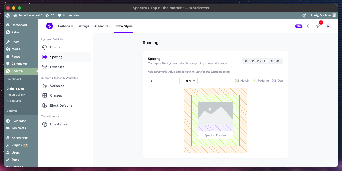
Overview
System Spacing Variables create a consistent spatial rhythm across your website. These values control margins, padding, gaps, and other spacing elements throughout your design.
Spacing Scale Structure
The system provides six spacing sizes with a progressive scale:
| Size | Typical Range | Common Usage |
|---|---|---|
| XS | 4-8px (0.25-0.5rem) | Fine adjustments, element borders |
| SM | 8-16px (0.5-1rem) | Button padding, small gaps |
| MD | 16-24px (1-1.5rem) | Standard element spacing |
| LG | 24-40px (1.5-2.5rem) | Section padding, large gaps |
| XL | 40-64px (2.5-4rem) | Major section separation |
| XXL | 64px+ (4rem+) | Hero sections, major layouts |
Unit Support
Each spacing value supports multiple CSS units:
| Unit | Description | Best For |
|---|---|---|
| rem | Relative to root font size | Scalable layouts |
| em | Relative to element font size | Component-based spacing |
| px | Absolute pixels | Precise control |
Configuration Interface
- Tab-Based Selection
- Six tabs for each spacing size (XS, SM, MD, LG, XL, XXL)
- Clear visual indication of active size
- Easy switching between sizes
- Value Input
- Numeric input for spacing value
- Unit dropdown for rem/em/px selection
- Real-time preview of combined value
- Interactive Preview
- Visual demonstration of spacing effects
- Shows margin, padding, and gap applications
- Striped backgrounds indicate different spacing types
- Reset Functionality
- Restore individual sizes to defaults
- Maintains other custom values
- Confirmation dialog prevents accidental resets
How Spacing Variables Work
CSS Variable Generation
--space--xs: 0.5rem;
--space--sm: 1rem;
--space--md: 1.5rem;
--space--lg: 2rem;
--space--xl: 3rem;
--space--xxl: 5rem;
Usage in Blocks
- Automatic application in Global Styles classes
- Available in block settings dropdowns
- Consistent spacing across all components
Best Practices
- Scale Consistency
- Maintain proportional relationships between sizes
- Use a mathematical ratio (e.g., 1.5x, 2x) for harmonious scaling
- Test across different screen sizes
- Unit Selection
- Use
remfor scalable, accessible designs - Use
pxfor precise control requirements - Avoid
emunless component-relative scaling needed
- Use
- Responsive Considerations
- Smaller spacing values work better on mobile
- Consider how spacing affects readability
- Test with different font sizes and zoom levels
System Font Size Variables
Overview
System Font Size Variables establish a consistent typography hierarchy across your website. The system provides separate scales for body text and headings, ensuring readable and well-proportioned typography.
Typography Categories
Text Sizes (Body Content)
For general content, captions, and interface elements:
| Size | Typical Range | Common Usage |
|---|---|---|
| XS | 10-12px (0.625-0.75rem) | Fine print, captions |
| SM | 12-14px (0.75-0.875rem) | Small text, labels |
| MD | 16px (1rem) | Default body text |
| LG | 18-20px (1.125-1.25rem) | Emphasized body text |
| XL | 20-24px (1.25-1.5rem) | Lead paragraphs |
| XXL | 24px+ (1.5rem+) | Large body text |
Heading Sizes (H1-H6)
For headings and titles:
| Heading | Typical Range | Hierarchy Purpose |
|---|---|---|
| H1 | 32-48px (2-3rem) | Page titles, main headings |
| H2 | 28-36px (1.75-2.25rem) | Section headings |
| H3 | 24-32px (1.5-2rem) | Subsection headings |
| H4 | 20-28px (1.25-1.75rem) | Minor headings |
| H5 | 18-24px (1.125-1.5rem) | Small headings |
| H6 | 16-20px (1-1.25rem) | Smallest headings |
Interface Features
- Dual Tab System
- Text Tab: Configure body text sizes (XS-XXL)
- Headings Tab: Configure heading sizes (H1-H6)
- Clear separation of content types
- Size Selection
- Secondary tabs within each category
- Visual indication of active size
- Preview of all sizes in hierarchy
- Live Typography Preview
- All font sizes displayed simultaneously
- Real-time updates as you adjust values
- Highlighted current editing size
- Proper hierarchy demonstration
- Unit and Value Controls
- Numeric input for size value
- Unit dropdown (rem, em, px)
- Real-time combination preview
Typography Hierarchy Principles
Proper Scaling
- Progressive Scale: Each size should be noticeably different
- Mathematical Ratios: Use ratios like 1.25, 1.5, or Golden Ratio (1.618)
- Readability: Ensure sufficient size differences for clear hierarchy
Visual Balance
- Heading Contrast: H1 should be significantly larger than body text
- Logical Progression: Each heading level should be smaller than the previous
- Context Appropriateness: Size should match content importance
Configuration Best Practices
- Start with Base Size
- Set MD text size as your foundation (typically 16px, or 1rem)
- Build other sizes relative to this base
- Consider reading distance and device usage
- Establish Ratios
- Use consistent multipliers between sizes
- Common ratios: 1.125 (Major Second), 1.25 (Major Third), 1.5 (Perfect Fifth)
- Test ratios across different content types
- Unit Selection Guidelines
- rem: Best for scalable, accessible typography
- px: Use for precise control requirements
- em: Rarely recommended for system-wide scaling
- Responsive Typography
- Consider how sizes appear on different devices
- Larger text may need more adjustment on mobile
- Test readability across various screen sizes
CSS Variable Output
/* Text sizes */
--text--xs: 0.75rem;    /* 12px */
--text--sm: 0.875rem;   /* 14px */
--text--md: 1rem;       /* 16px */
--text--lg: 1.25rem;    /* 20px */
--text--xl: 1.5rem;     /* 24px */
--text--xxl: 2rem;      /* 32px */

/* Heading sizes */
--heading--1: 2.25rem;  /* 36px */
--heading--2: 1.875rem; /* 30px */
--heading--3: 1.5rem;   /* 24px */
--heading--4: 1.25rem;  /* 20px */
--heading--5: 1.125rem; /* 18px */
--heading--6: 1rem;     /* 16px */
Custom Variables
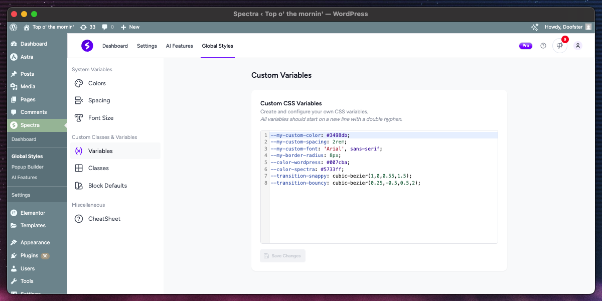
Overview
Custom Variables provide advanced users with the ability to create their own CSS custom properties (CSS variables) for use throughout the site. This feature uses a syntax-highlighted code editor for professional CSS development.
Key Features
| Feature | Description | Benefit |
|---|---|---|
| Code Editor | Syntax-highlighted CSS editor | Professional coding experience |
| Real-time Validation | CSS variable format validation | Error prevention |
| Temporary Storage | Cross-navigation persistence | No lost work |
| Save State Management | Visual feedback for save status | Clear user feedback |
How to Use Custom Variables
- Writing CSS Variables–my-custom-color: #3498db; –my-custom-spacing: 2rem; –my-custom-font: ‘Arial’, sans-serif; –my-border-radius: 8px;
- Variable Naming Conventions
- Start with double dashes (
--) - Use descriptive, lowercase names
- Separate words with hyphens
- Group related variables with prefixes
- Start with double dashes (
- Value Types
- Colors: Hex (#3498db), RGB, RGBA, HSL, HSLA, named colors (red, blue), currentColor
- Dimensions: px, rem, em, %, vw, vh, vmin, vmax, ch, ex, cm, mm, in, pt, pc, fr
- Fonts: Font families, weights, styles, font-size, line-height
- Numbers: Line heights, opacity values, z-index, flex values
- Any Valid CSS: Custom variables can store any valid CSS value including calc() functions, gradients, shadows, transforms, and complex property combinations
Code Editor Features
Syntax Highlighting
- CSS Property Highlighting: Variables and values color-coded
- Bracket Matching: Matching braces and parentheses highlighted
Temporary Storage System
- Auto-save: Content automatically saved to temporary storage
- Cross-navigation: Work preserved when switching tabs
- Loss Prevention: Warning before leaving with unsaved changes
- Restoration: Unsaved work restored on return
Save State Feedback
- Saving Indicator: Visual feedback during save operation
- Success Confirmation: Clear indication of successful save
- Error Handling: Notification of save failures
- Dirty State Tracking: Visual indication of unsaved changes
Variable Usage Examples
Brand Colors
--brand-primary: #e74c3c;
--brand-secondary: #3498db;
--brand-accent: #f1c40f;
--brand-dark: #2c3e50;
--brand-light: #ecf0f1;
Typography System
--font-primary: 'Inter', sans-serif;
--font-secondary: 'Playfair Display', serif;
--font-mono: 'Fira Code', monospace;
--line-height-tight: 1.2;
--line-height-normal: 1.5;
--line-height-loose: 1.8;
Spacing and Layout
--container-width: 1200px;
--content-padding: 2rem;
--border-radius-small: 4px;
--border-radius-medium: 8px;
--border-radius-large: 16px;
--shadow-light: 0 2px 4px rgba(0,0,0,0.1);
--shadow-medium: 0 4px 8px rgba(0,0,0,0.15);
Integration with Global Styles
Automatic Availability
- Variables automatically available in Custom Classes
- Can be referenced in any CSS property
Usage in Classes
/* In Custom Classes editor */
.my-custom-button {
  background-color: var(--brand-primary);
  padding: var(--content-padding);
  border-radius: var(--border-radius-medium);
}
Best Practices
- Organization
- Group related variables together
- Use consistent naming patterns
- Naming Strategy
- Use semantic names (–color-primary vs –color-red)
- Include context in names (–button-padding vs –padding)
- Avoid abbreviations for clarity
- Value Management
- Define base values first, then variations
- Use calc() for related values
- Consider dark mode alternatives
- Performance
- Limit to essential variables only
- Avoid extremely complex calculations
Custom Classes
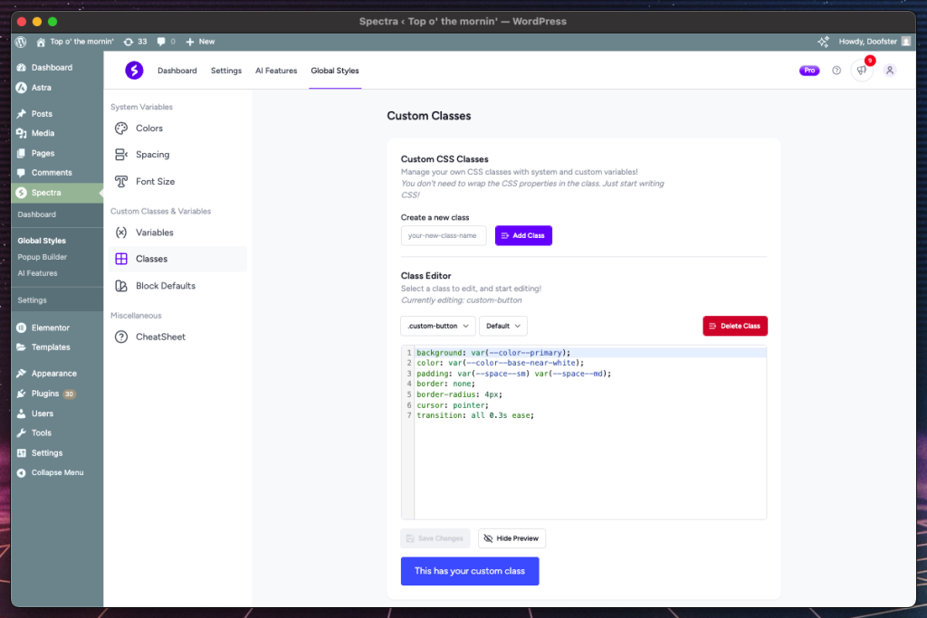
Overview
Custom Classes allow you to create reusable CSS classes with comprehensive interactive state support. This powerful feature includes live preview, temporary storage, and professional code editing capabilities.
Key Features
| Feature | Description | Capability |
|---|---|---|
| Class Management | Create, edit, delete custom classes | Full CRUD operations |
| Interactive States Support | Hover, focus, active, and structural states | Complete interaction coverage |
| Live Preview | Real-time preview with state testing | Immediate visual feedback |
| Code Editor Integration | Syntax-highlighted CSS editor | Professional development experience |
| Temporary Storage | Complex state management for unsaved work | Work preservation system |
Interactive State Categories
Action States
For user interactions:
- hover: Mouse hover state
- active: Click/pressed state
- focus-visible: Keyboard focus (visible focus indicator)
- focus-within: When child element has focus
Input States
For form elements:
- disabled: Disabled form inputs
- checked: Selected checkboxes/radio buttons
Link States
For link elements:
- visited: Previously visited links
Structural States
For element position:
- first-child: First child element
- last-child: Last child element
- only-child: Single child element
Class Creation Workflow
- Create New Class
- Enter class name (without leading dot) under “Create a new class”
- Validation ensures proper CSS class naming
- Click on the “Add Class” button to create your new class
- Select Class and Interactive State
- Choose the class to edit from dropdown (newly created classes automatically get selected)
- Choose from comprehensive dropdown
- Default state (none) for base styling
- Each state creates separate CSS rules for the selected class
- Write CSS Properties
- Use the code editor for CSS properties
- Syntax highlighting and validation
- Auto-completion for common properties
- Preview and Test
- Live preview updates in real-time
- Interactive testing of different states
- Visual confirmation of styling
- Save and Manage
- Individual save per class
- Temporary storage preserves unsaved work
- Confirmation dialog with visual preview on class deletion
Preview System
Dynamic Rendering
The preview system adapts based on the selected interactive state:
- Default/None: Simple div with class applied
- Action States: Interactive button for testing hover/active/focus
- Structural States: Multiple elements showing position relationships
Live Stylesheet Injection
- CSS immediately applied to preview element
- Real-time updates as you type
- Context-appropriate preview elements
Temporary Storage System
Cross-navigation Persistence
- Unsaved changes preserved when switching tabs
- Individual storage per class
- Warning before leaving with unsaved work
- Automatic restoration on return
Smart Cleanup
- Storage cleared when changes are saved
- Automatic cleanup of empty entries
- Memory-efficient management
Class Configuration Examples
Card Component
/* Base card class */
.custom-card {
  background: white;
  border-radius: 8px;
  padding: 1.5rem;
  box-shadow: 0 2px 4px rgba(0,0,0,0.1);
  transition: box-shadow 0.3s ease;
}

/* Hover enhancement */
.custom-card:hover {
  box-shadow: 0 8px 16px rgba(0,0,0,0.15);
}
Button Styling (with Global Styles variables)
/* Base button class */
.custom-button {
  background: var(--color--primary);
  color: var(--color--base-near-white);
  padding: var(--space--sm) var(--space--md);
  border: none;
  border-radius: 4px;
  cursor: pointer;
  transition: all 0.3s ease;
}

/* Hover state */
.custom-button:hover {
  background: var(--color--primary-dark);
  transform: translateY(-2px);
}

/* Focus Visible state */
.custom-button:focus-visible {
  background: var(--color--primary-dark);
  transform: translateY(-2px);
}
Best Practices
- Class Naming
- Use descriptive, semantic names
- Follow BEM methodology when appropriate
- Avoid conflicts with existing classes
- Interactive State Usage
- Always define base styles first
- Use transitions in the default state for smooth interactions
- Test all different states thoroughly
- CSS Organization
- Group related properties together
- Use consistent property ordering
- Performance Considerations
- Limit complex selectors and calculations
- Use efficient CSS properties
Block Defaults
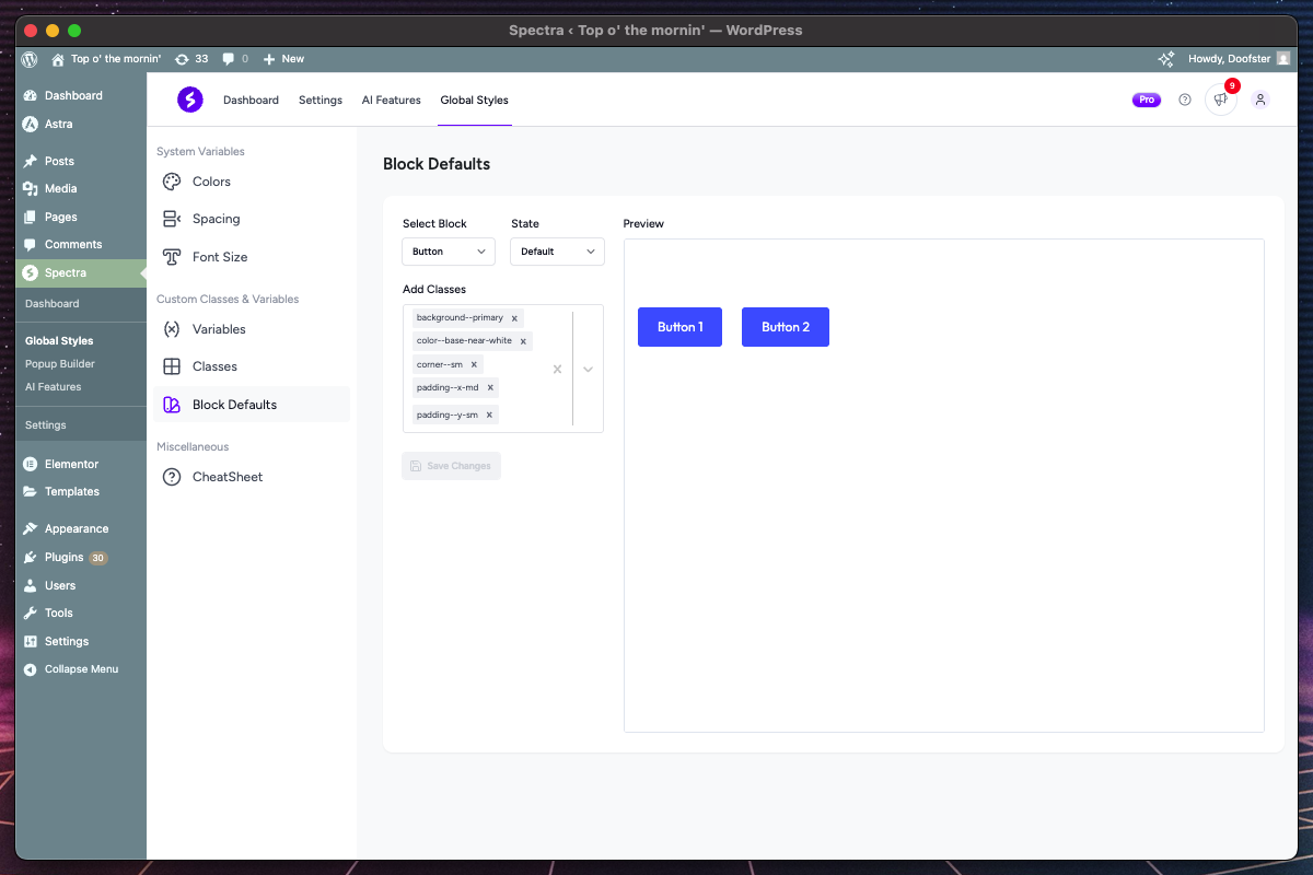
Overview
Block Defaults allow you to automatically apply Global Styles classes to new Spectra blocks as they’re created. This system includes live preview, interactive state support, and intelligent block categorization.
Key Features
| Feature | Description | Benefit |
|---|---|---|
| Block Selection | Dropdown with organized block categories | Easy block discovery |
| Live Preview | Real-time block preview with applied classes | Visual confirmation |
| Interactive State Support | Default, hover, focus-visible states | Complete interaction styling |
| Automatic Application | Classes applied to new blocks instantly | Workflow efficiency |
| Parent/Child Relationships | Smart handling of complex block structures | Proper context rendering |
Block Organization Structure
Dropdown Sections
Blocks are organized in collapsible groups for better navigation:
Common Blocks
- Container, Text, Google Map, Separator – individual standalone blocks
- Frequently used, simple blocks without child components
Complex Block Groups
- Button Blocks: Buttons → Button (parent/child relationship)
- Icon Blocks: Icons → Icon (parent/child relationship)
- List Blocks: List → List Item + List Icon (parent with multiple children)
- Tabs Blocks: Tabs → Tab Area + Tab + Panel (complex hierarchy)
- Accordion Blocks: Accordion → Accordion Item + Header + Details + Header Title + Header Icon (complex hierarchy)
- Slider Blocks: Slider → Slide (parent/child relationship)
- Countdown Blocks: Countdown → Day Container + Hour Container + Minute Container + Second Container + Number + Label + Separator + Expiry Wrapper (complex hierarchy)
- Modal Blocks: Modal → Trigger + Trigger: Button + Trigger: Content + Trigger: Icon + Overlay + Popup + Close Icon (complex hierarchy)
- Loop Builder Blocks: Loop Builder → Search + Filter + Filter: Dropdown + Filter: Checkbox + Filter: Button + Reset Button + Sort + Template + Pagination + Previous Button + Page Numbers + Next Button + No Results (complex hierarchy)
How Block Defaults Work
Automatic Class System
- Default Class Assignment: Every supported block automatically gets a
default-[blockname]class - CSS Generation: When defaults are configured, CSS is generated for the default class
- Universal Application: All Spectra blocks on the page inherit their default styling (existing and new blocks)
- Removable Classes: Default classes can be removed from individual blocks if desired
- No Configuration: If no defaults set, default class remains empty (no visual impact)
Configuration Interface
Block Selection
- Organized Dropdown: Groups with section headers and expand/collapse
- Visual Hierarchy: Indication of parent/child relationships
Class Assignment
- Multi-select Interface: Choose multiple Global Styles classes per block
- Interactive State Tabs: Configure different states independently
- Class Preview: See all assigned classes with descriptions
- Quick Removal: Easy class deselection
Live Preview System
- Iframe-based Preview: Isolated preview environment that renders the actual blocks as in the editor
- Parent Block Rendering: Child blocks when selected are shown within parent context
- Real-time Updates: Preview updates immediately when classes change
- Interaction Testing: Test hover/focus states live
Preview System Architecture
CSS Management
- Comprehensive Loading: All Global Styles CSS loaded initially
- Incremental Updates: Individual class additions/removals
- Performance Optimization: Minimal DOM manipulation
Supported Blocks
All Spectra and Spectra Pro blocks are supported by the Block Defaults system. This includes both standalone blocks and complex parent/child block systems with their nested components.
Configuration Examples
Button Styling
// Block Defaults configuration
"button": {
  "default": ["background--primary", "corner--md", "padding--sm"],
  "hover": ["background--primary-dark"],
  "focus-visible": ["background--primary-darker"]
}
Result: All Button blocks automatically get:
- Primary background color
- Medium border radius
- Small padding
- Dark primary background on hover
- Darker primary background on focus-visible
Container Sections
"container": {
  "default": ["padding--lg", "background--base-light"],
  "hover": ["background--base-lighter"]
}
Result: All Container blocks get:
- Large padding for sections
- Light base background color
- Lighter background on hover
Best Practices
- Strategic Class Assignment
- Start with most commonly used blocks
- Apply foundational styling (colors, spacing)
- Add interaction states for engaging user experience
- Hierarchy Consistency
- Ensure parent and child blocks work together
- Test complex block structures thoroughly
- Maintain visual relationships between related blocks
- Performance Considerations
- Limit number of classes per block
- Use efficient CSS selectors
- Test changes in both editor and frontend contexts
- Maintenance Strategy
- Document your default class assignments
- Review and update defaults when design changes
- Test new blocks after theme or plugin updates
CheatSheet Reference
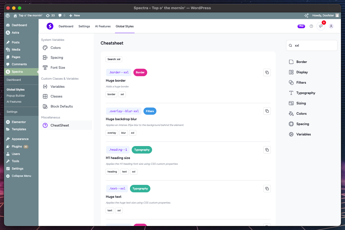
Overview
The CheatSheet is a comprehensive, searchable reference for all available Global Styles classes and variables. It provides quick access to copy class names, understand their purposes, and discover available styling options.
Key Features
| Feature | Description | Benefit |
|---|---|---|
| Comprehensive Search | Full-text search across all classes | Quick discovery |
| Category Filtering | Filter by CSS category (colors, typography, etc.) | Organized browsing |
| Tag-based Filtering | Multi-select tag filtering | Precise targeting |
| Copy to Clipboard | One-click copying of class names | Efficient workflow |
| Visual Organization | Color-coded categories and clear descriptions | Easy scanning |
Search and Filter System
Search Functionality
- Multi-criteria Search: Searches class names, descriptions, help text, and tags
- Real-time Results: Instant filtering as you type
- Highlighting: Search terms highlighted in results
- Case Insensitive: Finds matches regardless of capitalization
Category Filters
Available categories with color coding:
- Border – Border styles, radius, widths
- Colors – Background colors, text colors, gradients
- Display – Layout properties, visibility, positioning
- Filters – Visual effects, transforms, opacity
- Typography – Fonts, sizes, weights, spacing
- Sizing – Width, height, max/min dimensions
- Spacing – Margins, padding, gaps
- Variables – CSS variables that can be used in your custom classes
Tag Filtering
- Multi-select Interface: Choose multiple tags simultaneously
- Visual Indicators: Active filters shown as removable chips
- Tag Combinations: AND logic for multiple tag selections
- Quick Removal: Click filter chips to remove
Interface Layout
Two-Column Design
- Main Content Area (3/4 width): Search results and class listings
- Filter Sidebar (1/4 width): Search and filter controls
- Responsive Behavior: Stacks on mobile devices
Result Display
- Class Name: Prominent display with copy button
- Description: Clear explanation of class purpose
- Category Badge: Color-coded category indicator
- Tags: Related keywords for filtering
Pagination System
- Batch Loading: 100 items per page by default
- Performance Optimization: Smooth scrolling with large datasets
- Page Navigation: Ellipsis-based page number display
Copy to Clipboard System
One-Click Copying
- Class Names: Copy CSS class names directly to use in the Global Styles setting for the blocks in the editor
- CSS Variables: Copy CSS variables directly to be used in your custom classes
- Toast Notifications: Success/failure feedback
Usage Workflow
- Search/Filter: Find the class you need
- Copy: Click the copy icon next to class name
- Apply: Paste in your CSS or Global Styles interface
Class Organization
Naming Conventions
Global Styles classes follow consistent patterns:
- Property: CSS property being affected (background, corner, padding, etc.)
- Double Dash:
--separator between property and value - Value: Color, size, or variant specification
Examples:
background--primary     /* Primary background color */
background--primary-dark /* Dark primary background color */
corner--md             /* Medium border radius */
padding--lg            /* Large padding */
text--secondary        /* Secondary text color */
Available Class Types
Border Classes
- Border radius options for rounded corners
- Border styles and widths
- Border color variations
Display Classes
- Layout properties and positioning
- Visibility and display controls
- Alignment utilities for grid and flex
Filters Classes
- Visual effects like background blur
Typography Classes
- Font size classes matching system scale
- Line height options for text spacing
Sizing Classes
- Width and height utilities
- Aspect ratio controls
- Object fit properties
Colors Classes
- Background colors with shade variations
- Text colors with contrast optimization
- Overlay colors for layering effects
Spacing Classes
- Padding classes (all sides, individual sides)
- Margin classes (all sides, individual sides)
- Gap classes for flexbox/grid layouts
Variables Classes
- CSS custom properties for colors
- System spacing variables
- Typography scale variables
How to Use the CheatSheet
Discovery Workflow
- Browse by Category: Use category filters to explore specific styling areas
- Search by Purpose: Type full terms like “primary”, “border”, “secondary lighter”
- Filter by Tags: Combine tags like “lg” + “text” for specific needs
- Copy and Apply: Use copied class names or variables in your blocks or custom classes
Integration with Other Tabs
- Custom Classes: Reference available variables when writing custom CSS
- Block Defaults: Find appropriate classes for automatic application
- Block Editor: Find the best classes for easier fine-tuning
Best Practices
- Efficient Discovery
- Use specific search terms rather than browsing all classes
- Combine category and tag filters for precise results
- Remember frequently used classes for quick reference
- Class Selection Strategy
- Choose semantic classes over utility classes when possible using Custom Classes
- Prefer system-defined spacing/colors over custom values
- Test class combinations for design consistency
- Integration Workflow
- Use CheatSheet to discover available options
- Copy class names for use in Custom Classes, Block Defaults or for blocks in the Gutenberg Block Editor
- Reference variable names when writing Custom Variables
Tips and Best Practices
Design System Strategy
- Start with System Variables
- Establish your color palette first, and prefer the theme color palette over custom colors
- Define spacing scale before creating classes
- Set typography hierarchy early in the process
- Build Progressively
- Begin with essential colors and spacing
- Add custom classes as needed
- Configure block defaults after establishing base styles
- Maintain Consistency
- Use system values throughout custom classes
- Avoid hardcoded values when system options exist
- Document your design decisions
Workflow Optimization
- Use Temporary Storage
- Work on multiple classes simultaneously if needed
- Switch between tabs without losing work
- Save important work frequently
- Preview Everything
- Test all states before saving
- Verify classes work across different screen sizes
- Verify block default applications
- Organize Your Work
- Name classes and variables descriptively
- Group related styles together
- Use consistent naming conventions
Performance Considerations
- Efficient CSS
- Limit complex selectors in custom classes
- Use system variables instead of custom values
- Avoid redundant or unused classes
- Block Defaults Strategy
- Apply defaults selectively to commonly used blocks
- Verify styles appear correctly in the editor
- Ensure consistent styling with states across editor and frontend
- Regular Maintenance
- Remove unused custom classes and variables
- Update system values when redesigning
- Test compatibility with theme updates
Troubleshooting
Common Issues
Changes not appearing on frontend?
- Clear browser and caching plugin cache
- Check if theme CSS is overriding styles
- Verify classes are properly applied to blocks
Color variables not updating?
- Confirm save operation completed successfully
- Check browser console for JavaScript errors
- Clear any browser caching that might prevent updates
Custom classes not working?
- Validate CSS syntax in the code editor
- Check for naming conflicts with existing classes
- Ensure proper specificity for style overrides
Block defaults not applying?
- Verify block type is supported in system
- Check if classes are properly saved
- Test with fresh block insertion
Preview system not loading?
- Disable browser extensions that might block iframes
- Check browser console for error messages
- Try refreshing the page or clearing browser cache
Performance Issues
Dashboard loading slowly?
- Check for conflicts with other plugins
- Verify adequate server memory allocation
- Monitor network requests in browser developer tools
Editor lagging after applying global styles?
- Reduce number of classes applied per block
- Check for CSS conflicts causing layout thrashing
- Clear browser cache and refresh the editor
Frequently Asked Questions
Q: Can I export my Global Styles configuration?
A: Currently, Global Styles settings are stored in the WordPress database. Consider using WordPress export/import or database migration for moving configurations.
Q: Where can I use Global Styles?
A: Global Styles are designed to work with Spectra and Spectra Pro blocks in the Gutenberg Block Editor, providing seamless styling integration.
Q: How do I backup my Global Styles settings?
A: Global Styles data is stored in WordPress options. Include these in your regular database backups or use plugins that backup options specifically.
Q: Can I use Global Styles with custom themes?
A: Absolutely. Global Styles work with any WordPress theme and can even integrate with your theme’s color palette for consistent design across your site.
Q: Is there a limit to custom classes or variables?
A: While there’s no hard limit, performance can be impacted by extremely large numbers. We recommend staying under 100 custom classes for optimal performance.
Q: How are Global Styles optimized for performance?
A: Global Styles generates lightweight CSS by only including the classes actually used by Spectra blocks on each page, ensuring minimal impact on page load times.
Integration with Spectra Blocks
How Global Styles Enhance Blocks
- Automatic Integration
- Block defaults automatically apply to new blocks
- No additional configuration required for basic styling
- Consistent branding across all content
- Advanced Customization
- Custom classes available in all Spectra blocks
- System variables accessible throughout
- Interactive state support for engaging elements
- Design Efficiency
- Reduce repetitive styling tasks
- Maintain consistency across large sites
- Quick design updates through system variables
Block-Specific Benefits
Buttons Block
- Consistent button styling across site
- Hover and active states automatically applied after configuration
- Brand colors maintained globally
Container Block
- Standardized section spacing and backgrounds
- Consistent layout patterns
- Theme-integrated color schemes
Typography Blocks
- Hierarchical text sizing
- Consistent line heights and spacing
- Responsive typography scaling
Compatibility and Requirements
System Requirements
- WordPress: 6.6.0 or higher required
- PHP: 8.1 or higher
- Modern Browsers: Chrome 80+, Firefox 75+, Safari 13+, Edge 80+ with CSS Grid/Flexbox support
Theme Compatibility
- Universal Theme Support: Works with all standard WordPress themes
- Block Theme Integration: Full compatibility with block and classic themes using Gutenberg
- Advanced Theme Color Integration: Automatically detects and synchronizes with your active theme’s color palette, allowing seamless switching between theme colors and custom colors while maintaining design consistency across theme changes
Performance Considerations
- Server Resources: Adequate PHP memory and server memory for CSS generation and class processing
- JavaScript Requirements: Full functionality requires JavaScript enabled for dashboard features and real-time preview system
- Frontend Impact: Minimal impact on page load times with optimized CSS delivery
We don't respond to the article feedback, we use it to improve our support content.