- Section
- Troubleshooting: Missing Icons
- Spectra Patterns
- Contact Form 7: Multiple Column Fields
- Contact Form 7: Checkbox / Radio / Acceptance Control
- Unable To Style Contact Form 7
- Tab Index For Multiple Gravity Forms
- Getting Started With Spectra
- Exclude Heading From TOC
- Block Display Conditions
- Importing Starter Templates With Spectra
- Getting Started With Spectra
- Manually Install Spectra Via FTP
- Automatic Beta Updates
- Rollback To Previous Versions
- Load Google Fonts Locally
- Activate Spectra Pro License
- Install Spectra Pro
- Translate Strings With Loco Translate
- Process Refund Requests
- Transparent / Sticky Header
- Change Site Logo
- Change Global Styles
- Disable Title on Posts & Pages
- Transparent / Sticky Header For Single Page / Post
- Change Header & Footer Patterns
- Custom / Google Fonts
- Reset Global Default Styling
- Manually Install Spectra One Via FTP
- Enable / Disable Header & Footer On Specific Pages / Posts
- Container
- Buttons
- List
- Modal
- Slider In Spectra
- Animations In Spectra
- Icons
- Tabs In Spectra
- Text Block In Spectra
- Countdown In Spectra
- Loop Builder In Spectra
- Image Mask In Spectra
- Dynamic Content In Spectra
- Global Styles In Spectra
- Accordion In Spectra
- Responsive Control In Spectra
- Font Management In Spectra
- Google Maps
- Separator
- Getting Started With Spectra
- Public Actions and Hooks In Spectra
- Popup Builder In Spectra
- Counter Block In Spectra
- Login Block in Spectra
- Register Block In Spectra
- Spectra Design Library Guide
- How to Enable Spectra 3 Beta
- Preview Options in Spectra (Desktop, Tablet & Mobile)
List
Introduction
The List Block is an enhanced version of WordPress’s standard list functionality, offering advanced styling options, custom icons, and extensive customization capabilities. Perfect for creating feature lists, step-by-step instructions, table of contents, or any structured content that needs visual hierarchy. Unlike the core list block, this block allows you to use custom icons, advanced numbering styles, and individual item styling.
How to Add or Use the Block in the Gutenberg Editor
- Adding the Block
- Click the “+” button to open the block inserter
- Search for “List” or navigate to the Spectra category
- Click on the List Block to add it to your page
- The block starts with three default list items
- Adding List Items
- Type your content in the first item
- Press Enter to create a new list item
- Press Tab to create a nested sub-list
- Press Shift+Tab to outdent items
- Customizing List Style
- Use the toolbar to switch between ordered/unordered
- For unordered lists: Choose custom icons
- For ordered lists: Select numbering style
- Apply colors and styling from the settings panel
Block Styling Options
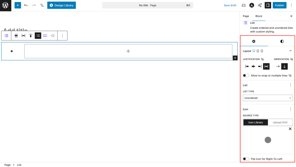
List Type Settings
| Option | Description | Available Settings |
|---|---|---|
| List Type | Choose list format | Unordered (bullets), Ordered (numbers) |
| Layout | List orientation | Vertical, Horizontal |
Unordered List Options
| Option | Description | Available Settings |
|---|---|---|
| Icon | Custom bullet icon | Icon picker with categories |
| Icon Size | Size of list icons | 10-100px |
| Icon Rotation | Rotate icon angle | 0-360 degrees |
| Flip for RTL | Mirror icons for RTL | On/Off toggle |
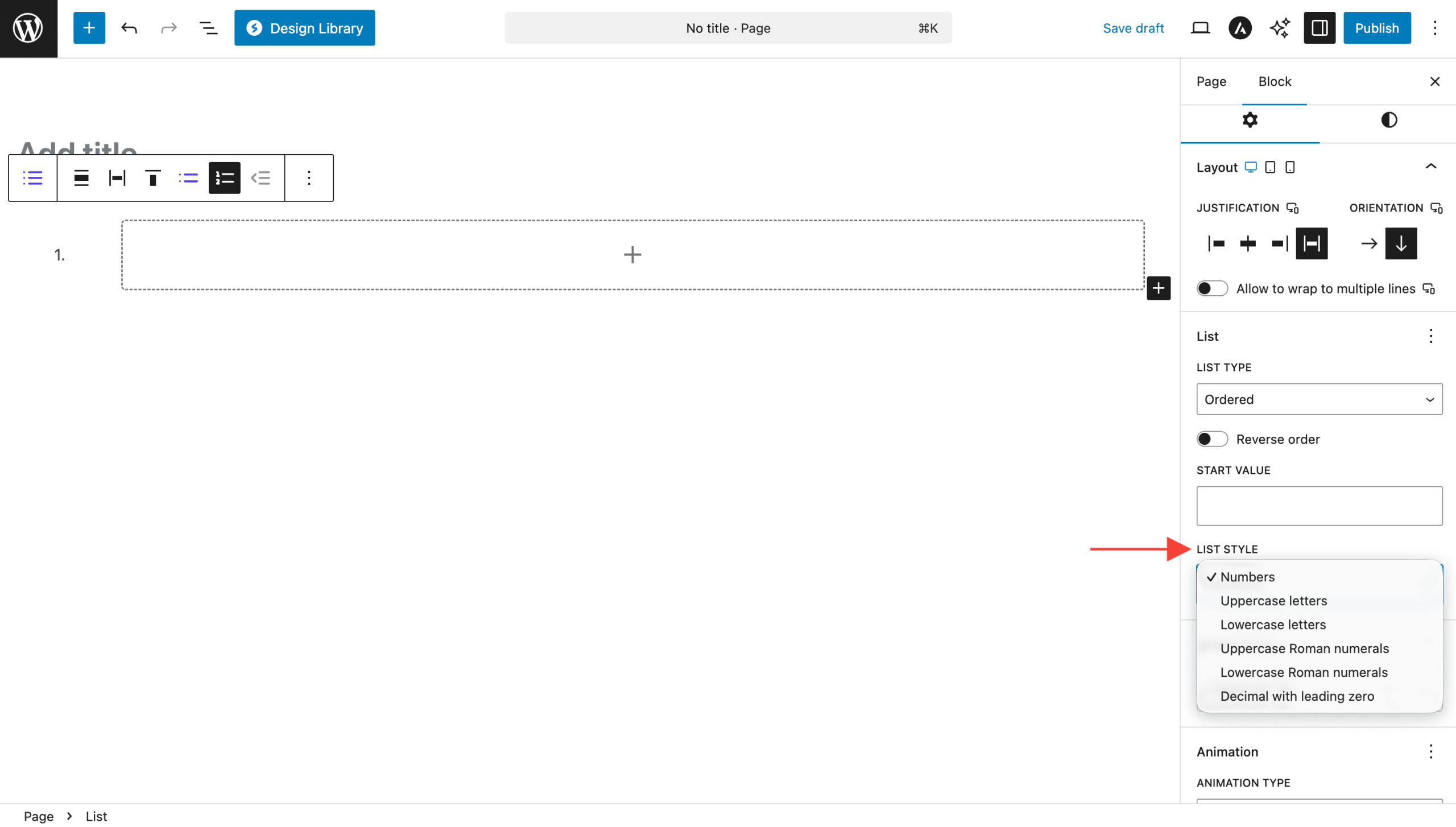
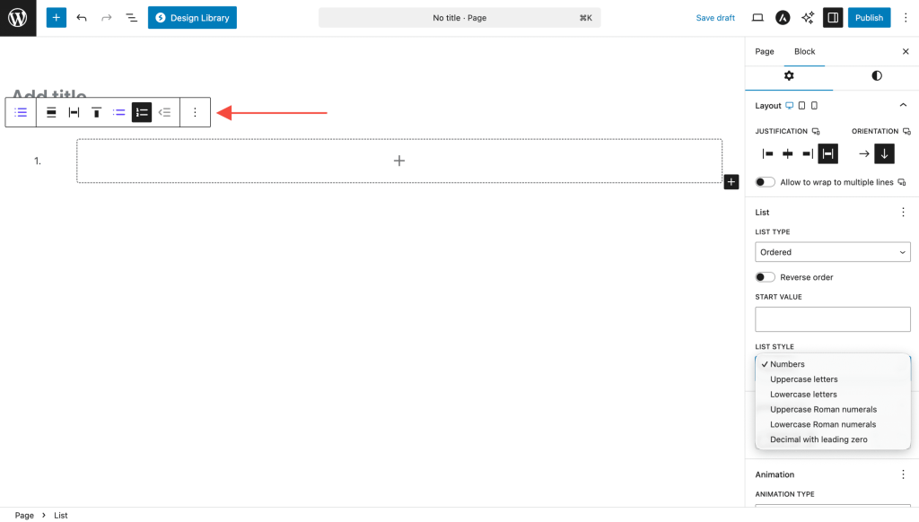
Ordered List Options
| Option | Description | Available Settings |
|---|---|---|
| List Style | Numbering format | See table below |
| Start Value | Beginning number | Any integer |
| Reversed | Count backwards | On/Off toggle |
Numbering Styles
| Style | Example | Description |
|---|---|---|
| Decimal | 1, 2, 3 | Standard numbers |
| Decimal Leading Zero | 01, 02, 03 | Numbers with leading zeros |
| Upper Alpha | A, B, C | Uppercase letters |
| Lower Alpha | a, b, c | Lowercase letters |
| Upper Roman | I, II, III | Uppercase Roman numerals |
| Lower Roman | i, ii, iii | Lowercase Roman numerals |
Color Settings
| Option | Description | Available Settings |
|---|---|---|
| Text Color | List item text color | Color picker |
| Text Hover Color | Text color on hover | Color picker |
| Background Color | Item background | Color/Gradient picker |
| Background Hover | Background on hover | Color/Gradient picker |
Typography & Spacing
| Option | Description | Available Settings |
|---|---|---|
| Typography | Text styling | Font, size, weight, line height |
| Block Gap | Space between items | 0-100px (Responsive) |
| Padding | Internal item spacing | Top, Right, Bottom, Left |
| Margin | External list spacing | Top, Right, Bottom, Left |
Advanced Features
Custom Icons for Lists
Transform boring bullets into engaging visuals:
- Select an unordered list
- Open the icon picker
- Choose from hundreds of Font Awesome icons
- Customize size and rotation
- Icons automatically update for all items
Popular icon choices:
- Checkmarks for feature lists
- Arrows for process steps
- Stars for highlights
- Pins for locations
- Lightbulbs for tips
Advanced Numbering
Create sophisticated numbered lists:
- Legal Documents: Use Roman numerals (I, II, III)
- Outline Format: Combine letters and numbers
- Technical Docs: Leading zeros (01, 02, 03)
- Reverse Lists: Countdown format
- Custom Start: Begin from any number
Horizontal Lists
Perfect for:
- Navigation menus
- Tag lists
- Inline options
- Social media links
- Breadcrumb trails
Nested Lists
Create hierarchical content:
- Press Tab to indent (create sub-list)
- Press Shift+Tab to outdent
- Mix ordered and unordered lists
- Each level can have different styling
- Unlimited nesting levels
Block Toolbar Options
List Block Toolbar
- List Type Toggle: Switch between ordered/unordered
- Text Alignment: Align list content
- Indent/Outdent: Create nested lists
- Transform: Convert to other blocks
Individual Item Options
- Move items up/down
- Delete specific items
- Convert to paragraph
Common Use Cases
- Feature Lists: Product features with checkmark icons
- Step-by-Step Guides: Numbered instructions
- Table of Contents: Hierarchical document structure
- FAQ Lists: Questions with custom icons
- Navigation Menus: Horizontal lists with links
- Pros and Cons: Different icons for positive/negative
- Contact Information: Icons for phone, email, address
- Social Media Links: Brand icons in horizontal layout
Styling Examples
Clean Minimal Lists
- Simple text color
- No backgrounds
- Small, subtle icons
- Adequate spacing
Highlighted Feature Lists
- Colored icons (brand colors)
- Light background on items
- Hover effects
- Generous padding
Numbered Process Steps
- Large numbers
- Circular backgrounds
- Different colors per step
- Clear hierarchy
Icon-Rich Lists
- Meaningful icons
- Consistent icon size
- Color-coded by category
- Professional appearance
Responsive Controls
Device-Specific Settings
| Setting | Desktop | Tablet | Mobile |
|---|---|---|---|
| Font Size | ✓ | ✓ | ✓ |
| Icon Size | ✓ | ✓ | ✓ |
| Block Gap | ✓ | ✓ | ✓ |
| Padding | ✓ | ✓ | ✓ |
| Margin | ✓ | ✓ | ✓ |
Mobile Considerations
- Reduce font size for better fit
- Increase touch targets for links
- Stack horizontal lists on small screens
- Simplify nested structures
Tips and Best Practices
Content Guidelines
- Consistency: Keep list items similar in length
- Clarity: Start items with strong action words
- Hierarchy: Use nesting sparingly (2-3 levels max)
- Scannability: Front-load important information
Design Best Practices
- Icon Selection: Choose icons that enhance meaning
- Color Usage: Use color to group or categorize
- Spacing: Ensure adequate space between items
- Contrast: Maintain readability with backgrounds
Performance Tips
- Icon Optimization: Use simple icons for better performance
- List Length: Break very long lists into sections
- Nesting Depth: Limit nesting for better mobile experience
Accessibility Considerations
- Semantic HTML: Proper list structure for screen readers
- Color Contrast: Ensure WCAG compliance
- Focus States: Visible focus for interactive items
- Meaningful Order: Logical sequence of items
Copy and Paste Styles
The List Block supports style copying:
- Style your first list perfectly
- Select the list and copy styles
- Select another list and paste styles
- All styling transfers instantly
Troubleshooting
Icons not showing?
- Check if icon is selected in settings
- Verify list type is set to unordered
- Clear browser cache
- Check for theme conflicts
Numbering incorrect?
- Verify start value setting
- Check if reversed is unintentionally enabled
- Ensure proper list type is selected
Horizontal layout not working?
- Check layout setting in block options
- Verify theme doesn’t override flexbox
- Ensure adequate container width
Nested lists not indenting?
- Use Tab key for indenting
- Check if items are properly nested
- Verify theme supports nested lists
Hover effects not visible?
- Ensure hover colors differ from default
- Check if theme overrides hover states
- Test in preview mode
Frequently Asked Questions
Q: Can I use different icons for each list item?
A: Currently, all items in a list share the same icon. For different icons, use multiple lists or the Icons block.
Q: How do I create a checklist?
A: Use an unordered list with checkmark icons. For interactive checkboxes, consider a forms plugin.
Q: Can I mix ordered and unordered in one list?
A: Not in the same level, but you can nest different list types.
Q: Is there a limit to list items?
A: No hard limit, but very long lists (50+ items) may impact performance.
Q: Can I add images to list items?
A: Yes! List items can contain any blocks, including images, buttons, or even other lists.
Q: How do I link entire list items?
A: Add links to the text within items. For full-item links, consider using custom HTML.
Advanced Customization
Complex List Layouts
Combine with other blocks:
- List + Columns: Multi-column lists
- List + Container: Boxed list sections
- List + Image: Icon alternatives
- List + Buttons: Interactive lists
Available Extensions
Animation Extension
Animate your lists:
- Stagger animations for items
- Entrance effects
- Smooth reveals
- Attention-grabbing motion
Migration from Core List Block
Converting existing lists:
- Copy content from core list
- Add Spectra List block
- Paste content
- Apply advanced styling
- Delete original list
Benefits of migrating:
- Custom icons
- Advanced numbering
- Hover effects
- Better spacing control
- Responsive options
Compatibility and Requirements
System Requirements
- WordPress: 6.6.0 or higher
- PHP: 8.1 or higher
- Browser: Modern browsers with CSS flexbox support
Theme Compatibility
- Works with all standard themes
- May require CSS adjustments for some themes
- Full compatibility with block themes
Icon Support
- Font Awesome 5+ icons
- SVG rendering
- RTL language support
We don't respond to the article feedback, we use it to improve our support content.