- Section
- Troubleshooting: Missing Icons
- Spectra Patterns
- Contact Form 7: Multiple Column Fields
- Contact Form 7: Checkbox / Radio / Acceptance Control
- Unable To Style Contact Form 7
- Tab Index For Multiple Gravity Forms
- Getting Started With Spectra
- Exclude Heading From TOC
- Block Display Conditions
- Importing Starter Templates With Spectra
- Getting Started With Spectra
- Manually Install Spectra Via FTP
- Automatic Beta Updates
- Rollback To Previous Versions
- Load Google Fonts Locally
- Activate Spectra Pro License
- Install Spectra Pro
- Translate Strings With Loco Translate
- Process Refund Requests
- Transparent / Sticky Header
- Change Site Logo
- Change Global Styles
- Disable Title on Posts & Pages
- Transparent / Sticky Header For Single Page / Post
- Change Header & Footer Patterns
- Custom / Google Fonts
- Reset Global Default Styling
- Manually Install Spectra One Via FTP
- Enable / Disable Header & Footer On Specific Pages / Posts
- Container
- Buttons
- List
- Modal
- Slider In Spectra
- Animations In Spectra
- Icons
- Tabs In Spectra
- Text Block In Spectra
- Countdown In Spectra
- Loop Builder In Spectra
- Image Mask In Spectra
- Dynamic Content In Spectra
- Global Styles In Spectra
- Accordion In Spectra
- Responsive Control In Spectra
- Font Management In Spectra
- Google Maps
- Separator
- Getting Started With Spectra
- Public Actions and Hooks In Spectra
- Popup Builder In Spectra
- Counter Block In Spectra
- Login Block in Spectra
- Register Block In Spectra
- Spectra Design Library Guide
- How to Enable Spectra 3 Beta
- Preview Options in Spectra (Desktop, Tablet & Mobile)
Loop Builder In Spectra
Introduction
Create powerful, dynamic post listings with advanced filtering, searching, sorting, and pagination – all without page reloads using modern WordPress Interactivity API.
Getting Started
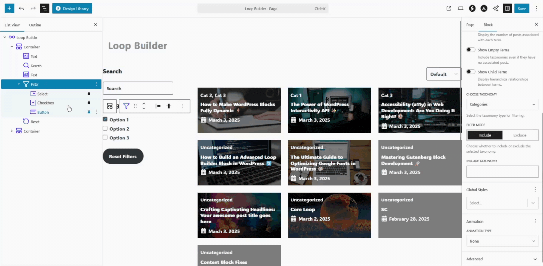
Adding the Block
- Click the “+” button in the block editor
- Search for “Loop Builder” or find it in the Spectra Pro category
- Click to add the block to your page
- Choose from 7 pre-built variations or start from scratch
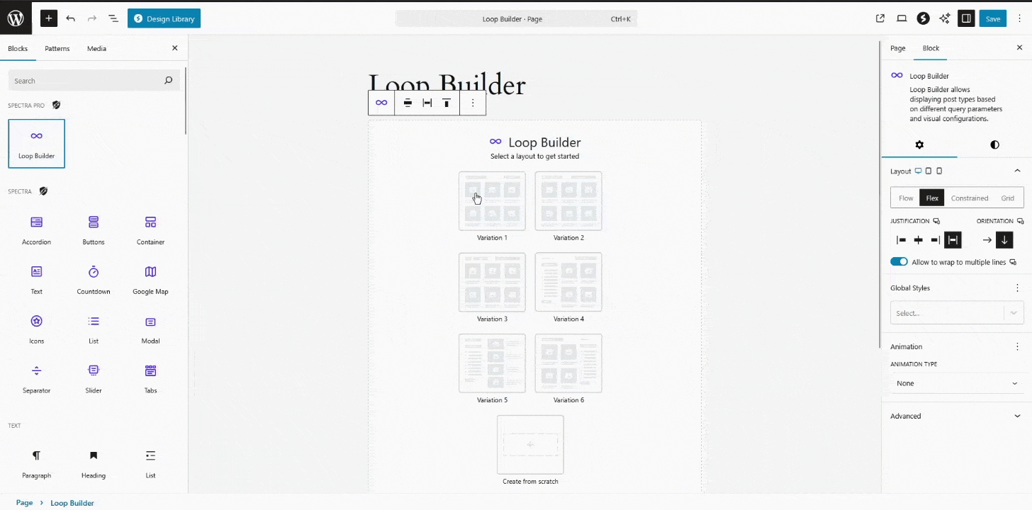
Complete process: Adding block, selecting variation, customizing template, and adding filters
The Loop Builder automatically displays your latest posts. Customize the query, add filters, and style your layout using the comprehensive settings panels.
Core Features
Advanced Post Querying
Display any post type with powerful filtering options using WordPress’s optimized query system.
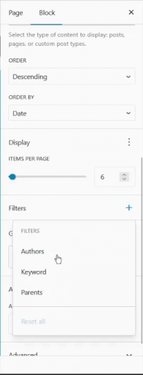
Configuration:
- Post Types: Posts, pages, or any custom post type
- Query Controls: Posts per page, offset, max pages
- Sorting: Date, title, author, ID, modified date (ascending/descending)
- Filters: Authors, taxonomies, parent posts, post formats, sticky posts
Real-time Interactions (No Page Reloads)
All filtering, searching, sorting, and pagination happens instantly using WordPress Interactivity API.
Interactive Features:
- Live Search: 500ms debounced search as you type
- Dynamic Filtering: Instant filter application with URL updates
- AJAX Pagination: Smooth page transitions
- Sort Updates: Real-time result reordering
- State Management: Maintains filter state in URL for bookmarking
Template System
Design custom post layouts using any WordPress blocks with multiple pre-built template variations.
Available Templates:
- Portrait 1: Clean 3-column grid with featured image, date, title, excerpt
- Portrait 2: Card-style design with author avatar and category
- Landscape: 2-column horizontal layout with content beside image
- Boxed: Overlay design with dynamic featured image backgrounds
- Create from Scratch: Start with just a post title
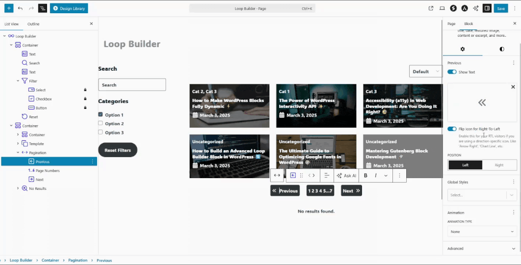
Block Architecture
The Loop Builder uses a parent-child system where each component can be used independently:
Loop Builder
- Template (Required) – Post Display Layout
- Search – Live search input
- Filter – Taxonomy filtering (Select/Button/Checkbox)
- Sort – Post ordering options
- Pagination – Previous/Next/Page Numbers
- Reset – Clear all filters
- No Results – Fallback content
Pre-built Variations
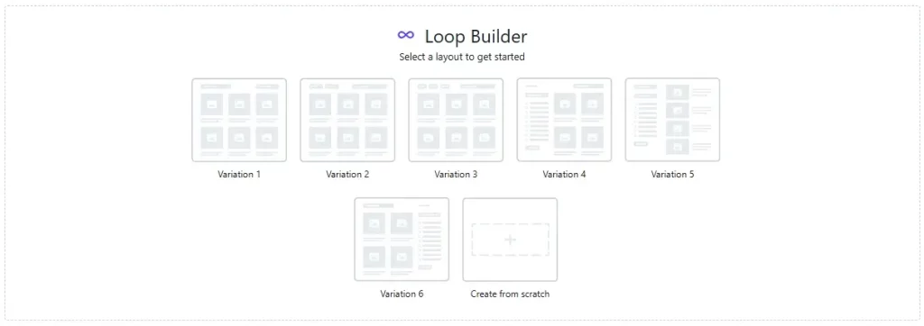
All 7 pre-built variations available when adding Loop Builder
Variation 1 – Basic Layout (Recommended for Beginners)
- Horizontal search and category filter
- 3-column grid template
- Simple pagination
- Perfect for blogs and news sites
Variation 2 – Advanced Filters (Content-Heavy Sites)
- Left: Category filter and sort dropdown
- Right: Search and reset button
- Professional layout for magazines
Variation 3 – Button Filters (Visual Appeal)
- Button-style category filtering
- Great for portfolios and product displays
- Engaging interactive design
Variation 4 – Sidebar Layout (Blog/Magazine Style)
- Left sidebar: Search, checkbox filters, reset
- Right: Content area with sort controls
- Classic blog layout
Variation 5 – Extended Sidebar (Directory Style)
- Comprehensive left sidebar with all controls
- Right: Posts and pagination
- Ideal for business directories
Variation 6 – Right Sidebar (Alternative Layout)
- Left: Content with sort controls
- Right: Search and checkbox filters
- Different visual hierarchy
Variation 7 – Create from Scratch (Full Control)
- Minimal setup with just template
- Complete customization freedom
- For advanced users
Settings Tab
Overview of all settings panels and configuration options
Layout Panel
Controls how the Loop Builder integrates with your page:
Layout Type Selection:
- Flow (Default): Inline with other blocks – natural content flow
- Flex: Full alignment control with justification options
- Grid: Responsive grid system with column controls
- Constrained: Maximum width constraint for readability
Flex Layout Controls (When Flex selected)
- Orientation: Horizontal (Default) or Vertical arrangement
- Justification: Left, Center, Right, Space Between, Around, Evenly
- Vertical Alignment: Top, Center, Bottom, Stretch
- Flex Wrap: Allow wrapping or keep single line
- Gap: Spacing between child elements
Settings Panel
Core Loop Builder configuration:
Post Type Selection:
- Posts (Default): Standard blog posts
- Pages: Static pages
- Custom Post Types: Any registered custom post type
- Smart Interface: Shows ToggleGroup for 2 options, Dropdown for 3+
Sorting Configuration:
- Order: How posts are arranged (Default: Descending)
- Ascending: A→Z, Oldest→Newest, Low→High
- Descending: Z→A, Newest→Oldest, High→Low
- Order By: Sort criteria (Default: Date)
- Date: Publication date
- Title: Alphabetical by post title
- Author: By author name
- Last Modified: By last update date
Sticky Posts (Posts only):
- Include (Default): Sticky posts displayed at top of results
- Exclude: Sticky posts hidden from results completely
- Ignore: Sticky posts appear like regular posts, no special placement
- Only: Show only sticky posts in results
Display Panel
Control pagination and post limits:
Posts per Page:
- Default: Uses site setting (Settings → Reading)
- Custom: Override with specific number
- Performance: Recommended 20 or fewer for better performance
Offset:
- Skip Posts: Number of posts to skip from beginning
- Default: 0 (start from first post)
- Use Cases: Skip featured posts, pagination offsets
Max Pages to Show:
- Unlimited (Default): 0 = no limit
- Limited: Set maximum number of pages
- Performance: Recommended 50 or fewer for large sites
Filters Panel
Advanced content filtering:
Taxonomies:
- Auto-Detection: Shows available taxonomies for selected post type
- Multiple Selection: FormTokenField with auto-suggestions
- Smart Suggestions: Case-insensitive matching with existing terms
- Real-time Updates: Debounced input for performance
Authors:
- Multiple Selection: Choose specific authors
- FormTokenField: Auto-complete with existing authors
- User Permissions: Only shows authors with published posts
Keyword Search:
- Search Term: Filter posts by content/title
- Debounced Input: 250ms delay for performance
- Real-time Preview: Shows matching posts as you type
Parents (Hierarchical post types only):
- Page Parents: For pages and custom hierarchical types
- Multiple Selection: Choose multiple parent posts
- Auto-Complete: Suggestions based on existing posts
Formats (If theme supports):
- Post Formats: Standard, Aside, Gallery, Link, Image, Quote, Status, Video, Audio, Chat
- Theme Dependent: Only shows if theme declares support
- Multiple Selection: Choose multiple format types
Child Block Settings
Template Block Settings
The Template Block has minimal custom settings and uses WordPress’s native layout and styling controls:
Template Variations:
Choose from 5 professional designs when first adding the Template block:
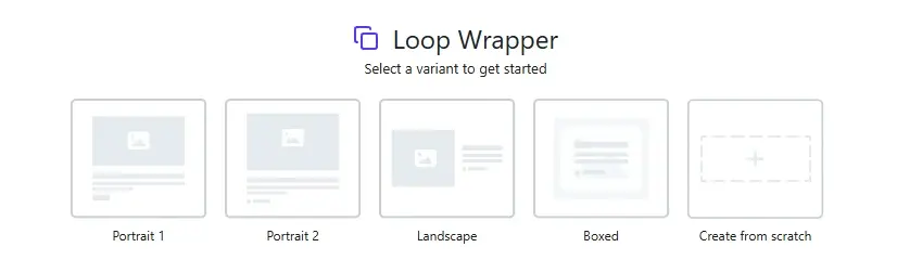
All 5 template layout options available for post display
- Portrait 1: Basic card layout
- Portrait 2: Enhanced with author info
- Landscape: Horizontal image + content
- Boxed: Overlay text on featured image
- Custom: Build from scratch
Color Settings:
- Text: Normal text color
- Background: Background color and gradient
- Link: Link color for linked elements
- Text Hover: Text color on hover
- Background Hover: Background color/gradient on hover
WordPress Native Controls:
The Template Block uses WordPress’s built-in controls for:
- Layout: Grid, Flex, Flow layouts with full configuration
- Typography: Font family, size, weight, line height, letter spacing
- Dimensions: Margin, padding, block gap
- Border & Shadow: Width, color, radius, style, shadow
Essential Post Blocks:
The Template block can contain any WordPress blocks. Core post-related blocks include:
- Post Title – Post title (linkable)
- Post Excerpt – Post summary with custom “Read more” text
- Post Content – Full post content
- Post Featured Image – Featured image with aspect ratio controls
- Post Date – Publication or modified date
- Post Author Name – Author name (linkable)
- Post Author Biography – Author bio/description
- Avatar – Author profile picture
- Post Terms – Categories, tags, or custom taxonomies
- Comments Link – Link to post comments
- Post Navigation Link – Previous/next post navigation
Dynamic Content Support:
Through the Dynamic Content extension, you can add dynamic data to supported Spectra blocks within templates:
- Post Data: Dynamic titles, content, featured images, permalinks
- Custom Fields: Meta values, ACF fields, custom post data
- Author Info: Names, bios, avatars, social links
- Taxonomies: Categories, tags, custom taxonomy terms
Supported Blocks: Text block, Image (Core block), Button, Icon, and other Spectra blocks with Dynamic Content capability.
Filter Block Settings
Filter block configuration options and taxonomy settings
The main Filter Block has only a General settings panel (no color settings):
General Panel:
- Choose Taxonomy: Categories, Tags, or Custom taxonomies (Select)
- Taxonomy Settings: Include/Exclude mode with FormTokenField for specific terms
Note: The main Filter block is a container. Individual filter display types (Select, Checkbox, Button) are separate child blocks with their own specific settings.
Individual Filter Block Settings
Each filter type has its own specific settings when used as individual blocks:
Checkbox Filter Block Settings:
General Panel:
- Layout: Stack (Default) or Inline arrangement (Toggle Group)
Dimensions Panel:
- Checkbox Size: Custom dimensions with unit controls (px, %, em, rem, vw)
- Items Gap: Spacing between individual checkbox items
- Label-Checkbox Gap: Space between checkbox and label text
Color Settings:
- Text Hover: Text color on hover
- Background Hover: Background color/gradient on hover
Button Filter Block Settings:
Color Settings:
- Text Active: Text color for selected/active filter
- Text Focus/Hover: Text color on focus and hover states
- Background Active: Background color/gradient for active filter
- Background Focus/Hover: Background color/gradient on focus and hover
Select Filter Block Settings:
General Panel:
- Select Placeholder: Custom placeholder text for dropdown
Color Settings:
- Text Focus/Hover: Text color on focus and hover states
- Background Focus/Hover: Background color/gradient on focus and hover
Search Block Settings
Search block configuration and styling options
General Panel:
- Placeholder: Custom placeholder text (Default: “Search”)
Color Settings:
- Text: Default text color
- Background: Background color and gradient
- Text Focus: Text color when input is focused
- Placeholder: Placeholder text color
- Placeholder Focus: Placeholder color when input is focused
- Background Focus: Background color/gradient when input is focused
Pagination Block Settings
Pagination block configuration and button styling options
The main Pagination Block has only Color Settings (no general settings panel):
Color Settings:
- Button Text: Default button text color
- Button Text Hover: Text color on hover
- Button Text Active: Text color for current page
- Button Background: Default button background color/gradient
- Button Background Hover: Button background on hover
- Button Background Active: Button background for current page
- Background: Container background color/gradient
- Background Hover: Container background on hover
Individual Pagination Block Settings
Each pagination sub-block has its own specific settings:
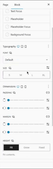
Previous/Next Button Settings:
General Panel:
- Show Text: Toggle to show/hide button text (Only disabled when no icon selected)
- Icon: Choose from Lucide icon library (IconPicker)
- Icon Position: Left or Right of text (Toggle Group – only when both icon and text shown)
- Icon Rotation: 360-degree angle picker (Only when icon selected)
- Flip Icon for Right-To-Left: Auto-flip icon for RTL languages (Only when icon selected)
Dimensions Panel:
- Icon Size: Custom dimensions with unit controls (px, %, em, rem, vw) (Only when icon selected)
- Text-Icon Gap: Space between text and icon (Only when icon selected)
Color Settings:
- Text Hover: Text color on hover
- Icon: Icon color (Only when icon selected)
- Icon Hover: Icon color on hover (Only when icon selected)
- Background Hover: Background color/gradient on hover
Page Numbers Button Settings:
General Panel:
- Number of Links: Range control (0-5, default: 2)
- Controls how many page links appear before and after current page
- First, current, and last pages are always visible
Color Settings:
- Text Active: Text color for current page
- Text Hover: Text color on hover
- Background Hover: Background color/gradient on hover
- Background Active: Background color/gradient for current page
Reset Button Settings
Reset Panel:
- Show Text: Toggle to show/hide button text (Only disabled when no icon selected)
- Icon: Choose from Lucide icon library (IconPicker)
- Icon Position: Left or Right of text (Toggle Group – only when both icon and text shown)
- Icon Rotation: 360-degree angle picker (Only when icon selected)
- Flip Icon for Right-To-Left: Auto-flip icon for RTL languages (Only when icon selected)
Dimensions Panel:
- Icon Size: Custom dimensions with unit controls (px, %, em, rem, vw) (Only when icon selected)
- Text-Icon Gap: Space between text and icon (Only when icon selected)
Color Settings:
- Text Hover: Text color on hover
- Icon: Icon color (Only when icon selected)
- Icon Hover: Icon color on hover (Only when icon selected)
- Background Hover: Background color/gradient on hover
No Results Block Settings
The No Results Block has minimal custom settings and uses WordPress’s native content editing:
Color Settings:
- Text Hover: Text color on hover
- Background Hover: Background color/gradient on hover
Content Management:
- Custom Content: Add any WordPress blocks as inner content
- Conditional Display: Only shows when no posts found
- Full Styling: Complete design control through WordPress native controls
Common Use Cases:
- “No posts found” messages
- Alternative content suggestions
- Newsletter signup forms
- Custom graphics or call-to-actions
Style Tab
Dimensions
The Loop Builder Style Tab contains basic spacing controls:
- Margin: Outer spacing around the Loop Builder container
- Padding: Inner spacing within the Loop Builder container
- Block Gap: Spacing between child elements (filters, template, pagination)
Note: Individual child blocks (Template, Filter, Search, etc.) have their own comprehensive styling options in their respective settings panels.
WordPress Interactivity API
Modern Frontend Architecture
Zero jQuery Dependency:
- Modern vanilla JavaScript approach
- Efficient state management and DOM updates
- Server-side rendering for SEO
Performance Features
Smart Optimization:
- Debounced Search: 500ms delay prevents server overload
- Filter Debouncing: 200ms for checkbox filters
- Efficient Updates: Only changed DOM elements update
- State Persistence: URL parameters maintain filter state
- Prefetching: Hover/focus preloads linked content
- Multiple Instance Support: Isolated state for multiple Loop Builders per page
Interactive Behaviors
- Real-time Filtering: Instant results without page reloads
- AJAX Pagination: Smooth page transitions with loading states
- URL Management: Browser history support for bookmarkable states
- Animation Handling: Automatically retriggers AOS animations (200ms delay)
- Focus Management: Proper accessibility during navigation
- Router Regions: Each Loop Builder is an independent navigation region
Advanced Technical Features
- URL Parameter System:
query-{ID}-{type}format for state management - Filter Parameter Format:
{taxonomy}|{term_ids}structure - Query Isolation: Unique query IDs prevent conflicts between instances
Use Cases & Examples
News Website
- Setup: Variation 2 with category filters and search
- Template: Portrait 2 with author info and dates
- Features: Sticky posts, multiple categories, search
- Styling: Professional typography, subtle shadows
Example: News site with breaking news section and category filtering
E-commerce Catalog
- Setup: Variation 4 with sidebar filters
- Template: Custom with price and buy buttons
- Features: Product categories, price sorting, search
- Styling: Product-focused with clear CTAs
Example: Online store with comprehensive product filtering
Portfolio Gallery
- Setup: Variation 3 with button filters
- Template: Boxed with overlay text
- Features: Project categories, visual buttons
- Styling: Image-focused with minimal text
Example: Designer portfolio with project type filtering
Business Directory
- Setup: Variation 5 with extensive sidebar
- Template: Landscape with contact info
- Features: Location filters, business types, search
- Styling: Information-dense with clear hierarchy
Example: Local business directory with map integration
Design Gallery
Explore real Loop Builder designs for the most popular use cases:
Loop Builder for Portfolios
Creative portfolio showcase with project filtering and dynamic content integration.
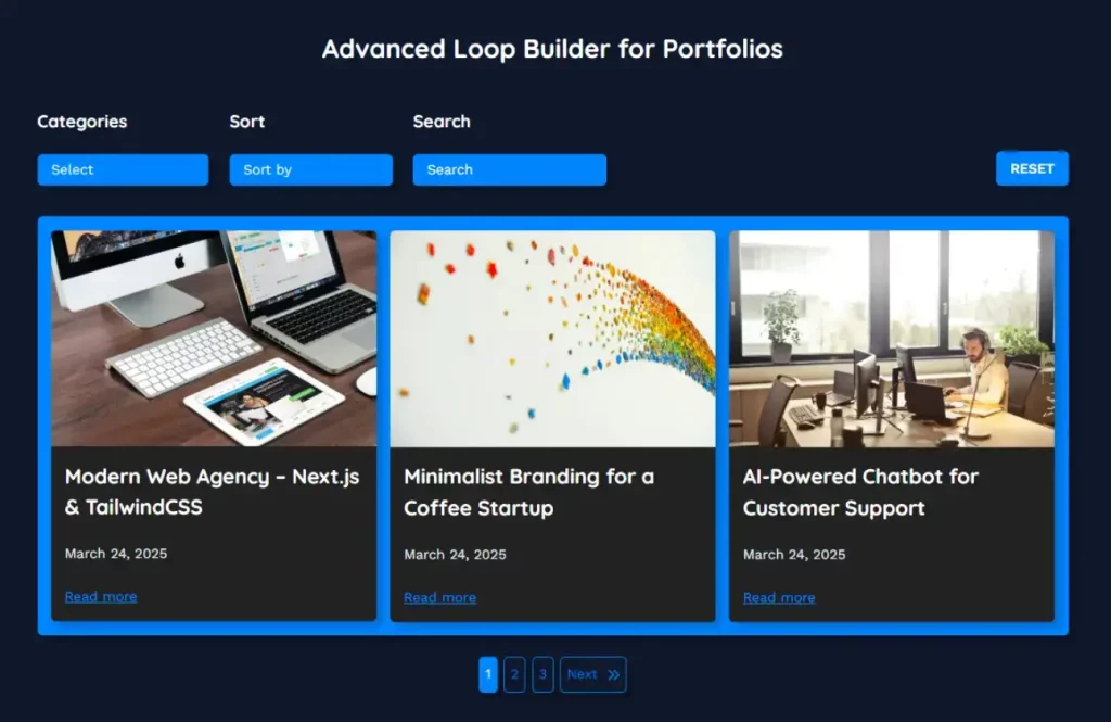
Visual portfolio with project type filtering, hover effects, and custom field integration
Loop Builder for eCommerce
Modern product grid with advanced filtering, sorting, and shopping features.
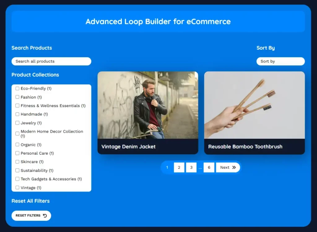
Product showcase with category filters, price sorting, and cart integration
Loop Builder for Blogs
Engaging blog layout with author information, category filtering, and reading features.
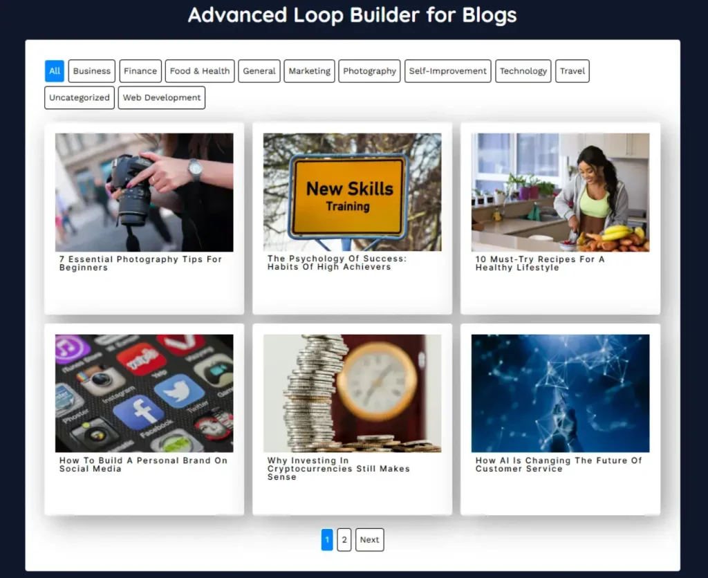
Modern blog cards with author avatars, category tags, and reading time
Accessibility & Best Practices
Accessibility Features
WCAG 2.1 AA Compliant:
Keyboard Navigation:
- Tab Order: Logical sequence through all interactive elements
- Focus Management: Proper focus handling during navigation
- Skip Links: Automatic skip-to-content functionality
- Keyboard Shortcuts: Standard interactions (Enter, Space, Arrow keys)
Screen Reader Support:
- ARIA Labels: Proper labeling for all interactive elements
- Live Regions: Status updates for dynamic content changes
- Semantic HTML: Meaningful structure for assistive technologies
- Context Announcements: Filter changes and loading states
Visual Accessibility:
- Contrast Checking: Automatic WCAG compliance warnings
- Focus Indicators: Clear visual focus states
- Text Scaling: Responsive to user font size preferences
- Color Independence: Never rely solely on color to convey information
Technical Accessibility:
- ARIA Live Regions: Status updates for dynamic content changes
- Semantic HTML: Proper HTML structure for assistive technologies
- Router Region Support: Proper navigation announcements
- Context Announcements: Filter and search state changes announced
- Keyboard Navigation: Full keyboard support for all interactions
Performance Best Practices
Query Optimization:
- Efficient Queries: Uses WordPress’s optimized query functions
- Database Indexes: Leverages existing indexes for fast retrieval
- Caching Integration: Compatible with popular caching plugins
- Smart Pagination: Only loads visible pages
Frontend Performance:
- Debounced Interactions: Prevents excessive API calls
- Progressive Loading: Only loads necessary resources
- Browser Caching: Proper cache headers for static assets
- Lazy Loading: Images load as needed
Common Mistakes to Avoid
Performance Issues:
- Setting posts per page too high (>50)
- Using too many taxonomy queries simultaneously
- Not enabling caching plugins
- Including heavy media in templates without optimization
User Experience Problems:
- Missing “No Results” messaging
- Filters that return zero results without indication
- Poor mobile responsive design
- Confusing filter combinations
Accessibility Issues:
- Low contrast ratios in custom colors
- Missing focus indicators on interactive elements
- Not testing with keyboard navigation
- Poor semantic HTML structure in custom templates
Troubleshooting
Posts Not Displaying
Quick Fixes:
- Check Post Type: Verify correct post type selected
- Review Filters: Ensure taxonomy filters aren’t too restrictive
- Post Status: Confirm posts are published and visible
- Permissions: Check user role permissions for post type
Filters Not Working
Debugging Steps:
- JavaScript Errors: Check browser console for errors
- Interactivity API: Verify WordPress 6.4+ and theme compatibility
- Query ID: Ensure unique query IDs per Loop Builder instance
- Taxonomy Configuration: Validate taxonomy exists and is public
Performance Issues
Optimization Steps:
- Reduce Posts Per Page: Lower to 20 or fewer for better performance
- Enable Caching: Use caching plugins (WP Rocket, W3 Total Cache)
- Optimize Images: Compress featured images used in templates
- Database Cleanup: Remove unused taxonomies and optimize database
Styling Problems
Common Solutions:
- CSS Specificity: Check for theme CSS conflicts
- Global Styles: Verify Global Styles integration
- Theme Compatibility: Test with default WordPress theme
- Selector Issues: Validate custom CSS selectors
Performance Optimization
Database Queries:
- Uses WordPress’s optimized WP_Query with proper caching
- Leverages existing database indexes
- Compatible with object caching (Redis, Memcached)
- Smart query parameter handling
Frontend Performance:
- Modern ES modules for efficient loading
- Tree-shaking eliminates unused code
- Progressive enhancement for accessibility
- Minimal DOM manipulation with Interactivity API
Recommended Settings for Large Sites:
- Posts per page: 20 or fewer
- Max pages: 50 or fewer
- Enable object caching
- Use CDN for media files
- Regular database optimization
We don't respond to the article feedback, we use it to improve our support content.