- Section
- Troubleshooting: Missing Icons
- Spectra Patterns
- Contact Form 7: Multiple Column Fields
- Contact Form 7: Checkbox / Radio / Acceptance Control
- Unable To Style Contact Form 7
- Tab Index For Multiple Gravity Forms
- Getting Started With Spectra
- Exclude Heading From TOC
- Block Display Conditions
- Importing Starter Templates With Spectra
- Getting Started With Spectra
- Manually Install Spectra Via FTP
- Automatic Beta Updates
- Rollback To Previous Versions
- Load Google Fonts Locally
- Activate Spectra Pro License
- Install Spectra Pro
- Translate Strings With Loco Translate
- Process Refund Requests
- Transparent / Sticky Header
- Change Site Logo
- Change Global Styles
- Disable Title on Posts & Pages
- Transparent / Sticky Header For Single Page / Post
- Change Header & Footer Patterns
- Custom / Google Fonts
- Reset Global Default Styling
- Manually Install Spectra One Via FTP
- Enable / Disable Header & Footer On Specific Pages / Posts
- Container
- Buttons
- List
- Modal
- Slider In Spectra
- Animations In Spectra
- Icons
- Tabs In Spectra
- Text Block In Spectra
- Countdown In Spectra
- Loop Builder In Spectra
- Image Mask In Spectra
- Dynamic Content In Spectra
- Global Styles In Spectra
- Accordion In Spectra
- Responsive Control In Spectra
- Font Management In Spectra
- Google Maps
- Separator
- Getting Started With Spectra
- Public Actions and Hooks In Spectra
- Popup Builder In Spectra
- Counter Block In Spectra
- Login Block in Spectra
- Register Block In Spectra
- Spectra Design Library Guide
- How to Enable Spectra 3 Beta
- Preview Options in Spectra (Desktop, Tablet & Mobile)
Modal
Introduction
The Modal Block is a powerful and versatile content display solution that allows you to create interactive popup windows, off-canvas panels, and overlays. Perfect for displaying additional information, forms, images, videos, or any content that needs to appear above the page content. The Modal Block features a sophisticated trigger system, customizable animations, and advanced positioning options that make it ideal for modern web experiences.
How to Add or Use the Block in the Gutenberg Editor
- Adding the Block
- Click the “+” button to open the block inserter
- Search for “Modal” or navigate to the Spectra category
- Click on the Modal Block to add it to your page
- The block comes with a default button trigger and popup content area
- Setting Up the Trigger
- Configure what will open the modal (button, icon, text, or automatic)
- Customize the trigger’s appearance and text
- Set up advanced trigger options like custom classes or IDs
- Designing the Modal Content
- Add any blocks inside the modal popup area
- Configure modal appearance, size, and position
- Set up close button options and behavior
- Configuring Modal Behavior
- Choose opening animations and effects
- Set closing conditions (ESC key, overlay click)
- Configure advanced options like cookies and auto-display
Block Structure and Components
The Modal Block is composed of several child components:
Main Components
- Modal Container: The parent wrapper containing all modal elements
- Trigger: The element that opens the modal (button, icon, text, or automatic)
- Popup: The modal content area that appears when triggered
- Close Icon: Optional close button for the modal
Child Blocks
- Modal Trigger: Button, icon, or text that opens the modal
- Modal Popup: The content area that displays when modal opens
- Modal Close Icon: Customizable close button for the modal
Block Styling Options
Trigger Settings
| Option | Description | Available Settings |
|---|---|---|
| Trigger Type | What opens the modal | Button, Icon, Text, Custom Class (Pro), Custom ID (Pro), Automatic (Pro) |
| Button Text | Text for button trigger | Any text string |
| Icon Selection | Icon for icon trigger | Font Awesome icon picker |
| Link Settings | Button/text link behavior | URL, target, rel attributes |
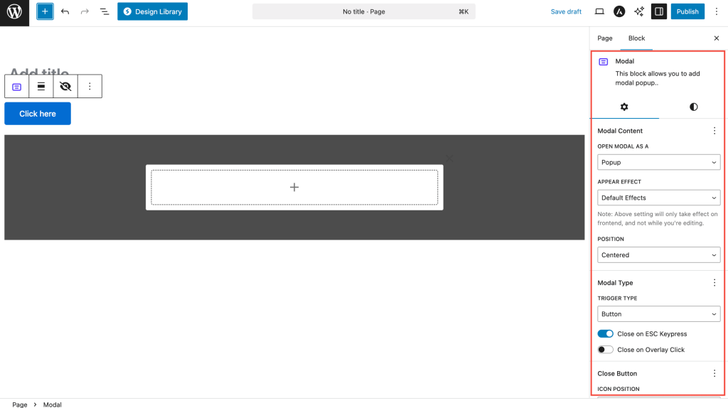
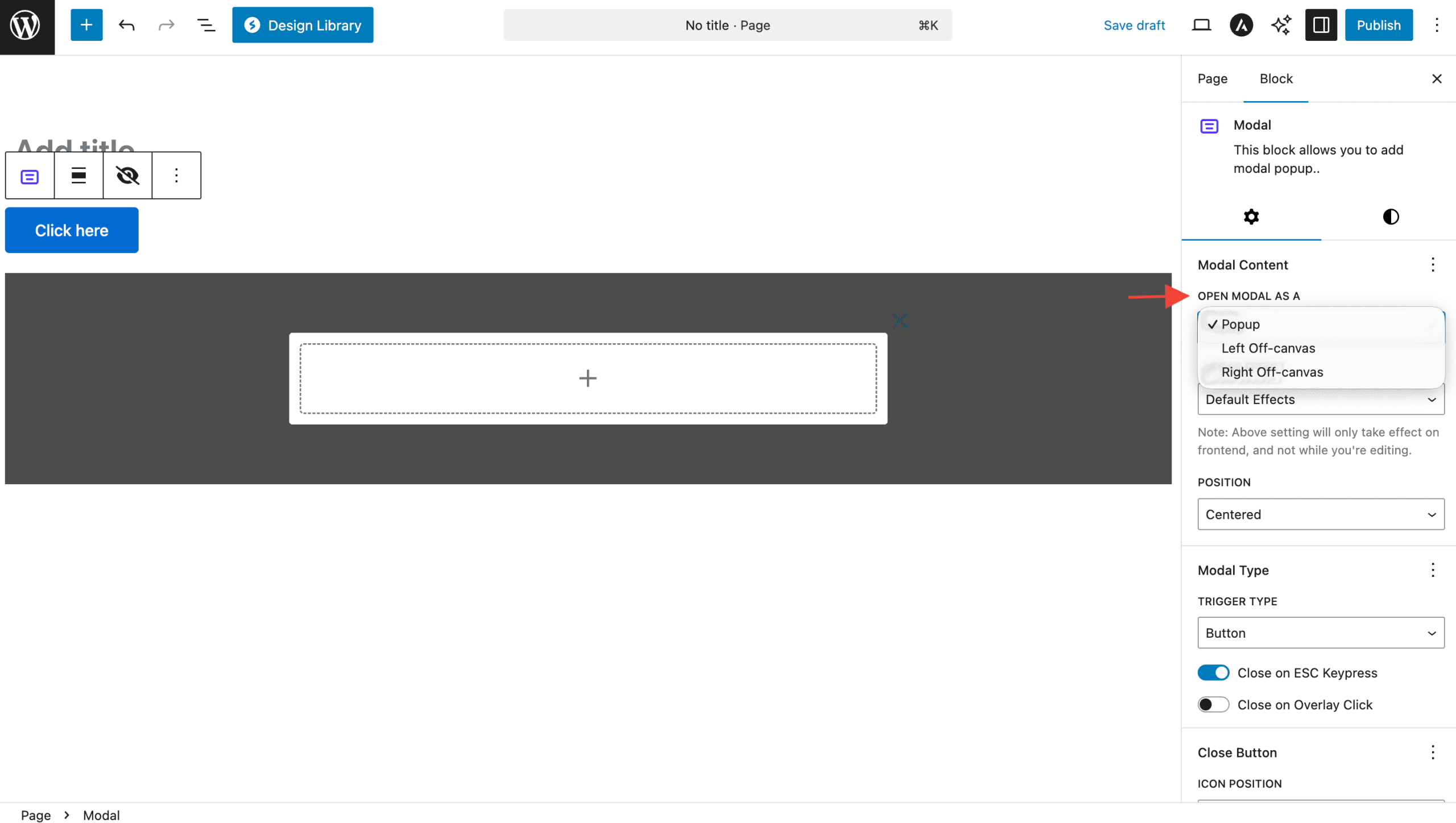
Modal Content Settings
| Option | Description | Available Settings |
|---|---|---|
| Modal Type | How modal appears | Popup, Left Off-canvas (Pro), Right Off-canvas (Pro) |
| Position | Where modal appears | Centered, Top Left (Pro), Top Right (Pro), Bottom Left (Pro), Bottom Right (Pro), Custom (Pro) |
| Appear Effect | Opening animation | Default, Scale (Pro), Scale In (Pro) |
| Width | Modal content width | Auto, px, %, vw, em, rem |
| Height | Modal content height | Auto, px, %, vh, em, rem |
Close Button Settings
| Option | Description | Available Settings |
|---|---|---|
| Close Icon Position | Where close button appears | Top Left, Top Right, Window Top Left (Pro), Window Top Right (Pro) |
| Close on ESC | Close modal with ESC key | On/Off toggle |
| Close on Overlay | Close when clicking outside | On/Off toggle |
| Custom Close Icon | Custom close button icon | Font Awesome icon picker |
| Close Icon Size | Size of close button | 10-100px |
Advanced Trigger Options (Pro Features)
| Option | Description | Available Settings |
|---|---|---|
| Custom Class | CSS class trigger | Custom class name (frontend only) |
| Custom ID | CSS ID trigger | Custom ID name (frontend only) |
| Exit Intent | Show on mouse exit | On/Off toggle |
| Display After Seconds | Auto-show after time | On/Off toggle + seconds |
| Enable Cookies | Remember user interaction | On/Off toggle |
| Set Cookies On | When to set cookie | Close Action, Page Refresh |
| Hide for Days | Cookie duration | 0-1000 days |
Position and Offset (Pro Features)
| Option | Description | Available Settings |
|---|---|---|
| Horizontal Offset | Custom X position | px, %, vw, em, rem |
| Vertical Offset | Custom Y position | px, %, vh, em, rem |
| Custom Position | Complete position control | Horizontal + Vertical offsets |
Modal Types and Behaviors
1. Standard Popup Modal
The default modal type that appears as an overlay:
- Centered positioning by default
- Backdrop overlay dims the background
- Focus trapping keeps navigation within modal
- Responsive design adapts to screen sizes
Perfect for:
- Contact forms
- Image galleries
- Video players
- Product details
- Newsletter signups
2. Off-Canvas Panels (Pro)
Side panels that slide in from the edges:
- Left Off-canvas: Slides in from the left
- Right Off-canvas: Slides in from the right
- Full height coverage
- Smooth animations for professional feel
Perfect for:
- Navigation menus
- Shopping carts
- User profiles
- Filter panels
- Additional content areas
3. Positioned Popups (Pro)

Precisely positioned modal windows:
- Corner positioning (top-left, top-right, bottom-left, bottom-right)
- Custom positioning with pixel-perfect control
- Responsive behavior adapts position on mobile
- Non-intrusive design options
Perfect for:
- Notifications
- Help tooltips
- Promotional banners
- Chat interfaces
- Status updates
Trigger Options
Button Trigger
Standard button that opens the modal:
- Full button styling options
- Icon + text combinations
- Hover effects and animations
- Responsive sizing and positioning
Icon Trigger
Icon-only trigger for minimal design:
- Font Awesome icon library
- Custom sizing and colors
- Hover animations and effects
- Accessible with proper ARIA labels
Text Trigger
Text link that opens the modal:
- Inline text integration
- Link styling options
- Underline and hover effects
- SEO-friendly structure
Automatic Triggers
- Exit Intent: Detects when user is about to leave
- Time-based: Shows after specified seconds
- Cookie Integration: Remembers user interactions
Animation and Effects
Appear Effects (Pro)
| Effect | Description | Use Case |
|---|---|---|
| Default | Fade in with backdrop | General purpose, subtle |
| Scale | Grows from center | Attention-grabbing |
| Scale In | Scales from small to full | Modern, professional |
Transition Behaviours
- Smooth animations with CSS transitions
- Backdrop fade for professional appearance
- Focus management for accessibility
- Mobile optimized animations
Advanced Features
Cookie Management (Pro)
Intelligent user experience features:
- Remember interactions to avoid repetitive popups
- Configurable duration (days to remember)
- Multiple trigger options (close action or page refresh)
- GDPR compliant cookie handling
Exit Intent Detection (Pro)
Capture users before they leave:
- Mouse tracking detects exit movement
- Mobile adaptation uses scroll patterns
- One-time display prevents annoyance
- Conversion optimization for better results
Time-Based Display (Pro)
Automatic modal display features:
- Delayed appearance after page load
- Scroll-based triggers at specific page positions
- Session management with cookies
- A/B testing friendly setup
Responsive Design
Mobile Adaptations
- Full-screen popups on small screens
- Touch-friendly close buttons
- Swipe gestures for off-canvas panels
- Adaptive positioning prevents viewport overflow
Tablet Considerations
- Medium-sized popups for better readability
- Touch targets sized appropriately
- Landscape/portrait mode adaptations
- Content scaling for optimal viewing
Desktop Features
- Precise positioning with custom offsets
- Keyboard navigation support
- Multiple monitor awareness
- High DPI display optimization
Common Use Cases
1. Contact Forms
- Lead generation with attractive popups
- Newsletter signups with exit intent
- Contact information collection
- Event registrations and RSVPs
2. Content Display
- Image galleries with lightbox effect
- Video players for media content
- Product details in e-commerce
- Terms and conditions display
3. Navigation Enhancement
- Mobile menus as off-canvas panels
- Search interfaces in overlay
- User account panels
- Shopping cart previews
4. Marketing and Promotion
- Special offers with time delays
- Coupon codes with exit intent
- Social media follow prompts
- App download promotions
5. User Experience
- Help documentation in popups
- Onboarding tutorials step-by-step
- Confirmation dialogs for actions
- Error messages and alerts
Block Toolbar Options

Modal Block Toolbar
- Trigger Settings: Quick access to trigger options
- Content Alignment: Align modal content
- Preview Mode: Test modal functionality
- Transform: Convert to other blocks
Child Block Toolbars
- Trigger Toolbar: Button/icon/text specific options
- Content Toolbar: Standard block formatting
- Close Icon Toolbar: Position and style options
Accessibility Features
Keyboard Navigation
- Tab order properly managed
- Focus trapping within modal
- ESC key closes modal
- Enter/Space activates triggers
Screen Reader Support
- ARIA labels for all interactive elements
- Role attributes for proper semantics
- Focus announcements when modal opens
- Close button clearly identified
Troubleshooting
Modal not opening?
- Check trigger type is correctly set
- Verify custom class/ID exists on page (Pro features)
- Ensure JavaScript is not blocked
- Check for theme conflicts
Content not displaying correctly?
- Verify modal width/height settings
- Check for CSS conflicts with theme
- Ensure proper block structure
- Test in preview mode
Animations not working?
- Enable JavaScript in browser
- Check if reduced motion is enabled
- Verify CSS animations are supported
- Test in different browsers
Mobile issues?
- Check responsive settings
- Verify touch targets are large enough
- Test scroll behavior
- Ensure viewport meta tag exists
Cookies not working? (Pro)
- Verify cookies are enabled in browser
- Check domain settings
- Ensure HTTPS for secure cookies
- Test in incognito/private mode
Frequently Asked Questions
Q: Can I have multiple modals on the same page?
A: Yes! Each modal block creates an independent instance with unique IDs.
Q: How do I create a video modal?
A: Add a Video block inside the modal popup content area. The modal will automatically size to fit.
Q: Can I use custom CSS with modals?
A: Absolutely! Use the Additional CSS Classes field or target the modal’s unique ID.
Q: Do modals work with caching plugins?
A: Yes, modals are JavaScript-based and work with all major caching solutions.
Q: Can I trigger modals from external links?
A: Yes! Use Custom Class or Custom ID triggers (Pro) to open modals from anywhere on your site.
Q: How do I create a contact form modal?
A: Add any form plugin’s block inside the modal content area. Popular options include Contact Form 7, Gravity Forms, or WPForms.
Q: Are modals SEO-friendly?
A: Modal content is crawlable by search engines, but important content should also be accessible without JavaScript.
Q: Can I disable modals on mobile?
A: Use responsive controls to hide modal triggers on specific devices, or create device-specific modal versions.
Pro vs Free Comparison
Free Features
- Button, Icon, Text triggers
- Basic popup modals
- Standard positioning (centered)
- Basic animations
- ESC/Overlay close options
- Responsive design
Pro Features
- Off-canvas panels (left/right)
- Advanced positioning (corners, custom)
- Exit intent detection
- Time-based auto-display
- Cookie management
- Custom class/ID triggers
- Advanced animations
- Window-positioned close buttons
We don't respond to the article feedback, we use it to improve our support content.