- Section
- Troubleshooting: Missing Icons
- Spectra Patterns
- Contact Form 7: Multiple Column Fields
- Contact Form 7: Checkbox / Radio / Acceptance Control
- Unable To Style Contact Form 7
- Tab Index For Multiple Gravity Forms
- Getting Started With Spectra
- Exclude Heading From TOC
- Block Display Conditions
- Importing Starter Templates With Spectra
- Getting Started With Spectra
- Manually Install Spectra Via FTP
- Automatic Beta Updates
- Rollback To Previous Versions
- Load Google Fonts Locally
- Activate Spectra Pro License
- Install Spectra Pro
- Translate Strings With Loco Translate
- Process Refund Requests
- Transparent / Sticky Header
- Change Site Logo
- Change Global Styles
- Disable Title on Posts & Pages
- Transparent / Sticky Header For Single Page / Post
- Change Header & Footer Patterns
- Custom / Google Fonts
- Reset Global Default Styling
- Manually Install Spectra One Via FTP
- Enable / Disable Header & Footer On Specific Pages / Posts
- Container
- Buttons
- List
- Modal
- Slider In Spectra
- Animations In Spectra
- Icons
- Tabs In Spectra
- Text Block In Spectra
- Countdown In Spectra
- Loop Builder In Spectra
- Image Mask In Spectra
- Dynamic Content In Spectra
- Global Styles In Spectra
- Accordion In Spectra
- Responsive Control In Spectra
- Font Management In Spectra
- Google Maps
- Separator
- Getting Started With Spectra
- Public Actions and Hooks In Spectra
- Popup Builder In Spectra
- Counter Block In Spectra
- Login Block in Spectra
- Register Block In Spectra
- Spectra Design Library Guide
- How to Enable Spectra 3 Beta
- Preview Options in Spectra (Desktop, Tablet & Mobile)
Popup Builder In Spectra
Introduction
The Popup Builder Block is a comprehensive and versatile solution that enables you to create interactive popups and information bars to engage your website visitors. Perfect for displaying announcements, special offers, contact forms, newsletters, or any content that needs to capture attention and drive conversions. The Popup Builder features two distinct variations – popups for modal-style overlays and info bars for banner-style notifications – each with sophisticated customization options, responsive design, and advanced display controls.
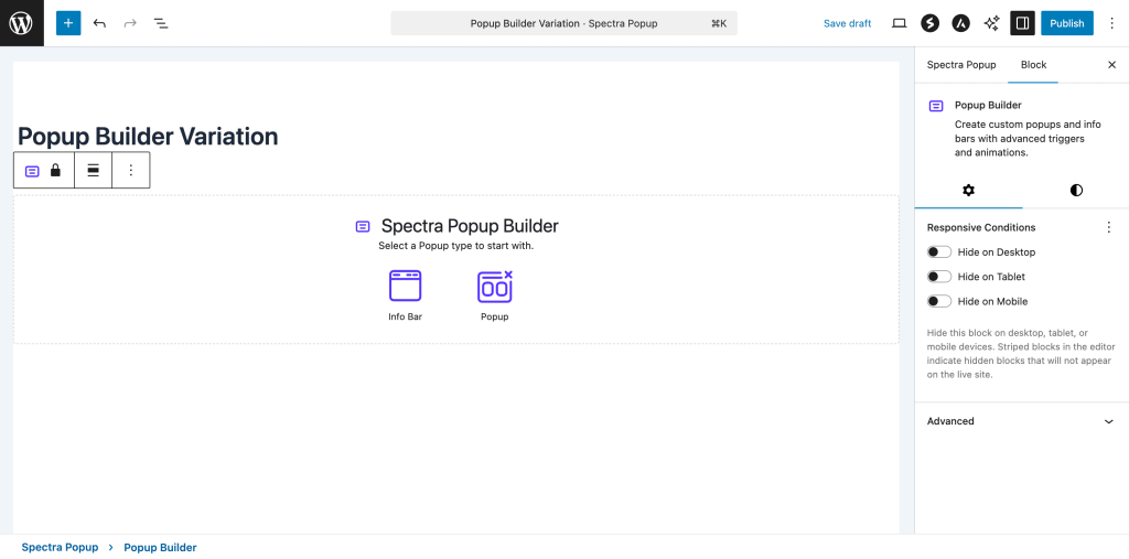
How to Add or Use the Block in the Gutenberg Editor
- For Adding Popup on site
- Go to the Popup Builder Post Type
- Click on create a new popup
- Choose between Info Bar or Popup variation
- Selecting the Right Variation
- Info Bar: Creates horizontal banner-style notifications at the top or bottom of your page
- Popup: Creates modal-style overlays that appear centered on the page with background overlay
- Configuring the Popup Content
- Add any blocks inside the popup content area
- Customize the appearance, size, and positioning
- Set up close button options and behavior
- Setting Up Display Behavior
- Configure repetition settings to control how often the popup shows
- Choose positioning and overlay options
- Set up responsive behavior for different devices
Block Structure and Components
The Popup Builder Block is composed of several key components that work together:
Main Components
- Popup Container: The parent wrapper containing all popup elements
- Content Area: The main content area where you add your blocks
- Close Icon: Customizable close button for dismissing the popup
- Overlay: Background overlay for popup variations (optional)
Child Blocks
The Popup Builder accepts any blocks as children, making it highly flexible for various use cases:
- Text blocks (headings, paragraphs)
- Button blocks for calls-to-action
- Form blocks for lead generation
- Image blocks for visual content
- Container blocks for complex layouts
Block Variations
1. Info Bar Variation
The Info Bar creates horizontal banner-style notifications perfect for announcements:
Default Content:
- Countdown timer showing days, hours, minutes, seconds
- Engaging headline text
- Call-to-action button
Key Characteristics:
- Horizontal layout with flexible content areas
- Top or bottom positioning on the page
- Push content option to move page content down
- No background overlay by default
- Compact design suitable for persistent notifications
Perfect for:
- Limited-time offers with countdown timers
- Important announcements
- Cookie consent notices
- Newsletter signup prompts
- Special promotions
2. Popup Variation
The Popup creates modal-style overlays that appear centered on the page:
Default Content:
- Success icon for positive messaging
- Engaging headline
- Descriptive text
- Call-to-action button
Key Characteristics:
- Centered positioning with background overlay
- Fixed dimensions with customizable width and height
- Modal behavior with focus trapping
- Background interaction blocking
- Professional overlay appearance
Perfect for:
- Contact forms and lead generation
- Special offers and promotions
- Newsletter subscriptions
- Product announcements
- Terms and conditions display
Popup Settings Options
General Popup Settings
| Option | Description | Available Settings | Variation Support |
|---|---|---|---|
| Popup Width | Controls the width of the popup content | Auto, px, %, vw, em, rem | Popup only |
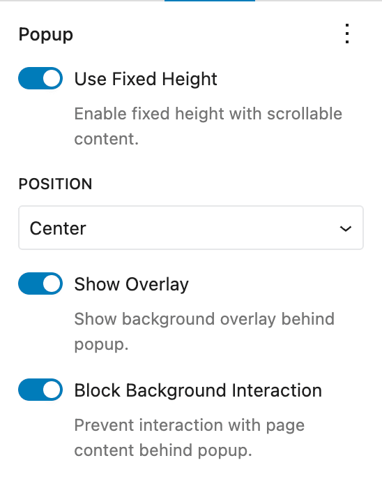
| Fixed Height | Enable fixed height with scrollable content | On/Off toggle | Both |
| Content Vertical Alignment | Alignment when fixed height is enabled | Top, Center, Bottom | Both |
| Show Overlay | Display background overlay behind popup | On/Off toggle | Popup only |
| Block Background Interaction | Prevent interaction with page behind popup | On/Off toggle | Popup only |
| Push Page Content | Push page content down when banner shows | On/Off toggle | Info Bar only |
| Position | Where the info bar appears on page | Top, Bottom | Info Bar only |
Step-by-Step: Configuring General Settings
- Setting Popup Width (Popup Variation)
- Navigate to Settings → Popup panel
- Locate the “Popup Width” control
- Enter a numeric value and select unit (px, %, vw, em, rem)
- Default: 700px
- Responsive: Set different values for tablet and mobile
- Enabling Fixed Height
- Toggle “Use Fixed Height” to enable
- When enabled, popup content becomes scrollable if it exceeds the height
- Use “Content Vertical Alignment” to position content within the fixed area
- Options: Top (flex-start), Center, Bottom (flex-end)
- Configuring Overlay (Popup Only)
- Toggle “Show Overlay” to display background behind popup
- When enabled, creates a darkened background effect
- Works in conjunction with “Block Background Interaction”
- Setting Up Push Content (Info Bar Only)
- Toggle “Push Page Content” to move page content when banner appears
- When disabled, banner overlays existing content
- When enabled, reveals position options (Top/Bottom)
Close Icon Settings
The close icon allows users to dismiss the popup and provides comprehensive customization options.
| Option | Description | Available Settings |
|---|---|---|
| Icon Selection | Choose the close button icon | Font Awesome icon picker |
| Icon Position | Position of the close button | Top Left, Top Right |
| Icon Size | Size of the close button | 0-100px range slider |
| Flip for RTL | Mirror icon for right-to-left languages | On/Off toggle |
| Rotation | Rotate the icon by degrees | 0-360 degree angle picker |
| Accessibility Mode | How screen readers interpret the icon | SVG, Image, Decorative |
| Accessibility Label | Custom label for screen readers | Text input field |
Step-by-Step: Configuring Close Icon
- Selecting an Icon
- Navigate to Settings → Close Icon panel
- Click on the icon picker to browse available icons
- Search for specific icons using the search field
- Click on desired icon to select
- Default: “xmark” (X symbol)
- Positioning the Icon
- Use “Close Icon Position” dropdown
- Choose between “Top Left” and “Top Right”
- Icon appears within the popup content area
- Default: “Top Right”
- Sizing the Icon
- Use the “Size” range slider
- Adjust from 0 to 100 pixels
- Changes apply in real-time in the editor
- Default: 25px
- Setting Up Accessibility
- Choose “Accessibility Mode”:
- SVG: Treats icon as an SVG element (requires label)
- Image: Treats icon as an image (requires label)
- Decorative: Icon is decorative only (no label needed)
- When SVG or Image is selected, provide an “Accessibility Label”
- Label helps screen readers understand the icon’s purpose
- Example: “Close popup” or “Dismiss notification”
- Choose “Accessibility Mode”:
Repetition Settings
Control how often the popup displays to users using browser-based tracking.
| Option | Description | Available Settings |
|---|---|---|
| Repeat Infinitely | Show popup every time page loads | On/Off toggle |
| Repetition per Browser | Number of times to show popup | 1-100 range |
Step-by-Step: Configuring Repetition
- Setting Up Infinite Repetition
- Navigate to Settings → Repetition panel
- Toggle “Repeat Infinitely” to ON
- When enabled, popup shows on every page load
- When disabled, reveals repetition counter
- Configuring Limited Repetition
- Ensure “Repeat Infinitely” is OFF
- Use “Repetition per Browser” slider
- Set value from 1 to 100
- Default: 1 (shows once per browser)
- Note: Counter decreases on close, not on page refresh
Color Settings
Comprehensive color controls for all popup elements with support for gradients and hover states.
| Color Setting | Description | Supports Gradients | Hover State |
|---|---|---|---|
| Background | Main popup background color | Yes | Yes |
| Background Hover | Hover state for background | Yes | N/A |
| Close Icon Color | Color of the close button | No | Yes |
| Close Icon Hover Color | Hover color for close button | No | N/A |
| Overlay Color | Background overlay color | No | No |
Step-by-Step: Setting Colors
- Configuring Background Colors
- Navigate to Settings → Colors panel (or Block toolbar color options)
- Click on “Background” color swatch
- Choose from:
- Solid colors: Click on color picker or enter hex value
- Gradients: Switch to gradient tab and configure
- Set “Background Hover” for interactive effects
- Colors apply immediately in the editor
- Customizing Close Icon Colors
- Set “Close Icon Color” for default state
- Set “Close Icon Hover Color” for mouse-over effect
- Use contrast colors for better visibility
- Consider background color when choosing icon colors
- Configuring Overlay Color (Popup Only)
- Set “Overlay Color” to control background dimming
- Default: rgba(0,0,0,0.75) (75% transparent black)
- Adjust opacity using the Background Overlay Opacity control
Opacity Settings
Fine-tune the transparency of background overlays.
| Option | Description | Range | Default |
|---|---|---|---|
| Background Overlay Opacity | Controls overlay transparency | 0-100% | 75% |
Step-by-Step: Adjusting Opacity
- Setting Overlay Opacity
- Navigate to Settings → Colors panel
- Locate “Background Overlay Opacity” slider
- Adjust from 0% (completely transparent) to 100% (completely opaque)
- 0%: No dimming effect
- 50%: Moderate dimming
- 100%: Complete background blocking
- Adjust in increments of 5%
Dimension Settings
Control the size constraints and dimensions of your popup with responsive support.
| Dimension | Description | Units Available | Responsive |
|---|---|---|---|
| Width | Overall popup width | px, %, vw, em, rem | Yes |
| Height | Overall popup height | px, %, vh, em, rem | Yes |
| Min Width | Minimum width constraint | px, %, vw, em, rem | Yes |
| Min Height | Minimum height constraint | px, %, vh, em, rem | Yes |
| Max Width | Maximum width constraint | px, %, vw, em, rem | Yes |
| Max Height | Maximum height constraint | px, %, vh, em, rem | Yes |
Step-by-Step: Setting Dimensions
- Configuring Basic Dimensions
- Navigate to Settings → Dimensions panel
- Set “Width” using the unit control
- Enter numeric value and select unit type
- Available units: px (pixels), % (percentage), vw (viewport width), em (relative to font size), rem (relative to root font size)
- Setting Size Constraints
- Use “Min Width” and “Min Height” to prevent popup from becoming too small
- Use “Max Width” and “Max Height” to prevent popup from becoming too large
- Constraints work together with the main width/height settings
- Useful for responsive design and content overflow handling
- Responsive Dimension Control
- Each dimension setting includes responsive controls
- Set different values for Desktop, Tablet, and Mobile
- Use the device preview buttons to test different screen sizes
- Consider content readability on smaller screens
Background Styles
Advanced background styling options including images, videos, and gradients.
| Background Type | Description | Configuration Options |
|---|---|---|
| Image | Background image with various display options | Upload/select image, position, size, repeat |
| Video | Background video for dynamic effects | Upload video file, poster image, play settings |
| Gradient | Advanced gradient backgrounds | Multiple colors, direction, type |
Step-by-Step: Configuring Background Styles
- Setting Background Images
- Navigate to Settings → Styles panel
- Click “Background” section
- Upload or select an image from media library
- Configure image settings:
- Position: How image aligns within popup
- Size: Cover, contain, or custom dimensions
- Repeat: Whether image tiles if smaller than popup
- Adding Background Videos
- Select video file from media library
- Set poster image for mobile devices or loading states
- Configure autoplay and loop settings
- Consider file size and loading performance
- Creating Gradient Backgrounds
- Choose gradient type (linear or radial)
- Add multiple color stops
- Adjust gradient direction or center point
- Combine with overlay opacity for layered effects
Advanced Features
Responsive Design
The Popup Builder automatically adapts to different screen sizes and provides granular control over responsive behavior.
Mobile Adaptations
- Automatic full-width: Popups expand to fit mobile screens
- Touch-friendly close buttons: Larger tap targets on mobile devices
- Reduced padding: Optimized spacing for smaller screens
- Adaptive positioning: Info bars remain user-friendly on mobile
Tablet Considerations
- Medium-sized popups: Balanced sizing for tablet screens
- Touch target optimization: Appropriate sizing for finger navigation
- Orientation handling: Works in both portrait and landscape modes
- Content scaling: Maintains readability across tablet sizes
Responsive Controls
- Device-specific settings: Set different values for desktop, tablet, and mobile
- Unit flexibility: Use viewport units (vw, vh) for truly responsive designs
- Preview modes: Test your popup on different device sizes in the editor
Browser-Based Repetition Control
The Popup Builder includes sophisticated repetition management to balance engagement with user experience.
How Repetition Works
- Browser storage: Uses local browser storage to track display counts
- User-specific: Each user’s browser maintains its own count
- Per-popup tracking: Different popups have independent counters
- Close-based counting: Counter decreases when user closes popup, not on page refresh
Configuration Options
- Infinite repeat: Shows popup on every page load
- Limited repeat: Shows popup a specific number of times per browser
- Range: Set from 1 to 100 repetitions
- Reset behavior: Clears automatically after reaching limit
Use Case Examples
- Announcements: Set to 3 repetitions for important news
- Promotions: Single display for special offers to avoid annoyance
- Feedback requests: Limited to 1 display per user session
- Newsletter signups: 2-3 displays for maximum conversion opportunity
Accessibility Features
The Popup Builder prioritizes web accessibility and follows WCAG guidelines.
Keyboard Navigation
- Tab order: Proper tab sequence within popup content
- Focus management: Focus moves to popup when opened
- Close shortcuts: ESC key closes popup (when enabled)
- Focus return: Focus returns to trigger element after closing
Screen Reader Support
- ARIA labels: Proper labeling for all interactive elements
- Role attributes: Correct semantic markup for assistive technologies
- Close button identification: Clear identification of close functionality
- Content announcements: Screen readers announce popup opening
Visual Accessibility
- Color contrast: Ensure sufficient contrast between text and backgrounds
- Focus indicators: Visible focus states for keyboard navigation
- Icon alternatives: Accessibility labels for icon-based elements
- Text alternatives: Proper alt text for images and decorative elements
Common Use Cases and Examples
1. Newsletter Signup Popup
Configuration:
- Variation: Popup
- Width: 400px
- Repetition: 2 times per browser
- Content: Heading, description, email form, button
Settings:
- Popup Width: 400px
- Show Overlay: ON
- Block Background Interaction: ON
- Repetition per Browser: 2
- Close Icon Position: Top Right
- Background Color: #ffffff
- Overlay Color: rgba(0,0,0,0.6)
2. Limited Time Offer Banner
Configuration:
- Variation: Info Bar
- Position: Top
- Push Content: ON
- Content: Countdown timer, offer text, CTA button
Settings:
- Push Page Content: ON
- Position: Top
- Background Color: #ff6b35
- Text Color: #ffffff
- Repetition per Browser: 1
- Close Icon Color: #ffffff
3. Contact Form Modal
Configuration:
- Variation: Popup
- Width: 600px
- Fixed Height: ON
- Content: Contact form with multiple fields
Settings:
- Popup Width: 600px
- Use Fixed Height: ON
- Content Vertical Alignment: Top
- Show Overlay: ON
- Background Color: #f8f9fa
- Close Icon Position: Top Right
Settings:
- Push Page Content: OFF
- Position: Bottom
- Background Color: #343a40
- Text Color: #ffffff
- Repeat Infinitely: ON
- Close Icon Position: Top Right
Troubleshooting
Common Issues and Solutions
Popup not appearing on frontend?
- Verify the repetition settings aren’t at zero
- Check if browser cache is affecting display
- Ensure the popup block is published, not just saved as draft
- Confirm no theme or plugin conflicts with popup functionality
Close button not working?
- Check that close icon is properly configured
- Verify “isDismissable” setting is enabled
- Test in different browsers for JavaScript compatibility
- Ensure no CSS conflicts are hiding the close button
Responsive issues on mobile?
- Review mobile-specific width and height settings
- Check padding and margin values for mobile devices
- Verify touch targets are large enough (minimum 44px)
- Test in actual mobile devices, not just browser responsive mode
Popup positioning problems?
- Review alignment matrix settings
- Check custom positioning values
- Verify viewport units are appropriate for content
- Test on different screen sizes and orientations
Performance issues with background videos?
- Compress video files to reduce file size
- Use appropriate video formats (MP4, WebM)
- Set poster images for mobile devices
- Consider disabling autoplay on mobile connections
Accessibility concerns?
- Verify all interactive elements have proper labels
- Test keyboard navigation through entire popup
- Check color contrast ratios meet WCAG guidelines
- Ensure screen reader compatibility with NVDA/JAWS
Overlay not displaying correctly?
- Check overlay color settings and opacity
- Verify z-index conflicts with theme styles
- Review “Block Background Interaction” setting
- Test in different browsers for CSS compatibility
Frequently Asked Questions
Q: Can I have multiple popups on the same page?
A: Yes! Each Popup Builder block creates an independent instance. However, consider user experience – multiple popups can be overwhelming. Use different repetition settings and triggers to avoid conflicts.
Q: How does the repetition counter work exactly?
A: The counter is stored in the user’s browser local storage and decreases each time the user closes the popup (not on page refresh). When it reaches zero, the popup stops showing for that browser until the storage is cleared.
Q: Can I trigger popups based on user behavior?
A: Currently, the Popup Builder focuses on page-load triggers with repetition control. For behavior-based triggers (scroll, exit intent, time delays), you may need additional plugins or custom JavaScript.
Q: Are popups SEO-friendly?
A: Popup content is crawlable by search engines since it’s part of the page HTML. However, for critical content, ensure it’s also accessible without JavaScript for users with disabled scripts.
Q: How do I create a GDPR-compliant cookie notice?
A: Use the Info Bar variation, set position to bottom, enable infinite repetition, and include appropriate cookie policy text with accept/decline buttons. Consider adding custom functionality for user preferences.
Q: Can I customize the close button beyond the provided options?
A: Yes! Use Additional CSS Classes to apply custom styles, or target the popup’s unique CSS classes. The close button uses Font Awesome icons, so you have extensive icon choices.
Q: How do I make popups work with caching plugins?
A: Popup Builder is JavaScript-based and works with most caching solutions. If issues occur, exclude popup pages from caching or use cache-compatible popup trigger methods.
Q: What’s the difference between Push Content and overlay for Info Bars?
A: “Push Content” moves the page content down to make room for the info bar. When disabled, the info bar overlays existing content at the top or bottom of the page.
Q: Can I use custom CSS with Popup Builder?
A: Absolutely! Each popup has unique CSS classes and IDs. Use the Additional CSS Classes field in Advanced settings, or add styles to your theme’s custom CSS area.
Q: How do I integrate forms with the Popup Builder?
A: Simply add any form plugin’s block (Contact Form 7, Gravity Forms, WPForms, etc.) inside the popup content area. The popup will automatically accommodate the form’s dimensions.
Best Practices
Design Guidelines
- Keep content concise: Users have limited attention spans for popups
- Use clear call-to-actions: Make the desired action obvious
- Maintain brand consistency: Match your site’s colors and fonts
- Optimize for mobile: Test on actual mobile devices
- Consider loading performance: Large images/videos can slow popup display
User Experience Tips
- Respect repetition limits: Don’t overwhelm visitors with frequent popups
- Provide clear close options: Always allow easy dismissal
- Time your displays: Consider user journey and page context
- Test extensively: Try different settings and monitor user behavior
- Monitor conversion rates: Track effectiveness of different popup configurations
Performance Optimization
- Optimize images: Compress popup background images
- Minimize content: Include only essential elements
- Use efficient animations: Avoid complex CSS animations that may lag
- Test loading speed: Ensure popups don’t delay page load times
- Consider conditional loading: Load popup resources only when needed
Accessibility Best Practices
- Provide keyboard access: Ensure all functionality works without mouse
- Use semantic HTML: Proper heading structure and markup
- Include alt text: For all images and icons
- Test with screen readers: Verify compatibility with assistive technologies
- Maintain focus management: Proper focus trapping and return
This comprehensive documentation covers all aspects of the Popup Builder block, from basic setup to advanced customization and troubleshooting. Use it as a reference for creating effective, user-friendly popups and info bars that enhance your website’s engagement and conversion potential.
We don't respond to the article feedback, we use it to improve our support content.