- Section
- Troubleshooting: Missing Icons
- Spectra Patterns
- Contact Form 7: Multiple Column Fields
- Contact Form 7: Checkbox / Radio / Acceptance Control
- Unable To Style Contact Form 7
- Tab Index For Multiple Gravity Forms
- Getting Started With Spectra
- Exclude Heading From TOC
- Block Display Conditions
- Importing Starter Templates With Spectra
- Getting Started With Spectra
- Manually Install Spectra Via FTP
- Automatic Beta Updates
- Rollback To Previous Versions
- Load Google Fonts Locally
- Activate Spectra Pro License
- Install Spectra Pro
- Translate Strings With Loco Translate
- Process Refund Requests
- Transparent / Sticky Header
- Change Site Logo
- Change Global Styles
- Disable Title on Posts & Pages
- Transparent / Sticky Header For Single Page / Post
- Change Header & Footer Patterns
- Custom / Google Fonts
- Reset Global Default Styling
- Manually Install Spectra One Via FTP
- Enable / Disable Header & Footer On Specific Pages / Posts
- Container
- Buttons
- List
- Modal
- Slider In Spectra
- Animations In Spectra
- Icons
- Tabs In Spectra
- Text Block In Spectra
- Countdown In Spectra
- Loop Builder In Spectra
- Image Mask In Spectra
- Dynamic Content In Spectra
- Global Styles In Spectra
- Accordion In Spectra
- Responsive Control In Spectra
- Font Management In Spectra
- Google Maps
- Separator
- Getting Started With Spectra
- Public Actions and Hooks In Spectra
- Popup Builder In Spectra
- Counter Block In Spectra
- Login Block in Spectra
- Register Block In Spectra
- Spectra Design Library Guide
- How to Enable Spectra 3 Beta
- Preview Options in Spectra (Desktop, Tablet & Mobile)
Register Block In Spectra
Introduction
The Register Form Block allows you to create customizable user registration forms anywhere on your WordPress site. Perfect for membership sites, community platforms, or any site that needs user signups. The block provides extensive styling options and modular child components that you can arrange and customize to match your design needs.
How to Add or Use the Block in the Gutenberg Editor
- Adding the Block
- Click the “+” button in the editor to open the block inserter
- Search for “Register Form” or navigate to the Spectra Pro v2 category
- Click on the Register Form Block to add it to your page
- The block automatically creates a complete registration form with all necessary fields
- Working with Form Components
- Click on any form element to select and customize it
- The form includes these child blocks by default:
- Welcome heading
- Username input field
- Email input field
- Password input field with toggle visibility
- Confirm Password input field
- Submit button
- Success and error message areas
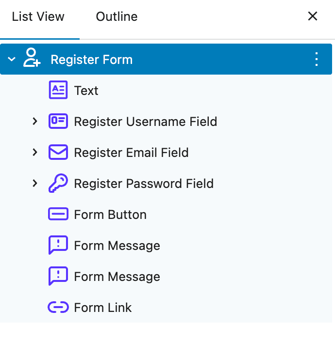
- Adding Optional Fields
- Use the “+” button to add optional child blocks:
- First Name field (
spectra-pro/register-first-name) - Last Name field (
spectra-pro/register-last-name) - Terms and Conditions checkbox (
spectra-pro/register-terms-and-conditions) - Login link for existing users
- First Name field (
- Use the “+” button to add optional child blocks:
Block Architecture
The Register Form Block uses a parent-child relationship:
- Register Form Block (Container):
spectra-pro/register– Manages overall layout, colors, and form behavior - Child Blocks: Individual form components that inherit parent settings:
spectra-pro/register-user-name– Username input fieldspectra-pro/register-email– Email input fieldspectra-pro/register-password– Password input fieldspectra-pro/register-confirm-password– Confirm password fieldspectra-pro/register-first-name– First name field (optional)spectra-pro/register-last-name– Last name field (optional)spectra-pro/register-terms-and-conditions– Terms checkbox (optional)spectra-pro/form-button– Submit buttonspectra-pro/form-link– Login linkspectra-pro/form-message– Success/error messagesspectra-pro/form-recaptcha– reCAPTCHA component
Important: Child blocks inherit styling from the parent but can be customized individually.
General Settings
| Option | Description | Available Settings |
|---|---|---|
| Show Labels | Display field labels | On/Off toggle |
| Show Icons | Display icons in input fields | On/Off toggle |
| Show Password Toggle | Allow showing/hiding password | On/Off toggle |
| Overall Alignment | Form alignment | Left, Center, Right |
| Button Alignment | Submit button alignment | Left, Center, Right |
| Form Width | Maximum width of form container | Custom width with units |
Field Labels and Placeholders
| Option | Description | Default Value |
|---|---|---|
| Username Label | Label for username field | “Username” |
| Username Placeholder | Placeholder text | “Enter username” |
| Email Label | Label for email field | “Email Address” |
| Email Placeholder | Placeholder text | “Enter your email” |
| Password Label | Label for password field | “Password” |
| Password Placeholder | Placeholder text | “Enter password” |
| Confirm Password Label | Label for confirm password field | “Confirm Password” |
| Confirm Password Placeholder | Placeholder text | “Confirm your password” |
| First Name Label | Label for first name field | “First Name” |
| First Name Placeholder | Placeholder text | “Enter first name” |
| Last Name Label | Label for last name field | “Last Name” |
| Last Name Placeholder | Placeholder text | “Enter last name” |
| Register Button Label | Button text | “Register” |
| Login Link Label | Link text | “Already have an account? Login” |
Color Settings
Label Colors
| Option | Description | Available Settings |
|---|---|---|
| Label Color | Default label text color | Color picker |
| Label Color Hover | Label text color on hover | Color picker |
Input Field Colors
| Option | Description | Available Settings |
|---|---|---|
| Input Text Color | Text color inside input fields | Color picker |
| Input Text Color Hover | Text color on hover | Color picker |
| Input Background | Input field background | Color picker |
| Input Background Hover | Background on hover | Color picker |
| Placeholder Color | Placeholder text color | Color picker |
Icon Colors
| Option | Description | Available Settings |
|---|---|---|
| Icon Color | Color for input field icons | Color picker |
| Fields Icon Size | Size of field icons | Default: 16px |
| Eye Icon Size | Size of password toggle icon | Default: 16px |
| Eye Icon Color | Password toggle icon color | Color picker |
Button Colors
| Option | Description | Available Settings |
|---|---|---|
| Button Text Color | Submit button text color | Color picker |
| Button Text Hover | Text color on hover | Color picker |
| Button Background | Button background color | Color picker |
| Button Background Hover | Background on hover | Color picker |
Link Colors
| Option | Description | Available Settings |
|---|---|---|
| Link Color | Color for login link | Color picker |
| Link Color Hover | Link color on hover | Color picker |
Message Colors
| Option | Description | Available Settings |
|---|---|---|
| Success Background | Background for success messages | Color picker |
| Success Text Color | Text color for success messages | Color picker |
| Error Background | Background for error messages | Color picker |
| Error Text Color | Text color for error messages | Color picker |
Form Container Colors
| Option | Description | Available Settings |
|---|---|---|
| Background Color | Form container background | Color picker |
| Background Gradient | Container gradient background | Gradient picker |
| Background Hover | Container background on hover | Color picker |
| Gradient Hover | Container gradient on hover | Gradient picker |
Layout and Spacing Settings
| Option | Description | Available Settings |
|---|---|---|
| Padding | Internal spacing | Top, Right, Bottom, Left (Responsive) |
| Margin | External spacing | Top, Right, Bottom, Left (Responsive) |
| Border | Form container border | Width, Style, Color, Radius |
| Box Shadow | Shadow effects | Multiple shadow layers |
Advanced Features
User Registration Settings
| Option | Description | Available Settings |
|---|---|---|
| New User Role | Default role for new users | Subscriber, Contributor, Author, etc. |
| After Register Actions | What happens after registration | Auto-login, Email verification |
| Enable Email Verification | Require email verification before login | On/Off toggle |
Security Settings
| Option | Description | Available Settings |
|---|---|---|
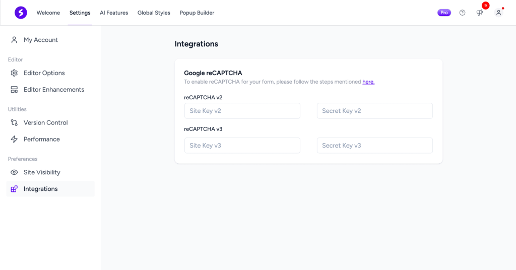
| Enable reCAPTCHA | Add spam protection | On/Off toggle |
| reCAPTCHA Type | Version to use | v2, v3 |
Note: reCAPTCHA requires configuration in Spectra Pro settings with valid site and secret keys.
Custom Messages
| Option | Description | Default Value |
|---|---|---|
| Success Message | Message shown on successful registration | “Registration successful! Please check your email to verify your account.” |
| Invalid Email Error | Message for invalid email format | “Please enter a valid email address.” |
| Email Missing Error | Message when email is not provided | “Email is required.” |
| Email Already Used Error | Message when email is already registered | “This email is already registered.” |
| Invalid Username Error | Message for invalid username | “Please enter a valid username.” |
| Username Missing Error | Message when username is not provided | “Username is required.” |
| Username Already Used Error | Message when username is taken | “This username is already taken.” |
| Invalid Password Error | Message for weak password | “Password must be at least 8 characters long.” |
| Password Confirm Error | Message when passwords don’t match | “Passwords do not match.” |
| Terms Error | Message when terms not accepted | “You must agree to the terms and conditions.” |
| Other Error | Generic error message | “An error occurred. Please try again.” |
Demo Messages
| Option | Description | Available Settings |
|---|---|---|
| Show Demo Success Message | Preview success message in editor | On/Off toggle |
| Show Demo Error Message | Preview error message in editor | On/Off toggle |
| Show Demo Field Error Message | Preview field error messages in editor | On/Off toggle |
Email Verification Settings
When email verification is enabled:
| Option | Description | Default Value |
|---|---|---|
| Email Template Type | Template to use | Default, Custom |
| Email Subject | Verification email subject | “Welcome! Please verify your email” |
| Email Message | Verification email body | “Thank you for registering. Please click the link below to verify your email address.” |
Device-Specific Settings
| Setting | Desktop | Tablet | Mobile |
|---|---|---|---|
| Font Size | ✓ | ✓ | ✓ |
| Padding | ✓ | ✓ | ✓ |
| Margin | ✓ | ✓ | ✓ |
| Border Width | ✓ | ✓ | ✓ |
| Border Radius | ✓ | ✓ | ✓ |
| Icon Size | ✓ | ✓ | ✓ |
Tips and Best Practices
Security Guidelines
- Always Use HTTPS: Ensure your site uses SSL certificates
- Enable reCAPTCHA: Protect against spam registrations
- Email Verification: Verify email addresses to prevent fake accounts
- Strong Password Policy: Enforce minimum password requirements
- Limit User Roles: Set appropriate default user role (usually Subscriber)
- Keep WordPress Updated: Ensure WordPress core and Spectra Pro are up to date
Design Guidelines
- Clear Visual Hierarchy: Make the submit button stand out
- Adequate Spacing: Use block gap for better readability
- Mobile Optimization: Test form on mobile devices
- Error Visibility: Ensure error messages are clearly visible
- Accessible Colors: Maintain sufficient color contrast
- Progress Indication: Show clear feedback during registration
User Experience Tips
- Show Password Toggle: Help users verify their password entry
- Password Requirements: Clearly indicate password requirements
- Confirm Password: Require password confirmation to prevent typos
- Clear Error Messages: Help users understand validation errors
- Login Link: Provide link for users who already have accounts
Field Recommendations
Required Fields (minimum for registration):
- Username or Email
- Password
- Email (if username is used)
Optional but Recommended:
- First Name and Last Name (for personalization)
- Password confirmation (prevent typos)
- Terms and Conditions acceptance (legal protection)
Avoid:
- Too many required fields (reduces conversion)
- Unclear validation requirements
- Asking for sensitive data upfront
Accessibility Features
Built-in Accessibility
- Semantic HTML form structure
- Proper label associations
- ARIA attributes for screen readers
- Keyboard navigation support
- Focus indicators
- Error message announcements
- Required field indicators
Keyboard Controls
- Tab: Navigate forward through form fields
- Shift + Tab: Navigate backward through form fields
- Enter: Submit form
- Space: Toggle checkboxes and password visibility
Troubleshooting
Registration not working?
- Check if user registration is enabled in WordPress settings
- Verify email delivery is working on your server
- Check for plugin conflicts
- Ensure form is not cached
- Verify redirect URLs are valid
Email verification not sending?
- Check WordPress email settings
- Verify SMTP is configured correctly
- Check spam folder
- Test email functionality with plugins like WP Mail SMTP
- Review server email logs
Styling not applying?
- Clear browser and server cache
- Check theme compatibility
- Use browser inspector for CSS conflicts
- Verify no custom CSS is overriding
reCAPTCHA not showing?
- Configure reCAPTCHA keys in Spectra Pro settings
- Verify reCAPTCHA version matches your keys
- Ensure site key is for the correct domain
- Check if browser extensions are blocking it
Validation errors not showing?
- Enable “Show Demo Field Error Message” to preview
- Check browser console for JavaScript errors
- Verify error message colors have sufficient contrast
Username/Email already exists errors?
- This is normal – WordPress prevents duplicate usernames and emails
- Ensure error messages clearly communicate this to users
Frequently Asked Questions
Q: Can I customize individual form fields?
A: Yes! Select any child block to customize its specific settings while inheriting parent colors.
Q: How do I make First Name and Last Name required?
A: Add these optional child blocks to your form. Each field has its own required setting.
Q: Can I change the default user role for new registrations?
A: Yes, use the “New User Role” setting to select from available WordPress roles.
Q: Does email verification work automatically?
A: When enabled, WordPress will send a verification email. Ensure your server can send emails.
Q: Can I add custom registration fields?
A: The block supports standard WordPress registration fields. Custom fields require additional plugins or custom code.
Q: What happens after someone registers?
A: You can configure “After Register Actions” to either auto-login the user or require email verification first.
Q: Can I redirect users to different pages based on their role?
A: The block provides a single redirect URL. For role-based redirects, you’ll need additional plugins.
Q: How do I prevent spam registrations?
A: Enable reCAPTCHA and consider email verification. You can also use additional anti-spam plugins.
Q: Can I customize the verification email template?
A: Yes, set “Email Template Type” to “Custom” and edit the subject and message fields.
Q: What is the minimum password requirement?
A: By default, WordPress requires passwords to be at least 8 characters. You can modify this with additional plugins.
WordPress Settings
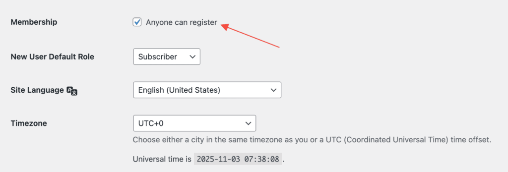
Important: Ensure user registration is enabled:
- Go to Settings > General in WordPress admin
- Check “Anyone can register” option
- Set “New User Default Role” (typically Subscriber)
Related Documentation
For user login functionality, see the Login Form Block documentation.
We don't respond to the article feedback, we use it to improve our support content.