- Section
- Troubleshooting: Missing Icons
- Spectra Patterns
- Contact Form 7: Multiple Column Fields
- Contact Form 7: Checkbox / Radio / Acceptance Control
- Unable To Style Contact Form 7
- Tab Index For Multiple Gravity Forms
- Getting Started With Spectra
- Exclude Heading From TOC
- Block Display Conditions
- Importing Starter Templates With Spectra
- Getting Started With Spectra
- Manually Install Spectra Via FTP
- Automatic Beta Updates
- Rollback To Previous Versions
- Load Google Fonts Locally
- Activate Spectra Pro License
- Install Spectra Pro
- Translate Strings With Loco Translate
- Process Refund Requests
- Transparent / Sticky Header
- Change Site Logo
- Change Global Styles
- Disable Title on Posts & Pages
- Transparent / Sticky Header For Single Page / Post
- Change Header & Footer Patterns
- Custom / Google Fonts
- Reset Global Default Styling
- Manually Install Spectra One Via FTP
- Enable / Disable Header & Footer On Specific Pages / Posts
- Container
- Buttons
- List
- Modal
- Slider In Spectra
- Animations In Spectra
- Icons
- Tabs In Spectra
- Text Block In Spectra
- Countdown In Spectra
- Loop Builder In Spectra
- Image Mask In Spectra
- Dynamic Content In Spectra
- Global Styles In Spectra
- Accordion In Spectra
- Responsive Control In Spectra
- Font Management In Spectra
- Google Maps
- Separator
- Getting Started With Spectra
- Public Actions and Hooks In Spectra
- Popup Builder In Spectra
- Counter Block In Spectra
- Login Block in Spectra
- Register Block In Spectra
- Spectra Design Library Guide
- How to Enable Spectra 3 Beta
- Preview Options in Spectra (Desktop, Tablet & Mobile)
Separator
Introduction
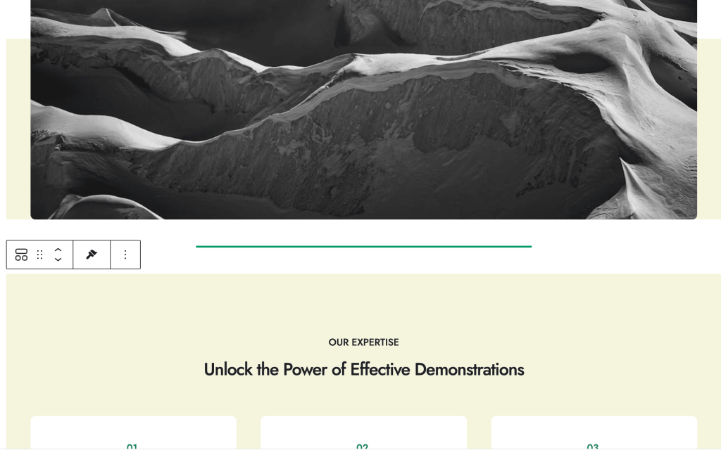
The Separator Block is a versatile content divider that helps organize and structure your page content. It provides clean visual separation between sections with customizable styles, colors, and alignments. Whether you need simple lines or decorative patterns, this block offers both classic border styles and modern SVG patterns for enhanced visual appeal.
How to Add or Use the Block in the Gutenberg Editor?
- Adding the Block
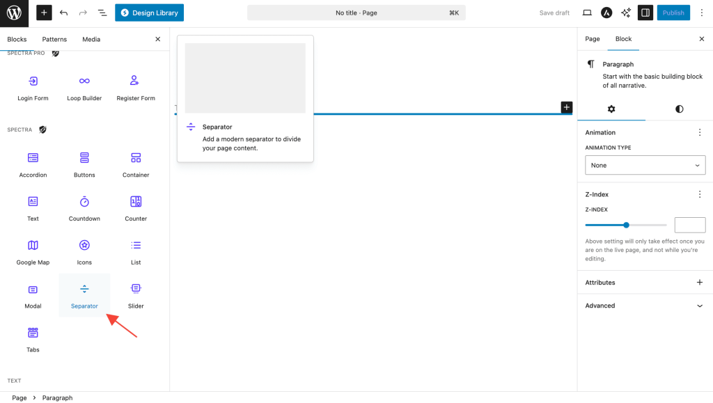
- Click the “+” button in the editor to open the block inserter
- Search for “Separator” or navigate to the Spectra category
- Click on the Separator Block to add it
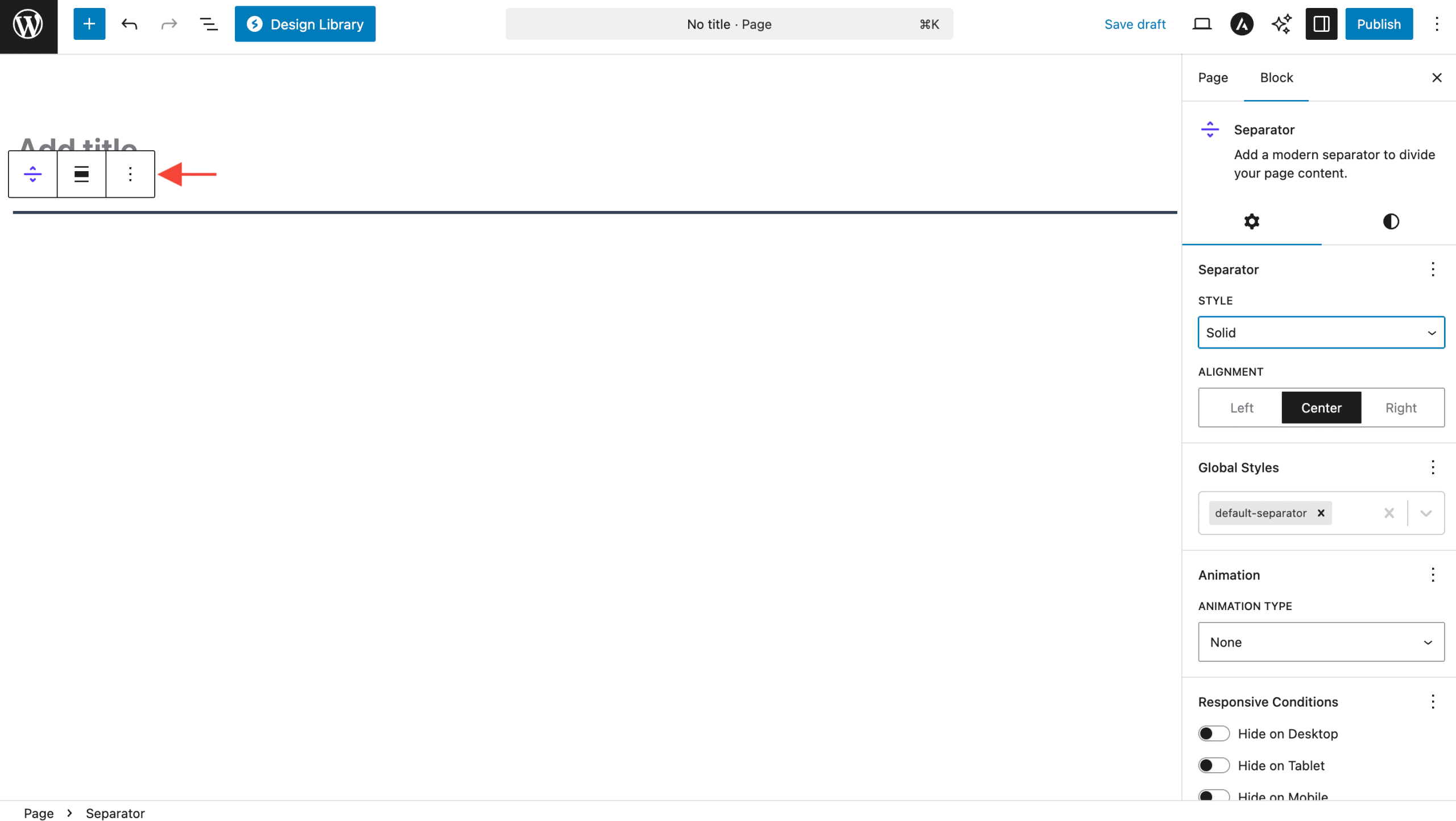
- Basic Configuration
- The separator appears immediately with default settings
- Use the settings panel to customize appearance
- Preview changes in real-time as you adjust settings
- Positioning and Layout
- Place separators between content blocks for visual division
- Use multiple separators to create structured layouts
- Combine with spacing controls for optimal visual hierarchy
Block Styling Options
The Separator Block provides three main categories of styling options:
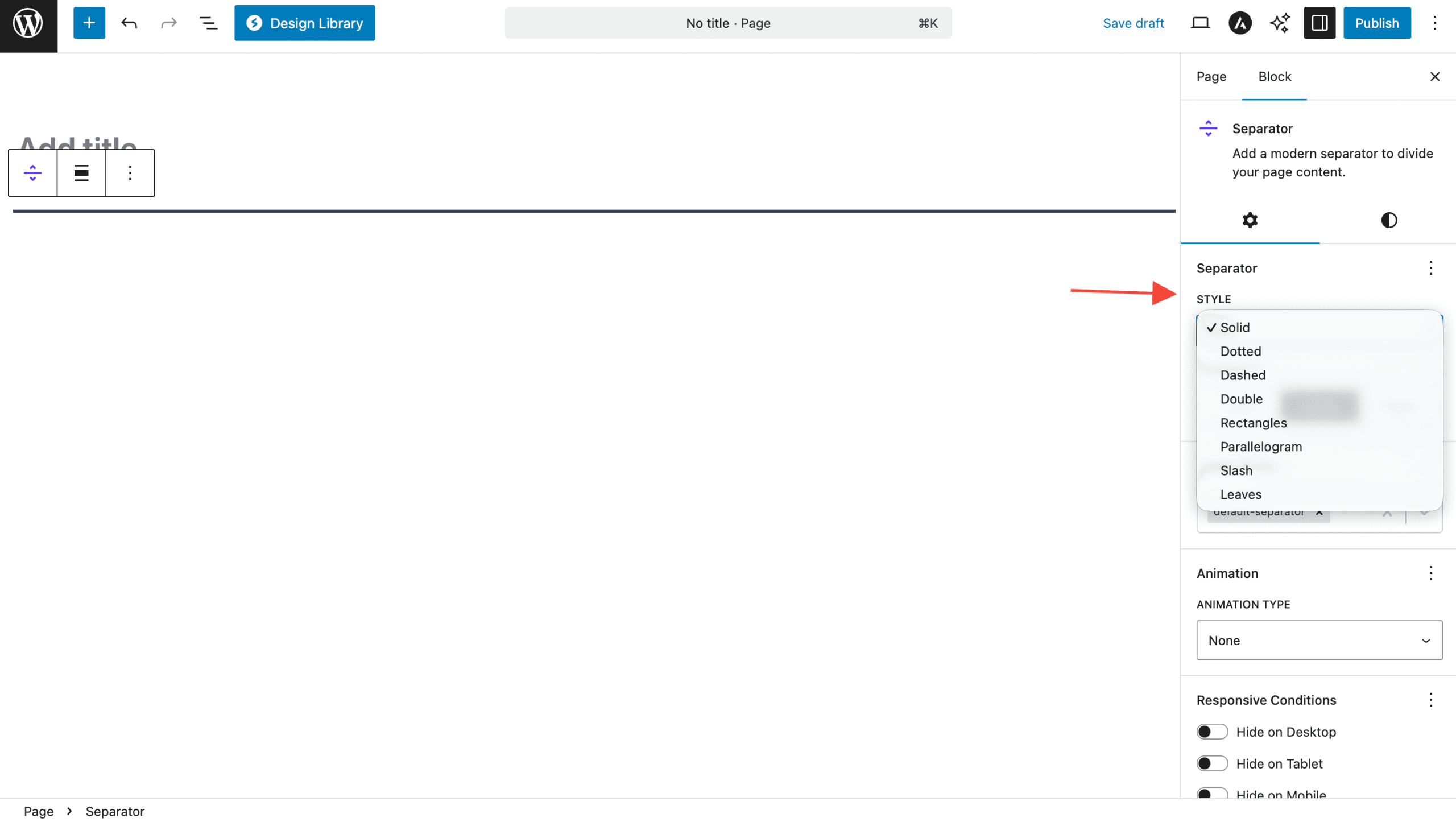
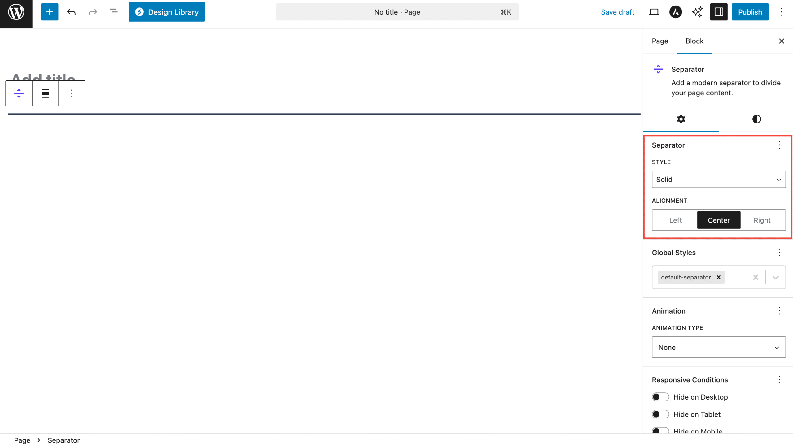
General Settings
| Option | Description | Available Settings |
|---|---|---|
| Style | Separator appearance | Solid, Dotted, Dashed, Double, Rectangles, Parallelogram, Slash, Leaves |
| Alignment | Horizontal positioning | Left, Center, Right |
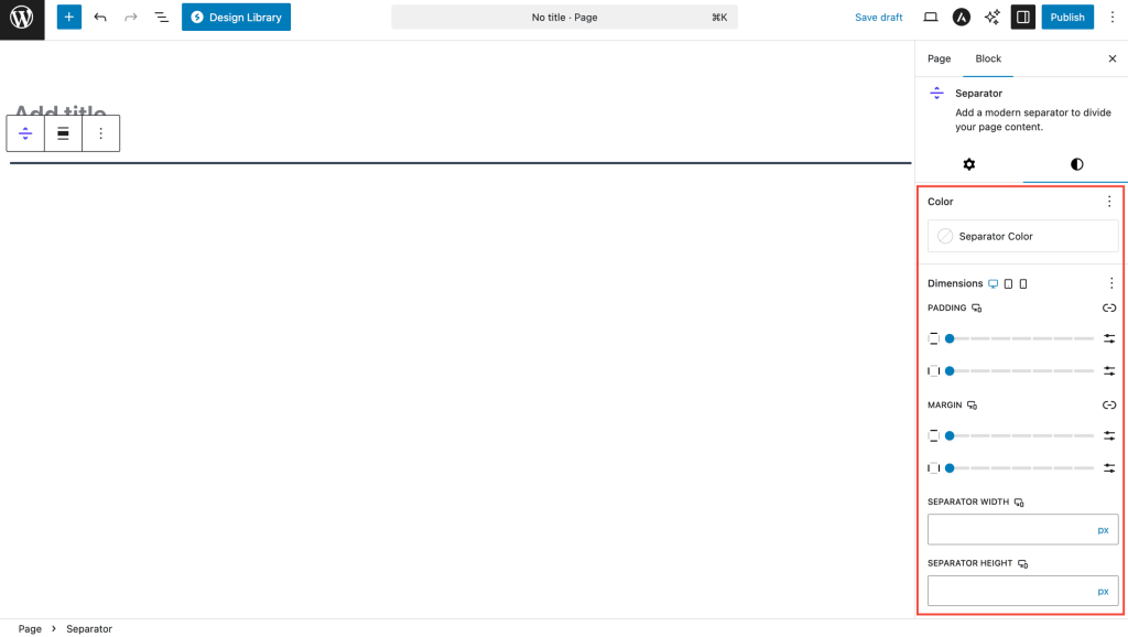
Dimensions
| Option | Description | Available Settings |
|---|---|---|
| Width | Separator width | px, %, vw, em, rem (Default: 100%) |
| Height | Separator thickness | px, %, vh, em, rem (Default: 3px) |
| Size | Pattern size for custom SVG styles | px, %, em, rem (Default: 5px) |
Color Settings
| Option | Description | Available Settings |
|---|---|---|
| Separator Color | Color of the separator line/pattern | Color picker with opacity support |
Separator Styles
Classic Border Styles
| Style | Description | Use Case |
|---|---|---|
| Solid | Continuous line | General content division |
| Dotted | Series of dots | Subtle separation |
| Dashed | Dashed line pattern | Informal content breaks |
| Double | Two parallel lines | Formal section divisions |
Custom SVG Patterns
| Style | Description | Use Case |
|---|---|---|
| Rectangles | Geometric rectangle pattern | Modern, architectural designs |
| Parallelogram | Slanted rectangle shapes | Dynamic, angular layouts |
| Slash | Diagonal line pattern | Creative, artistic sections |
| Leaves | Organic leaf motifs | Nature-themed, decorative content |
Important Settings
Critical Configuration
- Style Selection – Choose appropriate style for your content context
- Color Contrast – Ensure separator is visible against background
- Width Responsiveness – Consider mobile appearance with percentage widths
- Alignment Consistency – Match alignment with overall page layout
- Pattern Size – Adjust SVG pattern size for optimal visual balance
Tips and Best Practices
- Consistent Styling: Use the same separator style throughout similar content sections
- Appropriate Thickness: Thicker separators (5-10px) for major divisions, thinner (1-3px) for subtle breaks
- Color Harmony: Choose separator colors that complement your theme palette
- Spacing Context: Consider surrounding content spacing when positioning separators
- Mobile Optimization: Test separator visibility on smaller screens
Common Use Cases
- Content Sections: Divide blog posts into logical sections
- Feature Lists: Separate different features or services
- Testimonials: Create breaks between customer quotes
- Portfolio Items: Divide project showcases
- FAQ Sections: Separate question and answer groups
- Decorative Elements: Add visual interest with SVG patterns
Block Toolbar Options
- Alignment: Quick access to left, center, right alignment
- Transform: Convert to other compatible blocks if needed
- Drag Handle: Reposition the separator within content
- Options Menu: Additional settings and block actions
Advanced Features
Custom SVG Patterns
The separator includes four unique SVG patterns that provide modern alternatives to traditional border styles:
- Scalable: Patterns resize based on the Size setting
- Colorizable: Full color customization support
- Optimized: Lightweight SVG data URLs for fast loading
- Responsive: Patterns adapt to different separator widths
Responsive Design
- Unit Flexibility: Use % for responsive width, px for fixed dimensions
- Mobile Considerations: Patterns remain visible on small screens
- Breakpoint Awareness: Separators adapt to container width changes
Troubleshooting
Common Issues
Separator not visible?
- Check color contrast against background
- Verify height setting isn’t too small
- Ensure width isn’t set to 0
SVG patterns not showing?
- Confirm custom style is selected (rectangles, parallelogram, slash, leaves)
- Check that Size setting provides adequate pattern visibility
- Verify color setting isn’t transparent
Alignment issues?
- Review container width settings
- Check parent block alignment
- Ensure margin settings aren’t conflicting
Mobile display problems?
- Test with percentage-based widths
- Verify minimum height for touch interfaces
- Check pattern size scaling on small screens
Modern Features
Core Functionality
- Clean Design: Focused on essential separator functionality
- Optimized Performance: Fast rendering and efficient styling
- Organized Settings: Logical grouping of configuration options
- Custom SVG Patterns: Unique decorative pattern options
- Responsive Design: Optimized for all device sizes
Frequently Asked Questions
Q: What’s the difference between border styles and SVG patterns?
A: Border styles (solid, dotted, dashed, double) use CSS borders, while SVG patterns (rectangles, parallelogram, slash, leaves) use custom graphics for unique visual effects.
Q: Can I animate separators?
A: Yes! The separator supports animation extensions for entrance effects and hover states.
Q: How do I make separators responsive?
A: Use percentage values for width and consider the Size setting for SVG patterns to ensure proper scaling across devices.
Q: Can I use custom colors?
A: Absolutely! The color picker supports any color value including transparency for subtle effects.
Q: What’s the recommended separator thickness?
A: For general use, 2-4px works well. Use thicker separators (5-10px) for major section breaks and thinner ones (1-2px) for subtle divisions.
We don't respond to the article feedback, we use it to improve our support content.