- Section
- Troubleshooting: Missing Icons
- Spectra Patterns
- Contact Form 7: Multiple Column Fields
- Contact Form 7: Checkbox / Radio / Acceptance Control
- Unable To Style Contact Form 7
- Tab Index For Multiple Gravity Forms
- Getting Started With Spectra
- Exclude Heading From TOC
- Block Display Conditions
- Importing Starter Templates With Spectra
- Getting Started With Spectra
- Manually Install Spectra Via FTP
- Automatic Beta Updates
- Rollback To Previous Versions
- Load Google Fonts Locally
- Activate Spectra Pro License
- Install Spectra Pro
- Translate Strings With Loco Translate
- Process Refund Requests
- Transparent / Sticky Header
- Change Site Logo
- Change Global Styles
- Disable Title on Posts & Pages
- Transparent / Sticky Header For Single Page / Post
- Change Header & Footer Patterns
- Custom / Google Fonts
- Reset Global Default Styling
- Manually Install Spectra One Via FTP
- Enable / Disable Header & Footer On Specific Pages / Posts
- Container
- Buttons
- List
- Modal
- Slider In Spectra
- Animations In Spectra
- Icons
- Tabs In Spectra
- Text Block In Spectra
- Countdown In Spectra
- Loop Builder In Spectra
- Image Mask In Spectra
- Dynamic Content In Spectra
- Global Styles In Spectra
- Accordion In Spectra
- Responsive Control In Spectra
- Font Management In Spectra
- Google Maps
- Separator
- Getting Started With Spectra
- Public Actions and Hooks In Spectra
- Popup Builder In Spectra
- Counter Block In Spectra
- Login Block in Spectra
- Register Block In Spectra
- Spectra Design Library Guide
- How to Enable Spectra 3 Beta
- Preview Options in Spectra (Desktop, Tablet & Mobile)
Slider In Spectra
Introduction
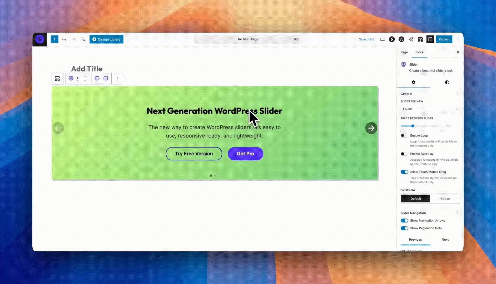
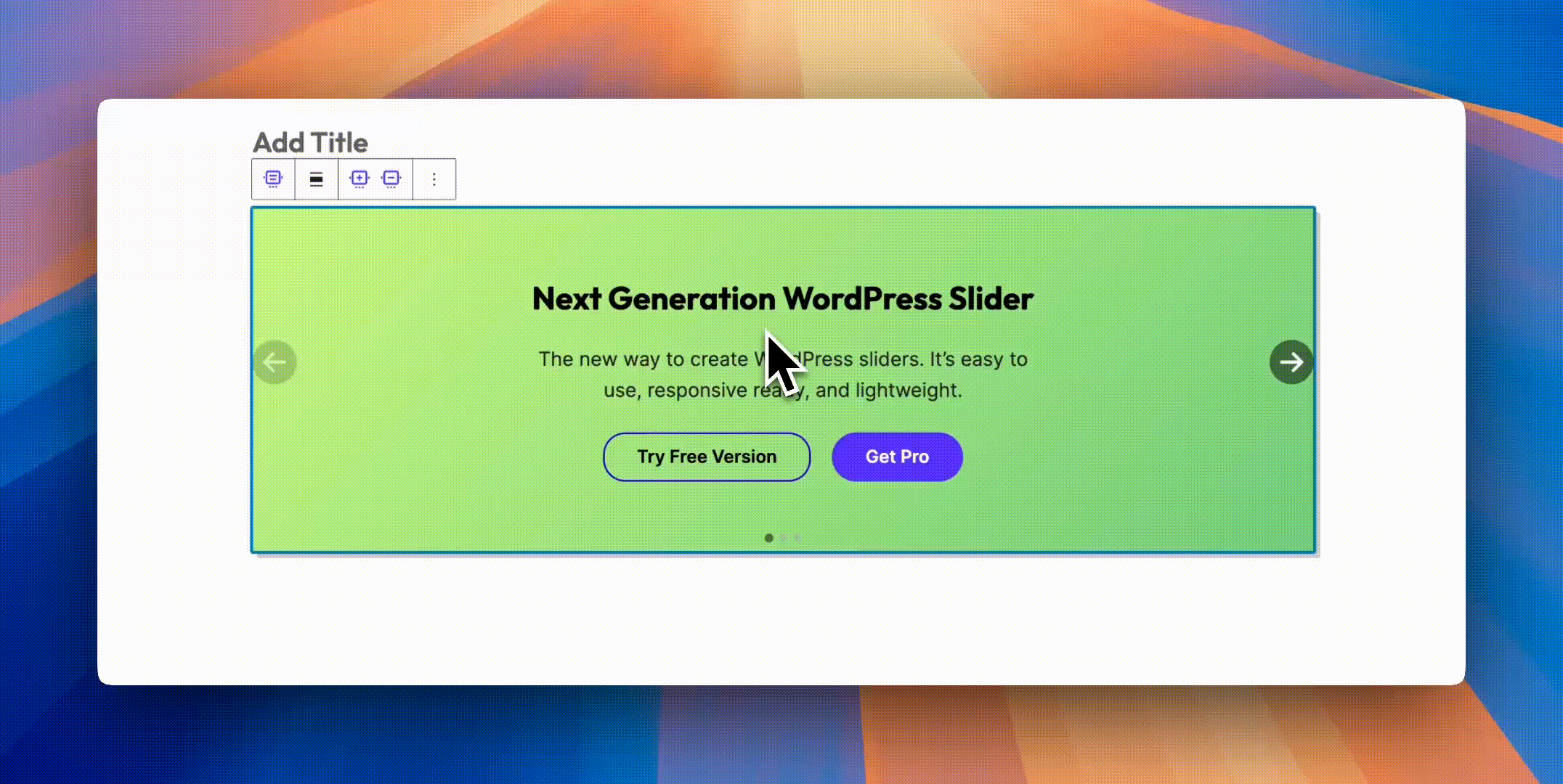
The Slider Block creates dynamic, responsive carousels for showcasing content, images, testimonials, or any combination of blocks. Built on the powerful Swiper.js library, it offers smooth transitions, touch support, and extensive customization options. Perfect for hero sections, product showcases, testimonial carousels, or any content that benefits from sequential presentation.
How to Add or Use the Block in the Gutenberg Editor
- Adding the Block
- Click the “+” button to open the block inserter
- Search for “Slider” or navigate to the Spectra category
- Click on the Slider Block to add it to your page
- The block starts with three default slides
- Adding Slides
- Click the “+” button in the slider to add a new slide
- Each slide is a container that can hold any blocks
- Add images, text, buttons, or complex layouts
- Use the toolbar to manage slides
- Navigating Slides in Editor
- Click arrow buttons to move between slides
- Use the slide selector in the toolbar
- Drag to reorder slides
- Delete slides using the toolbar options
Block Toolbar Options
Slider Container Toolbar
| Option | Description |
|---|---|
| Add Slide | Insert new slide at end |
| Slide Selector | Quick jump to any slide |
| Wide/Full Width | Container width options |
| More Options | Additional settings |
Individual Slide Toolbar
| Option | Description |
|---|---|
| Move Left | Reorder slide position |
| Move Right | Reorder slide position |
| Duplicate | Clone slide with content |
| Delete | Remove this slide |
| Add Block | Insert content to slide |
Block Styling Options
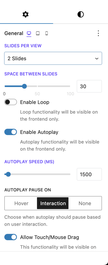
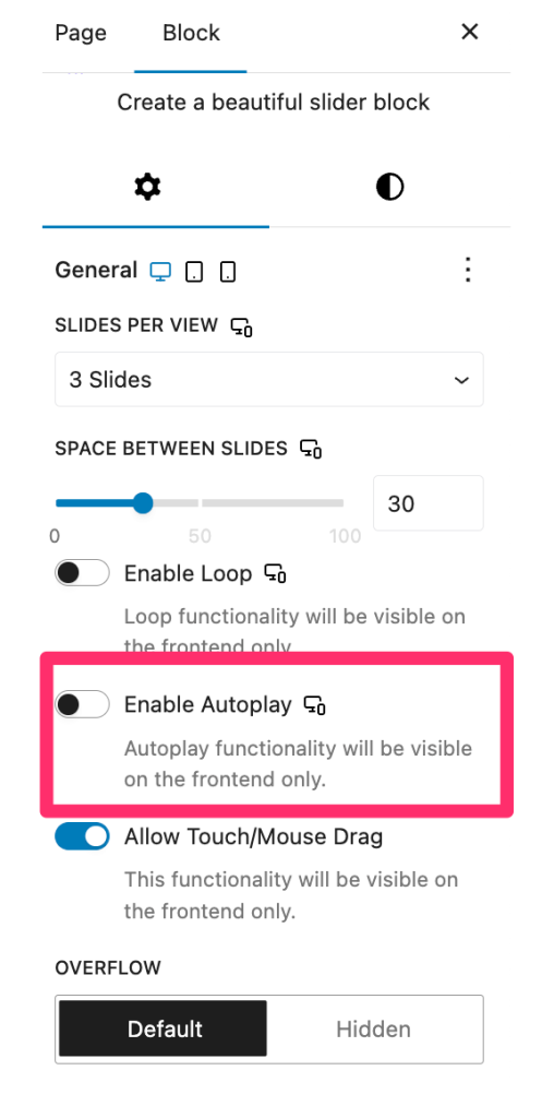
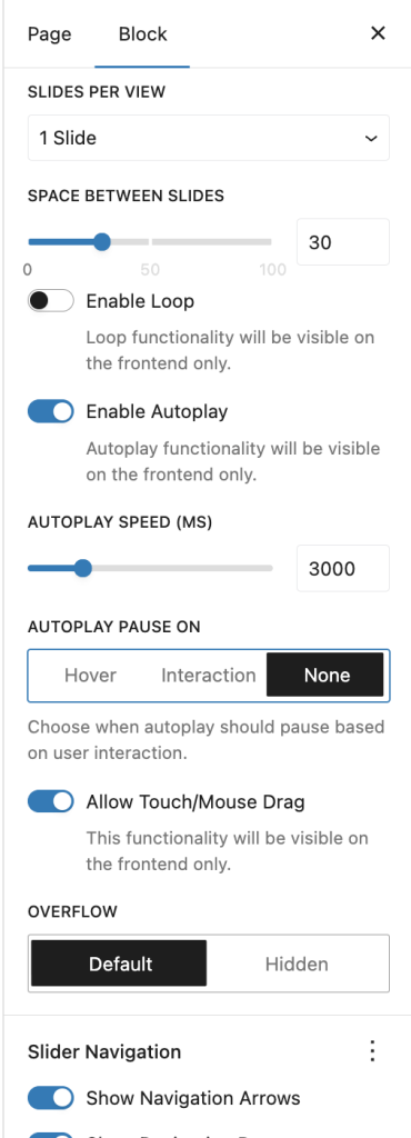
General Settings
| Option | Description | Available Settings |
|---|---|---|
| Slides Per View | Number of visible slides | 1, 2, 3, 4, Auto |
| Space Between | Gap between slides | 0-100px |
| Loop | Continuous navigation | On/Off toggle |
| Autoplay | Automatic progression | On/Off toggle |
| Autoplay Speed | Time between transitions | 1-10 seconds |
| Transition Speed | Animation duration | 100-2000ms |
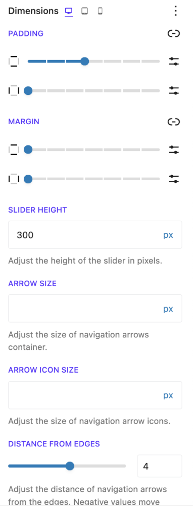
| Slider Height | Container height | Auto, px, vh, % |
Navigation Settings
| Option | Description | Available Settings |
|---|---|---|
| Show Arrows | Display navigation arrows | On/Off toggle |
| Previous Icon | Left/Previous arrow icon | Icon picker |
| Next Icon | Right/Next arrow icon | Icon picker |
| Arrow Size | Navigation button size | 20-100px |
| Icon Size | Arrow icon size | 10-50px |
| Arrow Distance | Position from edges | -100 to 100px |
Pagination Settings
| Option | Description | Available Settings |
|---|---|---|
| Show Dots | Display pagination dots | On/Off toggle |
| Dots Position | Vertical offset | -100 to 100px |
| Dot Size | Pagination dot size | Via CSS |
Color Settings
| Option | Description | Available Settings |
|---|---|---|
| Arrow Color | Navigation arrow color | Color picker |
| Arrow Hover Color | Arrow color on hover | Color picker |
| Arrow Background | Arrow button background | Color picker |
| Arrow Background Hover | Background on hover | Color picker |
| Dot Color | Pagination dot color | Color picker |
| Dot Hover Color | Dot color on hover | Color picker |
| Active Dot Color | Current slide dot | Color picker |
Advanced Settings
| Option | Description | Available Settings |
|---|---|---|
| Pause on Hover | Stop autoplay on hover | On/Off toggle |
| Pause on Interaction | Stop after user action | On/Off toggle |
| Allow Touch Move | Enable swipe navigation | On/Off toggle |
| Overflow | Content overflow behavior | Hidden, Visible |
Responsive Behavior
Mobile Responsive Settings
Tablet Responsive Settings
Desktop Responsive Settings
Breakpoint Options
| Setting | Description | Options |
|---|---|---|
| Breakpoints | Responsive behavior | None, Default, Custom |
| Desktop Slides | Slides on desktop | 1-4 or Auto |
| Tablet Slides | Slides on tablet | 1-4 or Auto |
| Mobile Slides | Slides on mobile | 1-4 or Auto |
Default Breakpoints
- Mobile: < 544px
- Tablet: 544px – 1023px
- Desktop: ≥ 1024px
Common Slider Configurations
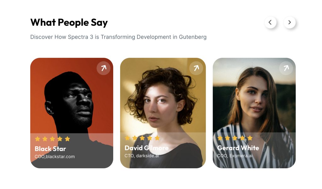
Testimonial Slider

Settings:
- Slides per view: 1-3 (responsive)
- Space between: 30px
- Autoplay: Disabled
- Custom arrow icons
- Center active slide
Content Slider
Settings:
- Slides per view: 1
- Fixed height: 500px
- Autoplay with pause on hover
- Custom navigation styling
Navigation Options
Arrow Navigation
Customization options:
- Icon Selection: Choose from Font Awesome icons
- Positioning: Inside or outside slider
- Size: Adjust button and icon sizes separately
- Colors: Normal and hover states
- Visibility: Show on hover only (CSS)
Pagination Dots
Dot features:
- Click to jump to specific slide
- Active state indication
- Customizable colors
- Adjustable position
- Can be hidden on mobile
Keyboard Navigation
The slider supports keyboard controls:
- Arrow Keys: Navigate next/previous
- Home/End: Jump to first/last slide
- Tab: Navigate through focusable elements
Slide Content Options
Simple Image Slides
- Add Image block to each slide
- Set consistent aspect ratios
- Use high-quality images
- Consider lazy loading
Background Options
Background Color Settings

Background Gradient Settings

- Color backgrounds: Solid or gradient
- Image backgrounds: With overlay options
- Video backgrounds: Autoplay support
- Transparent: For overlay effects
Animation Integration
Using Animations with Slides
- Enable Animation extension on slide content
- Choose animation type (fade, slide, zoom)
- Set animation to trigger on slide change
- Adjust timing to match slide transitions
Animation Best Practices
- Keep animations subtle
- Match animation speed to slide speed
- Use consistent animation types
- Test on mobile devices
Pro Features
Hash Navigation
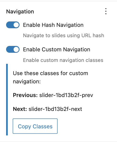
The Hash Navigation feature allows direct linking to specific slides using URL hash values.
Key Benefits:
- Direct linking to specific slides (e.g.,
yoursite.com/page#slide2) - Seamless deep linking for presentations
- Better user experience for multi-slide content
- Maintains slide position on page refresh
Implementation Tips:
- Enable hash navigation in block settings
- Combine with autoplay for smooth transitions
- Perfect for product showcases and portfolios
Custom Navigation
Custom Navigation allows any element on your page to control the slider, extending beyond traditional arrow buttons.
Features:
- Link any element to control slides
- Create custom thumbnail navigation
- Build interactive slide menus
- Design unique navigation experiences
Navigation Options:
- Next/Previous slide triggers
- Jump to specific slide
- Play/Pause controls
- Custom thumbnail strips
Example Use Cases:
- Thumbnail strip navigation
- External button controls
- Menu-based slide selection
- Interactive timeline navigation
Advanced Features
Autoplay Configuration
Autoplay Disabled Settings
Autoplay Enabled Settings
Options:
- Speed: 1-10 seconds between slides
- Pause on Hover: User-friendly option
- Pause on Interaction: Stops after manual navigation
Touch and Swipe Support
Mobile gestures:
- Swipe left/right to navigate
- Pinch to zoom (when applicable)
- Touch-friendly navigation buttons
Loop Mode
Benefits:
- Seamless continuous navigation
- No dead ends
- Better for autoplay
- Natural user experience
Performance Optimization
Best Practices
- Image Optimization
- Compress images before upload
- Use appropriate formats (WebP)
- Implement lazy loading
- Set explicit dimensions
- Slide Limits
- Keep to 5-10 slides maximum
- Use pagination for more content
- Consider performance on mobile
- Animation Performance
- Limit complex animations
- Use CSS transforms
- Test on lower-end devices
Accessibility Features
Built-in Accessibility
- ARIA Labels: Proper labeling for screen readers
- Role Attributes: Semantic slider roles
- Keyboard Navigation: Full keyboard support
- Focus Management: Visible focus indicators
- Live Regions: Announce slide changes
Accessibility Best Practices
- Alt Text: Add to all images
- Heading Structure: Maintain hierarchy
- Link Context: Clear link purposes
- Color Contrast: WCAG compliance
- Motion Control: Respect prefers-reduced-motion
Troubleshooting
Slider not advancing?
- Check if autoplay is enabled
- Verify loop setting for continuous play
- Look for JavaScript errors
- Test touch/swipe on mobile
Navigation not showing?
- Ensure arrows/dots are enabled
- Check color contrast
- Verify CSS isn’t hiding elements
- Look for theme conflicts
Responsive issues?
- Check breakpoint settings
- Test actual devices
- Verify slides per view settings
- Consider content overflow
Performance problems?
- Optimize images
- Reduce number of slides
- Disable unnecessary animations
- Check for plugin conflicts
Frequently Asked Questions
Q: How many slides can I add?
A: No hard limit, but 5-10 slides is recommended for performance.
Q: Can I have different heights for slides?
A: Yes, set height to ‘auto’ and slides adjust to content.
Q: Can I link entire slides?
A: Add links within slide content. For whole-slide links, use a container with link.
Q: Do videos autoplay in slides?
A: Background videos can autoplay. Content videos follow browser policies.
Q: Can I use the slider for a single image?
A: Yes, but consider using the Image block for single images.
Q: How do I create a full-screen slider?
A: Set height to 100vh and use full-width alignment.
Use Cases
Hero Sliders
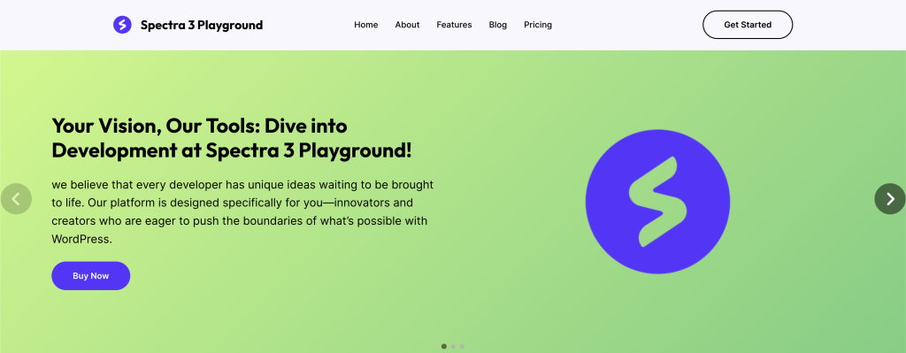
- Full-width promotional content
- Multiple CTAs
- Brand storytelling
- Feature highlights
Team members Showcases

- Team photo galleries
- Simple Avatar Images.
- Custom Navigation for slider.
Testimonial Carousels
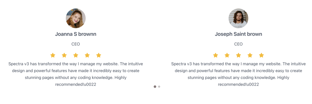
- Customer reviews
- Success stories
- Team quotes
- Social proof
Tips and Best Practices
Design Guidelines
- Slide Content Strategy
- Limit text to 2-3 sentences per slide
- Use high-quality images (optimize for web)
- Maintain consistent visual hierarchy
- Ensure readability on all devices
- Navigation Best Practices
- Always show navigation controls
- Make arrows large enough for touch (44x44px)
- Position dots where they won’t obscure content
- Consider adding pause button for accessibility
- Performance Optimization
- Optimize images before upload (use WebP)
- Lazy load off-screen slides
- Limit to 5-7 slides maximum
- Use srcset for responsive images
Animation and Timing
- Transition Settings
- Keep transitions under 1 second
- Use ease-in-out for smooth motion
- Match speed to content complexity
- Avoid jarring effects
- Autoplay Considerations
- Default to 5-7 seconds per slide
- Always include pause controls
- Stop on user interaction
- Consider motion preferences
Accessibility Requirements
- Keyboard Support
- Arrow keys for navigation
- Tab through interactive elements
- Escape to pause autoplay
- Clear focus indicators
- Screen Reader Optimization
- Descriptive slide labels
- Announce slide changes
- Alternative text for images
- Skip navigation options
Mobile Optimization
- Touch Gestures
- Enable swipe navigation
- Sufficient touch targets
- Momentum scrolling
- Pinch-to-zoom friendly
- Responsive Design
- Stack content vertically
- Adjust font sizes
- Simplify on small screens
- Test actual devices
Common Mistakes to Avoid
- Too many slides (cognitive overload)
- Autoplay too fast (unreadable)
- Small navigation controls
- Poor color contrast
- Missing pause controls
- Inconsistent slide layouts
- Heavy unoptimized images
- Ignoring keyboard users
Compatibility and Requirements
System Requirements
- WordPress: 6.6.0 or higher
- PHP: 8.1 or higher
- Browser: Modern browsers with JavaScript enabled
Library Dependencies
- Swiper.js: Version 8.x
- Modular architecture (only loads needed features)
- Mobile-optimized
Theme Compatibility
- Works with all standard themes
- May need z-index adjustments
- Full-width support varies by theme
We don't respond to the article feedback, we use it to improve our support content.