- Section
- Troubleshooting: Missing Icons
- Spectra Patterns
- Contact Form 7: Multiple Column Fields
- Contact Form 7: Checkbox / Radio / Acceptance Control
- Unable To Style Contact Form 7
- Tab Index For Multiple Gravity Forms
- Getting Started With Spectra
- Exclude Heading From TOC
- Block Display Conditions
- Importing Starter Templates With Spectra
- Getting Started With Spectra
- Manually Install Spectra Via FTP
- Automatic Beta Updates
- Rollback To Previous Versions
- Load Google Fonts Locally
- Activate Spectra Pro License
- Install Spectra Pro
- Translate Strings With Loco Translate
- Process Refund Requests
- Transparent / Sticky Header
- Change Site Logo
- Change Global Styles
- Disable Title on Posts & Pages
- Transparent / Sticky Header For Single Page / Post
- Change Header & Footer Patterns
- Custom / Google Fonts
- Reset Global Default Styling
- Manually Install Spectra One Via FTP
- Enable / Disable Header & Footer On Specific Pages / Posts
- Change Sidebar Contents
- FSE Templates & Template Parts
- Create Custom Front Page
- FAQ's
- Hide / Show Block Elements
- Group Blocks / Containers
- Clear Customizations
- Actual Predefined Font Sizes
- Make Changes To Single Pages
- Change Hero Section
- Install Spectra One
- Globally Change Width
- Sidebar: Page & Post
- FSE Stylebook
- Change Global Color Palette
- Customizing Block Styles
- Modify Patterns
- Change Sidebar Position For Pages & Posts
- Adding Dynamic SVG Color
- FSE Guide
- Editing Templates
- Change Favicon
- WooCommerce: Sticky Headers
- Google Analytics
- Create A Child Theme
- Translate Using WPML
- FSE Additional CSS
- Templates For Custom Post Types
- Custom Post Type Archive Template Using ACF
- Navigation Block
- How to Create and Customize Navigation Menus in the Spectra One Theme
Understanding Duotone and Adding Dynamic Color to SVG
Duotone is a technique that allows you to add vibrant colors to images or SVG (Scalable Vector Graphics) files. In our implementation, we have taken it a step further by making it dynamic with global styles, enabling you to apply dynamic color effects. In this easy-to-understand document, we will explain what duotone is and guide you on how to add dynamic colors to SVG using the supported classes: swt-duotone-primary and swt-duotone-secondary.
What is Duotone?
Duotone is a captivating method of enhancing images or SVG files by applying two distinct colors to them. With the rise of digital design and CSS (Cascading Style Sheets), duotone effects can now be applied dynamically to images and SVG files. The primary color typically serves as the highlight or foreground color, while the secondary color acts as the shadow or background color. These contrasting colors work together to bring depth, contrast, and a unique visual style to the image or SVG.
How to Apply Duotone on SVG images?
Here is how you can apply two colors on any SVG image.
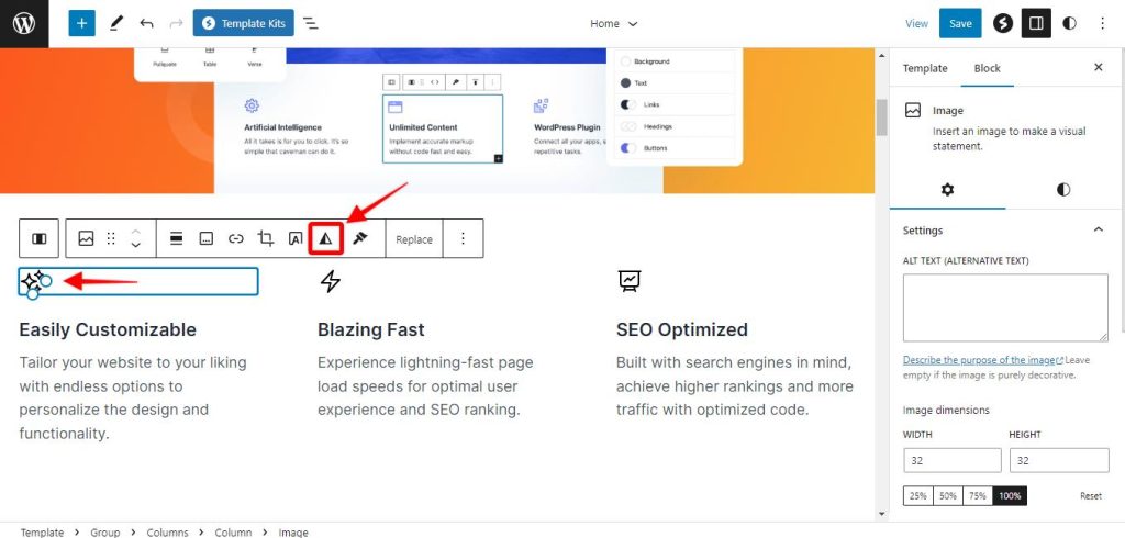
Step 1: Select the SVG image and click on the Apply Duotone Filter option from the menu
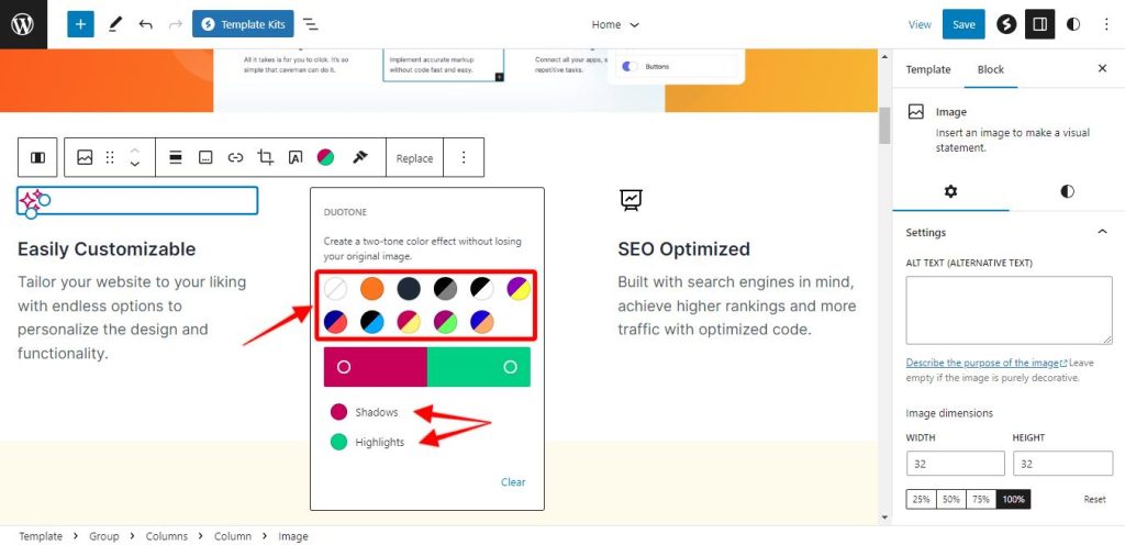
Step 2: This will open the options to choose the colors. Please choose one of the default colors or you can customize the colors by clicking separate colors for Shadow and Highlights.
Note
Please note that this will not make the SVG image colors dynamic; however, you can manually change the color of each and every SVG image on your website. This option will not work if there is a class already assigned to your SVG icons. If you would like to manually change the colors of your SVG images, please ensure that the Advanced CSS Class section as mentioned below remains empty.
How to Add the Class to the SVG icons?
To activate the dynamic version of the Duotone colors, you will need to add the class ID : swt-duotone-primary to the SVG icon under Advanced settings. Here are the steps below:
Step 1: Select the SVG icons on the page where you need to use the Duotone settings
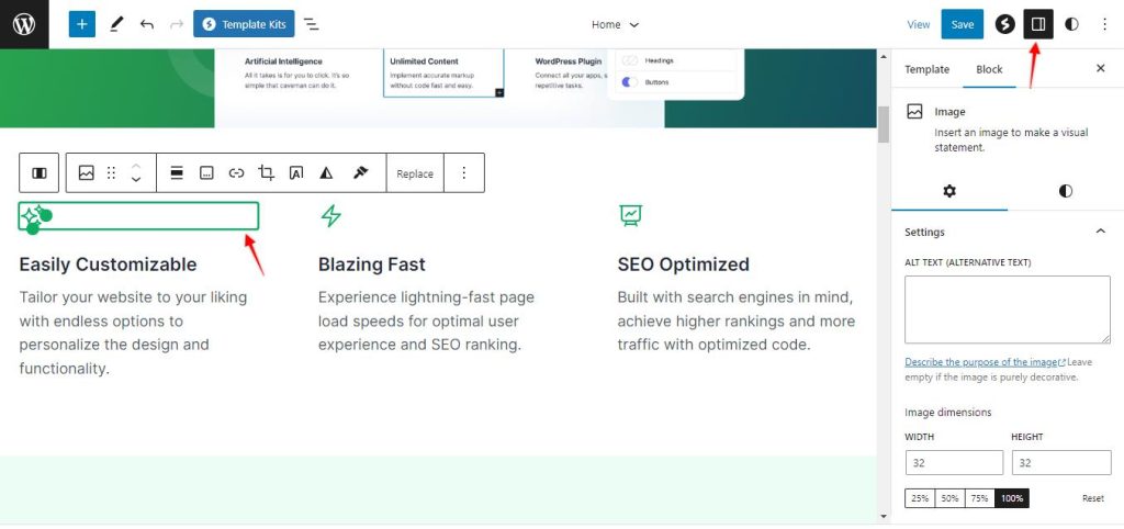
Step 2: Navigate to the block settings and click on Advanced

Step 3: Copy the class ID “swt-duotone-primary” and paste it under the Additional CSS Class option. You can also use the class ID “swt-duotone-secondary”. It is used to convert black svg to white when the styles are changed using style variation
Step 4: Click on the save button to make the changes permanent.
What does Dynamic Duotone do?
The dynamic nature of duotone with CSS enables you to change and manipulate the colors on the fly. By utilizing CSS variables or global style declarations, you can create a dynamic duotone effect that can be easily modified across multiple elements or throughout your entire website or application. This flexibility allows for greater customization and adaptability in achieving the desired visual impact.
Once you have added the aforementioned class to the SVG icons, when you change the theme color, the SVG icons will also change the color based on the different theme colors. Here is an example:

Conclusion
Duotone is a technique that allows you to add eye-catching colors to images or SVG files. By implementing the swt-duotone-primary and swt-duotone-secondary classes and defining the primary and secondary colors using global styles, you can create dynamic duotone effects. Experiment with different color combinations and adjust the global styles to achieve the desired visual impact. Embrace the power of duotone and dynamic colors to make your SVGs more engaging and visually appealing across your website or application.
We don't respond to the article feedback, we use it to improve our support content.