We use buttons on websites when we want readers to take specific actions. This is the most common element people use globally to interact with websites, be it a contact form, a poll, entering a coupon, a download button or any other action you want users to take.
“The average CTR for a call-to-action button is 4.23 percent across all industries” – source: vye.agency
The default WordPress button block lets you make basic buttons with limited features, but that’s often not enough.
Spectra offers different WordPress button blocks that allow you to design conversion-friendly and much more engaging buttons.
In this article, we’re going to show you how to add a button to a WordPress website. You’ll also learn how to create a button using HTML and CSS.
It’s quick and easy to do and could boost your conversion rate as a result!
Let’s start with a quick discussion on the different types of WordPress buttons.
What are the different types of WordPress buttons?
There are a range of buttons you can use on a website. The main difference between them is the design and the call to action you use.
They include:
Call to action button

A call to action (CTA) button encourages visitors to take specific actions. You can use CTA buttons to encourage visitors to sign up, buy now, add to cart and any action you want them to take.
Read more button

A read more button is typically used to expand the content on a post or blog page. You can use a ‘read more’ button as an anchor link to navigate users to another page, post, or website.
It’s an excellent way to offer more information without using up too much of the page
More info button
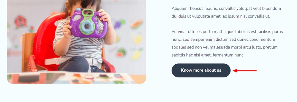
The more info button works in a similar way to read more, to access long-form information or content.
For example, where you have a dedicated service page where you talk in detail or where there are specific terms and conditions a reader needs to be aware of.
Contact button

A contact button can be added anywhere on a website. It’s the link to the contact page where users can easily get in touch.
Download button

You can use the download button for downloading digital products or media files. You can link it directly to the download or to the download page depending on how you have set up your website.
Submit button
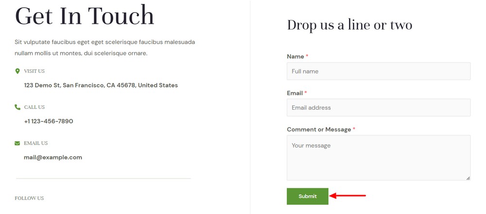
A submit button comes in many forms. You can see them on login pages, registration forms, newsletter signups, or other forms that visitors complete.
WordPress button examples
Let’s now see some buttons in action on some very recognizable websites. Feel free to use any of them for inspiration.
Apple
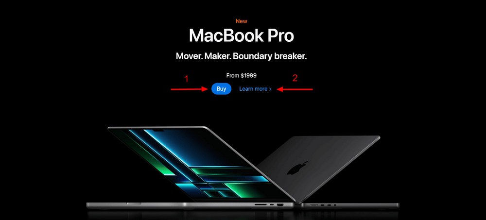
Apple uses multiple buttons on its website and you’ll usually see two different buttons on a page.
A call to action (CTA) button called ‘Buy’ offers a fast way for users to purchase the product. The ‘Learn more’ button will lead you to another page where you can get more information.
Microsoft

Microsoft uses a simple but catchy button on its website. It uses meaningful text so you can easily understand what it’s for.
The blue background and white text color are a good combination that gives you an eye-soothing contrast to the page content.
Astra

The use of buttons on the Astra website is very conversion friendly. You see an outlined download button in the navigation menu.
You’ll also find a button in the banner area. It comes with a yellow colored background and black text so it stands out more.
The use of the WordPress logo icon in the button attracts attention and makes it more engaging.
Now you have seen how some leading websites use buttons, let’s create some of our own!
How to add a button to a WordPress website
We come to the main part of the article, how to add a button to a WordPress website.
We’re not going to use the default WordPress button block as it comes with basic features and you’ll probably already know how to use it.
We’re going to use our own plugin, Spectra. It’s a block based page builder that comes with 30+ professional WordPress blocks including three different button blocks.
Before we get to the tutorial part, make sure that you’ve installed and activated the Spectra plugin on your WordPress website.
Add the button block
Open the page you want to add a block to with the WordPress block editor. You’ll see all the blocks added by Spectra next to the default blocks.
Select the black ‘+’ icon where you want to add a button and select the Spectra Buttons block.
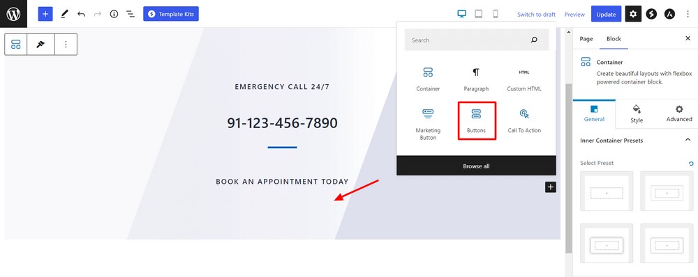
Once you successfully add the block, you’ll see two default buttons.
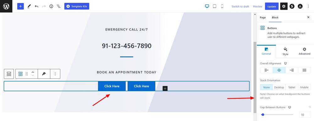
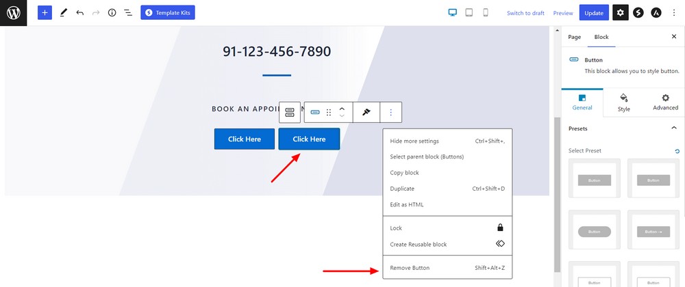
It isn’t often you would use two buttons together so let’s remove one.
Right click on the button block you want to delete and hit the Remove Button. You can also use the keyboard shortcut key Shift + Alt + Z.
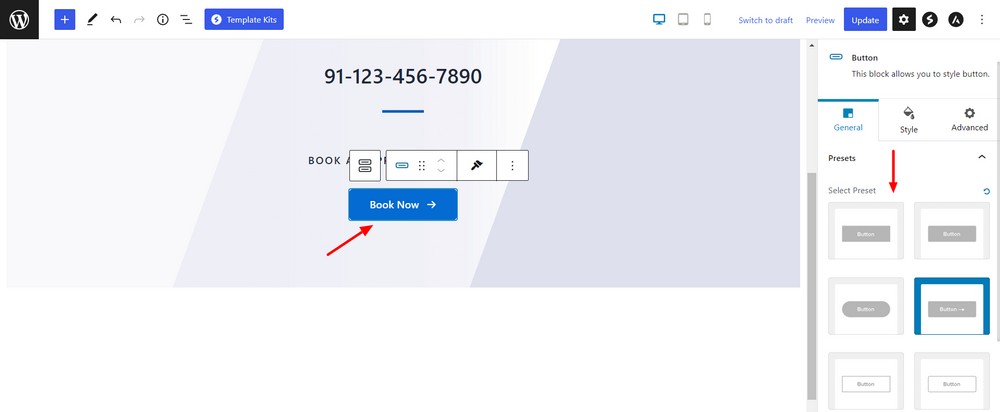
You’ll probably want to change the button text and style too. The button block in Spectra offers two types of presets, outlined and filled.
You’ll get four preset styles under the filled option.
- No border-radius button
- 5px border-radius button
- 30px border-radius button
- 5px border-radius with an icon button
The design is the same for the outlined button.
Experiment and see what each looks like and choose the one that fits best into your design.
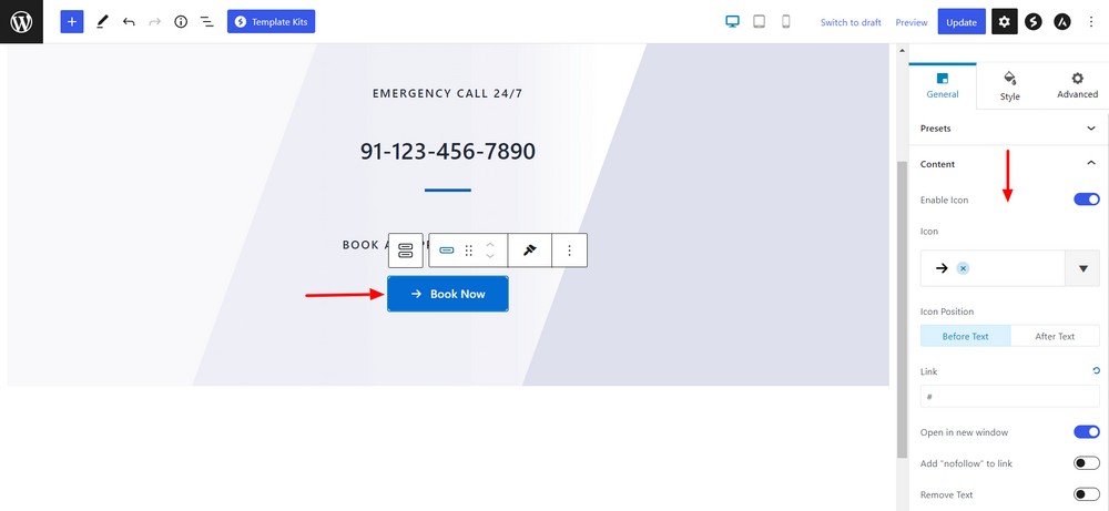
In General > Content, you’ll see all the necessary settings to manage the button.
You can change the icon and set its position. You can also insert the link and set the button text too.
Customize button design
The Style area is where you’ll find all the customization settings.
You can change the typography and set normal and hover text color.
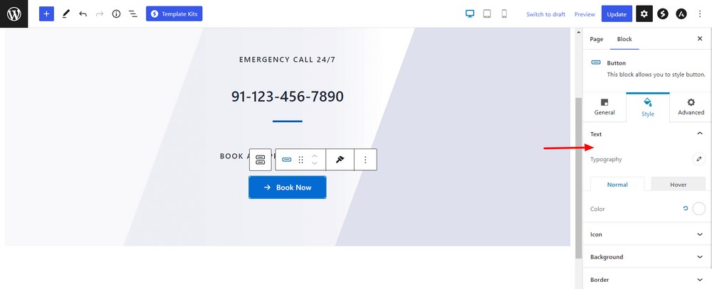
Experiment with colors, icons, shapes and sizes until you’re completely happy with how the button looks.
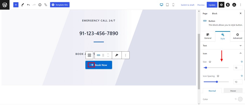
Use the Style > Background area to change the background color. You can set the background as transparent, normal color or use gradient color.
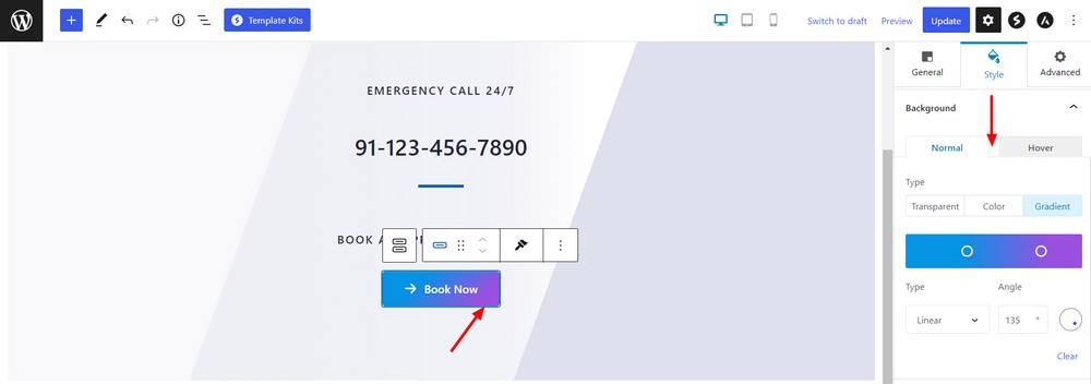
If you want to add a border outside the button, you can utilize the border setting under the style area.
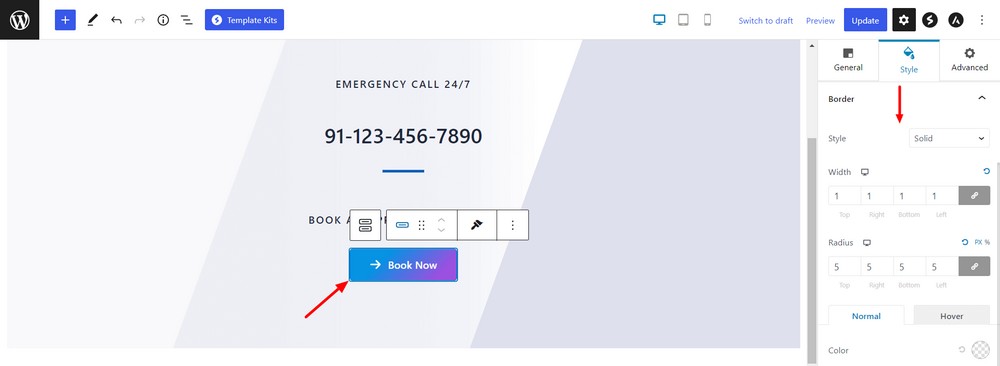
The button block also comes with attractive box shadows. You can use them, or not, as you like.
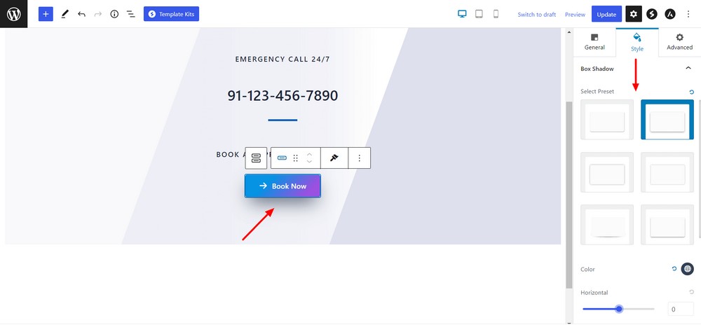
Add the necessary margin and padding to the button and make it more eye-catching.
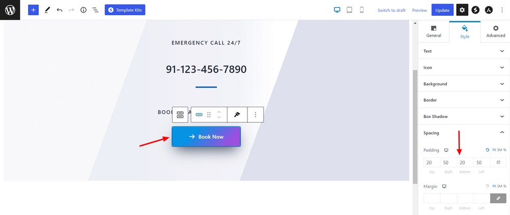
After customizing the button a little, this is what it looks like.

We’re sure yours will look different but equally attractive. As long as it fits into your design while attracting the eye, it should work well.
Other Spectra button blocks
Apart from the regular button block, Spectra offers two different blocks: Marketing and Call To Action.
The marketing button is ideal for making a newsletter signup button for example.
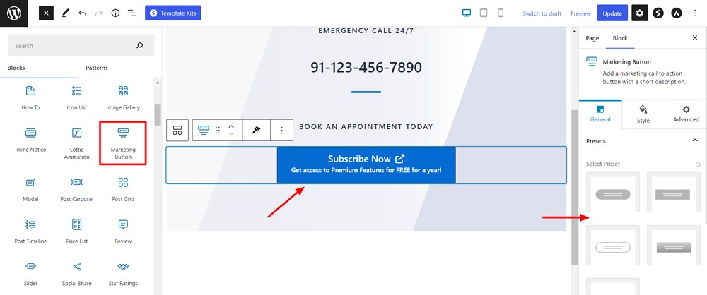
The Call To Action (CTA) block lets you design a beautiful call to action that should convert visitors into customers, fans or whatever you want from them.
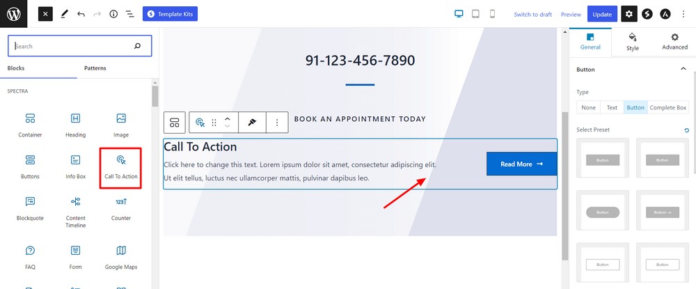
As you can see, the button blocks in Spectra offer a lot more design freedom than the default WordPress options.
But you can take buttons much further using HTML and CSS.
If that sounds like something you might like to try, let’s show you how.
How to manually add buttons using custom CSS
Now, we’re going to show you how you can add a button manually using HTML and CSS.
Add the Custom HTML block where you want to display the button.
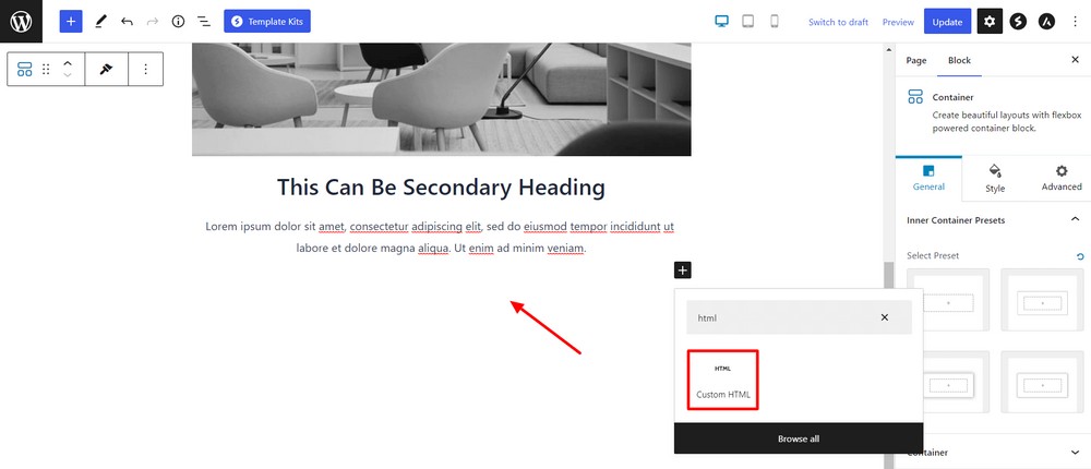
Insert the following HTML anchor tag code.
<a href="#" class="more-info-button">More Info</a>Make sure to add a class name so you can use it for styles.
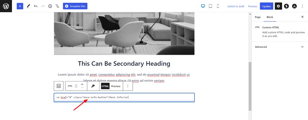
If you want to use the button as navigation, you can insert the link inside the href attribute where you see ‘#’.
Then it would look like:
<a href="https://staging.wpspectra.com/" class="more-info-button">More Info</a>Let’s shape it like a button.
Click the Customize link in the top bar.
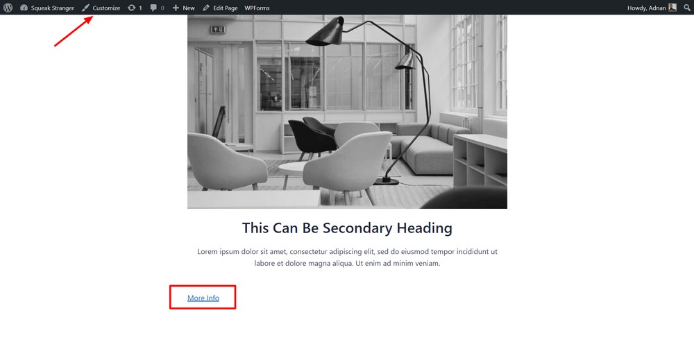
Find the Additional CSS option.
Insert the following code snippet into the box. Hit the blue Publish button to save the changes.
.more-info-button{

 background-color: #4CAF50;

 border: none;

 border-radius: 10px;

 color: white;

 padding: 16px 24px;

 text-align: center;

 font-size: 18px;

 text-decoration: none !important;

}

.more-info-button:hover{

 background-color: black;

 color: white;

}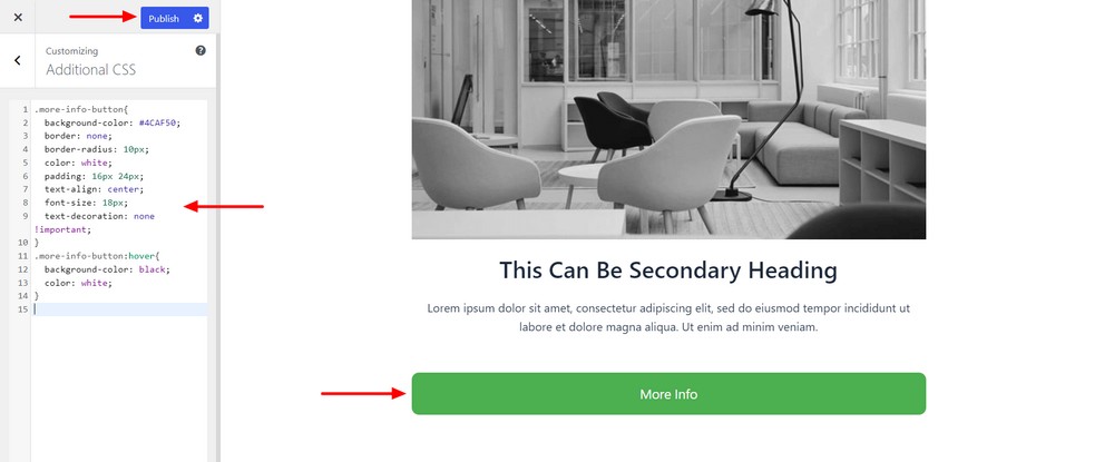
Reload the page and check the newly designed button!
If you don’t mind experimenting with HTML or CSS, you can customize the color, shape, size, position and all aspects of your button.
Wrapping up
Spectra makes life refreshingly simple. By activating this free tool, you’ll have more control over the default WordPress editor and can design professional websites in no time.
The amazing button block in Spectra offers far more creative freedom than the default options.
It gives you more design control which lets you create engaging buttons and customize them to fit perfectly onto the page.
If only everything in life was this easy!
Which Spectra button blocks do you like most? Are there button types you would like to see in a future release?
Share your ideas with us using the comment section below.
Disclosure: This blog may contain affiliate links. If you make a purchase through one of these links, we may receive a small commission. Read disclosure. Rest assured that we only recommend products that we have personally used and believe will add value to our readers. Thanks for your support!
Recommended Articles
How to add WordPress accordion blocks for collapsible text for free
How to delete a block in WordPress – a complete guide for everyone