- Section
- Troubleshooting: Missing Icons
- Spectra Patterns
- Contact Form 7: Multiple Column Fields
- Contact Form 7: Checkbox / Radio / Acceptance Control
- Unable To Style Contact Form 7
- Tab Index For Multiple Gravity Forms
- Getting Started With Spectra
- Exclude Heading From TOC
- Block Display Conditions
- Importing Starter Templates With Spectra
- Getting Started With Spectra
- Manually Install Spectra Via FTP
- Automatic Beta Updates
- Rollback To Previous Versions
- Load Google Fonts Locally
- Activate Spectra Pro License
- Install Spectra Pro
- Translate Strings With Loco Translate
- Process Refund Requests
- Transparent / Sticky Header
- Change Site Logo
- Change Global Styles
- Disable Title on Posts & Pages
- Transparent / Sticky Header For Single Page / Post
- Change Header & Footer Patterns
- Custom / Google Fonts
- Reset Global Default Styling
- Manually Install Spectra One Via FTP
- Enable / Disable Header & Footer On Specific Pages / Posts
Icon Block
Icon boxes come in very handy when building websites using Spectra. The Icon block in Spectra allows you to decorate your content with stylish icons. You can choose from thousands of icons available. You can make use of these icons for sections that list features of products or services. Additionally, you can access different color settings such as simple, gradient, and multicolor.
Icon Block in Spectra
While designing eye-catchy web pages, icons are the small things that have an extraordinary effect. They are now an integral part of web design. Integrating icons into your web design can make content visually appealing, and also helps highlight key features. It increases the conversion rate of visitors to readers and also helps in converting them into customers.
Using the Icon block in Spectra, you now have access to over 3000 amazing icons. Using this block, you can create an easy-to-manage list of items, with each item highlighted by its own icon.
General Settings in Icon block
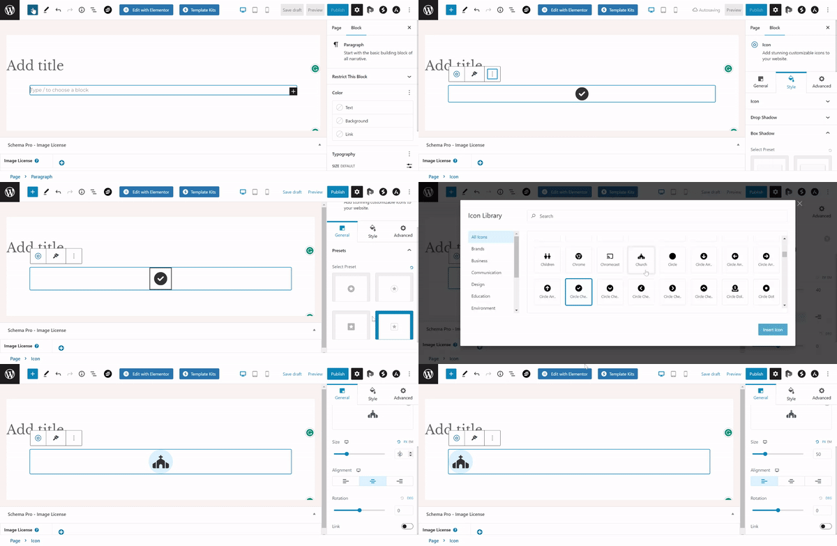
Presets: For the chosen icon, you can select the Preset of your choice here.
Icon:
- You can select the icon of your choice from the Icon Library here. Icon Library is the place where you can search for icons related to various modules like Brands, Business, Communication, Design, Education, Lifestyle, and many more.
- You can set the icon size, alignment, rotation, and links.

Styling Options for Icon block
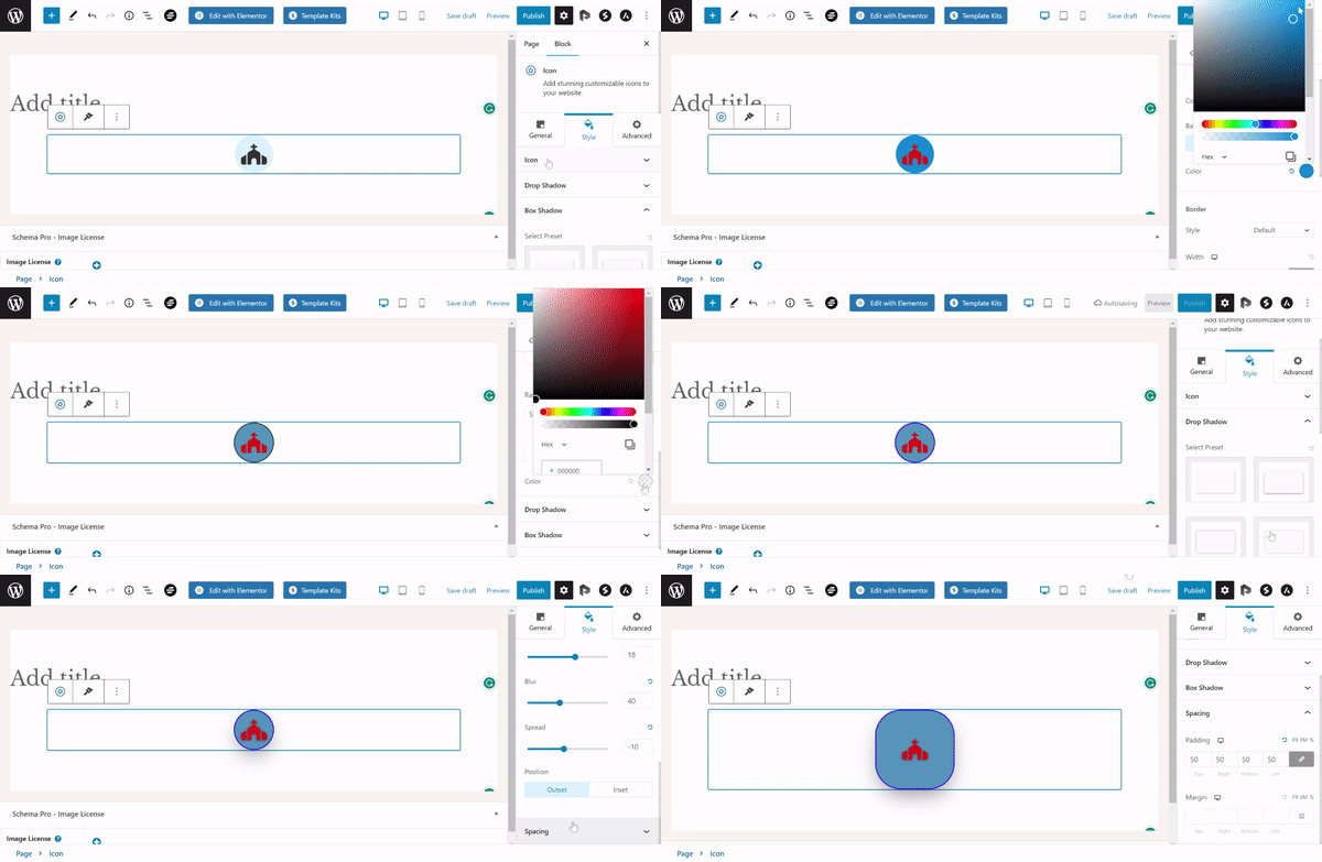
- You can choose the icon’s color, and the icon’s hover state color.
- You can access different color settings such as simple, gradient, and multicolor.
- You can also have the option to set the drop shadow, box shadow, preset.

We don't respond to the article feedback, we use it to improve our support content.