- Section
- Troubleshooting: Missing Icons
- Spectra Patterns
- Contact Form 7: Multiple Column Fields
- Contact Form 7: Checkbox / Radio / Acceptance Control
- Unable To Style Contact Form 7
- Tab Index For Multiple Gravity Forms
- Getting Started With Spectra
- Exclude Heading From TOC
- Block Display Conditions
- Import Single Pages, Templates, & Block Patterns
- Enable/Disable Design Library Button
- Copy & Paste Style
- Container Flex Property
- Default Content Width
- Blocks Editor Spacing
- Collapse Panels
- Responsive Conditions
- Dynamic Content Extension
- Site Visibility
- Spectra Actions: Clear Cache
- Quick Action Bar
- Add Multiple Instagram Accounts
- Grid Builder
- Move Title Bar To Top
- Resolving Container Layout Conflicts
- Register High-Privileged Users
- User Roles Access To AI
- Database Update Instructions (Below 2.0.0)
- FAQ's: VIP Priority Support
- Whitelist Email Address
- Using ACF Repeater Field in Spectra
- Pixabay Image Search Feature
- How to Fix Stretched Spectra Images in WordPress 6.7
- How to Change Breakpoints in Spectra?
- Controlling Access to the Spectra Design Library Based on User Roles
- Multi-Column Form Block Using Utility Classes
- Why Am I Seeing Mixed Content or Non-HTTPS Errors?
- Importing Starter Templates With Spectra
- Getting Started With Spectra
- Manually Install Spectra Via FTP
- Automatic Beta Updates
- Rollback To Previous Versions
- Load Google Fonts Locally
- Activate Spectra Pro License
- Install Spectra Pro
- Translate Strings With Loco Translate
- Process Refund Requests
- Transparent / Sticky Header
- Change Site Logo
- Change Global Styles
- Disable Title on Posts & Pages
- Transparent / Sticky Header For Single Page / Post
- Change Header & Footer Patterns
- Custom / Google Fonts
- Reset Global Default Styling
- Manually Install Spectra One Via FTP
- Enable / Disable Header & Footer On Specific Pages / Posts
Spectra – Responsive Conditions
One of the cool features of Spectra is its Responsive Conditions. This helps you decide how your website looks on different devices, like mobile, tablet, or PC.
For example, you have a section on your homepage that displays the restaurant’s featured dishes side by side. On larger screens like desktops and laptops, this layout looks great, but on smaller screens like mobile phones, the dishes appear too cramped.
So with Responsive Conditions, you can display one dish at a time on mobile devices.
Ready to know more about the Responsive Conditions?
Go through the following sections of this document to learn how to use this feature.
Understanding the Purpose of Spectra’s Responsive Conditions
Modern users engage with websites through a variety of devices, including desktops, tablets, and mobiles. Each device has unique characteristics that can impact the user experience.
Spectra’s Responsive Conditions feature allows you to selectively show or hide specific content to users based on the device they are using.
Whether it’s optimizing content for a particular screen size or temporarily disabling certain blocks, Spectra’s Responsive Conditions offer the flexibility you need.
How to Use Responsive Condition in Spectra
Now that we understand more about why you might want to use the responsive conditions, let’s look at how you can create an option to enable or disable the Responsive Conditions.
Note that for this tutorial, we’ll assume you already have Spectra installed and activated on your website.
Once you have Spectra installed on your site, you can simply follow the steps below.
Finding Responsive Conditions Options
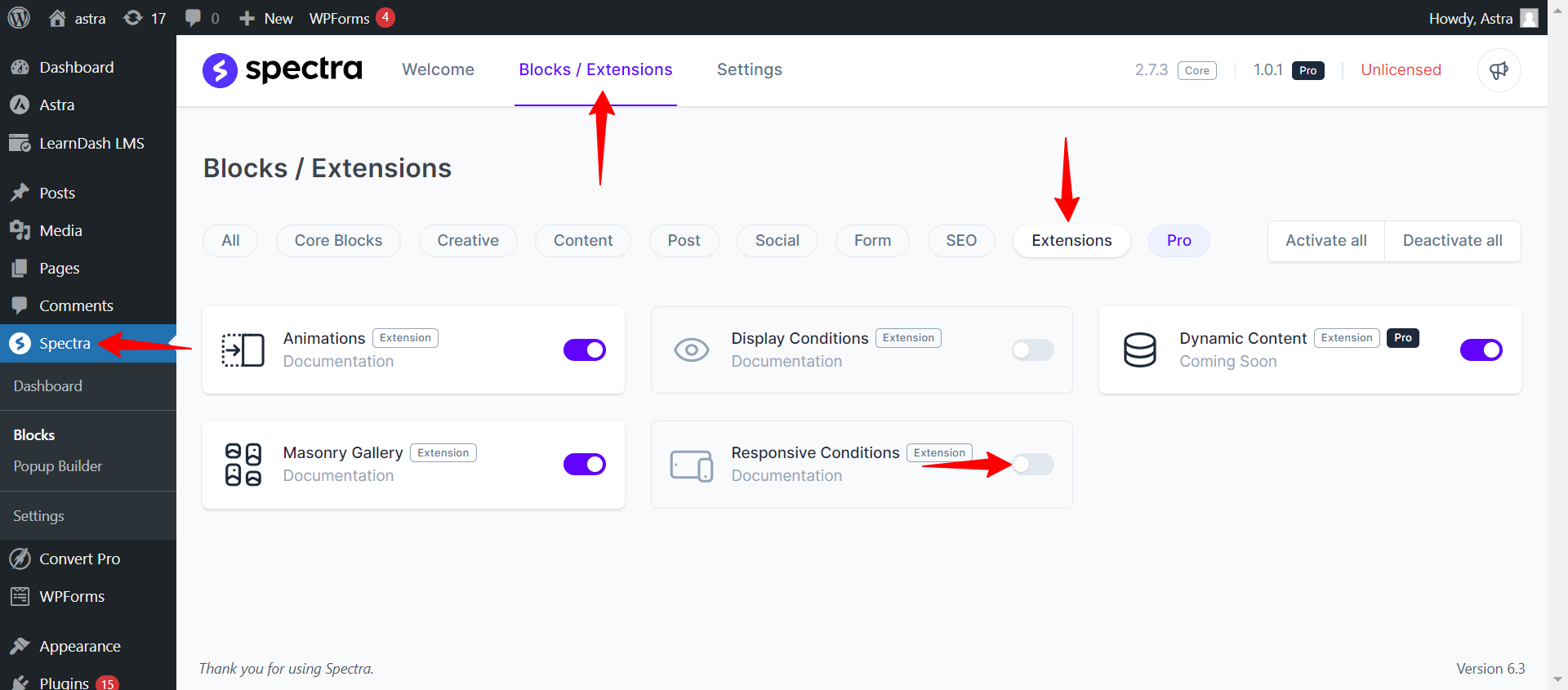
To get started with Spectra’s Responsive Conditions, navigate to the admin panel. You’ll find it under Spectra > Blocks / Extensions > Extensions > Responsive Conditions.
Enabling Responsive Conditions Extensions
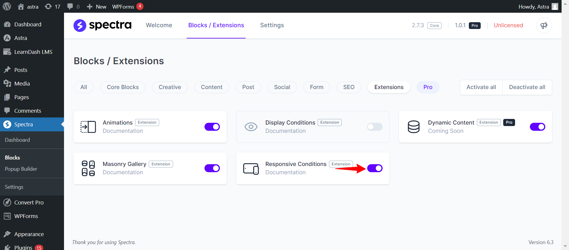
Make sure to turn on the Responsive Conditions option in the Spectra admin panel. This step is really important because it lets you access the special ability to customize how your content looks.
Hide/Display Content Setting in Block Editor
When you add a block to your page or post using Spectra, you just need to click on the “Advanced” settings for that block.
Note
Please note that this feature exclusively functions with Spectra blocks only.
That’s where you’ll discover the Responsive Conditions Options, ready for you to check out.
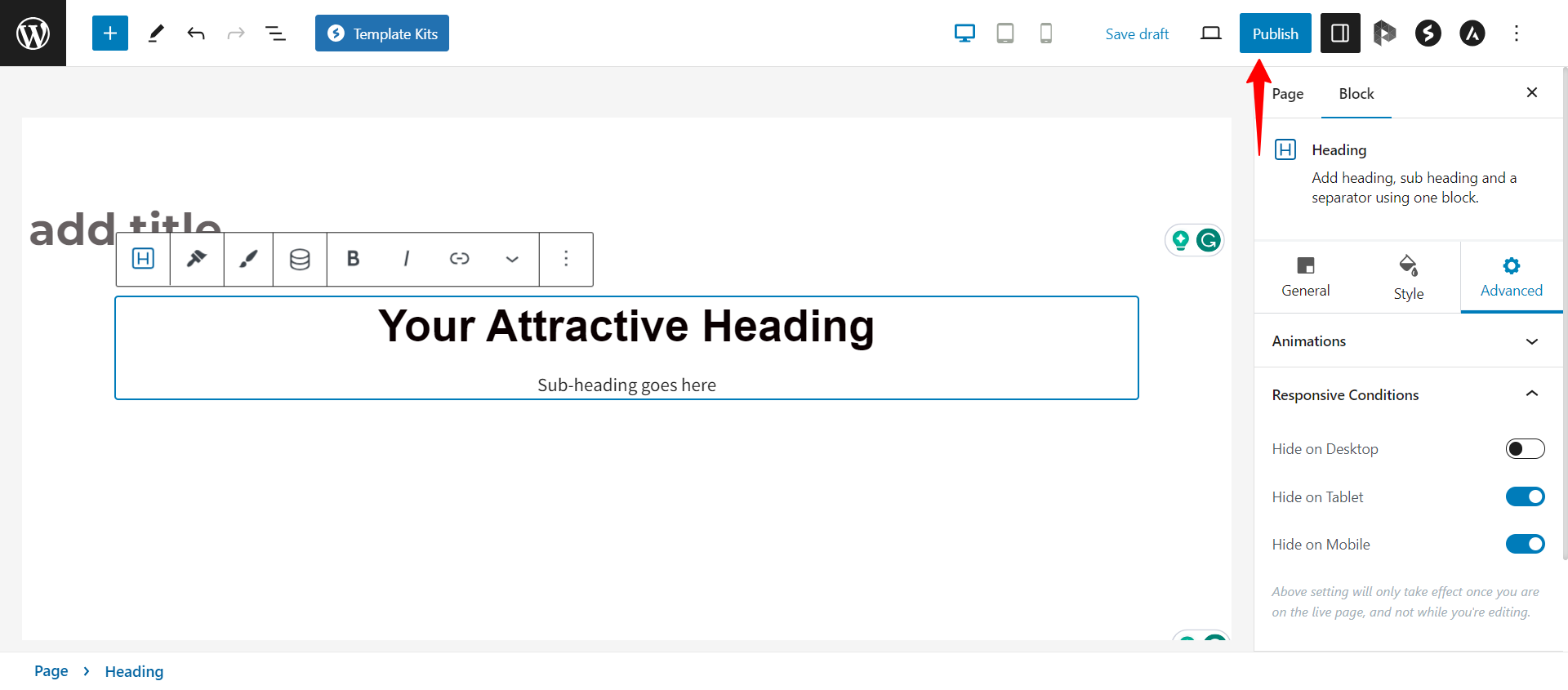
Next up, you can click on the Advanced settings. Inside, you’ll find the Responsive Conditions Options waiting for you. This is where the real excitement starts.
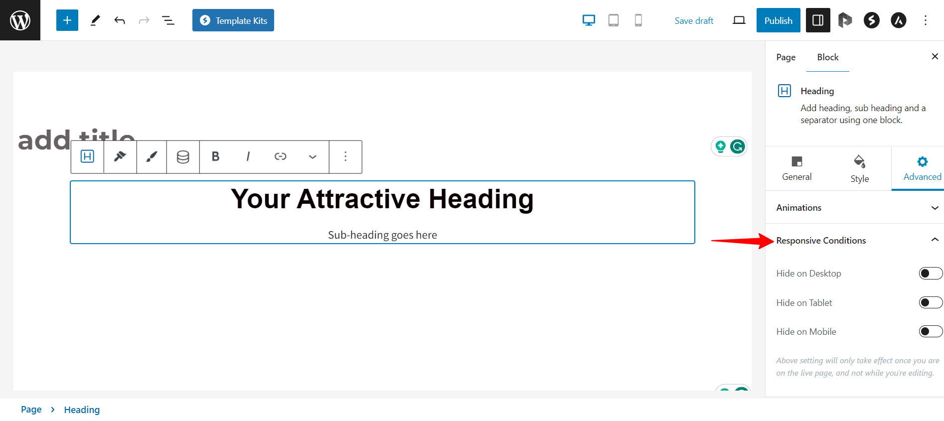
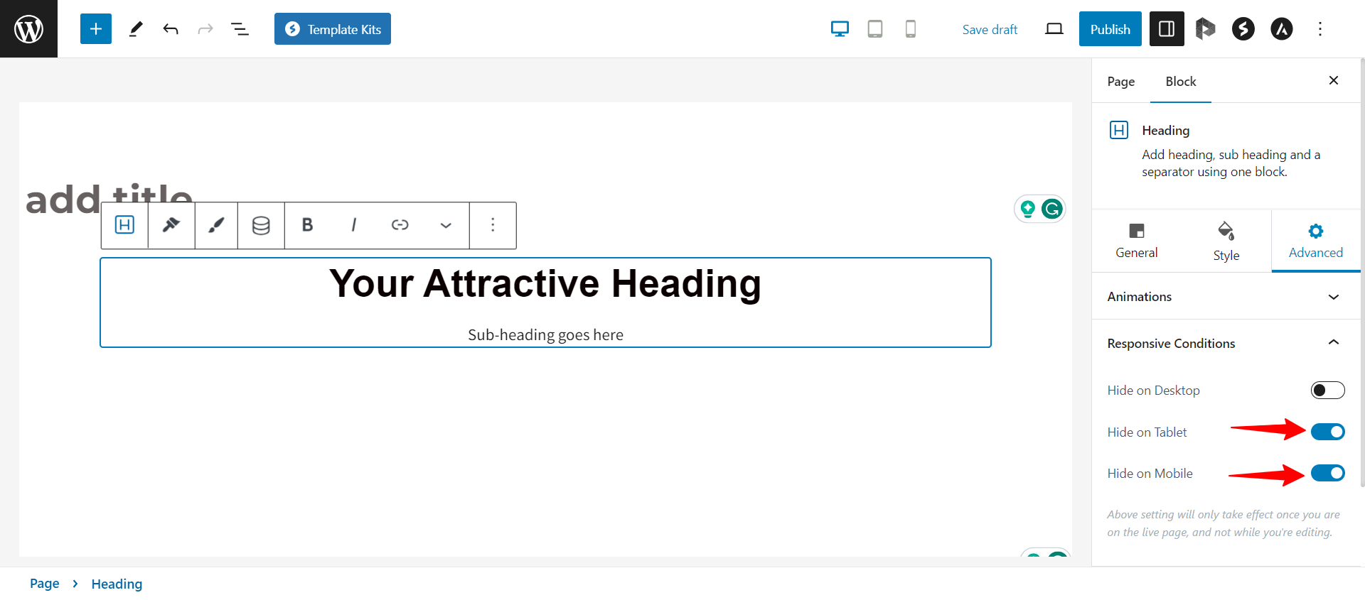
In the Responsive Conditions Options, you’ll find settings for Desktop, Tablet, and Mobile. These settings let you choose exactly when and where your content appears.
Save the Changes
Once you’ve set up your content for different devices, remember to save your changes. Just click the “update” or “publish” button to make sure your changes show up on your website.
That’s it!
Now your website will appear as per the responsive conditions you set.
We hope this article has been helpful. If you have any questions, please feel free to leave a comment below.
We don't respond to the article feedback, we use it to improve our support content.