- Using Heading Block
- Buttons
- Post Grid
- Content Timeline
- Social Share
- Google Map
- Add Testimonials
- Info Box
- Team
- Icon List
- Price List
- Post Masonry
- Post Carousel
- Post Timeline
- Call To Action
- Advanced Columns
- Blockquote
- Marketing Button
- Table Of Contents
- How-to Schema
- FAQ’s: Schema/Accordion
- Inline Notice
- WP – Search
- Review Schema
- Lottie
- Taxonomy List
- Tabs Block
- Create Contact Forms
- Star Rating
- Masonry Image Gallery
- Wireframe Blocks
- Heading Block
- Image Block
- Buttons Block
- Translate Everything WPML
- Container Block
- Taxonomy Styling Options
- Block Presets
- Image Gallery
- Counter Block
- Modal Block
- Registration Form Block
- Slider Block
- Pagel Level Custom CSS
- Countdown Pro
- Slider Custom Navigation
- Instagram Feed
- Loop Builder
- Animations
- Login Form Block
- Global Block Style Extension
- Create Popups
- Custom Blocks
- Move Block Patterns
- Grid Builder
- Newsletter Forms
- Register High-Privileged Users
- Hide Core Blocks
- Getting Started with Instagram
- Advanced Loop Builder
- Section
- Troubleshooting: Missing Icons
- Spectra Patterns
- Contact Form 7: Multiple Column Fields
- Contact Form 7: Checkbox / Radio / Acceptance Control
- Unable To Style Contact Form 7
- Tab Index For Multiple Gravity Forms
- Getting Started With Spectra
- Exclude Heading From TOC
- Block Display Conditions
- Importing Starter Templates With Spectra
- Getting Started With Spectra
- Manually Install Spectra Via FTP
- Automatic Beta Updates
- Rollback To Previous Versions
- Load Google Fonts Locally
- Activate Spectra Pro License
- Install Spectra Pro
- Translate Strings With Loco Translate
- Process Refund Requests
- Transparent / Sticky Header
- Change Site Logo
- Change Global Styles
- Disable Title on Posts & Pages
- Transparent / Sticky Header For Single Page / Post
- Change Header & Footer Patterns
- Custom / Google Fonts
- Reset Global Default Styling
- Manually Install Spectra One Via FTP
- Enable / Disable Header & Footer On Specific Pages / Posts
How to Create Popups Using Spectra
Popups play a crucial role in engaging website visitors, collecting contact information, showcasing special offers, and facilitating event registrations.
For WordPress websites, integrating popups is a valuable strategy for sales and marketing.
Spectra, the ultimate page builder, offers an easy-to-use Popup Builder feature to create effective popups.
This document provides step-by-step instructions on how to create popups using Spectra.
What Is a Popup?
A popup, or popup box, is a smaller window that appears on a website to draw attention to specific content.
Examples include email subscription forms or promotional offers.
Spectra enables users to design and implement popups seamlessly.
How to Create Popup On Your Site
You can follow the below steps to create pop up on your WordPress website.
- Ensure Spectra is activated on your website.
- Navigate to Spectra > Popup Builder.
- Click on “Create Popup” at the top left.
- Choose between Info Bar or Popup and customize the selected option.
- Use the editor to add or remove blocks to tailor the popup according to your preferences.
- Click “Publish” to make the popup live.
How to Customize the Popup
Through the popup builder block, these settings control the overall behavior of the popup.
- Popup Width & Height: You can define the exact dimensions of your popup window. This ensures your popup displays content at the desired size and avoids appearing too large or small on your web pages.
- Overlay: This setting controls the background element that appears behind your popup. You can customize its color and opacity to create different visual effects.
- Prevent Background Interaction: You can enable this option to disable scrolling and clicking on the content behind your popup when it’s visible. This helps focus user attention on the popup’s message.
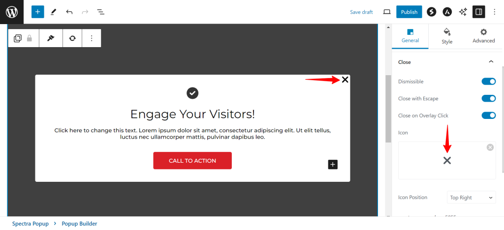
You can also configure how the popup can be closed.
- Dismissible: Enable to allow popups to be closed.
- Close on Overlay Click: Close popups when the overlay is clicked.
- Icon: Choose a closing icon.
- Icon Position: Specify where the closing icon appears in the popup (default: Top Right).

What are the Popup Builder Visibility Settings
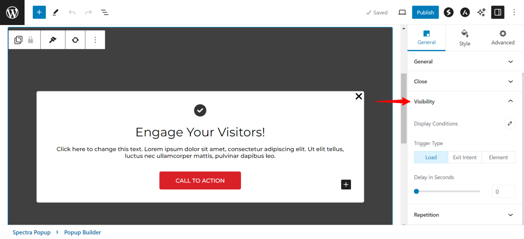
Spectra Pro’s Popup Builder Block offers advanced control over when and where your popups appear on your website. Here’s a breakdown of the key settings within the “Popup Visibility Settings”:
- Display Conditions: This section determines where your popup will be shown and where it won’t. You can likely choose to display the popup on all pages, specific pages (by selecting them), or exclude it from certain pages.
- Trigger Type: Configure when the popup should trigger.
- Load: Appears as soon as the configured page loads.
- Exit Intent: Appears when a user attempts to leave the page.
- Element Trigger Type: This allows you to create a custom trigger button or element. You’ll likely assign a specific CSS class to an element on your page. When a user clicks on that element, the popup will appear.

Repetition
You can control the repetitive behavior of the popup.
- Repeat Infinitely: Load the popup as many times as the trigger type is loaded.
- Repetition per Browser: Determine how many times the popup appears in a single browser on each load.

How to Style Your Popups in Spectra’s Popup Builder Block
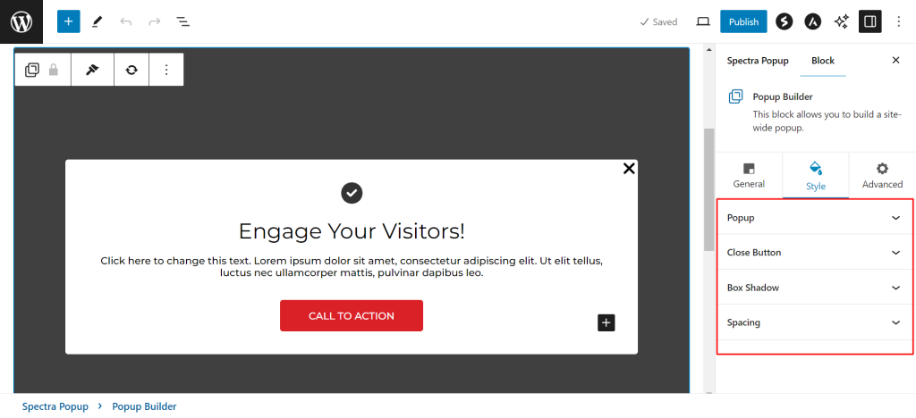
You can customize the appearance of the popup. Here’s how you can use the styling settings to create visually appealing popups:
- Popup Style: You can customize the overall appearance of your popup. This likely includes options to adjust the background color, overlay color, border style and thickness.
- Close Button: Make sure your visitors can easily dismiss the popup. You can customize the size and color of the closing icon (often a small “x”) to ensure it’s clear and visually appealing.
- Box Shadow: You can add a subtle 3D effect to your popups with a box shadow. This can make them stand out from the background content while maintaining a clean aesthetic.
- Spacing: You can control the amount of space between the popup’s content and its edges.

We hope this document has been helpful. If you have any queries further, feel free to leave a comment below.
We don't respond to the article feedback, we use it to improve our support content.