- Using Heading Block
- Buttons
- Post Grid
- Content Timeline
- Social Share
- Google Map
- Add Testimonials
- Info Box
- Team
- Icon List
- Price List
- Post Masonry
- Post Carousel
- Post Timeline
- Call To Action
- Advanced Columns
- Blockquote
- Marketing Button
- Table Of Contents
- How-to Schema
- FAQ’s: Schema/Accordion
- Inline Notice
- WP – Search
- Review Schema
- Lottie
- Taxonomy List
- Tabs Block
- Create Contact Forms
- Star Rating
- Masonry Image Gallery
- Wireframe Blocks
- Heading Block
- Image Block
- Buttons Block
- Translate Everything WPML
- Container Block
- Taxonomy Styling Options
- Block Presets
- Image Gallery
- Counter Block
- Modal Block
- Registration Form Block
- Slider Block
- Pagel Level Custom CSS
- Countdown Pro
- Slider Custom Navigation
- Instagram Feed
- Loop Builder
- Animations
- Login Form Block
- Global Block Style Extension
- Create Popups
- Custom Blocks
- Move Block Patterns
- Grid Builder
- Newsletter Forms
- Register High-Privileged Users
- Hide Core Blocks
- Getting Started with Instagram
- Advanced Loop Builder
- Section
- Troubleshooting: Missing Icons
- Spectra Patterns
- Contact Form 7: Multiple Column Fields
- Contact Form 7: Checkbox / Radio / Acceptance Control
- Unable To Style Contact Form 7
- Tab Index For Multiple Gravity Forms
- Getting Started With Spectra
- Exclude Heading From TOC
- Block Display Conditions
- Importing Starter Templates With Spectra
- Getting Started With Spectra
- Manually Install Spectra Via FTP
- Automatic Beta Updates
- Rollback To Previous Versions
- Load Google Fonts Locally
- Activate Spectra Pro License
- Install Spectra Pro
- Translate Strings With Loco Translate
- Process Refund Requests
- Transparent / Sticky Header
- Change Site Logo
- Change Global Styles
- Disable Title on Posts & Pages
- Transparent / Sticky Header For Single Page / Post
- Change Header & Footer Patterns
- Custom / Google Fonts
- Reset Global Default Styling
- Manually Install Spectra One Via FTP
- Enable / Disable Header & Footer On Specific Pages / Posts
Buttons
Spectra provides a Multi Buttons block that allows you to add multiple buttons within a single section. Further, you can individually style these buttons, while keeping them grouped in one block at the same time.
In addition, you can add any number of buttons, each with different colors, shapes, sizes, borders, hover colors, and typography. Have a look at the demo here.

These are key features of Multi Buttons block:
- Multiple Buttons
- Individual Styling Options
- Individual Button Control
- Hover color options
- Responsive Support
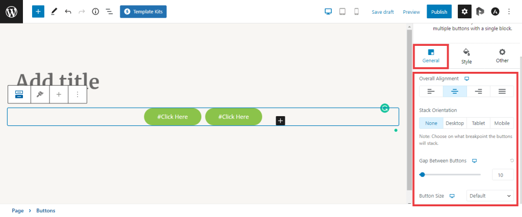
Buttons Block Settings
Firstly, you can set how your whole buttons block will look. Thus, under the \”General\” options, you will find the following settings:
- Alignment: choose between None, Left, Center, or Right;
- Spacing: set the Gap Between Buttons;
- Stack on: choose a breakpoint on which you wish to stack the buttons: Desktop, Tablet, or Mobile. By default, buttons will display inline on all devices;
- Typography: set the Font Family and Font Weight for all your buttons within the block.
Individual Button Settings
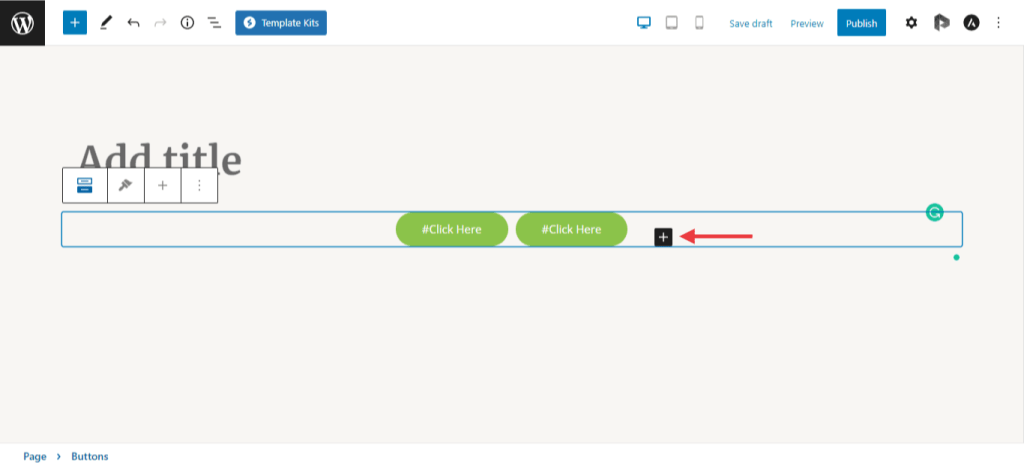
Once you click on the Buttons block, you can add as many individual buttons as you need. Similar to adding any other block, add buttons by clicking the “+” icon within the Buttons block.
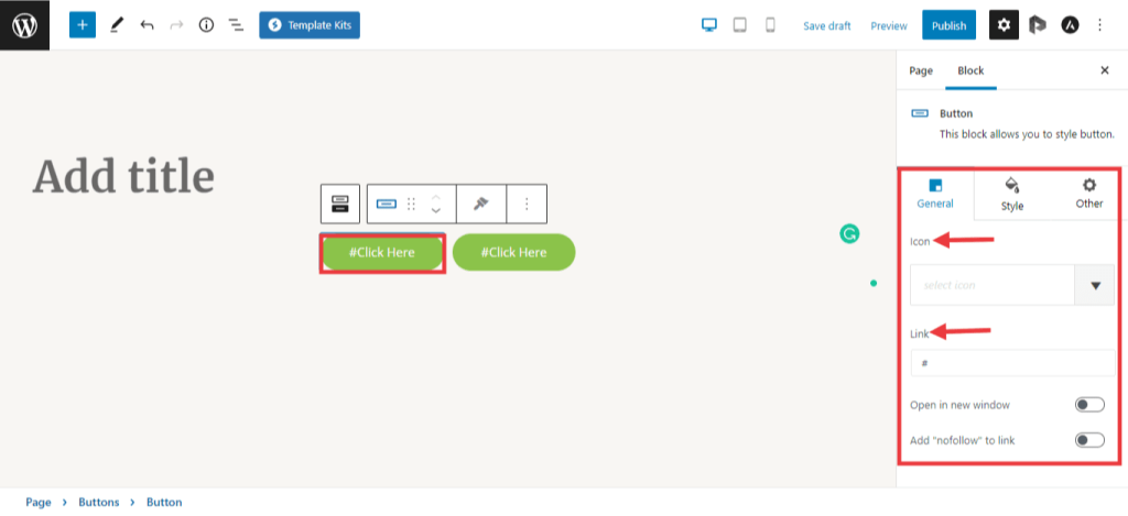
Individual Button Styling Options
The individual button can be customized completely. Below are the options under each button setting tab –
- Link
- Inherit from the Theme
- Button Icon
- Color Settings
- Top and Bottom Padding
- Left and Right Padding
- Border Style
- Border Thickness
- Rounded Corners
- Font Size
- Line Height
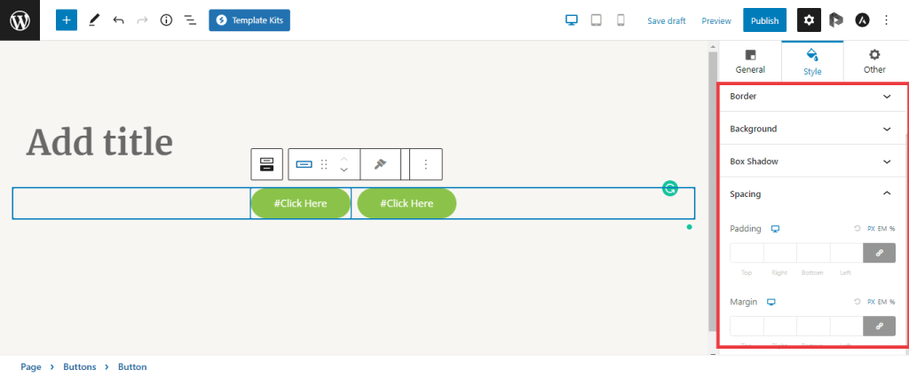
Under the ‘Style’ tab, you can set the button’s typography, border, box shadow, and background color.
We don't respond to the article feedback, we use it to improve our support content.