- Using Heading Block
- Buttons
- Post Grid
- Content Timeline
- Social Share
- Google Map
- Add Testimonials
- Info Box
- Team
- Icon List
- Price List
- Post Masonry
- Post Carousel
- Post Timeline
- Call To Action
- Advanced Columns
- Blockquote
- Marketing Button
- Table Of Contents
- How-to Schema
- FAQ’s: Schema/Accordion
- Inline Notice
- WP – Search
- Review Schema
- Lottie
- Taxonomy List
- Tabs Block
- Create Contact Forms
- Star Rating
- Masonry Image Gallery
- Wireframe Blocks
- Heading Block
- Image Block
- Buttons Block
- Translate Everything WPML
- Container Block
- Taxonomy Styling Options
- Block Presets
- Image Gallery
- Counter Block
- Modal Block
- Registration Form Block
- Slider Block
- Pagel Level Custom CSS
- Countdown Pro
- Slider Custom Navigation
- Instagram Feed
- Loop Builder
- Animations
- Login Form Block
- Global Block Style Extension
- Create Popups
- Custom Blocks
- Move Block Patterns
- Grid Builder
- Newsletter Forms
- Register High-Privileged Users
- Hide Core Blocks
- Getting Started with Instagram
- Advanced Loop Builder
- Section
- Troubleshooting: Missing Icons
- Spectra Patterns
- Contact Form 7: Multiple Column Fields
- Contact Form 7: Checkbox / Radio / Acceptance Control
- Unable To Style Contact Form 7
- Tab Index For Multiple Gravity Forms
- Getting Started With Spectra
- Exclude Heading From TOC
- Block Display Conditions
- Importing Starter Templates With Spectra
- Getting Started With Spectra
- Manually Install Spectra Via FTP
- Automatic Beta Updates
- Rollback To Previous Versions
- Load Google Fonts Locally
- Activate Spectra Pro License
- Install Spectra Pro
- Translate Strings With Loco Translate
- Process Refund Requests
- Transparent / Sticky Header
- Change Site Logo
- Change Global Styles
- Disable Title on Posts & Pages
- Transparent / Sticky Header For Single Page / Post
- Change Header & Footer Patterns
- Custom / Google Fonts
- Reset Global Default Styling
- Manually Install Spectra One Via FTP
- Enable / Disable Header & Footer On Specific Pages / Posts
Marketing Button
In the world of WordPress websites and digital marketing, every element plays a crucial role in capturing the attention of users and driving them toward desired actions.
One such element that has proven its effectiveness is the “Marketing Button Block.”
You can place these marketing buttons on your website to make people do different things on your website like making a purchase or filling out a form.
And Spectra has a marketing button block that can help you add nice-looking buttons on your website.
This article lets you know the significance of marketing button blocks and how they can be strategically used to enhance conversions and user engagement.
What is the Marketing Button Block in Spectra
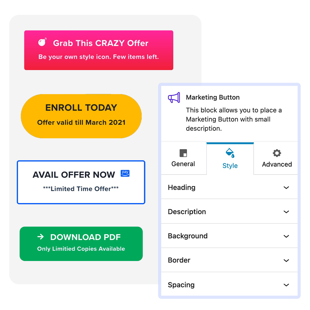
Marketing Button block is one of the blocks in Spectra that helps you add buttons to your website.
Also, these buttons are fully customizable so you can match their appearance as per your requirements.
It tells the users on your website to take specific actions, such as signing up for a newsletter, exploring a product, or initiating a purchase.

What are the Elements of an Effective Marketing Button Block
Let us assume that you are creating a high-converting marketing button block that involves more than just picking a random color and adding a link.
You want to make our button look appealing to the website visitors so they can click on the button and perform the action that you want.
So here are the key things that you can take care of to create your marketing button:
- Compelling Text: The words on the button should be short but interesting. They should clearly tell users what will happen when they click. Using words like “Discover,” “Join,” “Get Started,” or “Learn More” can make people curious and eager to take action.
- Strategic Placement: Where you put the button block really matters. It should be in a spot where people naturally look, like at the end of a section or next to stuff that’s related. This way, users won’t have to search around to find what they’re supposed to do.
- Contrasting Design: The marketing button block needs to catch the user’s eye compared to everything else around it. You can do this by using different colors, and fonts, or even making it move a little. The way the button looks should match the website’s style but still make users notice it.
- Clear Intent: The purpose of the button should be crystal clear. Users should have a clear understanding of what will happen after they click the button. Whether it’s claiming a discount, accessing exclusive content, or making a purchase, the intent should be clear
How to Create a Marketing Button in Spectra
Now that we understand more about why you might want to use the marketing button, let’s look at how you can create one in a few simple steps.
Note that for this tutorial, we’ll assume you already have Spectra installed and activated on your website.
Once you have Spectra installed on your site, you can simply follow the steps below.
Add the Marketing Button
To get started, navigate to the page or post where you want to insert your marketing button. Then, click on the + icon at the top of the screen.
This will launch the Spectra interface. From the blocks on the left, search for and select the marketing button block.
Add an Icon and Link to the Button
Under the General tab, in the Presets module – you can set the preset of your choice.
In the Content module, you can set the button, and text alignment, show or hide the description, add a link to the button, and make it open in a new window.
In the Heading module, you can select the heading of your choice for the button.
Lastly, in the Icon module, you can add an icon from the list, place the icon before or after text, and manage its position, and size.
Customizing the Marketing Button
Within the Design tab, specifically under the Background module, you can set the background color for the Button in two distinct states: normal and hovered.
With this feature, you can customize how the Button appears to users based on their interactions, providing a more engaging and interactive user experience.
Text Typography and Color Options
You can use the Style tab to handle how your button’s title and description look.
Within the Style tab, you can pick the perfect font, size, and color for the title and description. This helps your button not only look great but also convey its message clearly.
And it’s not just about looks – the Style tab lets you keep the text color consistent with your design.
This makes sure your button not only stands out but also serves its purpose well.
Save and Publish the Page/Post
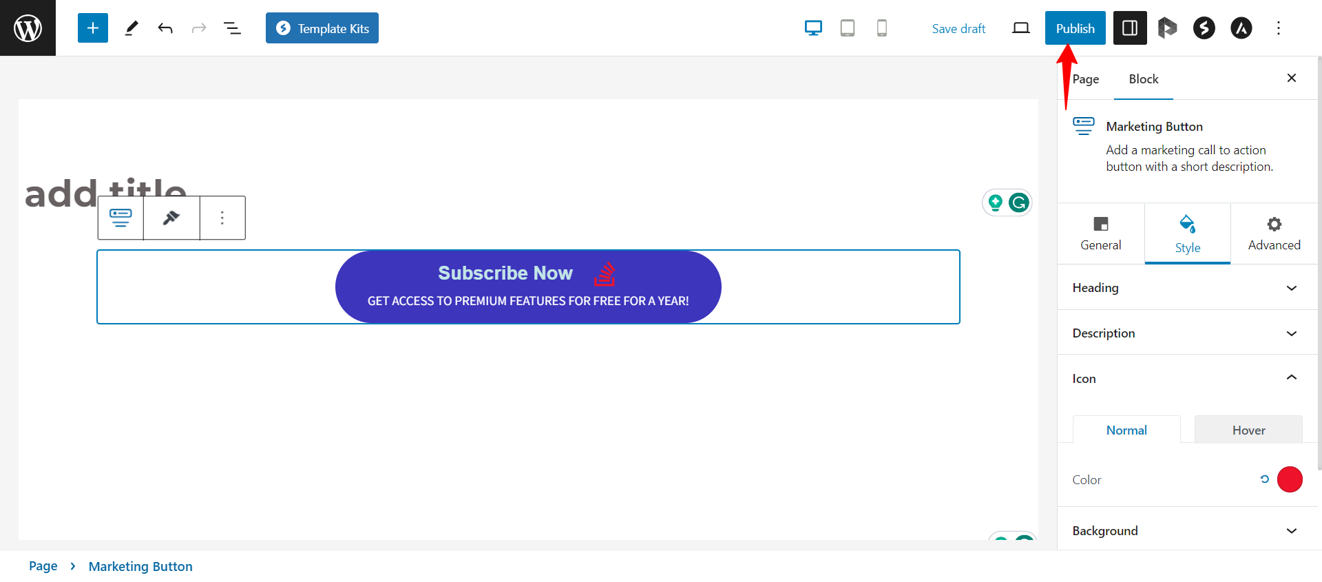
When you’re satisfied with the look and contents of your Spectra marketing button block, the only thing left to do is to save and publish it.
You can do so by selecting the Publish button at the top right side of the screen.

That’s it!
Then you can preview your block on the front end to confirm that it looks as you want it to.
We hope this article has been helpful. If you have any questions, please feel free to leave a comment below.
We don't respond to the article feedback, we use it to improve our support content.