- Using Heading Block
- Buttons
- Post Grid
- Content Timeline
- Social Share
- Google Map
- Add Testimonials
- Info Box
- Team
- Icon List
- Price List
- Post Masonry
- Post Carousel
- Post Timeline
- Call To Action
- Advanced Columns
- Blockquote
- Marketing Button
- Table Of Contents
- How-to Schema
- FAQ’s: Schema/Accordion
- Inline Notice
- WP – Search
- Review Schema
- Lottie
- Taxonomy List
- Tabs Block
- Create Contact Forms
- Star Rating
- Masonry Image Gallery
- Wireframe Blocks
- Heading Block
- Image Block
- Buttons Block
- Translate Everything WPML
- Container Block
- Taxonomy Styling Options
- Block Presets
- Image Gallery
- Counter Block
- Modal Block
- Registration Form Block
- Slider Block
- Pagel Level Custom CSS
- Countdown Pro
- Slider Custom Navigation
- Instagram Feed
- Loop Builder
- Animations
- Login Form Block
- Global Block Style Extension
- Create Popups
- Custom Blocks
- Move Block Patterns
- Grid Builder
- Newsletter Forms
- Register High-Privileged Users
- Hide Core Blocks
- Getting Started with Instagram
- Advanced Loop Builder
- Section
- Troubleshooting: Missing Icons
- Spectra Patterns
- Contact Form 7: Multiple Column Fields
- Contact Form 7: Checkbox / Radio / Acceptance Control
- Unable To Style Contact Form 7
- Tab Index For Multiple Gravity Forms
- Getting Started With Spectra
- Exclude Heading From TOC
- Block Display Conditions
- Importing Starter Templates With Spectra
- Getting Started With Spectra
- Manually Install Spectra Via FTP
- Automatic Beta Updates
- Rollback To Previous Versions
- Load Google Fonts Locally
- Activate Spectra Pro License
- Install Spectra Pro
- Translate Strings With Loco Translate
- Process Refund Requests
- Transparent / Sticky Header
- Change Site Logo
- Change Global Styles
- Disable Title on Posts & Pages
- Transparent / Sticky Header For Single Page / Post
- Change Header & Footer Patterns
- Custom / Google Fonts
- Reset Global Default Styling
- Manually Install Spectra One Via FTP
- Enable / Disable Header & Footer On Specific Pages / Posts
Spectra – Buttons Block
With Spectra, you can use the Buttons block to add multiple buttons in one section. These buttons can be different colors, shapes, sizes, borders, hover effects, and typography. You can control each button separately.
In this help document, we’ll talk about the Multi Button block and what you can do with it.
How to Add Multiple Buttons Block
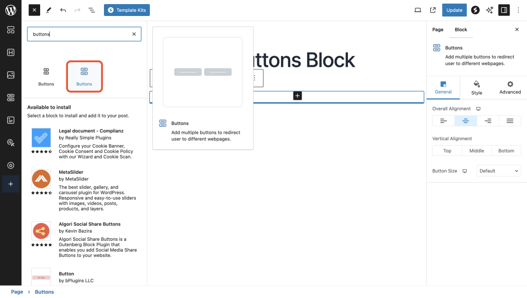
To insert the buttons block, click the Toggle block inserter + icon and search for the buttons block.

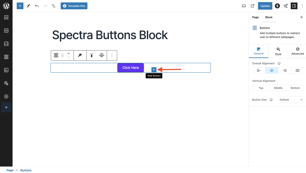
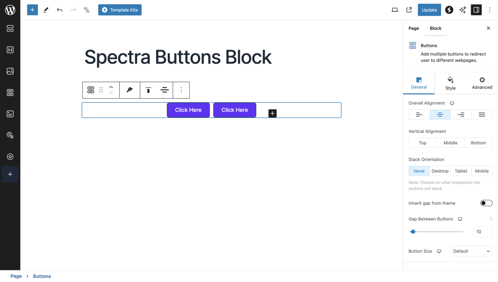
You’ll see two buttons added by default. You can change the button text to the text of your choice. Also, you add more buttons by clicking on the + icon.

What are the Multiple Buttons Block Styling Options
By selecting the block, you will be able to see the three vertical three dots. On clicking the dots, navigate to ‘show more settings. Then, the block settings panel will open on the right side of the block editor.
Under the General settings tab, you can set the button alignment, button size, and the gap between the buttons.

The Multi Button widget gives you global styling options that let you style all the buttons together. If you want all buttons to look identical, you can use the settings here.
Individual Button Styling Options
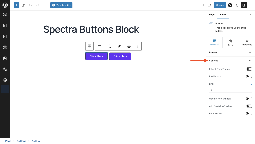
If you wish to style each button separately, click on the individual button you wish to edit. Then, you can access the styling options for the button on the right side of the block editor. You can control each button through its General settings.
You can add icons before/after text on a button to make it look good. Once you have added the icon, you can remove the text.
Also, you can add a hyperlink to the button, have the option to open the link in a new window, or add ‘no follow to the link. Take a look at the screenshot below.

Spectra Buttons Hover Settings
There are different hover options available for each component of the button under the Style tab.
For example, you can change the color of your button text when a user hovers around it under Text > Hover > Color.
Under Background > Hover > Color, you can change the background color of a button when the user hovers around it.
If you choose the Transparent option, the button will display a transparency effect when hovered over. You can also try out gradient colors for added visual appeal.
How to Add a Single Button without Adding Multiple Buttons
If you would like to add a single button, you can make use of the Button block which prompts users to take action with a group of button-style links. For a better understanding, we recommend you go watch the below attached video.
That wraps up this guide! If you encounter any issues with the button options or require further customization assistance, don’t hesitate to reach out to us by leaving a comment below. We’re here to help you!
We don't respond to the article feedback, we use it to improve our support content.