- Using Heading Block
- Buttons
- Post Grid
- Content Timeline
- Social Share
- Google Map
- Add Testimonials
- Info Box
- Team
- Icon List
- Price List
- Post Masonry
- Post Carousel
- Post Timeline
- Call To Action
- Advanced Columns
- Blockquote
- Marketing Button
- Table Of Contents
- How-to Schema
- FAQ’s: Schema/Accordion
- Inline Notice
- WP – Search
- Review Schema
- Lottie
- Taxonomy List
- Tabs Block
- Create Contact Forms
- Star Rating
- Masonry Image Gallery
- Wireframe Blocks
- Heading Block
- Image Block
- Buttons Block
- Translate Everything WPML
- Container Block
- Taxonomy Styling Options
- Block Presets
- Image Gallery
- Counter Block
- Modal Block
- Registration Form Block
- Slider Block
- Pagel Level Custom CSS
- Countdown Pro
- Slider Custom Navigation
- Instagram Feed
- Loop Builder
- Animations
- Login Form Block
- Global Block Style Extension
- Create Popups
- Custom Blocks
- Move Block Patterns
- Grid Builder
- Newsletter Forms
- Register High-Privileged Users
- Hide Core Blocks
- Getting Started with Instagram
- Advanced Loop Builder
- Section
- Troubleshooting: Missing Icons
- Spectra Patterns
- Contact Form 7: Multiple Column Fields
- Contact Form 7: Checkbox / Radio / Acceptance Control
- Unable To Style Contact Form 7
- Tab Index For Multiple Gravity Forms
- Getting Started With Spectra
- Exclude Heading From TOC
- Block Display Conditions
- Importing Starter Templates With Spectra
- Getting Started With Spectra
- Manually Install Spectra Via FTP
- Automatic Beta Updates
- Rollback To Previous Versions
- Load Google Fonts Locally
- Activate Spectra Pro License
- Install Spectra Pro
- Translate Strings With Loco Translate
- Process Refund Requests
- Transparent / Sticky Header
- Change Site Logo
- Change Global Styles
- Disable Title on Posts & Pages
- Transparent / Sticky Header For Single Page / Post
- Change Header & Footer Patterns
- Custom / Google Fonts
- Reset Global Default Styling
- Manually Install Spectra One Via FTP
- Enable / Disable Header & Footer On Specific Pages / Posts
Spectra – Container Block
The Container Block in the Gutenberg page builder provides a robust and flexible solution for designing custom layouts with ease. It allows users to combine various blocks within a single row, offering ultimate flexibility in terms of container layout and size configurations.
This versatile block allows users to create unique column layouts, manipulate container paddings and margins, and control the responsiveness of columns on different devices.
Go through the below sections of this document to learn more about how to use the container block using Spectra.
How to use the Container Block
To use the Container Block, you can begin by adding it to your page.
Once added, you can easily create your own column layout and manage the margins and paddings of each column. Other blocks can be added inside these columns, offering a seamless combination of different elements.
What are the Container Block General Settings
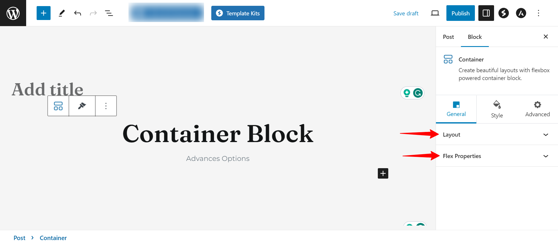
Upon selecting the Container Block, navigate to the General Tab in the settings sidebar. Here, you can fine-tune various parameters:
- Layout: You can set the container width to Full Width or Boxed, adjust the content width, and define minimum height.
- Flex Properties: Control the direction in which contained elements appear.
What are the Container Block Styling Options
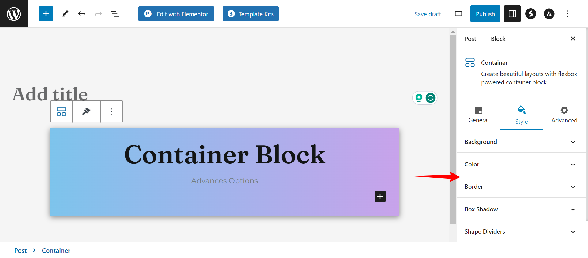
You can move to the Style tab to customize the appearance of the container.
- Background: Select from solid color, gradient, image, or video backgrounds.
- Color: Set text and hyperlink text colors from the palette.
- Border: Define border type, and border radius for rounded corners, and configure border settings.
- Shape Dividers: Apply dividers at the top and bottom of the container, specifying color, width, and height.
- Box Shadow: You can add a shadow effect to the container.
- Spacing: You can add row gap, column gap, padding, and margin.
What are the Container Block Advanced Options
In the advanced settings section, you have the following options:
Responsive Conditions: You can determine the page’s visibility on Desktop, Tablet, and Mobile devices. Note that these settings take effect only when the page is live, not during the editing process.
Sticky Container: This feature is controlled by a single toggle in the container’s advanced tab. Enabling this toggle allows you to specify whether the container should stick to the top or bottom of the screen. You can also adjust the distance (offset) from the edge at which it should be stuck.
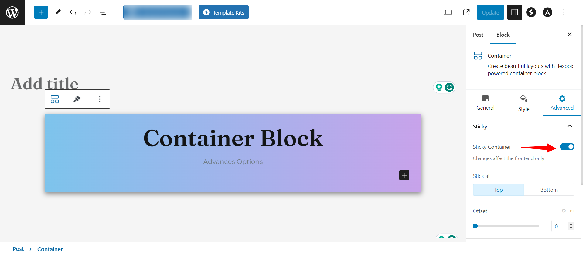
For example; I have created a page with a container block added to it and I have chosen that the container should stick to the top. Then in the front end, it would be like this:
If the container is nested within a parent container and set to stick at the top, you have the option to keep it inside the parent. With this setting, when the parent container scrolls out of view, the sticky element will also be out of view as it stops at the bottom of the parent.
How to work with Container blocks
Add a container block and then add other blocks inside it. These can be new, existing, or container blocks for nested styling. You can change different style settings for any Container block.
Adding new blocks to a Container
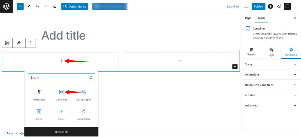
To add a new block inside an existing container block, click the + icon.
Dragging Existing blocks into a container
You can drag and drop any existing block into a container block. You can rearrange the order of blocks inside a container similarly.
Reusing a Container block in Multiple Designs
WordPress allows you to reuse blocks on as many pages as needed. This allows you to avoid setting up the same blocks repeatedly. You can also make container blocks to be reusable. This can save you a lot of time because container blocks can feature several other blocks and specific styling.
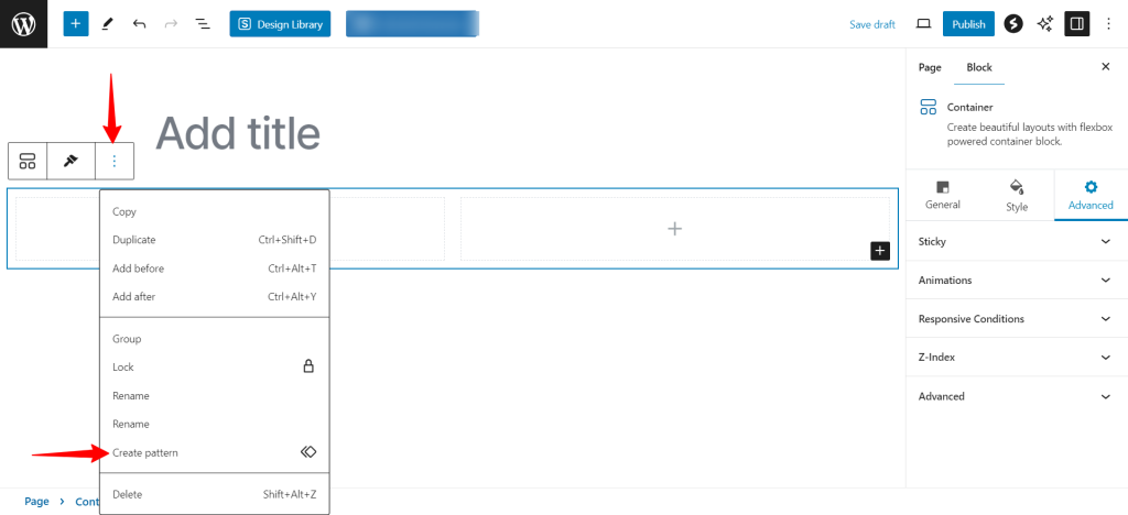
To make a Container block reusable, select it, then click the three dots icon for more block options. In the dropdown that appears, click the Create Pattern option and give a name to your reusable block.
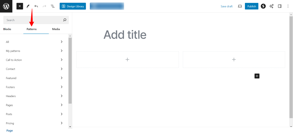
You can now insert this reusable container block in any design you create. Click to insert a new block, and in the Patterns section, click the one you want to insert.
We hope this document has been helpful. Please feel free to drop a comment below if you have any questions.
We don't respond to the article feedback, we use it to improve our support content.